


Good design is not just about appearance. It is also about making the website as easy to use as possible. A good website should be clear and simple, with intuitive functions. Call to action buttons should stand out so that they are visible, and sections for navigating the website should be clearly labelled so that it is easy to get around.
If users find a website to be beautiful and easy to use, they are more likely to remain on it, which increases the probability that they will purchase a product, no matter if it is a good or service. Remember, a good website reflects well on the business, so if a user likes a website, they will probably like the business too.

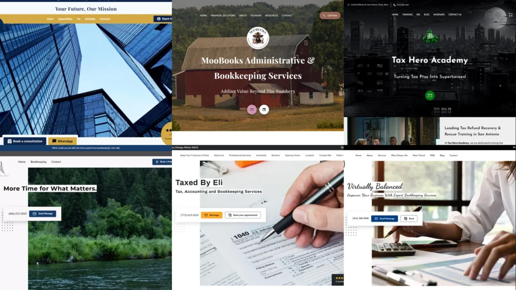
2. Craig Wale Accountancy

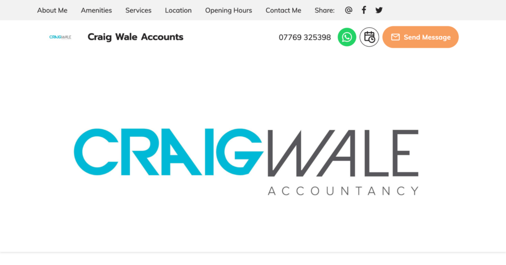
Craig Wale accountancy website is very cleanly designed, making it exceedingly approachable and easy to use. The various sections are neatly displayed in a navigation panel, while functions like an interactive map and a message form help users locate and get in touch with the business.
3. Mesa CPA Group

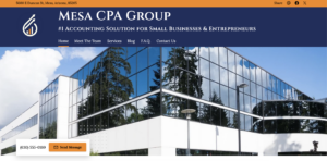
Mesa CPA Group’s website is an excellent example of great aesthetic design coming together with usability. The website’s sections are boldly labelled, while the high-quality content is clear and easy to read. A fantastic ‘Meet The Team’ page appeals to the common goals that the business shares with its clients, a sense that the business is on its clients’ side and establishing trust.
4. Kinsel Forensic Accounting LLP
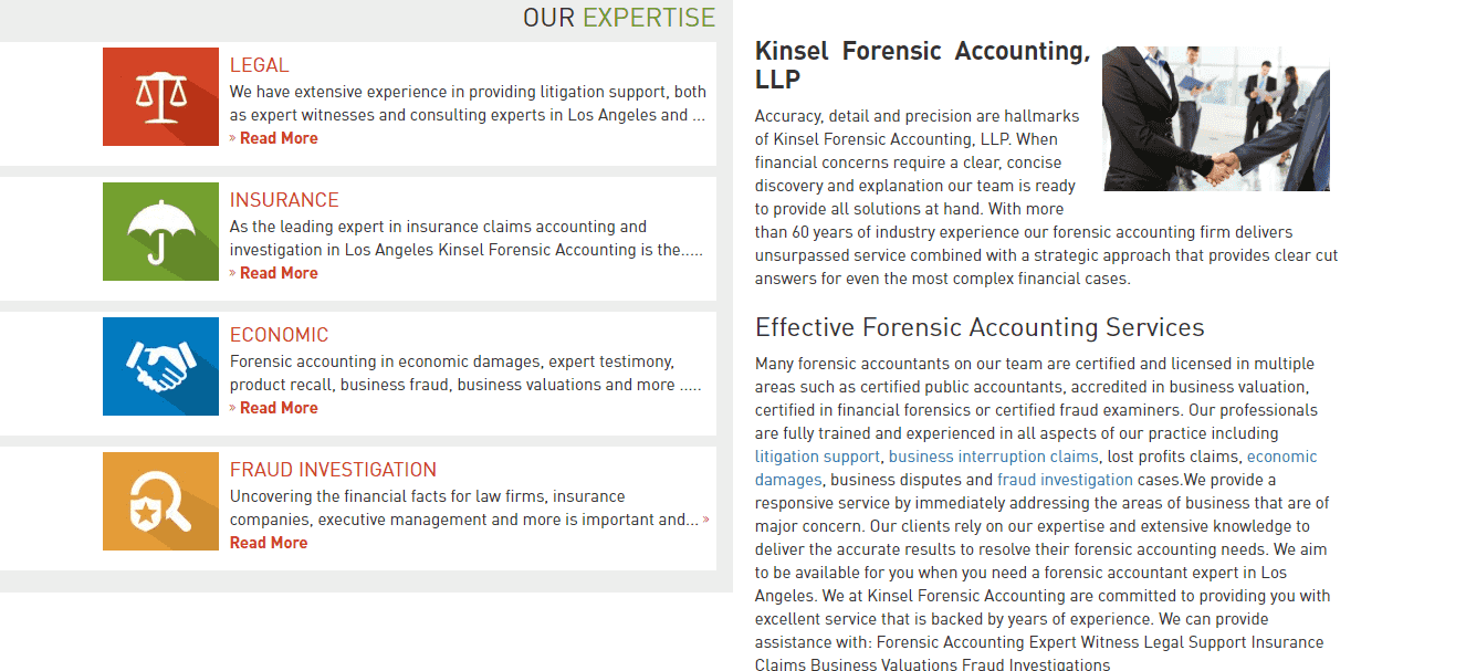

This website has a professional and sophisticated look, culminating in an image that sends the right messages for an accounting practice. The four main areas of the firm’s services are clearly displayed alongside coloured graphics that are easily noticeable. The inclusion of message functionality right at the top of the page is a great idea and allows potential customers to quickly inquire with the business.
5. Emerick & Company
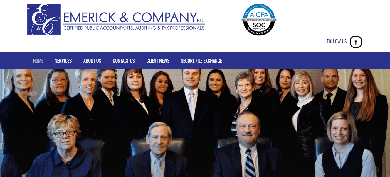

Emerick & Company’s website instantly creates a personal, welcoming feel by placing a large, high-quality photo of the company’s staff right on the landing page. The webpage is attractive and easy to use while still finding space to incorporate some excellent functions. A secure file exchange allows clients to safely transfer documents to the business, while a Tax Organiser lets clients quickly provide their tax details to the firm straight from the page.
6. Tanner
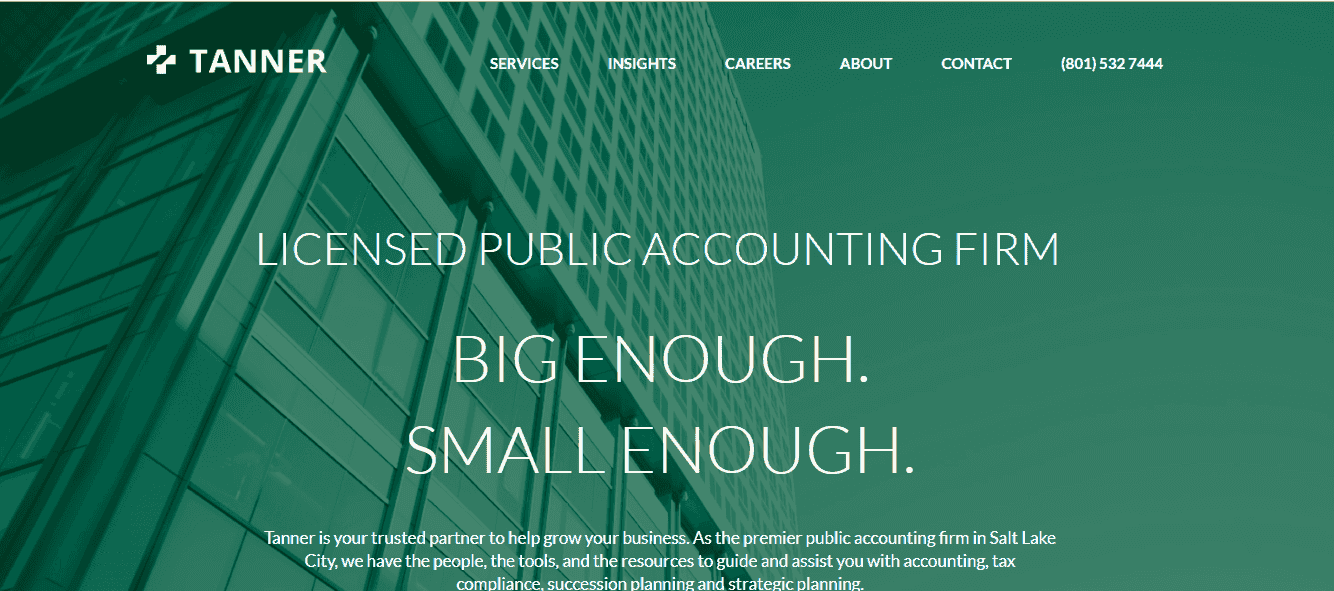

anner’s website is modern and appealing. An ‘Insights’ section offers users some excellent content in the form of a podcast produced by the firm, featuring some fascinating stories from local entrepreneurs and a well-written blog. These bonus offerings let customers know that the business cares about going beyond the normal scope and entices visitors to stay on the site.
7. Grant Thorton
Grant Thorton’s website is nicely designed and user-friendly. Neat design offers users the opportunity to find all the information easily, seek help or ask a question on the spot. At the same time, well-placed call to action buttons allows clients to contact the firm straight away, which improves the user experience.
8. ABA Tax Accounting
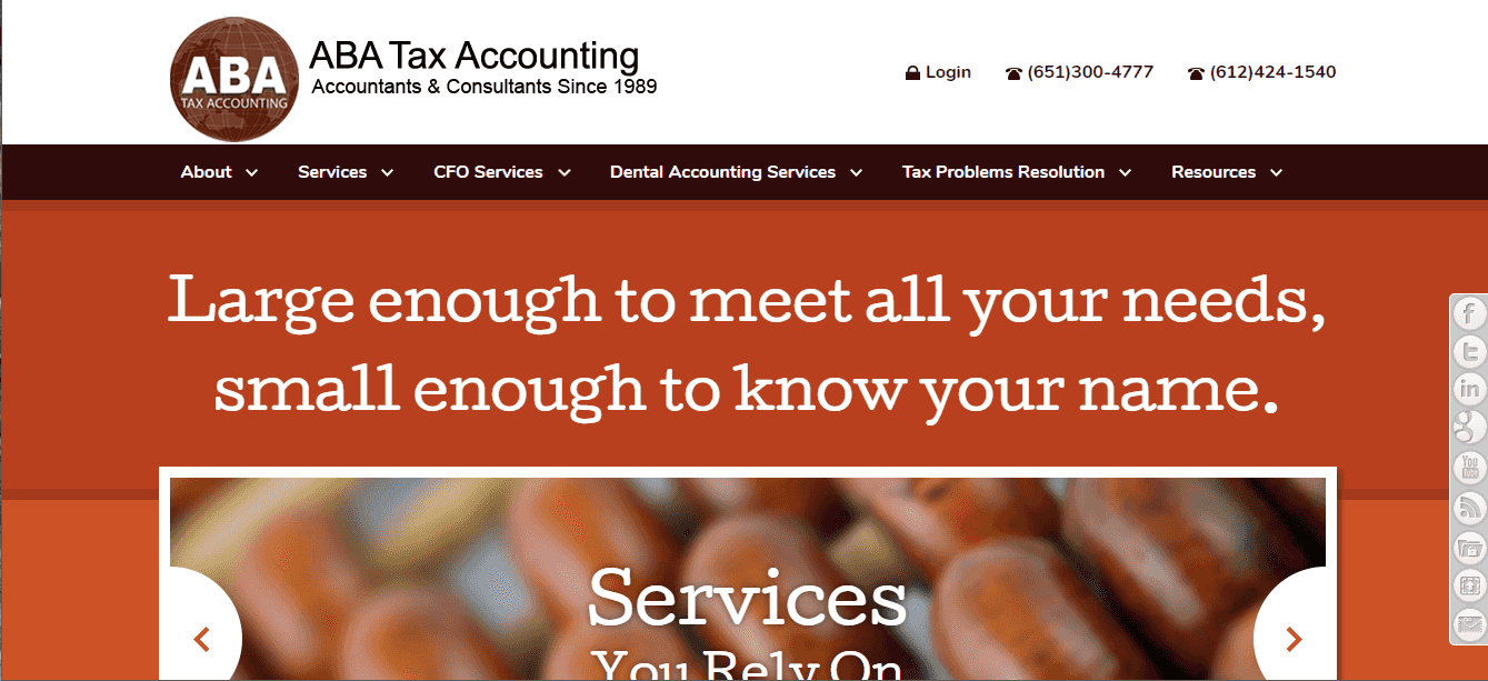

ABA Tax Accounting’s website is plainly styled, giving users the sense that the substance of the business is what matters. Trust badges displayed on the front page enhance the business’ reputation and build confidence in potential clients. A very comprehensive section offering solutions to tax problems is full of useful information for visitors.
9. Master
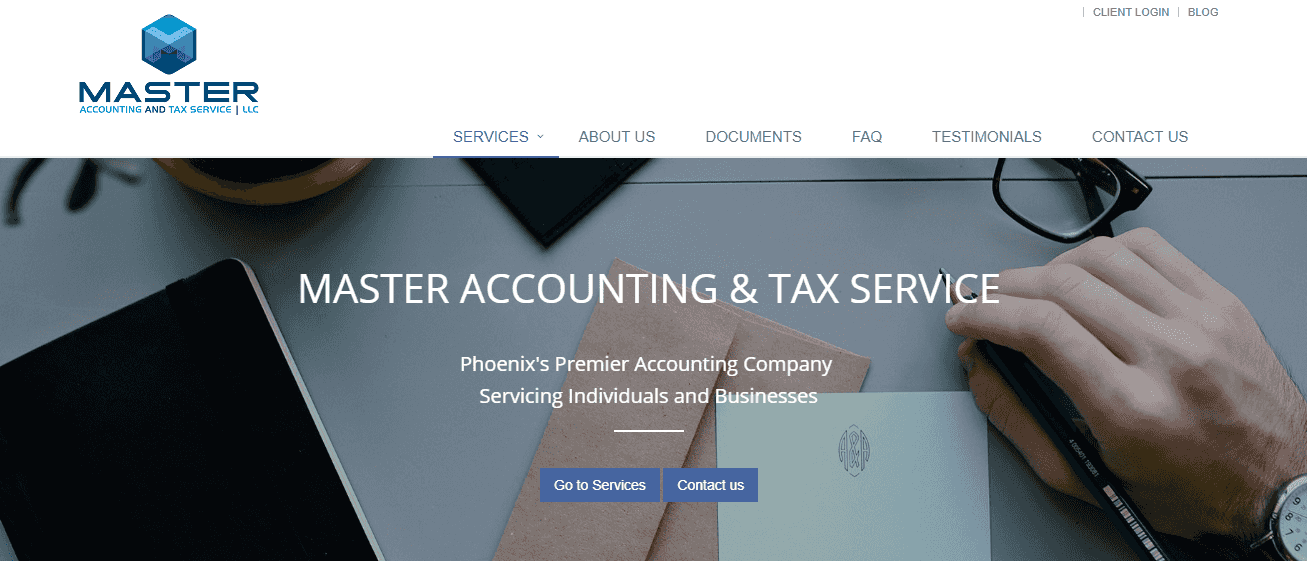

Master’s website is well put together. The branding and design are appealing, whilst key information such as contact details and the services on offer are clearly displayed. The website includes some good functionality to give clients what they need, such as a ‘Documents’ page which allows users to download useful tax forms. An interactive map assists potential customers to easily locate the business.
10. Lutz
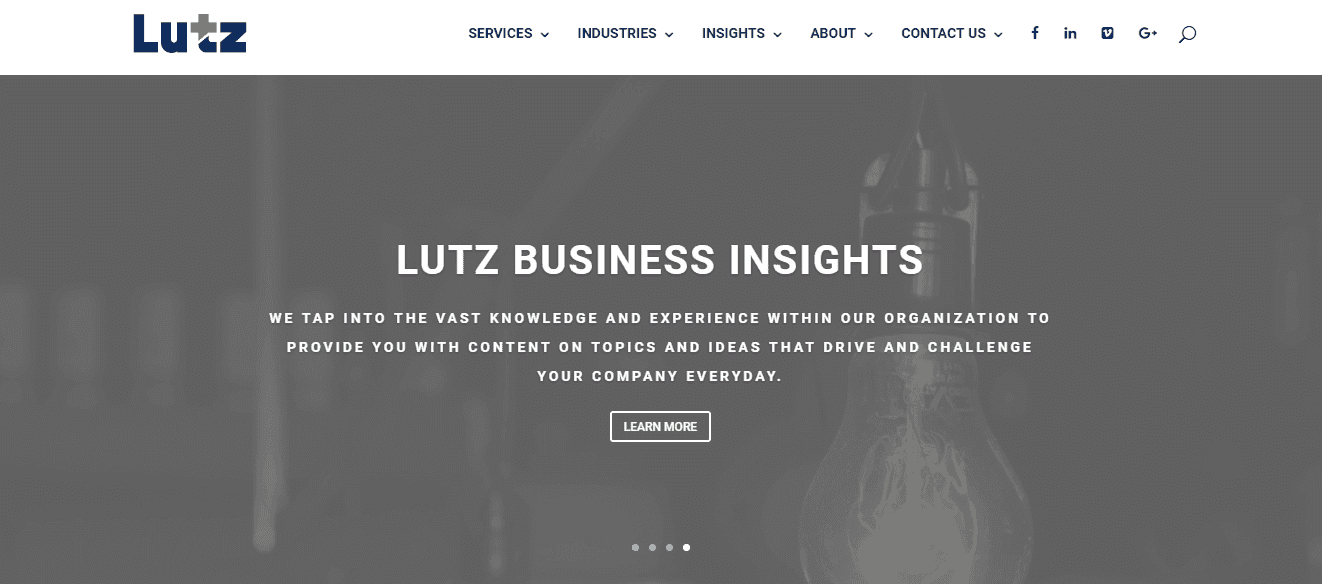

High-quality, engaging imagery adorn Lutz’s website, making it aesthetically pleasing while also adding to the business’ message. The home page makes a point of displaying the business’ core values in a sliding image window, establishing trust and genuine nature. The call to action buttons allows users to quickly share the website on social media, which, if acted on, provides the business with some free promotion.
11. BDO
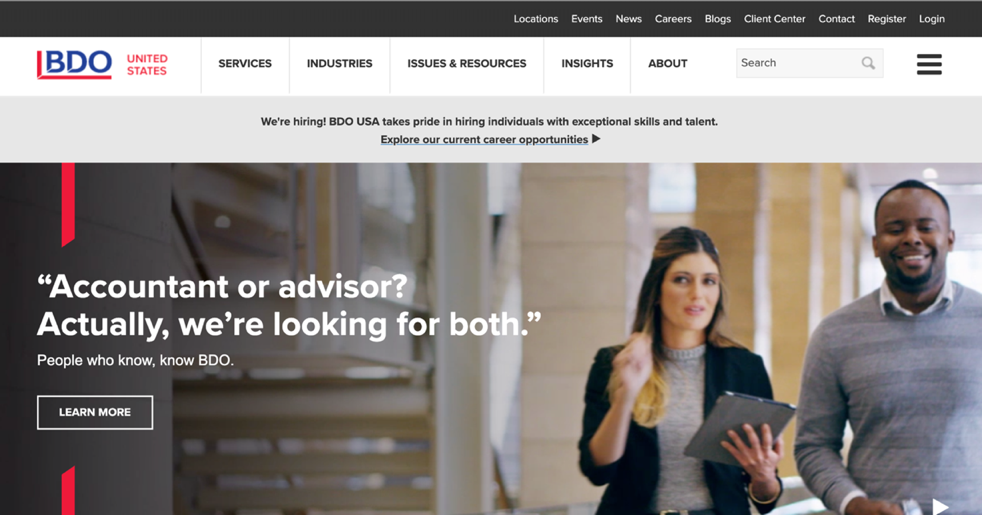
BDO’s website is equal parts informative and engaging. Elements of the site are nicely compartmentalised, with each section featuring moving images. The news and events feed on the landing page add value for the user, as does a contact function that follows the reader down the page.
12. Rolfe Benson

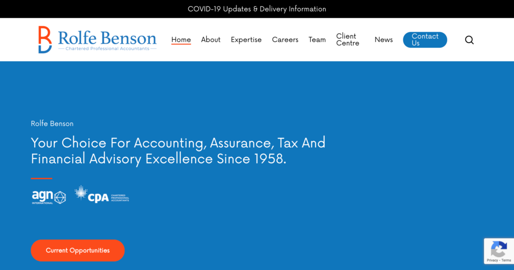
Rolfe Benson boasts a website that is sleek and professional. Premium images make the website aesthetically pleasing and add a personal touch to the staff biographies. Great functions include an excellent client centre, where clients can securely upload documents, download forms, pay an invoice or access announcements made by the firm, as well as the ability to directly email any team member by clicking their email address link.
13. Cahill
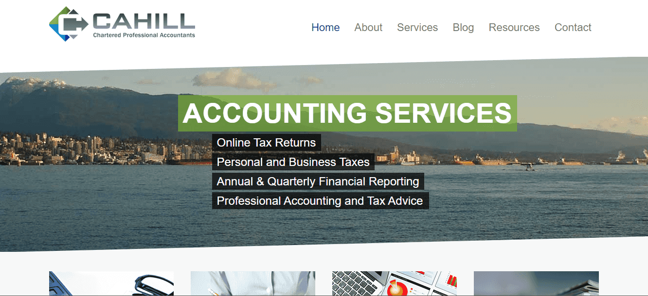

Cahill’s website skillfully combines beauty with simplicity. Excellent use of photographs of the local area makes the website beautiful and situates the business in its community by giving it a local feel. The services on offer are displayed alongside an accompanying image, and the user is invited to click a button if they require more information, which keeps the page clutter-free.
14. Maxwell Locke & Ritter
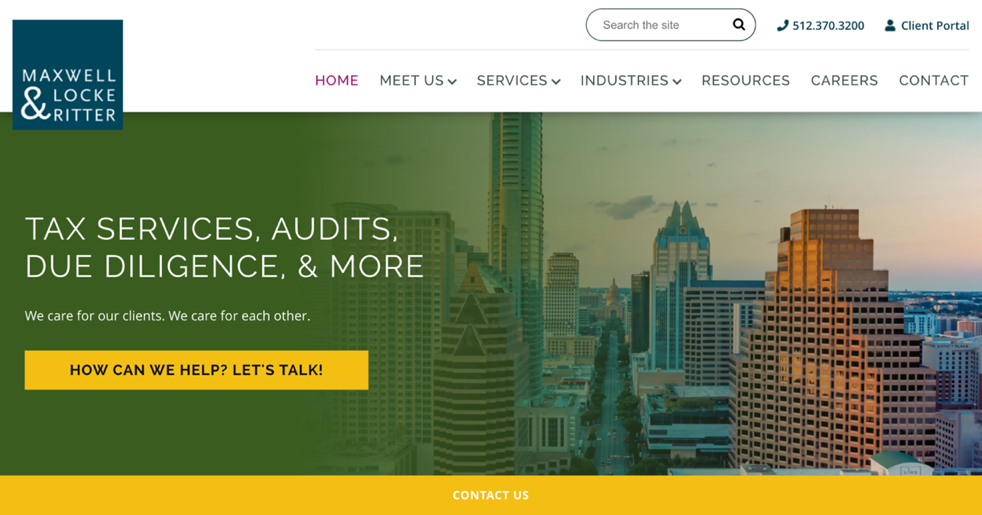
Maxwell Locke & Ritter’s website is brilliantly eclectic. A diverse colour scheme gives the page a spirited feel, as does the website’s use of graphic imagery that draws on the vibrancy of the local city. A navigation panel complete with graphics for each section makes it effortless to locate information on the website.
15. NHSCPA
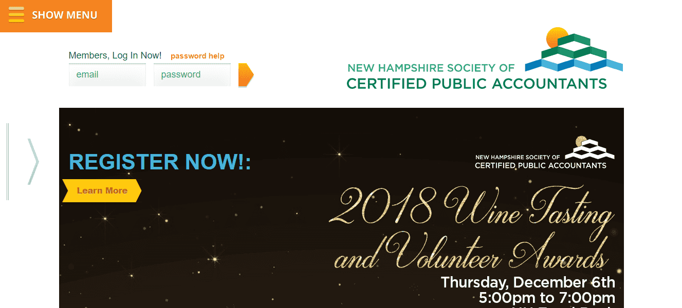

This accounting website has a strong focus on accessibility and user-friendliness. An upcoming events section is impossible to miss, with listings displayed brightly in separate compartments. A menu tab follows users down the page, so it is always accessible, and the boldly presented search function means users can quickly scour the website’s wealth of information.
16. GoRacke & Associates (Verdant)
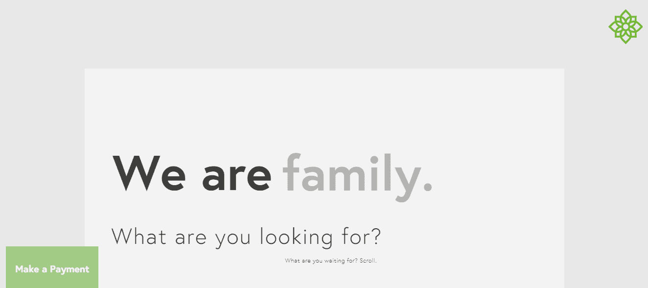

Now known simply as Verdant, GoRacke & Associates’ website is a triumph of stunning minimalist design. The landing page is beautifully basic, containing compartmentalised boxes (leading to separate web pages for each of the company’s services) that juxtapose matte colours with premium black and white photography, lending the page and business a sense of style and sophistication.
17. ACP Accounting
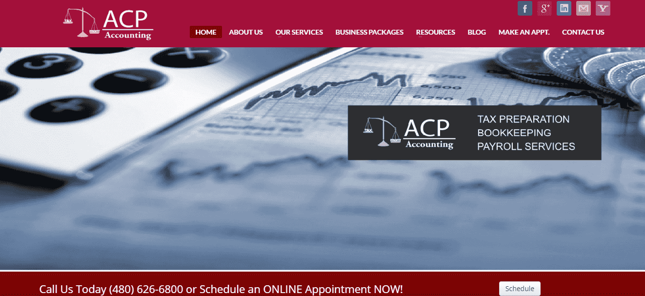

ACP Accounting’s website is fundamentally sound, employing a classic design with broad appeal. A navigation bar is clearly displayed at the top of the page, guiding users to the various pages. At the same time, “call to action” buttons provide for social media sharing and interaction and options for contacting the business or scheduling an appointment.
18. Solomon & Hardwick
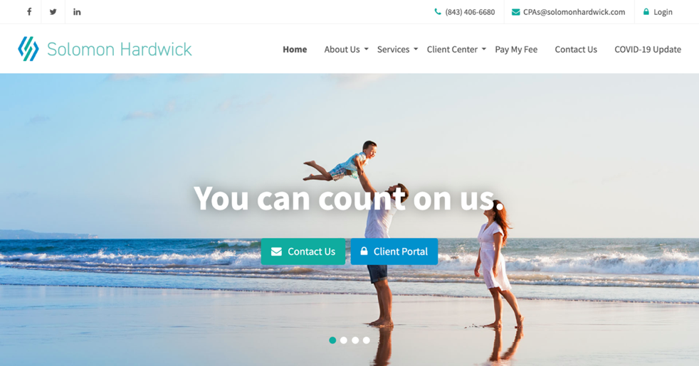
This accounting practice website employs an attractive colour scheme and is uncomplicated. The use of quality photography is clever, giving the business a family-oriented appeal. A resources section comes replete with a financial calculator, suggested books for further learning and links to various other useful websites. At the same time, a client portal provides users with the tools necessary to participate in managing their affairs.
19. Baldwin & Associates
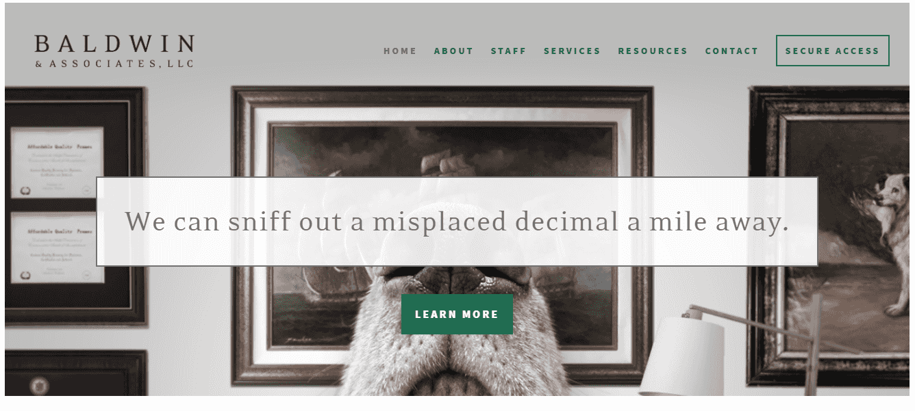

Baldwin & Associates’ website is outstanding. The use of clever imagery and subtle humour on the landing page creates a clever mood – a novel touch to offset the potentially dry subject matter – while discreetly asserting the competence of the staff. The website has a distinctly personal feel, assuring potential customers they are more than simply a number.
20. H&CO
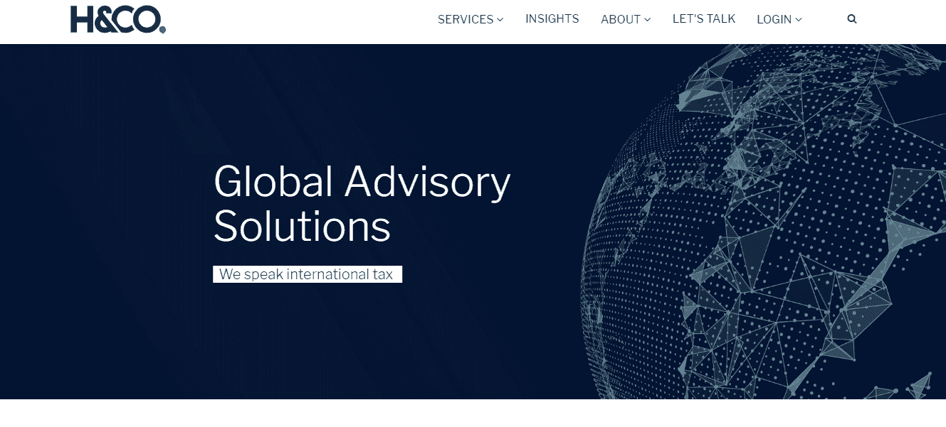

H&CO’s website exudes sophistication and professionalism, traits which the firm itself no doubt seeks to embody in its practice. The ‘By the Numbers’ section is an engaging and effective method for showcasing both the firm’s reach and popularity. Clearly displayed accolades also work to portray a preeminent reputation to potential clients.
21. The Leary Group
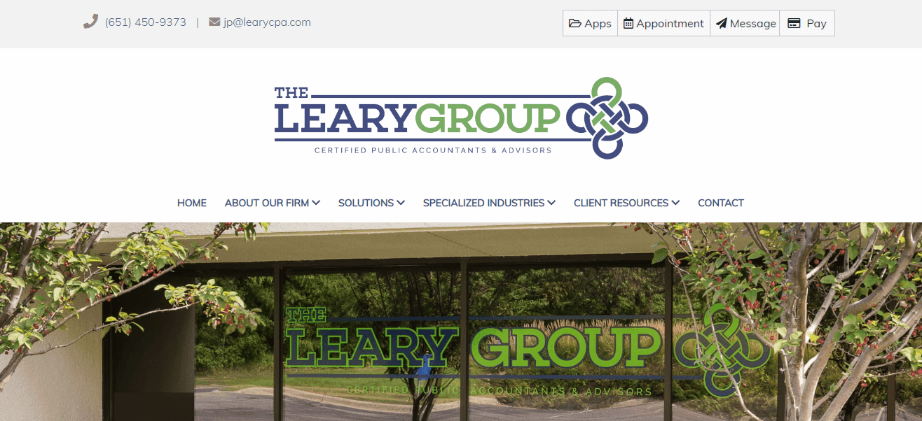

The Leary Group’s website beautifully pairs excellent design with superb functionality. A call to action tab shown on every page allows users to make an appointment, send a message to the firm, pay an invoice and access 8 separate financial management apps. Many other functions are also offered (including mobile versions of apps), making for a phenomenal user experience.
22. DMCL


The first thing that you notice on DMCL’s website is the outstanding use of imagery. Striking background photographs command the viewer’s attention, while images are responsive to the user’s cursor and give the website a high-tech feel and lend the business credibility. The strategic placement of the call to action buttons is also noteworthy, and the navigation menu is beautifully simple. The result? An effortless, elegant website.
23. Ted Dubasik
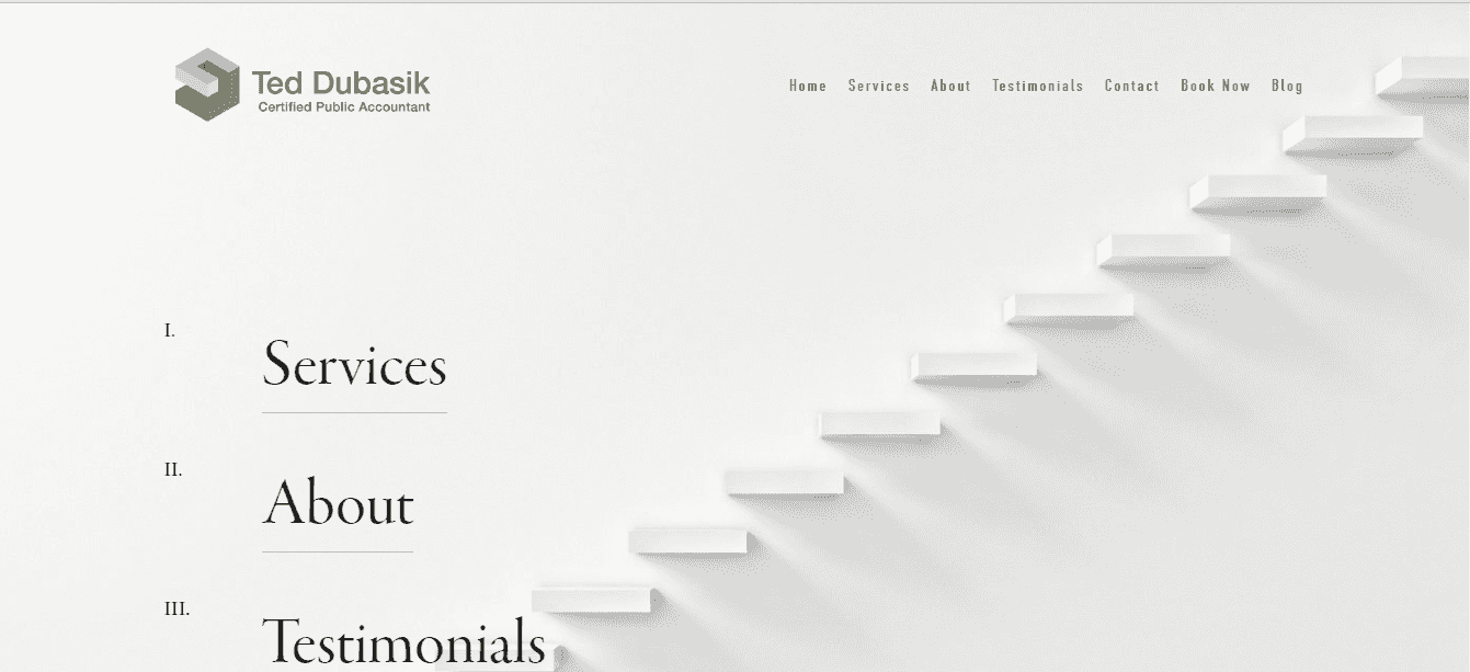

Ted Dubasik’s website is an exercise in minimalist beauty and delightful to use, to boot. The company branding is the lone coloured element on the page, ensuring it stands out. An artistic staircase graphic, which forms the background of the landing page, is visually pleasing and conveys a sense of ascending towards one’s goals – with the business’ help, of course.
24. Ignite Spot
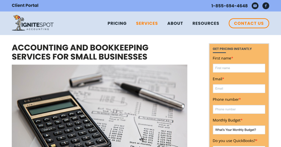
Ignite Spot’s website is neat and professional, with a clear focus on the fundamentals. An attractive photograph adorns the landing page, adding to its aesthetic appeal, while a navigation panel makes for simple manoeuvring around the website. The accesible form is a nice addition, offering visitors an easy way to get in contact.
25. Romolo & Associates
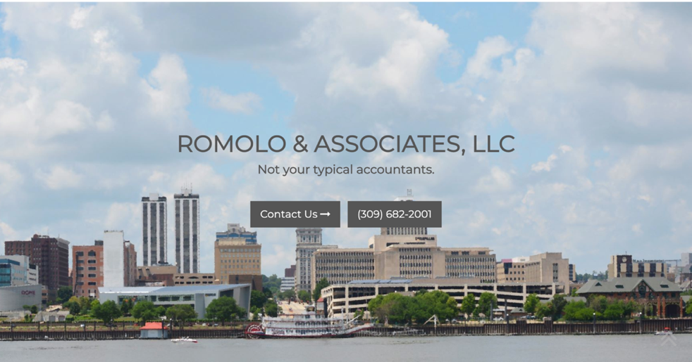
Romolo & Associates’ website is simply styled and approachable. A top-notch photo on the landing page uses humour to add a light-hearted feel to the website while simultaneously setting a familiar tone with potential clients. The ‘Guides’ page adds significant value to the page by offering excellent tips relating to life events in addition to investment, business and tax strategies.
26. Greenwood Ohlund & Co
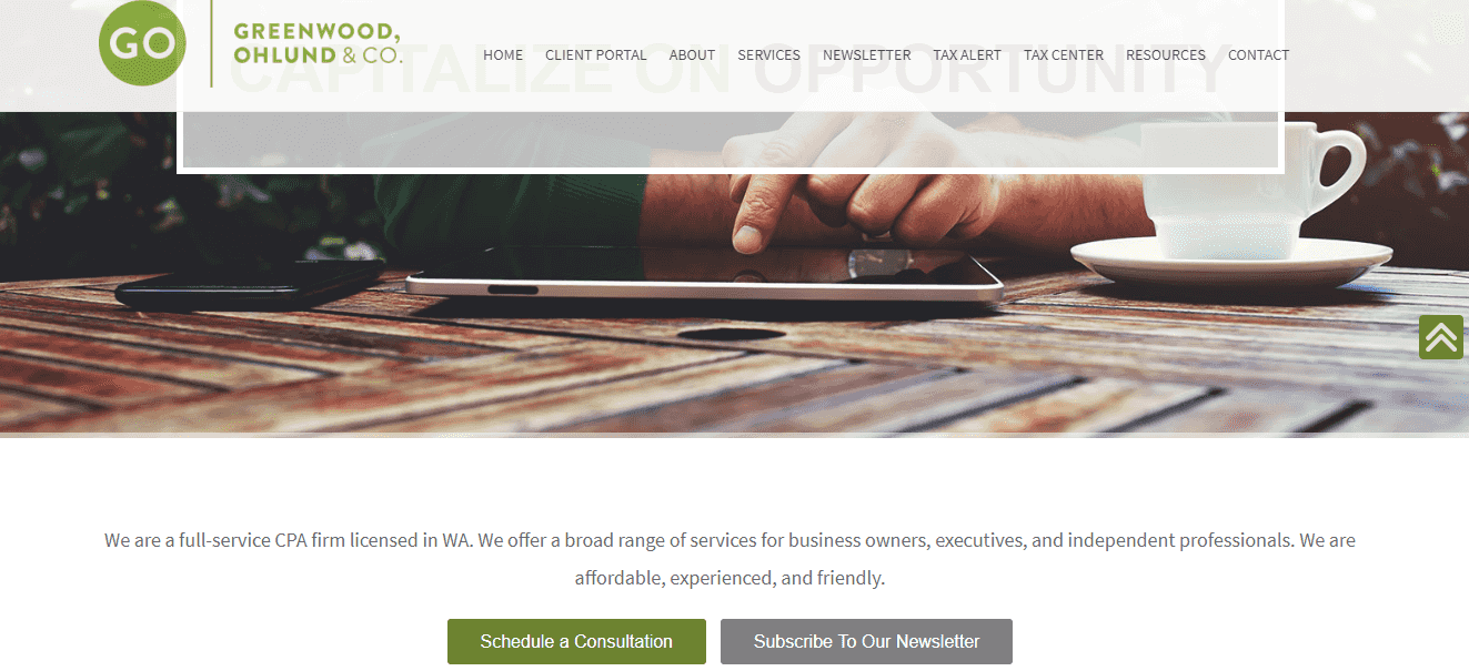

A premium background image and keywords dedicated to the business’ core values instantly set the tone on Greenwood Ohlund & Co’s website. The design is modern and eye-catching. A nifty navigation panel follows users as they scroll down the landing page, providing easy navigation and a seamless user experience. The newsletter page features great content on current issues in the accounting and business world.
27. Faulk & Winkler
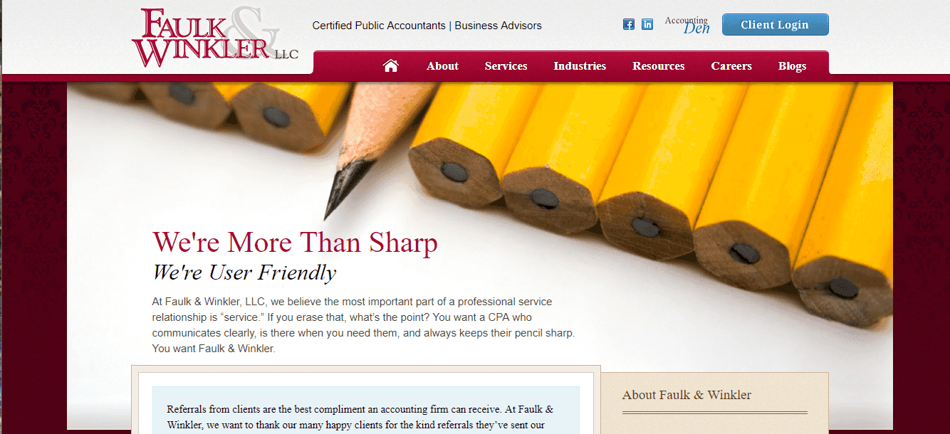

Faulk & Winkler’s website has a charming, classic character that suits its Louisiana location well. The landing page immediately advises the visitor that the business places a strong focus on being user-friendly, and the rest of the website follows suit. An ‘Industries’ page lets users quickly understand the business specialises, while the awards displayed on the homepage build trust with prospective clients.
28. Mann Gelon Glodney Gumerove Yee LLP
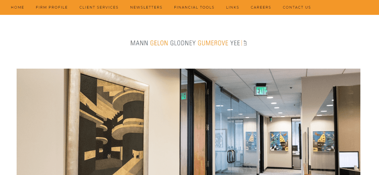

This accounting website is neatly styled while remaining simple. The written content is engaging and welcoming, while high-quality photographs add to the aesthetics and introduce the business’ staff. A ‘Financial Tools’ section is a great addition, offering the visitor several information sources for navigating different areas of their financial life.
29. Tilton & Co
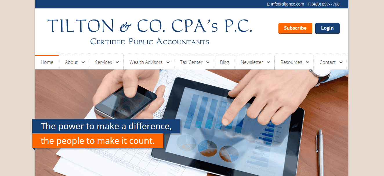

Tilton & Co’s website features a simple, appealing design focusing on usability. The navigation bar at the top of the page is complemented by additional buttons below, providing users with multiple navigation pathways. Finally, the ‘Services’ page is clearly written and outlines what is on offer.
30. Lurie
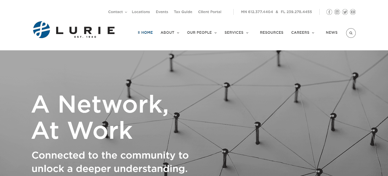

Lurie’s website has a polished design and a professional feel. The website makes excellent use of beautiful, high-resolution images, which make the website attractive and connect the business with real, everyday business owners, giving the business an authentic, caring quality.