For our UENI Plus and Reputation plan customers, there are a variety of themes available for your business so you can find the one that works best for you. For this article, we’re taking a look at the Classic Theme, which you can find in the Editor under Theme.
Give your site a professional look
Choosing the appropriate theme for your website is key to make it look professional and trustworthy. The Classic Theme features clean service organisation, professional image framing, as well as extensive space for your About Us section – making it perfect for businesses that want to focus their customers’ attention on written information.
For visually-oriented businesses where high-resolution images are the most important feature, check out our Natural and Modern themes.
This theme is for you if
- You want minimal pictures on your site so your text can stand out
- You want your website to be easy to understand for all of your clients
- You offer many different types of services.
Consider another theme if
- Your want to display pictures in a bigger format
- Your site functions as a portfolio of your work
- You really want to highlight your customers’ testimonials
Getting the most from: About Us
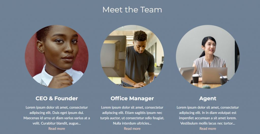
The rounded, smaller pictures on the About Us section in the Classic Theme are versatile and offer many possibilities. You can keep a biography of your business, of course, but you can also do things like:
Employee Headshots

Rearranging these content blocks to highlight your team with headshots. You can also add a bio or a description in the text below. This also works great for product showcases.
Exclusively Written Content
If you want your words to be the focus of your website, the Classic Theme is for you. It’s perfect if you have smaller images to complement your texts thanks to the on-page formatting, but it also performs well with no images at all.
This is great if you want to continually upload editorial articles, blog posts, or educational content. For the best presentation, keep your texts concise and proportionate to each other, as they’re laid out in sets of 3.
Getting the most from: The Gallery
The gallery style and the small square pictures on the services are ideal to display photos that are square or landscape (wider than they are tall) as well as well-centred pictures.
Remember, your pictures will look different in different screen sizes, so you will have to play around to see how they adapt to different screens and decide what works best for your business.
Getting The Most from: Cover Image
This theme works best with more subdued images in the Header section. Because the image will be behind your business name, title and subtitle, it can look a little messy if you plan to add a business card-style picture in the background, as it may not always be as easy to understand.
Getting the most from: Services, Price Lists & Testimonials
Services
The clean service group organisation makes it easy to navigate for your customers. Thanks to the menu on the left, every section is readily available and easy to find.
For the Classic Theme, brief and catchy service descriptions are the way to go. The full description will be displayed on the main page as well as in the service page, so if it’s too long it will take up a lot of space in your main page –and involves a lot of scrolling if you’re accessing it on a phone. Try to keep all the descriptions more or less the same size so they’ll look balanced on the page.
Price Lists
The price list looks stylish and well-separated on this theme. However, please note that your customers won’t be able to navigate easily if you have many different price lists – like a restaurant menu with many servings.
Therefore, we don’t recommend using the price list if you have many items in different categories – add these to your Services.
For businesses with extensive price lists, we recommend the Modern Theme.
Testimonials
While other themes rely on pictures for your customers’ testimonials, the Classic Theme will show their initials if a picture isn’t provided. This can be ideal if your customers may not have a photo of themselves ready to share with you.
Explore The Classic Theme
Even with everything we’ve shown you so far, the best way to get a feel for the Classic Theme is to explore some fully-finished pages in this style. That’s why we’ve put together a list of example websites built using the Classic Theme for you to explore. You can use these pages to get an idea of how you could format your business, and check out the colour options at the same time.
Animal Shelter
Not only does our example Animal Shelter feature an eye-catching promotion, as well as custom amenities, and cute animal photos, it’s also a great way to see how different a page can look on your computer, your tablet, and your phone. We definitely recommend looking at it on a couple of different devices if you can.
Jewellery Store
Also known as a Jewelry Store, for our North American clients, this example page features products displayed in the content blocks and the gallery whilst using a price list for the prices, as well as a great example of an effective cover image. It also gives you an idea of how a page using the Classic Theme appears without a map and no photos in testimonials.
Medical Centre
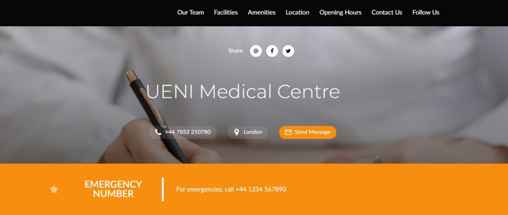
For another take on a customised About us Section, plus a customised Send A Message section and a great example of an industry-specific promotion, Check out our Medical Centre example. Another useful feature of this theme is that you can turn off the Services & Products section without taking away from the page, as you can see.
Estate Agent
Estate Agents, Realtors, or Real Estate Professionals. Whatever you call this business, this example page is a great example of how you can incorporate Gifs into your Cover Images (especially effective on cell phones or smaller devices) to really make the page pop, plus it does a great job of highlighting different types of homes for sale or rent.
Blogger
Bloggers, Writers, and other text-based businesses can often have a tough time crafting the perfect UENI page. Many of them don’t use many images, don’t offer price lists or services, and don’t necessarily want to feature their location or contact information.
Who Should Use The Classic Theme?
The Classic Theme is great for shops that offer only a few products or services, as it allows you to showcase the full range of items on the main page. It also works well for businesses that want to update the page frequently with new information. It’s also great for businesses that want to use the About Us section in a creative fashion.
Businesses that don’t need a lot of pictures.
No pictures? No problem! If your business is just starting out – or the work you do simply isn’t very visual – it’s possible that you don’t have many big and bold images to add to your website. Smaller pictures won’t be a problem with the Classic theme!
Businesses that want to keep it simple
The Classic theme showcases all your texts, services & products, as well as the items in your price list at first glance, saving your customers from having to navigate to different pages to read your texts or see the full list of what you offer.
Keep in mind that, if you’re navigating on a smaller screen – like a smartphone – the texts will be stacked, so too many can be overwhelming and stop your customers from scrolling far enough to get to your services.

