For our UENI Plus and Reputation plan customers, there are a variety of themes available for your business, and we’re here to help find the one that works best for you. Today, we’re taking a look at the Modern Theme, which you can find in the Editor under Theme.
The strength of this theme comes from it’s structured, clean design, and that’s boosted even further by high-quality images.
That’s why we believe it pairs well with businesses that have a sharp logo, a snappy business name and a great cover image. One pro tip: The Promotion field really stands out in Modern, so use the space to write something about your business, such as your mission or even a slogan if you’re not running a promotion at this time.
This theme is for you if:
- The strength of your business relies on visuals
- You have high-resolution images
- You want to keep the page easy to navigate with a lot of text
Consider another theme if:
- You don’t have high-resolution images
- It is important to explain your services with descriptions
- You prefer to display your entire Gallery at once
Getting the most from: About Us

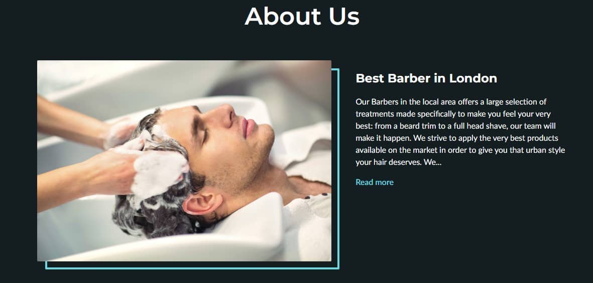
No matter the theme you choose, the About Us section can be customized to suit your purpose, without any limitations on the number of content blocks. What makes the Modern Theme stand out, though, is that only two content blocks will be displayed by default when the page is loaded. The rest will sit below a load more option:
This is ideal for two types of business – the ones that want a simple, clean “about us” section that doesn’t intrude on the gallery images below, and the businesses who want to offer a lot of things below the fold: really deep, detailed information that doesn’t feel overwhelming for visitors when people land on it for the first time.
It’s also important to keep in mind that the Modern Theme’s About Us/About Me sections work well with and without images:
Getting the most from: The Gallery
The gallery is one of the highlights of the Modern Theme, as it allows you to show your best work. In this section, you should aim for high-quality images, as smaller pictures run the risk of being pixelated. Your pictures will be shown one by one when customers swipe, so take some time to select the best ones to represent your business.
If it’s important for you to display your entire gallery at once, we recommend the Natural Theme, which lays out your work in a grid pattern, rather than a carousel.
Getting the most from: Services & Products
The way the Modern Theme delivers the Services & Products section of the website is nothing short of a blessing for businesses who want to rely on visuals to get their customers interested. This theme’s design offers an image-focused service layout option, perfect for those who don’t need or want extensive service descriptions. Additionally, it allows for a very visually appealing separation of services – perfect if you’re a business that might offer a few distinct types of work.
However, because this section is really built to show off photos for your services and products, any services or products that you offer that don’t have images attached are going to look a little out of place.
Getting the most from: Contact Us
No matter which theme you use, it’s important to display your current contact information and address, so the customers can communicate with you and even visit your business. Once they click on the map they are redirected to Google Maps where we always synchronize your information of location and opening times.
On the Modern theme, the Contact Us section is well proportioned, easy to read, and sits next to (on desktop) or above (on mobile) a map that can easily give your clients directions to your storefront if you need it.
Explore the Modern Theme
We’ve just scratched the surface of what makes the Modern Theme such a great tool for visually-focused businesses. That’s why we’ve put together this list of example pages showing off our Modern Theme to get a better idea of how it could be used to improve your business. Plus, they show off a few of the different colour palettes you can choose from.
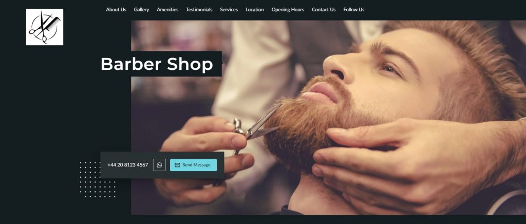
Barbershop
By now you’re familiar with our Barbershop example, but take some time to explore the page and see if you can get some ideas about how you can take your Cover Image, Logo, and Services to the next level.
Photographer
Our Photographer example highlights the flexibility of the Promotions Tag in the Modern Theme, which has taken the place of the About Us section to make way for the centrepiece of the site: the Portfolio.
Tattoo Shop
This Tattoo Shop shows off highlighted amenities, both from our stock list and custom, while also featuring a gorgeous Gallery and eye-catching Services and Opening Hours.
Who should use the Modern Theme?
We recommend the Modern Theme for businesses that are visually oriented, such as hairdressers and barber shops, photographers, tattoo artists, hotels, as well as businesses that deal with vehicle customisation, and advertising agencies. Of course, that’s only the top of the list: if you think your business works would work well with the Modern Theme, you’re probably right!

