It used to be that when you needed childcare, you’d turn to the Yellow Pages and find a centre that looked or sounded like it would give you the sort of service you needed. For many small businesses, these directories, along with word of mouth recommendations, were a lifeline.
Now, instead of the Yellow Pages, we have the Internet. Whenever someone wants to find local childcare, they turn to their friends and turn to their smartphones or computers. That means that if you’re an early learning and childcare centre that wants a piece of the nearly 40,000 searches Google processes every second, you’ve got to be online. And, beyond that, you’ve got to be online with a good website. But what does that really mean?
70-80% of people research a business online before they visit it. When customers today do this kind of exploratory research, they’re looking for a business that looks credible and well-liked.
They’ll want to see photos and positive reviews, as well as the standard details about your centre, including your hours, your contact information, and what kind of childcare and early learning services you have on offer.
They may even want to be able to interact with you directly to ask questions – so it’s smart to make yourself accessible in the right places.
As a rule, your childcare centre’s website should always feature three things: excellent usability, appealing aesthetics and informative content.
In practice, this means that you’ll want to pay particular attention to the quality of the photography or other images used, the design of the page – as well as how it looks on mobile, which is how more and more people are searching for small businesses today – and clear, concise description of the services, location, and hours.
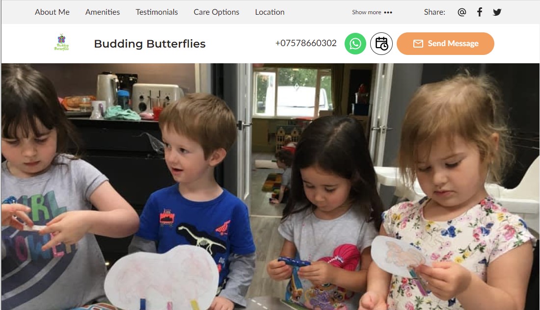
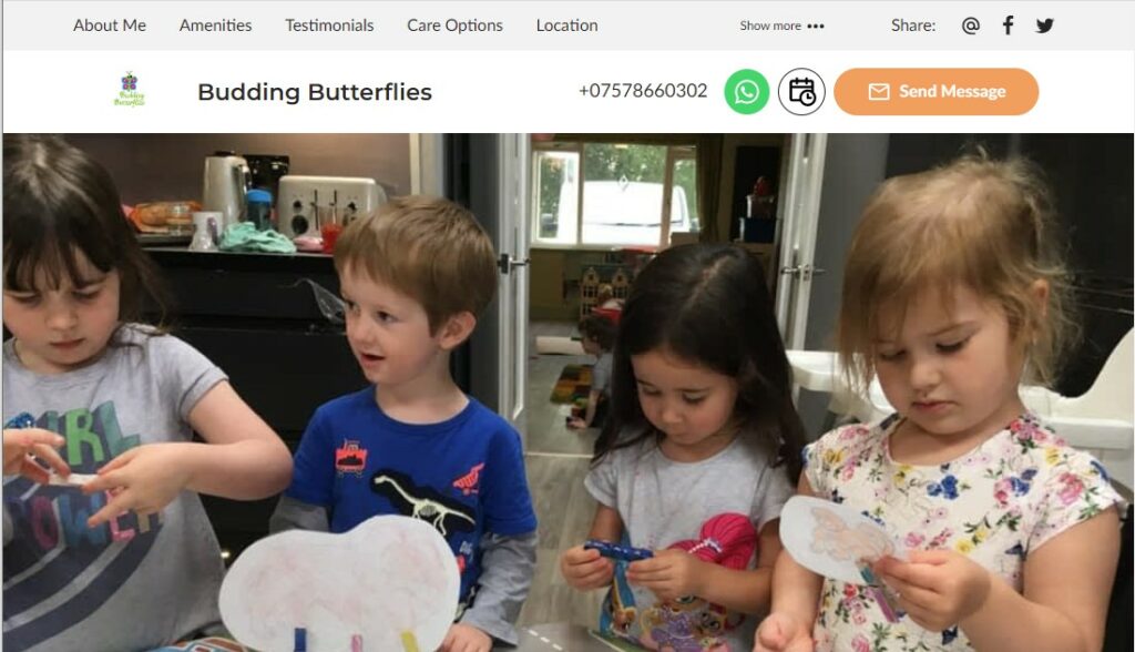
Take a look at this web page to see how our website model works for a childcare centre:
Budding Butterflies – a ready-made solution for a childcare centre from UENI

- Images: Custom, user-uploaded images that capture the visitor’s attention and provide visual context for the services on offer.
- Content: bespoke and engaging written content that welcomes visitors to the page, lays out the centre’s story and mission, and clearly and concisely informs the reader of what he or she needs to know about the business.
- Services: A services section makes visitors aware of the services offered and includes online booking functionality, allowing the user to book either regular or ad hoc childcare on the page.
- Map: An interactive map allows visitors to quickly and effortlessly pinpoint the business’s exact location.
- Opening hours: The business’ opening hours are clearly displayed for users in a readily digestible format.
Every one of our early learning and childcare websites has been built around these guiding principles – usability, aesthetics and great content.
This makes the website user-friendly and improves the overall user experience, allowing prospective customers to quickly and easily find the childcare centre and see what kind of childcare they offer.

