For this article, we are looking at the Store layout. Choosing the appropriate layout for your website is key to making it look professional. The Store layout will make your website a true e-commerce portal, with products and services on different pages for easy access.
The Store layout consists of the following pages:
- Home
- About
- Products
- Services
- Price List
- Contacts
- Spaces
Each top-level page is fully customisable, and additional pages can be added depending on your needs.
Who should use the Store Layout?
The Store Layout is great for shops that offer both products and services, with a focus on e-commerce. This layout lets you showcase various items and services on different pages.
It also works well for businesses that want to showcase different products and content on their websites. There is the About page that is great for businesses to introduce themselves. For the best presentation, try to keep your texts concise!
Magic Hand
Take a look at one of our example pages – Magic Hand
This website made use of the Store layout perfectly.
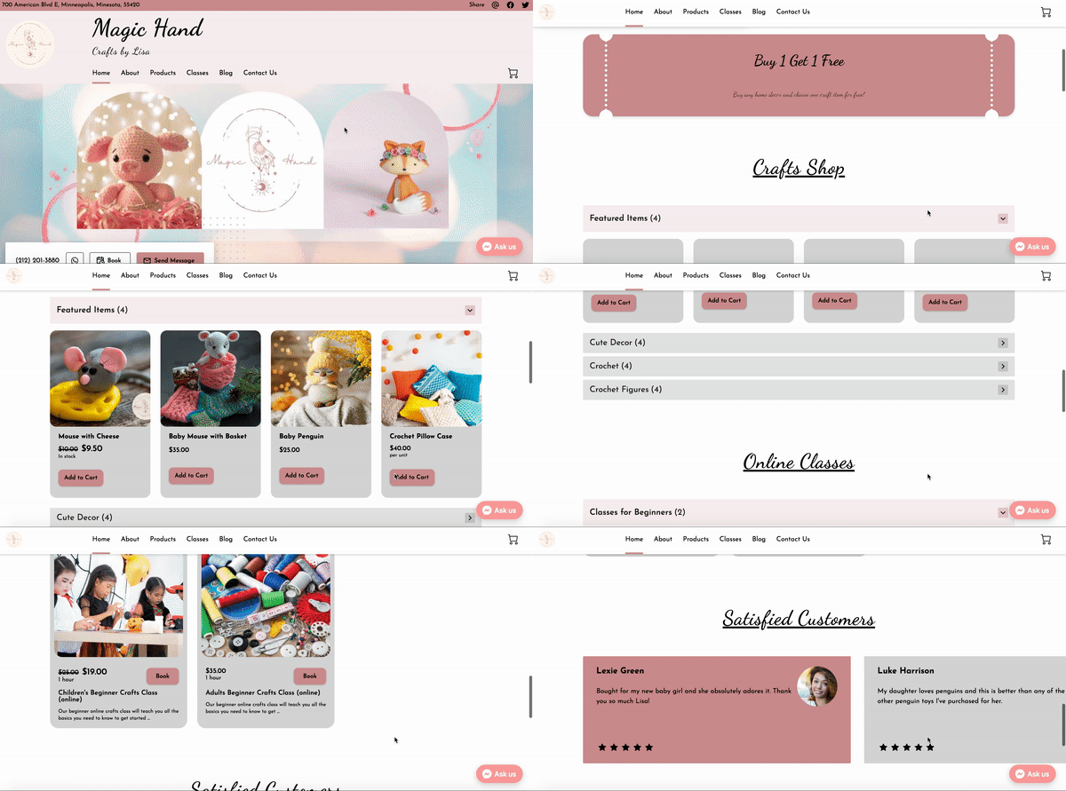
- The Home page is a collection of the main sections that showcase the business’ featured items, classes, customers reviews and contacts information.
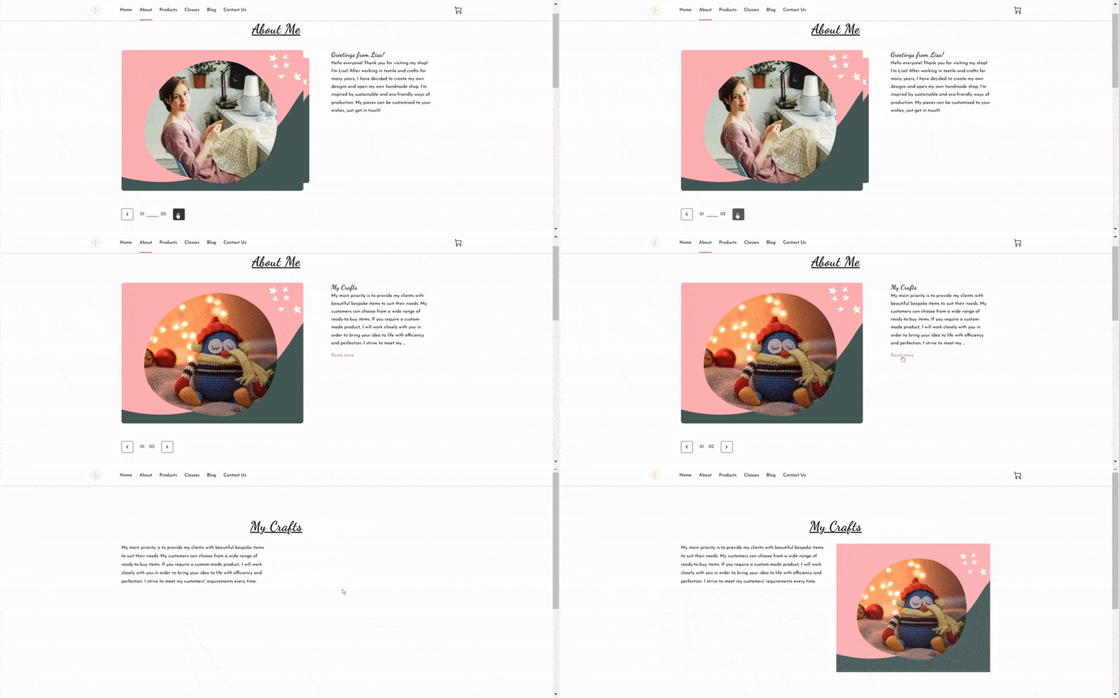
- The About page highlights the story and origin of the business.
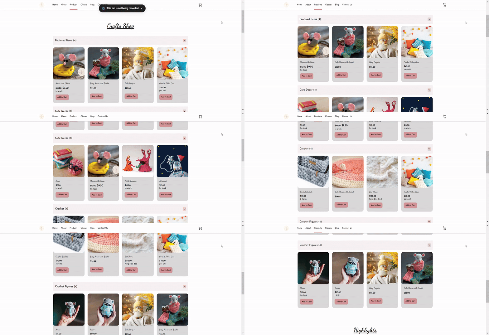
- The Products page focuses on selling their products.
- The Services page has been renamed to “Classes”, as the business offers and teaches bespoke craft classes.
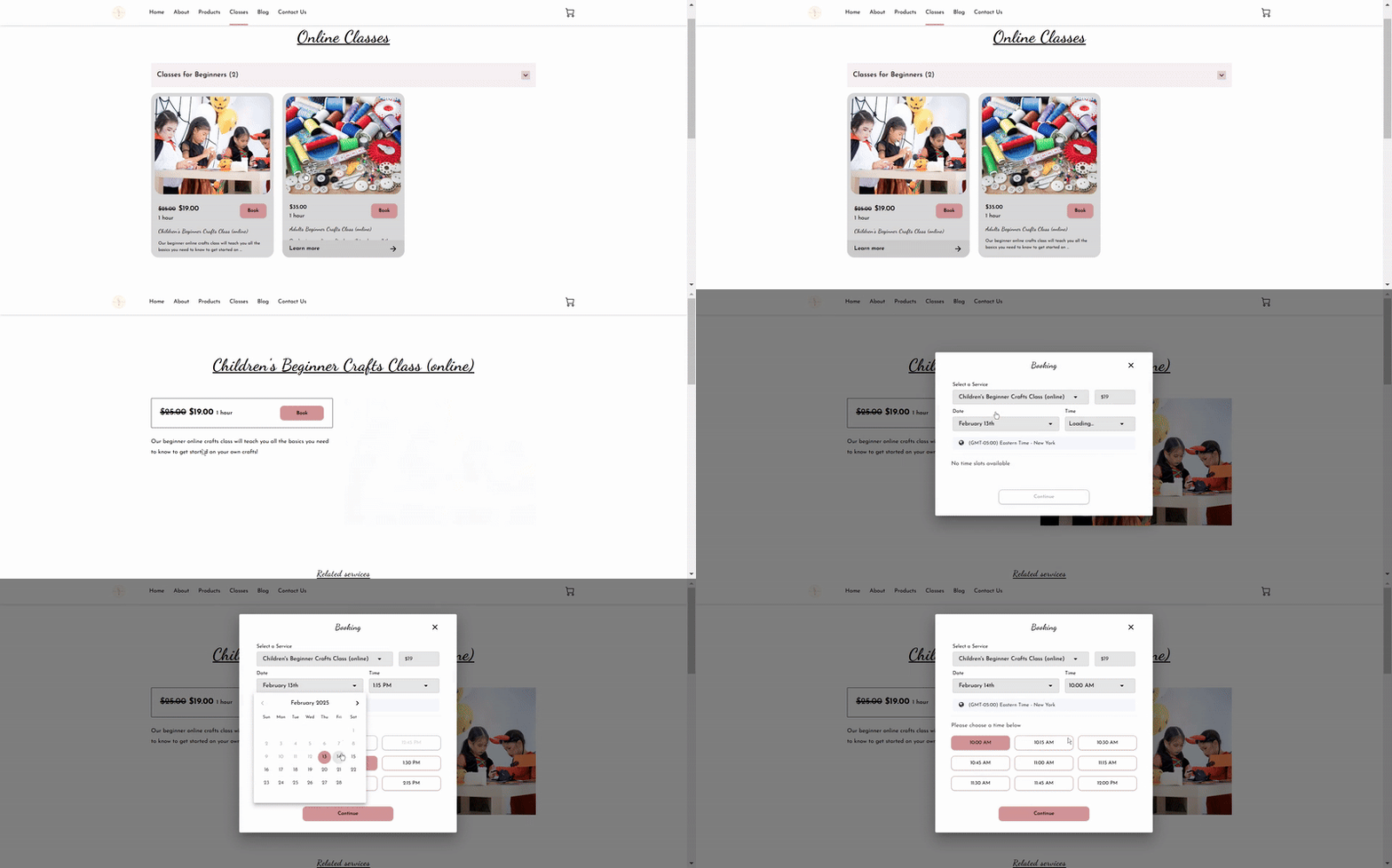
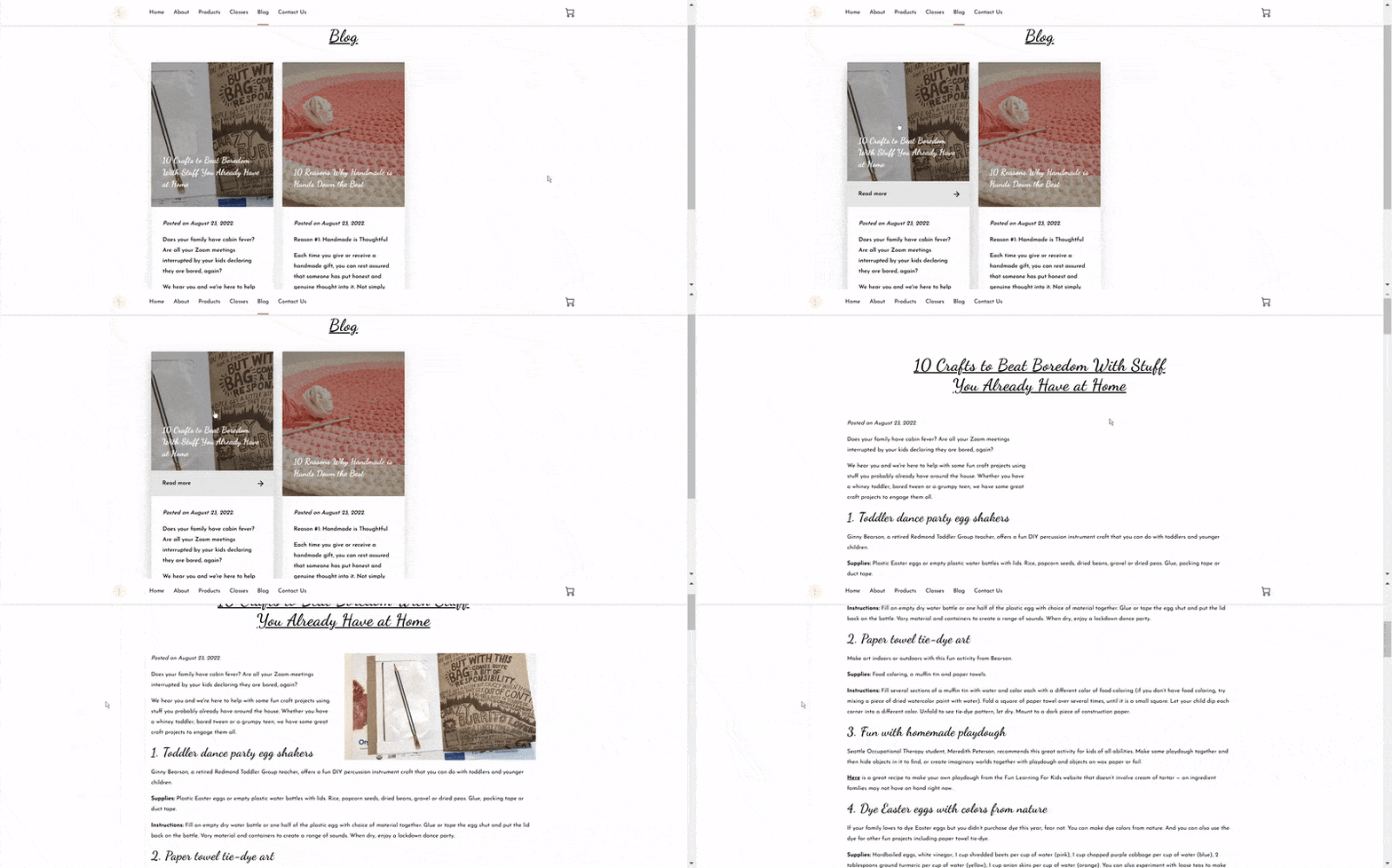
- The Blog page is a perfect space to create articles for those who are interested about topics that are relevant to the business, in this case, the business uses this to share tips about crafting and handmade products.
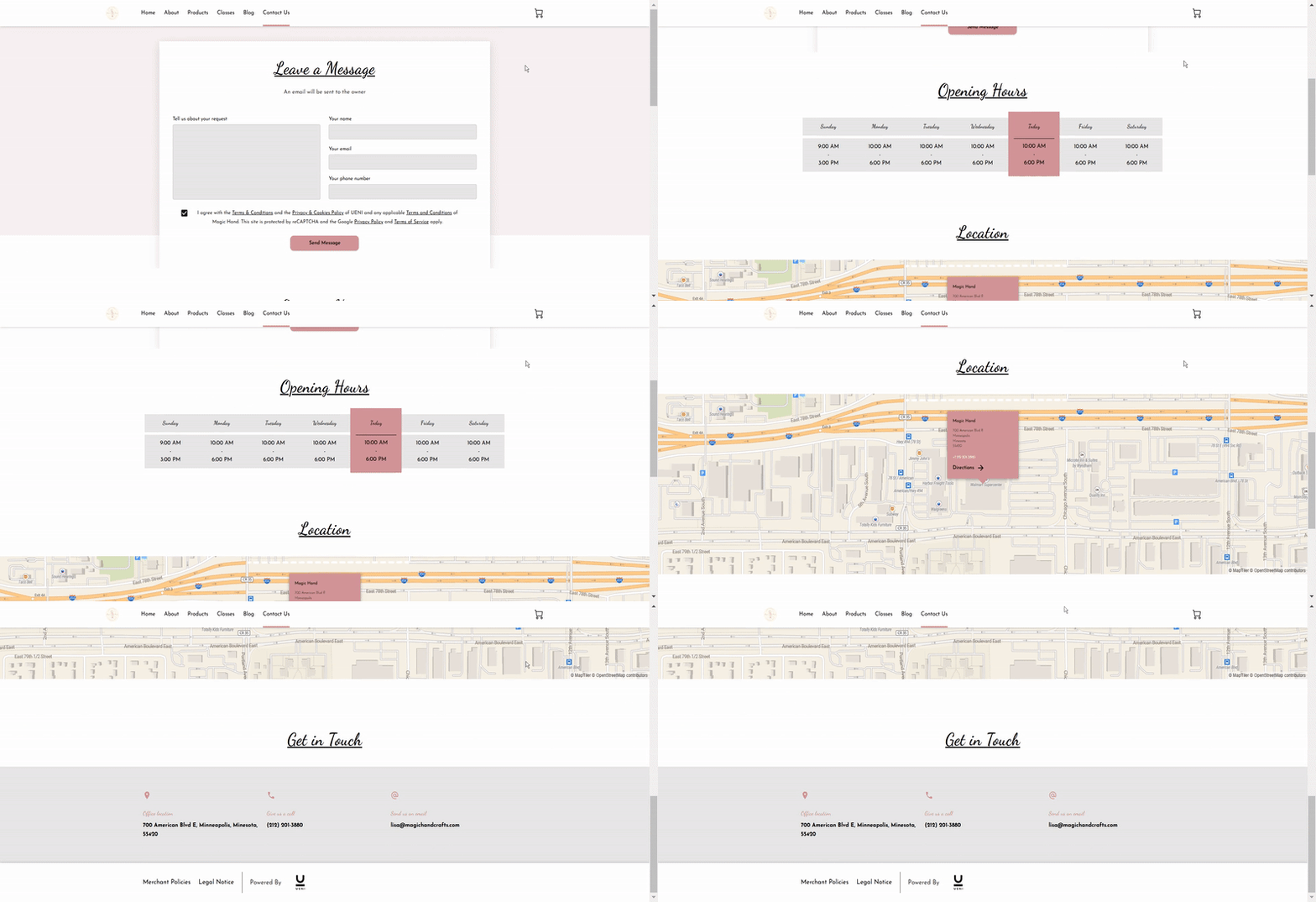
- Finally, the Contacts page lets visitors send any enquiries to the business.
For more information about how to create a professional website for your store, check out our video below:

