No matter how good or bad it is, your business logo alone is unlikely to determine failure or success for your local service. But it never hurts to have a strong, eye-catching visual signature – especially if you’re hoping to stand out from your competitors.
Your logo is more than a little icon on your business cards. It’s a unique method of identification for consumers to recognise you immediately. To give you a real life equivalent: when you pick up the phone and your friend says ‘Hey buddy, it’s me’, you don’t need further explanation; you know automatically who the ‘me’ is.
That’s the reaction the best logos illicit. Immediate recognition. You want your customers to know who you are the second they see your business logo.
The impact of digital
Digital culture reinforces the need for businesses to have an appealing logo because having a strong visual identity means customers are more likely to recognize your business and visit your website.
Customers interact with brands daily on their smartphones or computers, making having a strong identity a priority for companies of all sizes; customers now expect a visual identity from all businesses they have relationships with, from their local coffee shop to their repair shoes guy.
That’s why your business logo must speak a thousand words. It needs to be easy to spot through specific imagery, typography or color. Also, we can’t stress the importance of a thoughtful design enough. We all know examples of logos gone terribly wrong and the reactions they sparked on social media.
Perhaps, you remember the Trump-Pence logo controversy during the 2016 US presidential campaign? Or the Swipe right for Hillary logo? Disasters, the both of them.
The takeaway: No matter whether you’re a business, a politic or a media company, no one is immune to a bad business logo design. So if you don’t want to wound up on Buzzfeed’s Worst Logo Fails Ever, we suggest you give some thoughts before you go for a design.
Aim for a clean and minimal design
So what makes for a good logo design and how do you make sure it sets your business for success? If there is no magic formula, you can still find resources to give you an idea of what catches customer’s attention.
Smartsign recently published an analysis of roughly 2,000 companies’ logos where they identified the common characteristics of successful businesses. Results reveal interesting insight of what can work for your small businesses.
For instance successful companies tend to use both icon and wordmark, rather than wordmark or icon only as it helps for brand association and clarity. Also, angular shapes, like square, triangle and rectangle are preferred over soft, rounded shapes, as they represent stability, balance and efficiency.
Finally, a good business logo can be scaled easily while an intricated design makes it your customers to read.
The psychology of color
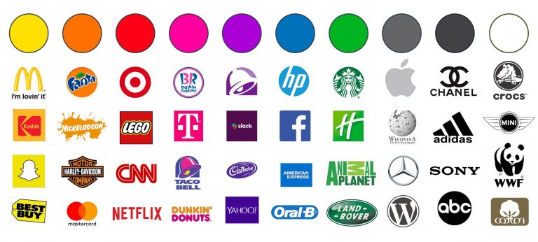
■ MailChimp and Caterpillar are two examples of companies that use yellow as their primary color. Yellow is cheerful and fun.
■ Powerful corporations like Tesla and a slew of healthcare organizations have adopted the red color as a symbol of love, hatred, and even sex.
■ Some progressive firms like Lyft, which are geared toward women, have utilized the color pink.
■ Orange signals danger and is a motivating color, brands like Home Depot and Harley-Davidson use orange logos as part of their branding.
■ The color black may convey a variety of moods, including melancholy, rebelliousness, or elegance.
■ Many ecological and agricultural brands utilize the color green to connote nature, but it may also signify money.
■ Because blue is seen as a conservative and reliable color, most water manufacturers utilize it to emphasize their products’ purity.
■ Purple has historically been associated with monarchy and fantasy, but is now being adopted by a slew of cutting-edge IT firms as well.
Use case: blue business logo
Like most successful companies, your logo should use no more than one or two colors. Blue is reputably color for businesses from all sectors, but if you want your business logo to stand out from the crowd, you need to think outside the box and adopt a more ownable palette. While blue is often associated with stability and growth, it’s also widely overused (Think about Facebook, Skype, Twitter, and Dropbox).
Instead, other companies have opted for a more innovative approach. Take Snapchat for example. It’s actually their founder who scribbled the ghost logo on a scrap of paper, and decided to go for yellow after he realised very few companies were using this colour on the Appstore.
As you can see, there’s a lot of potential for creativity when it comes to choosing a business palette. Consider what feelings you’d want to evoke.

Take the context into consideration
You should take into consideration different elements: first, who is your typical customer? Will your business logo be understandable by all of your customers?
Uber for instance has gone through a lot of rebranding and tried out different treatments of the letter U. In 2016, it adopted a small rectangle within a circle, and a line that connects the two. The company hoped the minimal logo would help them connect with global markets where the U letter had no signification (however, in 2018, two days after hiring their first chief marketing officer, they came up with a new brand, and that is still the current logo of the company). Even though your business might not be ready to conquer global markets, make sure your logo resonates with your audience.
Lastly, consider where your business logo will appear.
A few years ago, a barber shop or a plumber service needed a logo for their business cards or storefront. Now, small businesses need a logo for their website, to maintain a presence on Facebook, Instagram, Pinterest, or for their lines of branded products.
Does the color or the design you choose work in all these situations? Will a long or vertical logo work when crunched down to a three eights inch square? These are questions you need to think through before.
Did you know?
When you sign up to UENI, you will get in your bundle (along with your website and Google business profile), a free logo builder. You will be able to create a professional logo in just a couple of minutes.
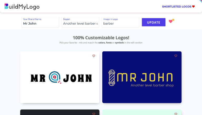
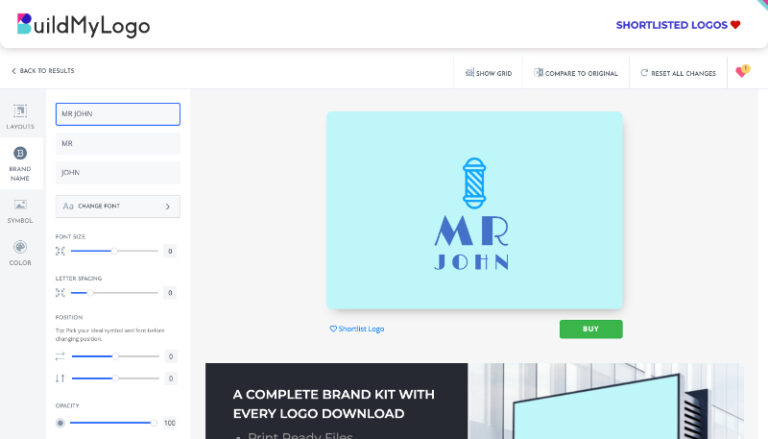
This is how it works.
1. Choose brand name, slogan, and type of image in logo.
2. Once you choose your logo, you can adjust the font, the color, or the symbol. It’s as easy as it gets!
3. Download it and start using it everywhere. You will instantly improve your business’s appearance and boost its professionalism.
Are you a UENI user and still didn’t claim your customized logo? What are you waiting for? Sign into your HUB and get it done today!


