


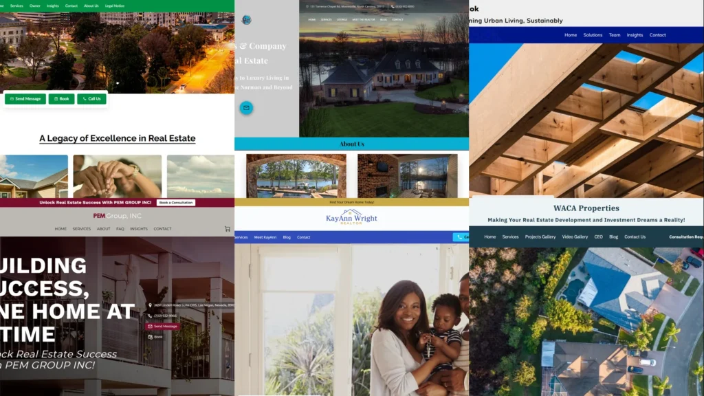
A real estate website carries an unusual amount of weight per page view. A buyer comparing three or four agents in the same school district, or a landlord deciding which property manager to trust with twelve units, usually makes the shortlist call on the homepage in under thirty seconds. To show what works, this guide collects 30 real estate website examples from real UENI customer firms across the US, covering realtors, brokerages, property managers, leasing operators, and niche specialists in luxury and sustainable development. Every link goes to a live, currently-trading business.
Key takeaways
- Strong real estate website examples lead with a real photograph the visitor can place. A specific twilight skyline, a known lake, a recognisable suburb, or the agent’s own portrait beats any stock house-and-keys image.
- The non-negotiable functionality on a real estate site in 2026: a visible “Book a Showing” or “Schedule a Call” button above the fold, click-to-call on mobile, named services (buy / sell / lease / property management), an MLS or current-listings link if applicable, and a review or testimonial widget close to the hero.
- Each sub-vertical has its own visual register. Luxury realtors lean dusk-skyline and gold-serif; property managers lean warm-interior and PM-service-nav; leasing communities lean architectural-twilight; personal-brand realtors lean confident-portrait.
- Niche specialism beats generic positioning. Senior-living realty, sustainable development, lakeside luxury, and HOA-only property management all out-convert the catch-all “we do all real estate” framing on the SERP.
- Most real estate prospects find firms via Google search or a Google Business Profile. Optimising both, with a specific primary category (Estate Agent, Property Management, Leasing Agent), usually moves more leads than either does alone. Our Google Business Profile guide covers the profile side.
What makes a good real estate website?
Before the 30 examples, it helps to set the bar. A real estate website’s job is narrow: turn an active buyer, seller, tenant, or landlord into a booked showing or a signed listing agreement before they click on the next agent in the results. Two things matter most, the design and the functionality.
The design
Design is the credibility filter. Visitors arriving from a “realtor near me” or “property manager Atlanta” search are not browsing; they are comparing. The strongest real estate website examples share three traits. The hero image is grounded and specific, an actual twilight neighbourhood, a real lakeside listing, the agent’s own portrait, or a recognisable city skyline, never the generic stock house-and-keys photograph. The colour palette signals the firm’s positioning, restrained navy and gold for traditional brokerage work, warm earth tones and timber for sustainable or boutique developers, deep green and refined serif for Southern luxury, and confident personal palettes for solo agents. Typography mixes a credible wordmark (a crest, a monogram, an architectural serif) with a clean humanist body face so the page reads as both established and current.
The functionality
Functionality is what turns the credibility signal into a booked showing. Real estate sites that perform usually nail four things. A prominent “Book a Showing”, “Schedule a Call”, or “Get a Free Home Valuation” button sits above the fold on desktop and as a sticky element on mobile. Phone numbers are tap-to-call on phones. The services offered are named in plain language (buy, sell, lease, property management, investment partnerships, HOA management) rather than buried under a single “Services” link. And a current-listings or MLS link, plus a Google Reviews or testimonials widget, are visible without scrolling for firms that have either. The most common failure pattern on real estate sites is a beautiful homepage that hides the showing booking three clicks deep.
30 best real estate website examples (2026)
Each example below is a real UENI customer firm’s live site, captured in May 2026. They span luxury realtors, regional brokerages, property managers, developers, leasing communities, and personal-brand agents, on purpose. A good real estate website example for a Lake Norman luxury realtor looks nothing like one for a Houston HOA property manager, and the variety is the point.
1. Southern Luxury Lifestyle
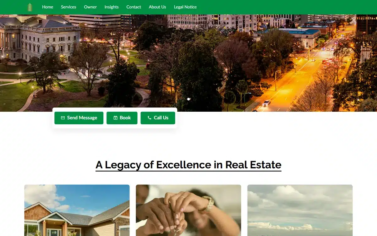

Southern Luxury Lifestyle in Greenville, South Carolina opens with a twilight Southern capitol skyline panorama and a refined green palette under “Legacy of Excellence” framing. For luxury realtors selling on history and prestige, the architectural-twilight hero is the single highest-ROI design choice available.
Borrow this: luxury realty homepages should hero a recognisable local landmark at twilight rather than a single listing. The landmark signals “we own this market”; a single listing signals “we have one good house this week”.
2. Rawlins & Company Real Estate
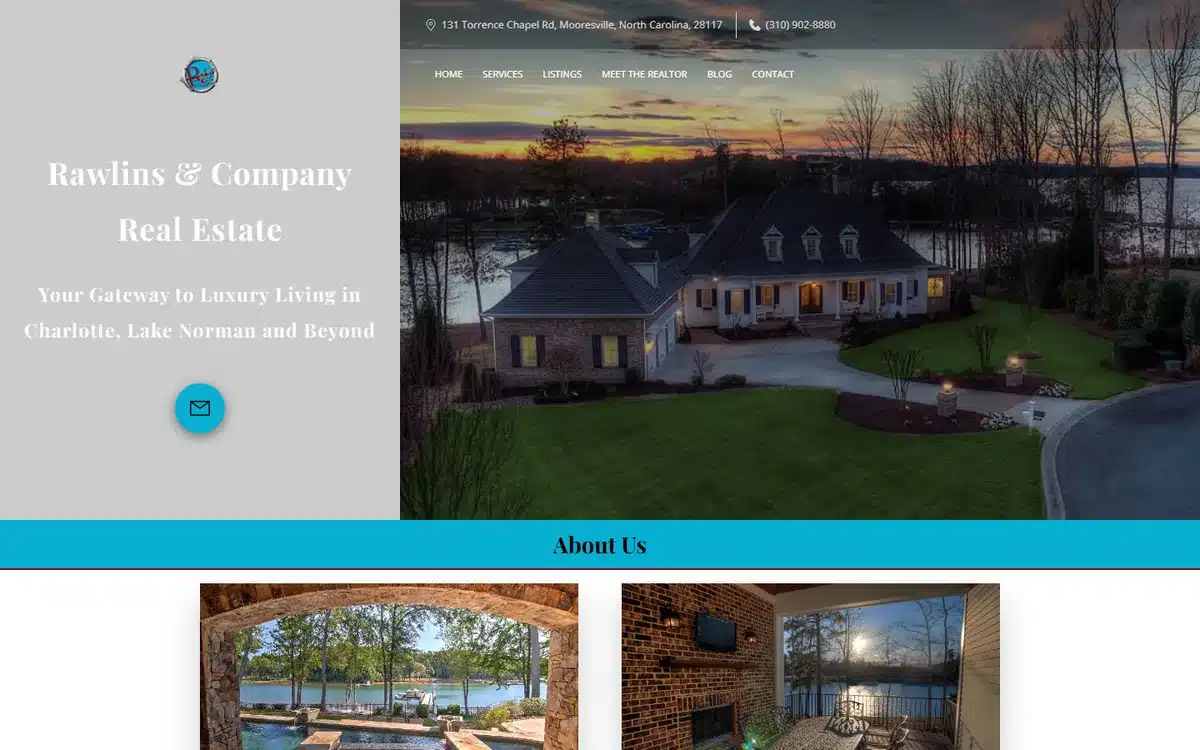
Rawlins & Company Real Estate in Mooresville, North Carolina nails the lakeside-luxury niche with a twilight-home hero on Lake Norman. The domain (“livinonlakenorman.com”) doubles as the positioning statement, which is exactly how a niche realtor should brand for search.
Borrow this: when your market has a single defining feature (a lake, a beach, a mountain, a downtown), let that feature own the domain, the hero, and the headline. Niche depth beats geographic breadth.
3. Brian Mason
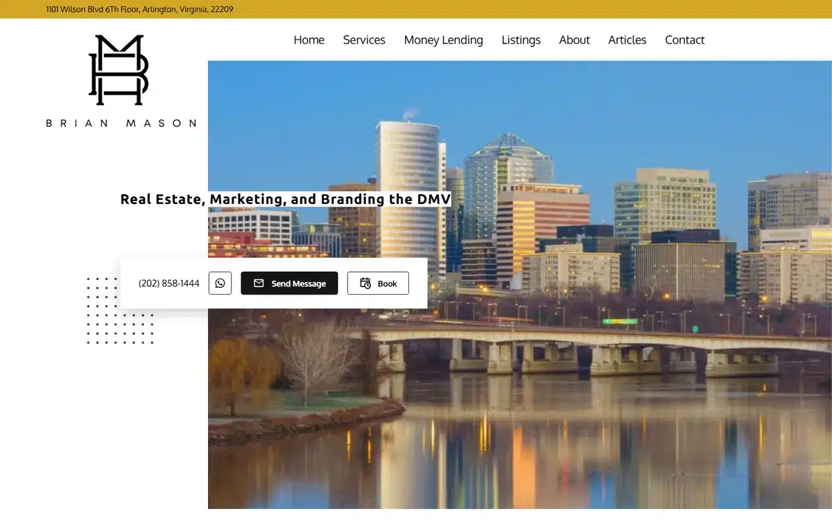
Brian Mason in Arlington, Virginia executes the modern personal-brand realtor aesthetic: a minimalist monogram, a clean DMV skyline hero, and confident typography. The page reads more like a designer portfolio than a real estate site, which is the point.
Borrow this: for a solo-agent personal brand, restraint is a flex. One monogram, one strong hero, one CTA. Maximalist agent websites read as desperate; minimalist ones read as in-demand.
4. Cody Pham, Realtor at Real Broker
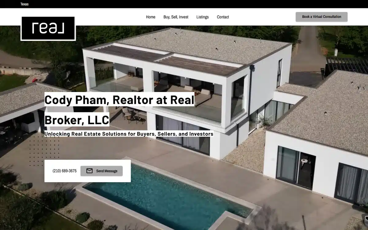
Cody Pham, Realtor at Real Broker in Texas opens with a modern-architecture hero and a lowercase “real” wordmark. The aesthetic codes are deliberately closer to a luxury-tech brand than a traditional real estate website, which suits an agent targeting younger, design-literate buyers.
Borrow this: realtors targeting tech, creative, or design-aware buyers should drop the trad-realty visual codes (cursive script, gold seal, columned-mansion stock photo) entirely. The audience reads those as old-fashioned, not premium.
5. Elysian Real Estate
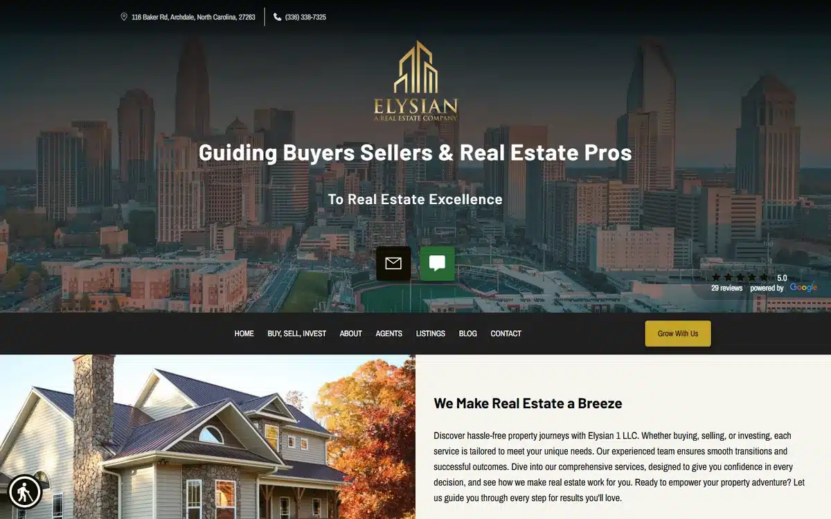
Elysian Real Estate in Archdale, North Carolina pairs a gold serif wordmark with a dusk skyline hero. The luxury-tier branding does the heavy lifting before any copy is read.
Borrow this: a single elegant wordmark, set in a refined serif against a dusk hero, signals luxury more effectively than any “luxury” or “elite” descriptor in the copy.
6. PEM Group
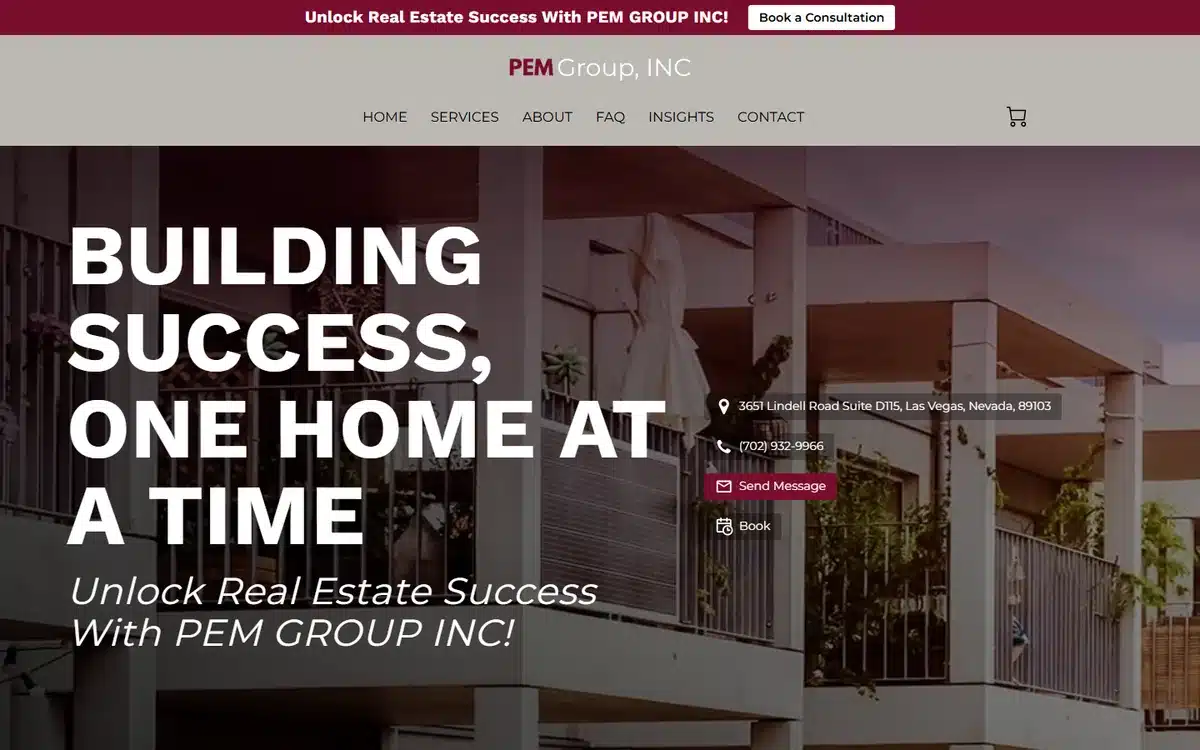
PEM Group in Las Vegas opens with a bold-serif “Building Success, One Home At A Time” hero in a burgundy palette over a modern-architecture backdrop. The typography is doing more work than the photograph, which is the right balance for a brand-led real estate website.
Borrow this: a confidently-set typographic hero can replace a photographic hero entirely. If your photography budget is limited, invest in the type design instead.
7. Timblok
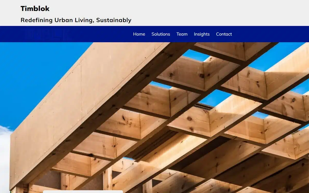
Timblok in Newport Beach, California leans hard into a sustainable-developer niche with an architectural timber-beam ceiling hero and the line “Redefining Urban Living, Sustainably”. The page reads more like an architecture firm than a developer, which is exactly the positioning.
Borrow this: sustainable and architecture-led developers should drop the suburban-house imagery entirely and lead with material close-ups (timber, concrete, glass, brass). The materials are the brand.
8. WACA Properties
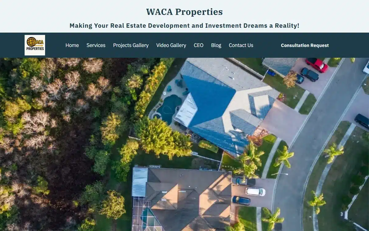
WACA Properties opens with a distinctive aerial drone shot of a pool-home and a rich Projects/Video gallery nav. The drone perspective and dedicated video gallery signal a developer that takes the showcasing seriously.
Borrow this: developers and high-end realtors should invest in aerial drone footage. The overhead shot is the single perspective most prospects cannot capture themselves, and it carries the asset.
9. Asahi Real Estate
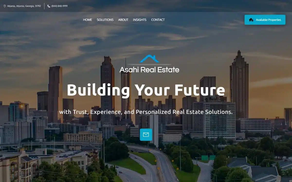
Asahi Real Estate in Atlanta, Georgia uses a moody Atlanta skyline with the line “Building Your Future”. The dark palette is unusual for a real estate website and reads as confident rather than gloomy in context.
Borrow this: stepping outside the bright-and-blue category default is one of the cheapest ways to look distinctive on a competitive SERP. Pick a palette no other agent in your market is using, and commit.
10. Jenn Bonk, Realtor
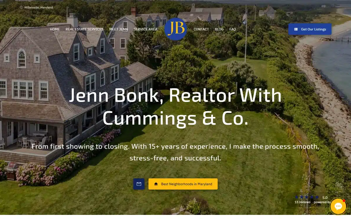
Jenn Bonk, Realtor in Millersville, Maryland heroes a premium waterfront-estate aerial with a JB monogram, a full-bleed design, and a visible social-proof badge. Personality-led real estate websites live or die on the hero, and this one carries the entire page.
Borrow this: for a personal-brand realtor, one excellent aerial-and-monogram pair is worth ten interior shots. Spend the budget on the single best image you can produce.
11. KayAnn Wright, Realtor
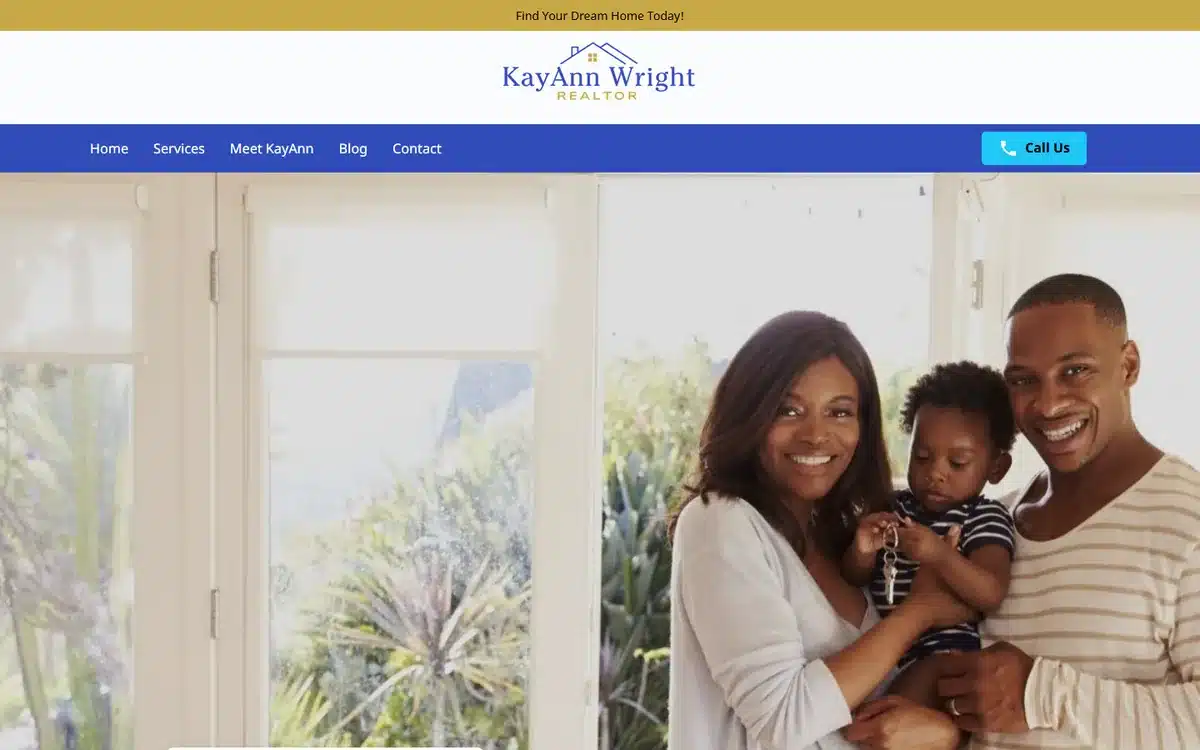
KayAnn Wright, Realtor on Long Island, New York opens with a warm family-lifestyle hero in a navy-and-gold palette. For agents targeting young families and first-time buyers, the lifestyle hero is a sharper filter than any “family-friendly agent” descriptor in the copy.
Borrow this: when your ICP is families with young children, put a family with young children in the hero. The right buyers recognise themselves; the wrong ones keep scrolling, and that is the goal.
12. Capstone Ventures Group
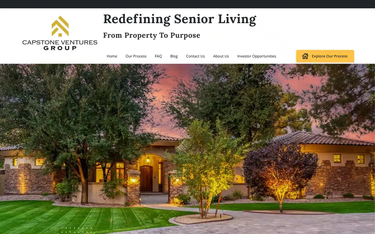
Capstone Ventures Group in Houston, Texas pairs a twilight luxury home with the line “Redefining Senior Living”. For realtors and investors focused on senior-living and assisted-residence markets, naming the niche in the hero filters the right buyers instantly.
Borrow this: niche real estate operators (senior living, military relocation, divorce sales, executive relocation) should name the niche in the hero, not bury it under “Services”. Vague positioning kills niche-realty traffic.
13. Blueprint Realty Development
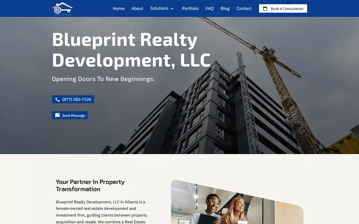
Blueprint Realty Development in Atlanta, Georgia opens with a construction-crane hero. For a firm doing both brokerage and development, the crane signals the development capability immediately, before the visitor has to dig into the services list.
Borrow this: if your firm does more than transaction-side brokerage (development, construction, property improvement), the hero should communicate that capability visually. Words alone get skimmed.
14. Dominion and Power Estates
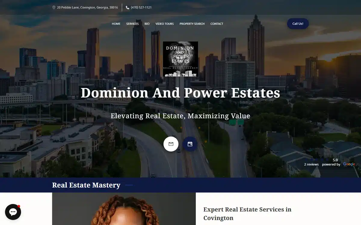
Dominion and Power Estates in Covington, Georgia executes the traditional luxury-brokerage register well, a navy palette, a crest logo, an Atlanta skyline hero, and “Elevating Real Estate” framing. Sometimes the conventional template, executed cleanly, is the right answer.
Borrow this: there is nothing wrong with the traditional luxury-realty template (crest, navy, skyline) when it is executed with discipline. A polished version of the convention beats a sloppy attempt at something distinctive every time.
15. Fairfax Realty – Lloyd Bernard
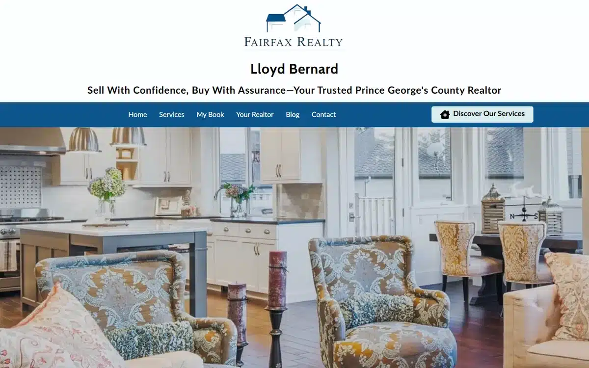
Fairfax Realty – Lloyd Bernard in Prince George’s County, Maryland uses a warm staged-home interior hero with a navy wordmark. The interior shot is the differentiator: it signals “this is the home you could be moving into”, whereas an exterior shot signals “this is the agent’s portfolio”.
Borrow this: a staged-interior hero outperforms an exterior-elevation hero for buyer-focused agents. Buyers imagine themselves living in the space, not staring at the facade.
16. Mission Park Flats
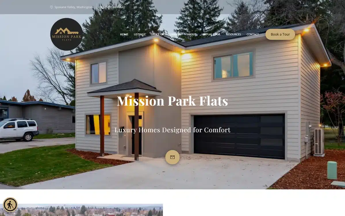
Mission Park Flats in Spokane Valley, Washington opens with a twilight modern duplex, warm-window glow, and a mountain logo. For a leasing community, the twilight architectural shot is the strongest aesthetic move available; it conveys “warm home” and “modern build” simultaneously.
Borrow this: leasing communities and rental properties should hero a twilight architectural shot with warm interior lights. The lights signal life inside; the daylight equivalent reads as vacant.
17. LacMont Realty Group
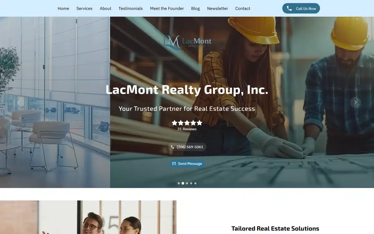
LacMont Realty Group in Seattle, Washington pairs a blueprint-planning hero with a visible review badge and a clear realty positioning. The review badge above the fold is the single highest-ROI trust signal a real estate website can include.
Borrow this: pull your Google or Zillow review widget up to the hero, not down to the testimonials section. Prospects compare on the first screen; they will not scroll to find proof.
18. Geaux Homes OKC
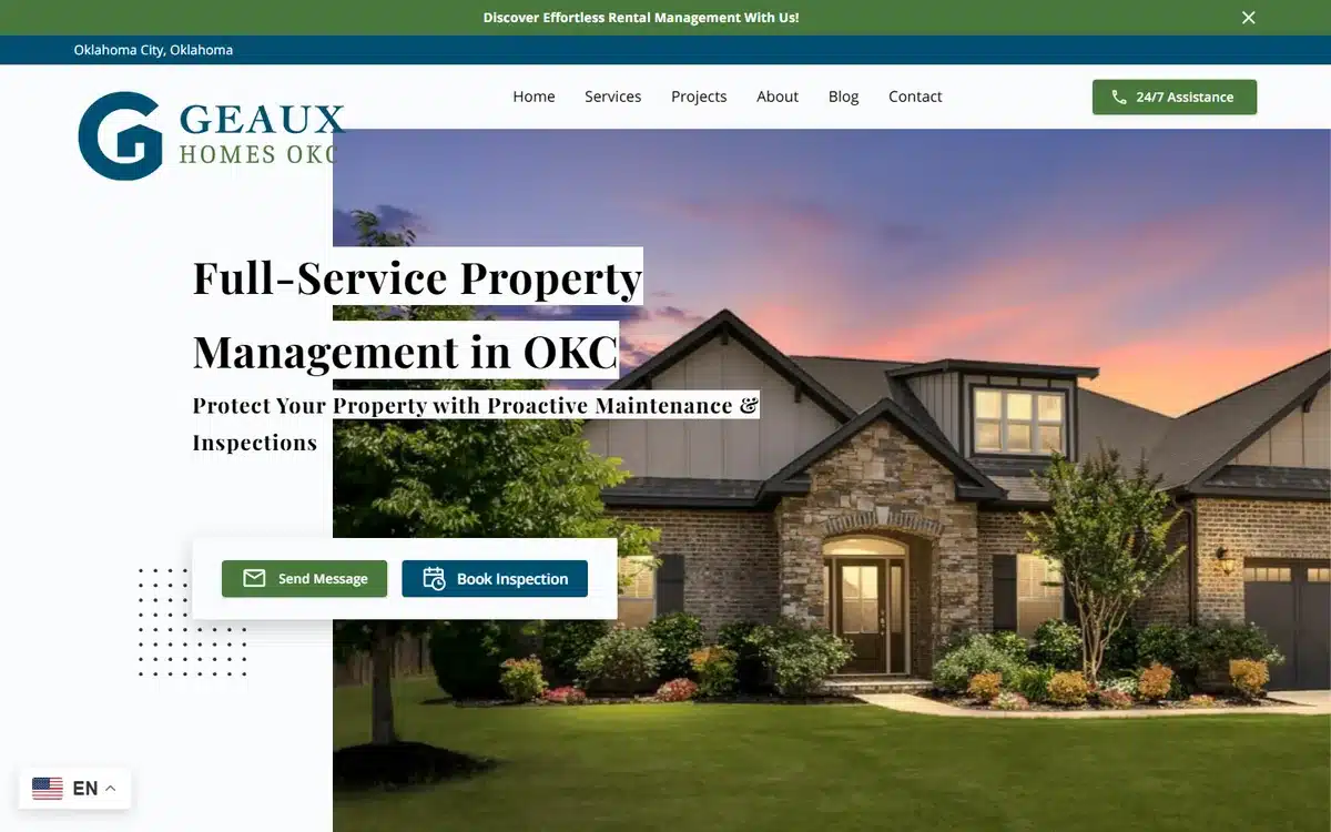
Geaux Homes OKC in Oklahoma City heroes a dusk house with a clean two-CTA stack (“Owners” and “Tenants”). For a property manager serving both audiences, the dual-CTA hero is the single best layout choice; one CTA forces a generic landing page, two routes the visitor to the right journey immediately.
Borrow this: property managers serving both owners and tenants should split the CTA above the fold. One audience-specific path each, no shared funnel. The journeys want different content from word one.
19. Good Life Property Group
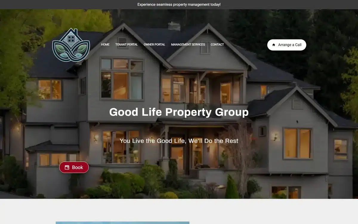
Good Life Property Group in Ashland, Oregon uses a twilight residence with warm windows and a leaf logo. The lifestyle framing (“Good Life”) plus the calm photography is unusual for a property manager and reads as more approachable than the typical PM aesthetic.
Borrow this: property management is associated with admin and rent-chasing in most prospects’ heads. A lifestyle-led brand and warm photography reposition the firm as service rather than enforcement.
20. Tandem Property Management
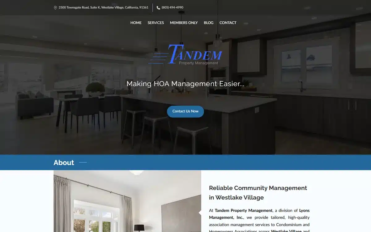
Tandem Property Management in Westlake Village, California opens with a moody dark-kitchen interior and a clean script logo, framed as “Making HOA Management Easier”. HOA management is a tight niche, and naming it in the hero filters the right boards in.
Borrow this: property managers serving a specific sub-niche (HOA, short-term rental, student housing, military family rentals) should name the niche in the hero, not in the about page. Generic PM positioning gets generic leads.
21. GMI Living
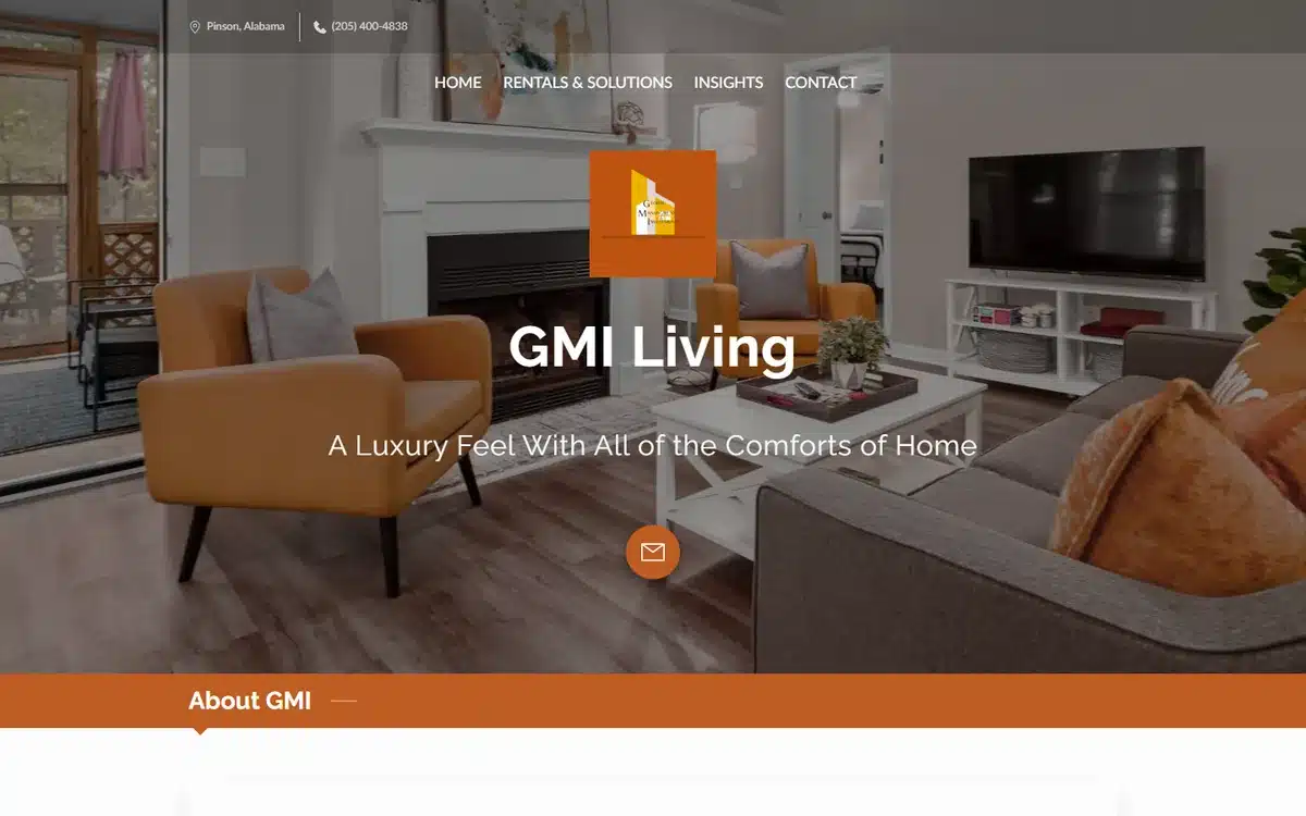
GMI Living in Pinson, Alabama pairs an editorial interior shot with warm orange-accent branding. The colour choice is unusual for hospitality and rentals (which default to warm beiges) and reads as more design-conscious than the category average.
Borrow this: short-term rental and luxury-rental brands should avoid the default warm beige palette. A confident off-category accent colour (orange, deep teal, terracotta) signals “design-led property” before the first photo is read.
22. Bos Property Accounting & Management
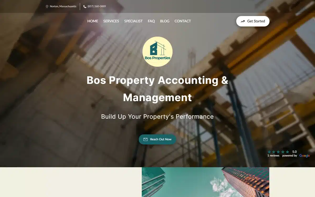
Bos Property Accounting & Management in Norton, Massachusetts uses a branded logo medallion over a scaffolding hero. The scaffolding image is unusual and effective: it signals “in-progress, active management” rather than the finished-home photography most PM sites lean on.
Borrow this: process-driven services (accounting, maintenance coordination, project management) can hero process imagery rather than finished outcomes. Process is what owners are buying; finished outcomes are what tenants see.
23. Virgimar
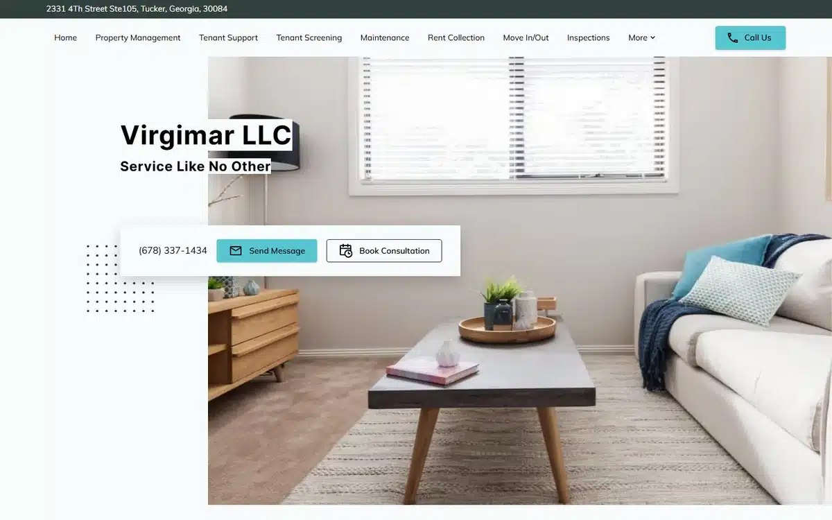
Virgimar in Tucker, Georgia pairs a warm living-room hero with a comprehensive PM service nav (Property Management, Tenant Support, Maintenance, Rent Collection). The visible service breadth in the nav is the credibility signal.
Borrow this: property management firms with a full service stack should put the stack in the top nav, not under a generic “Services” menu. Prospects scan navs first; spelling out the capabilities saves a click.
24. JWhitfield Management
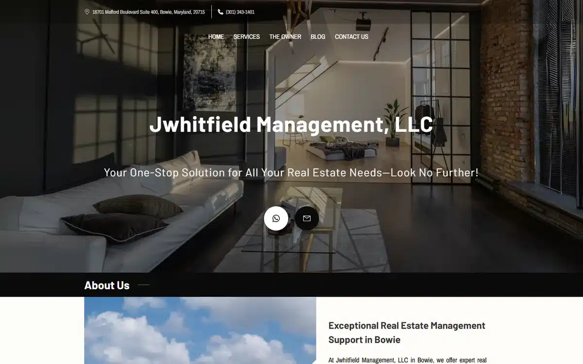
JWhitfield Management in Bowie, Maryland heroes a moody industrial-loft interior. For property managers serving urban and design-conscious tenant markets, the editorial-loft aesthetic out-signals the standard suburban-exterior PM template.
Borrow this: property managers serving urban professional renters should hero a loft, a converted warehouse, or a downtown high-rise interior rather than a suburban exterior. Tenant market match the imagery to the listing.
25. SRG Holdings
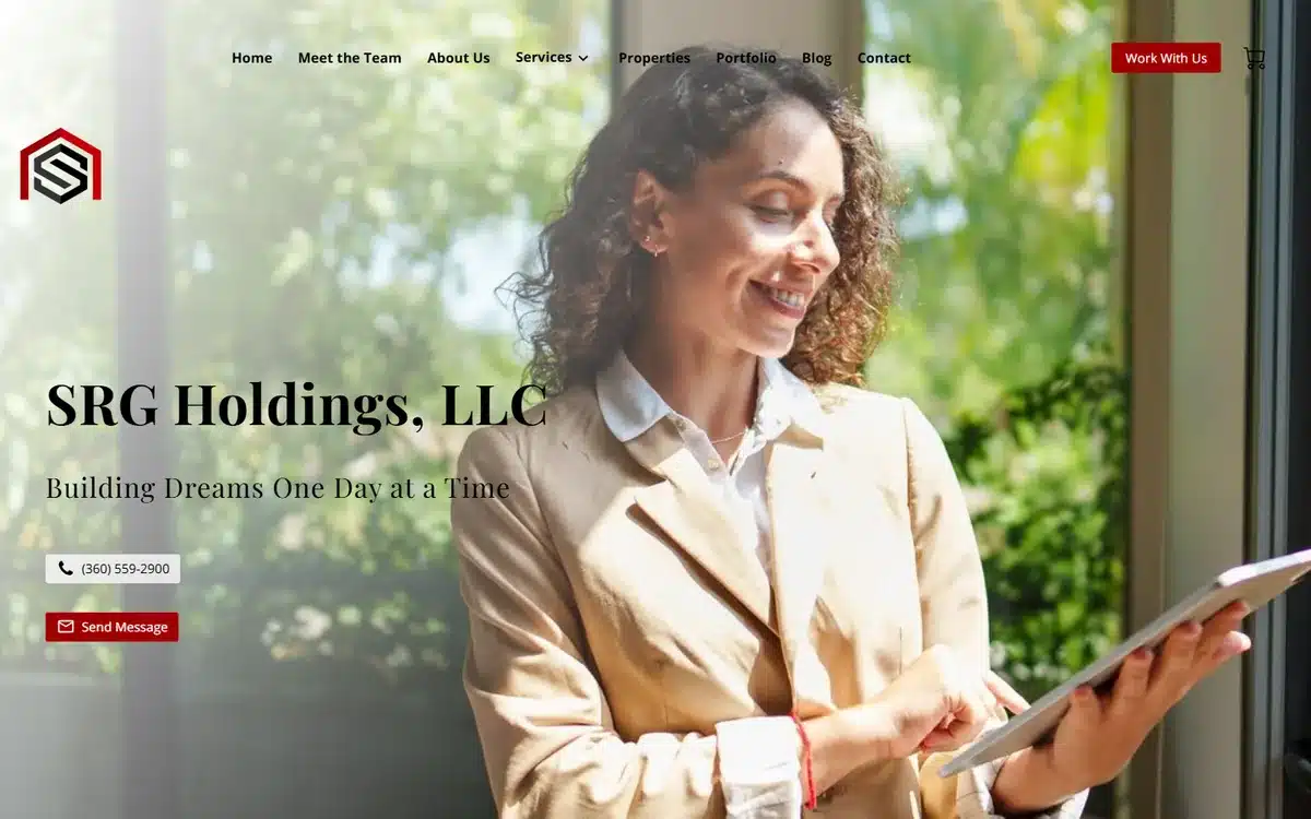
SRG Holdings in Centralia, Washington opens with a polished founder portrait holding a tablet against a soft bokeh background. For woman-led realty and investment firms, the founder-portrait hero is one of the stronger trust signals available, especially against the male-default real-estate aesthetic.
Borrow this: founder-led real estate firms should put the founder in the hero. The single portrait outperforms a team photo or stock-house imagery, and it builds the trust signal faster.
26. Sica Nacu
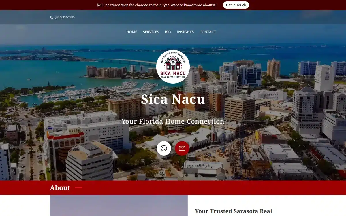
Sica Nacu in Sarasota, Florida pairs an aerial Sarasota cityscape with a realtor crest. The aerial city shot doubles as a portfolio and a market-knowledge signal in one image.
Borrow this: realtors in mid-sized markets often get more lift from a market-defining city aerial than from listing photography. The aerial says “I know this market end-to-end”; listings say “I have these three houses”.
27. The Reel On Real Estate

The Reel On Real Estate in Plantation, Florida heroes a confident realtor portrait with “Handing You The Keys To New Possibilities” framing. The personal-brand name and portrait combine to make a credible solo-agent website.
Borrow this: a memorable agent-brand name (a play on words, a phrase, a phonetic spin on a real name) gives a solo realtor durable recall advantage. “Jovaughn Charlton, Realtor” is forgettable; “The Reel On Real Estate” is not.
28. Grace Realty
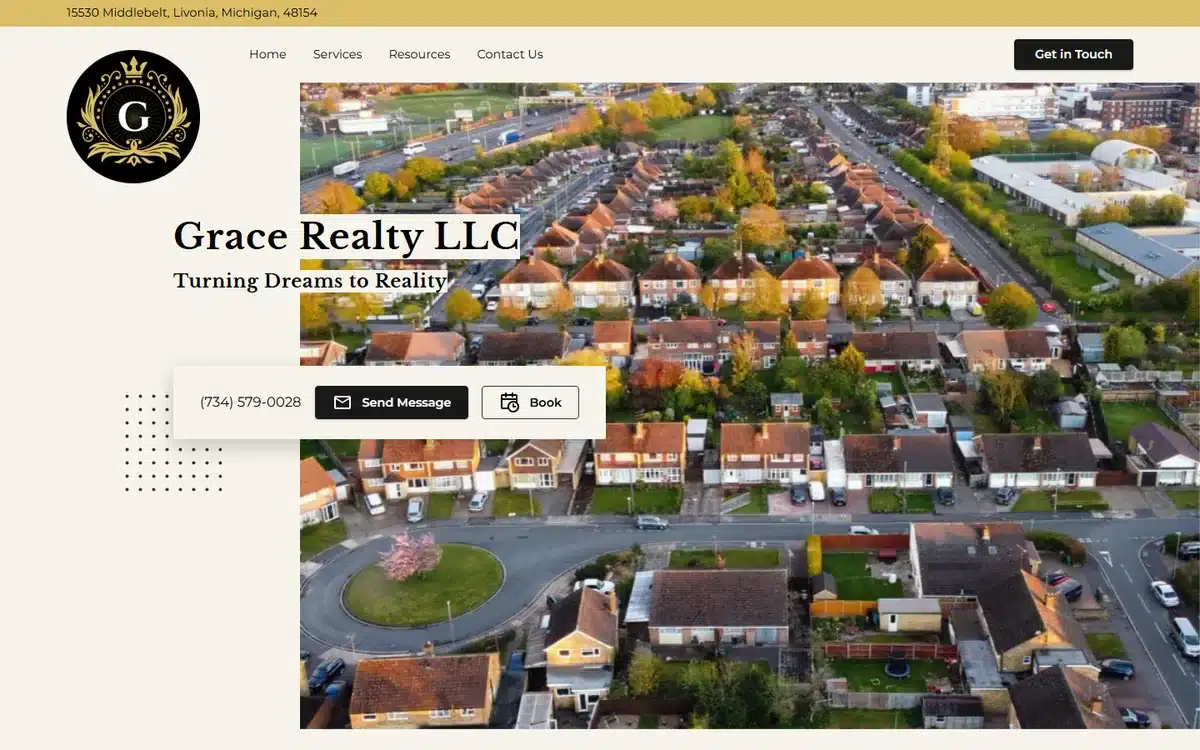
Grace Realty in Livonia, Michigan opens with an aerial neighbourhood hero and a refined gold monogram. The neighbourhood-not-listing perspective is the differentiator on a SERP otherwise dominated by single-house exteriors.
Borrow this: an aerial neighbourhood shot reads as a more confident market move than a single-house photo. The realtor who owns the neighbourhood is implicitly the better choice than the realtor who has one good listing.
29. Lilly and Loui Management
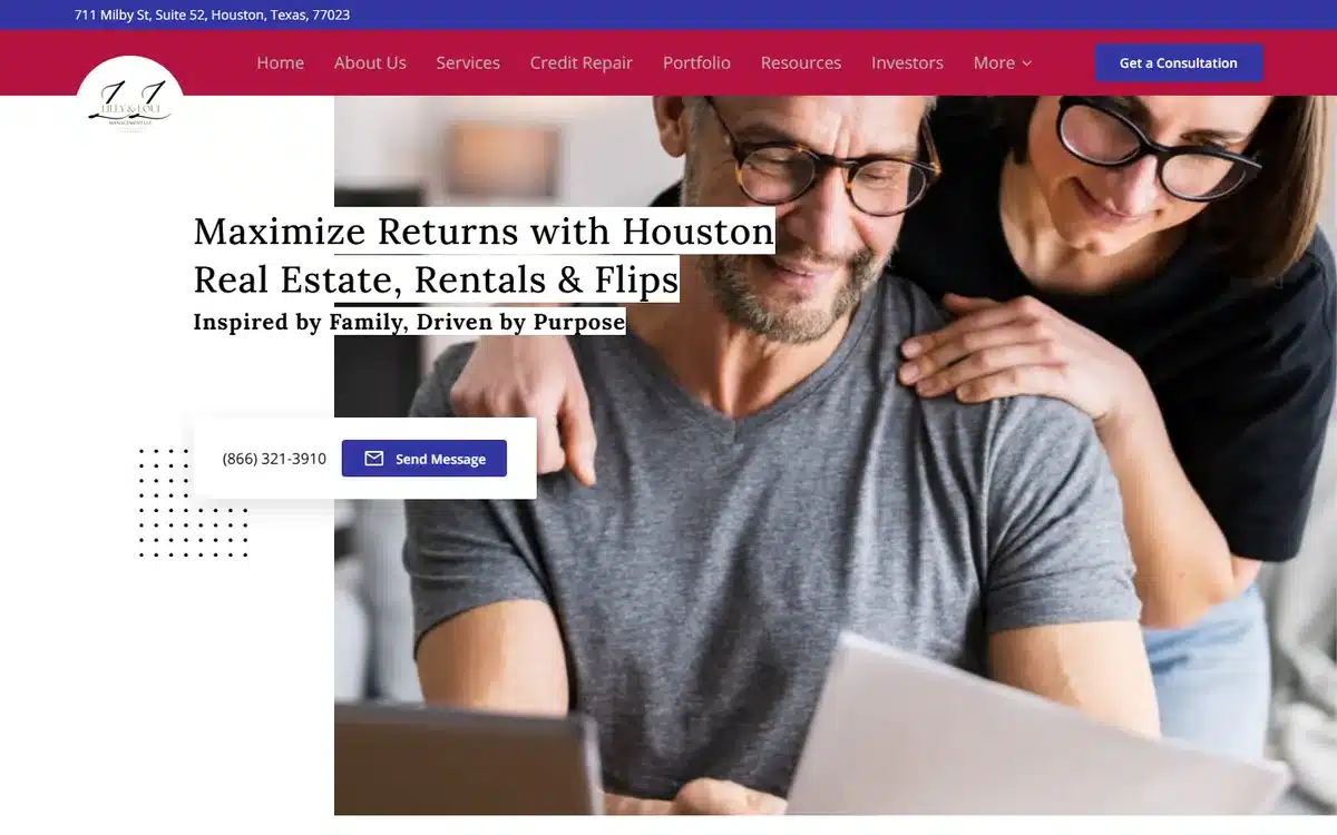
Lilly and Loui Management in Houston, Texas pairs a warm couple-at-laptop hero with a maroon-accented palette. The lifestyle photography signals “we help working families with their investments” more clearly than any service-list could.
Borrow this: for property management and small investor services, the prospect is often a couple managing rental income together. Show that couple in the hero rather than a single landlord or a generic house.
30. The Realtor in the Fedora
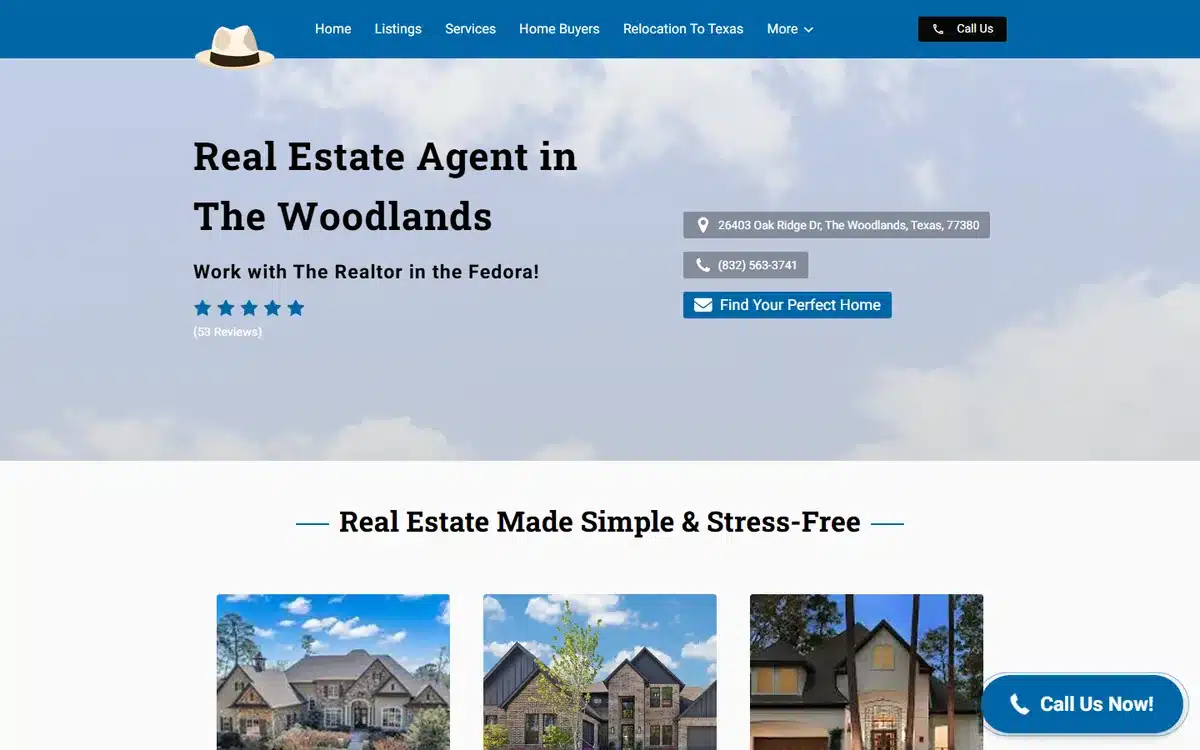
The Realtor in the Fedora in The Woodlands, Texas closes the list with a playful personal-brand identity built around a single sartorial choice. It is memorable, instantly differentiated, and easy to talk about, which is exactly what a solo realtor in a saturated market needs.
Borrow this: in a saturated agent market, a single distinctive personal-brand element (a hat, a colour, a phrase, a vehicle, a vintage object) gives prospects something to remember after they close ten browser tabs.
Frequently asked questions about real estate website examples
Six questions we hear most from realtors, brokerages, and property managers thinking about a new site.
How much does a real estate website cost?
Typically $0 to $10,000 upfront. Done-for-you builds with a founder portrait, named services, and Google Business Profile setup fall in the $500 to $2,500 range plus hosting. Custom agency builds with MLS integration, IDX feeds, lead capture forms, and CRM hooks usually start around $5,000. Free DIY builders cost nothing in cash but take 10 to 30 hours of the owner’s time.
What features should a real estate website have in 2026?
The non-negotiables: a “Book a Showing” or “Schedule a Call” button above the fold, click-to-call on mobile, named services (buy, sell, lease, property management), an MLS/IDX or current-listings link if you sell, owner and tenant journeys split if you manage, a reviews widget, and SSL. High-ROI additions: a Google Reviews badge in the hero, an aerial drone shot for niche markets, and a clear sub-vertical specialism.
Do realtors and property managers need a website?
Yes. Most prospects research a realtor or property manager online before contacting, evaluating credentials, market focus, sub-specialisms, and reviews. A sparse site loses prospects to better-presented competitors at the moment of comparison, especially in luxury and niche markets where visual cues set the fee expectation.
How do I make a website for my real estate firm?
Three routes. Build it yourself with a small-business builder (10 to 30 hours, reasonable if you have a portrait photo). Hire a freelancer or local agency ($1,500 to $5,000, 3 to 6 weeks). Or use a done-for-you service that builds the site, sources photography if needed, and configures Google Business Profile in one package.
What’s the best platform for a real estate website?
For most solo agents and small firms, a small-business builder (UENI, Squarespace, Wix) with a contact form and reviews widget is enough. Firms that need MLS/IDX listings, lead capture forms, and CRM integration should look at vertical platforms (Placester, AgentFire, Real Geeks) or a WordPress build with the right plugins. The filter is what the client journey needs to do: research, book, or browse listings.
How do real estate websites rank on Google?
Specific service pages with city or neighbourhood in the URL (“/real-estate-agent-arlington-va/”, “/property-management-lake-norman/”) outrank generic homepage content on commercial queries. A complete Google Business Profile with the most specific category (Real Estate Agency, Property Management Company, Apartment Rental Agency) signals legitimacy. Reviews on Google plus vertical directories (Zillow, Realtor.com, Yelp) feed the prominence signal Google uses for local rankings.
Next steps
If these real estate website examples have given you ideas, pick the two or three moves that fit your firm. The best examples in the list all share one pattern: they over-invest in one or two real photographs and under-invest in stock imagery, and they name their sub-vertical in plain language. Reversing the conventional real-estate-site ratio is the highest-ROI design change available.
If you would rather skip the build and have a professional real estate website delivered for you, UENI builds a done-for-you small business website in seven days, with custom domain, hosting, and local SEO so the firm can be found on Google.
Once the site is live, our guide to small business advertising covers the channels that work for real estate firms. For broader inspiration beyond realty, see our gallery of small business website examples.
Sources
- Live homepages of the 30 UENI customer real estate firms linked from each example above, reviewed in May 2026. Each firm is a real, currently-trading UENI customer; the description is based on direct observation of the homepage at time of review.
- UENI done-for-you build timeline and inclusions: UENI done-for-you website page, reviewed May 2026.
Observations in this article (design patterns, cost ranges, typical timelines, ranking-factor weightings) are based on UENI’s experience supporting real estate website builds and direct review of the live sites in May 2026. Presented as typical ranges, not figures attributed to a single external source. MLS/IDX integration requirements vary by jurisdiction and brokerage; check with your local board before commissioning a build.