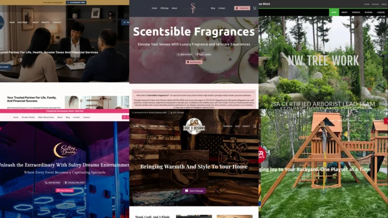
The fastest way to figure out what your own site should do is to look at small business website examples that already work. This guide collects 18 real small business websites built by UENI customers across wildly different industries — a painting contractor, a financial-services firm, a fragrance brand, an arborist, a music studio, a nonprofit, a custom-apparel shop, and more. Each one is live, each one is run by an actual owner (not an agency mock-up), and each one shows one specific design or functionality choice you can copy onto your own site today.
Key takeaways
- The best small business website examples lead with one strong, real image — the product, the owner, the work, or the place — not a generic stock photo. The hero image carries more conversion weight than any other single element.
- The functionality that matters in 2026 is the same across every industry: one clear call-to-action above the fold, click-to-call on mobile, a visible way to buy/book/enquire, and current contact details. Industry changes the content, not the checklist.
- A focused homepage beats a busy one. The strongest examples below give the visitor one obvious next step instead of ten competing ones.
- Brand consistency — one colour palette, one logo treatment, one voice — separates the sites that look established from the ones that look thrown together, regardless of budget.
- You don’t need a big budget or a developer. Every site in this list was built on a done-for-you small business platform, which is why they share a clean, mobile-first baseline while still feeling distinct.
What makes a good small business website?
Before the 18 small business website examples, here’s the bar they’re being measured against. A small business website has one job: turn a stranger who found you (via Google, a card, a social post) into an enquiry, a booking, or a sale. Two things decide whether it does that — the design and the functionality.
Still choosing a platform to build on? Compare the leading options in our guide to the best Wix alternatives for small businesses.
The design
Design is the credibility test. A visitor decides whether your business looks legitimate within a couple of seconds of the page loading, mostly from the hero image and the overall polish. The strongest small business website examples share three design traits. The hero is a real, specific image — the actual product, the actual owner, the actual work, or the actual location — never a generic stock photo of a handshake. The colour palette is restrained and consistent: one or two brand colours used everywhere, not a rainbow. And the layout gives the eye one place to land, usually a headline plus a single button, instead of a cluttered wall of competing elements.
The functionality
Functionality is what converts the interest into action. The checklist is identical whether you sell candles or fix roofs. There’s one clear call-to-action above the fold — book, buy, call, or enquire — and it’s impossible to miss. Phone numbers are tap-to-call on mobile, where most local searches happen. The core action (online store, booking calendar, quote form, contact details) is reachable in one click, not buried three pages deep. And the basics — current hours, location, what you actually do — are answered without the visitor having to hunt. Get those right and the website stops being a brochure and starts being a salesperson.
18 small business website examples (2026)
These 18 small business website examples span finance, home services, beauty, retail, events, the arts, nonprofits, and more — on purpose. A good website for an arborist looks nothing like a good one for a fragrance brand, and seeing the range is the point. For industry-specific roundups, we also have dedicated guides for restaurant websites, law firm websites, dental websites, and healthcare websites.
1. AGI Financial Group
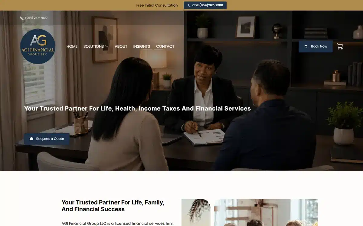
AGI Financial Group in Miramar, Florida opens with a premium dark hero and a real advisor-client meeting photo. Financial services live or die on trust, and the polished, restrained palette signals “established firm” the moment the page loads. The AGI monogram gives it an ownable brand mark.
Borrow this: trust-led businesses (finance, legal, insurance) should keep the palette dark and restrained, and hero a real human interaction rather than abstract imagery.
2. Precision Paintworks
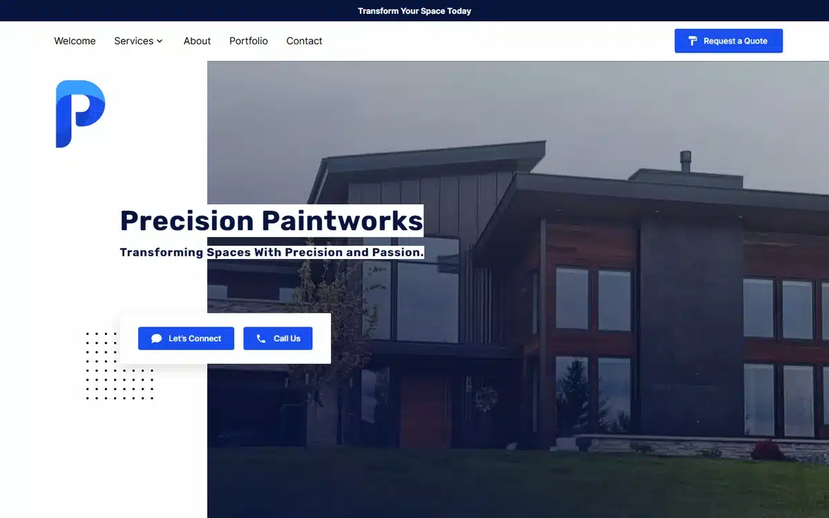
Precision Paintworks in Sheridan, Wyoming leads with a crisp modern-home photo and a clean P logo with blue accents. For a trade, the smartest hero is the finished result — a beautifully painted home tells the prospect exactly what they’re buying. Two clear CTAs handle “get a quote” and “see our work”.
Borrow this: trades should hero the finished result, not the tools or the team. Prospects buy the outcome; show it first.
3. NW Tree Work
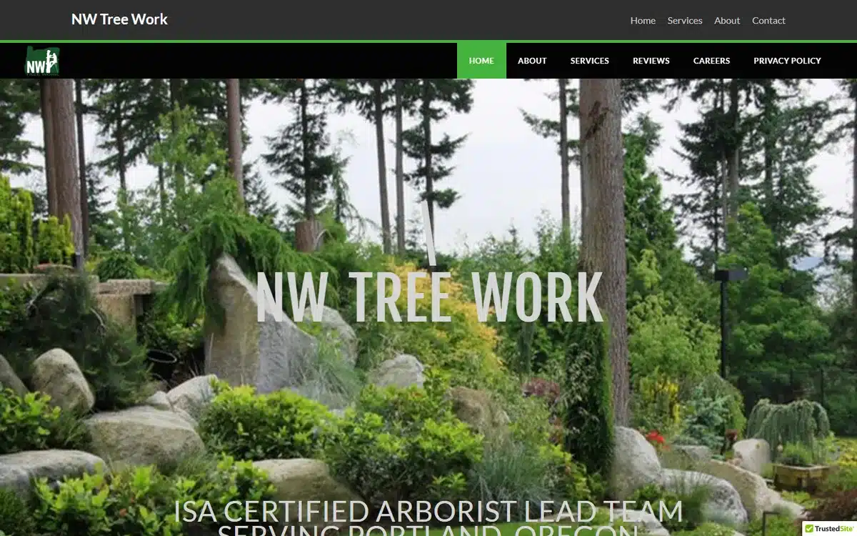
NW Tree Work in Portland, Oregon fills the screen with an immersive evergreen-forest hero that instantly communicates the trade. The full-bleed nature image plus a big confident wordmark makes a one-person arborist business look substantial.
Borrow this: an immersive, full-bleed environmental image makes a small operator look bigger. Match the image to the literal subject of the work.
4. HSB Home Services
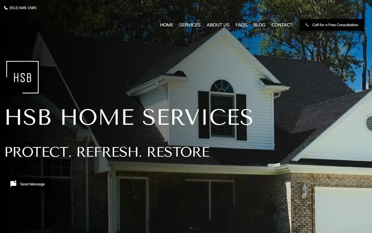
HSB Home Services in Horseshoe Bay, Texas pairs a crisp house photo with the three-word tagline “Protect. Refresh. Restore.” The triad does what good taglines do — it summarises the whole service menu in three beats a homeowner instantly understands.
Borrow this: a three-word verb tagline (“Protect. Refresh. Restore.”) communicates a multi-service business faster than a paragraph.
5. Scentsible Fragrances
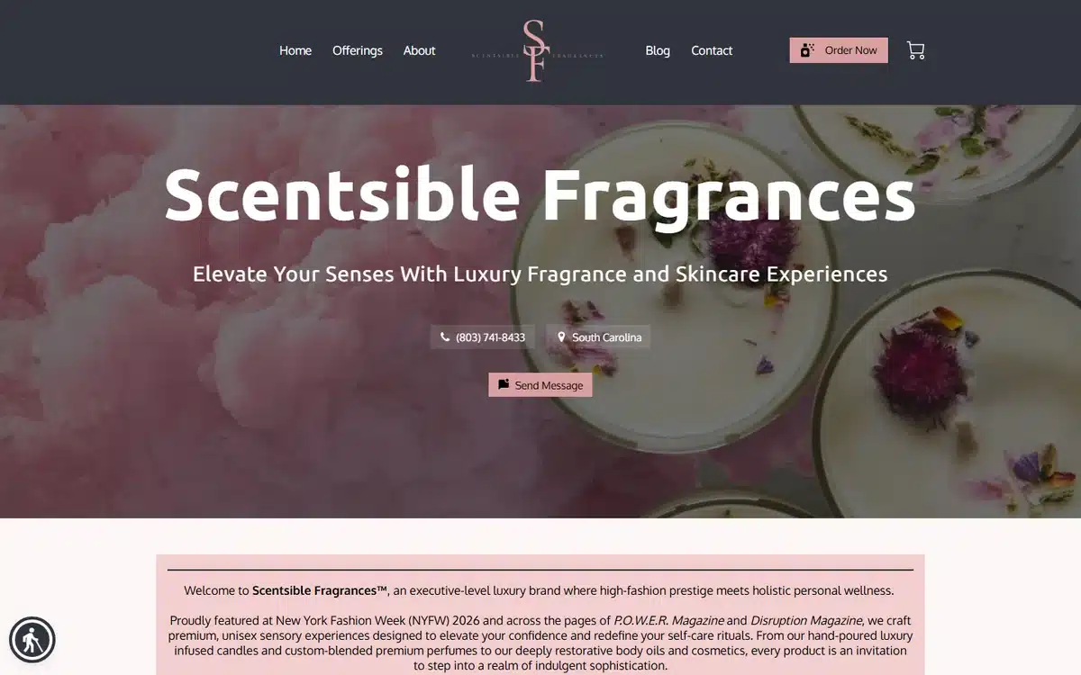
Scentsible Fragrances in South Carolina uses a soft pink petal-and-bowl hero and an elegant SF monogram. For a product brand, the homepage has to feel like the product — and this one feels expensive and calm, with a clear “Order Now” path to the store.
Borrow this: product brands should make the homepage feel like the product itself. Match the mood (luxury, playful, rugged) in the imagery and palette.
6. Raj Beauty Bar
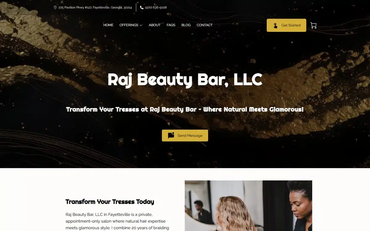
Raj Beauty Bar in Fayetteville, Georgia goes black-and-gold with the tagline “Where Natural Meets Glamorous”. Beauty businesses compete on aesthetic credibility, and the high-contrast palette reads as upscale without needing a big photo shoot.
Borrow this: a tight black-and-gold (or other high-contrast) palette is a cheap, reliable way for a beauty or salon brand to read as premium.
7. A Color Above
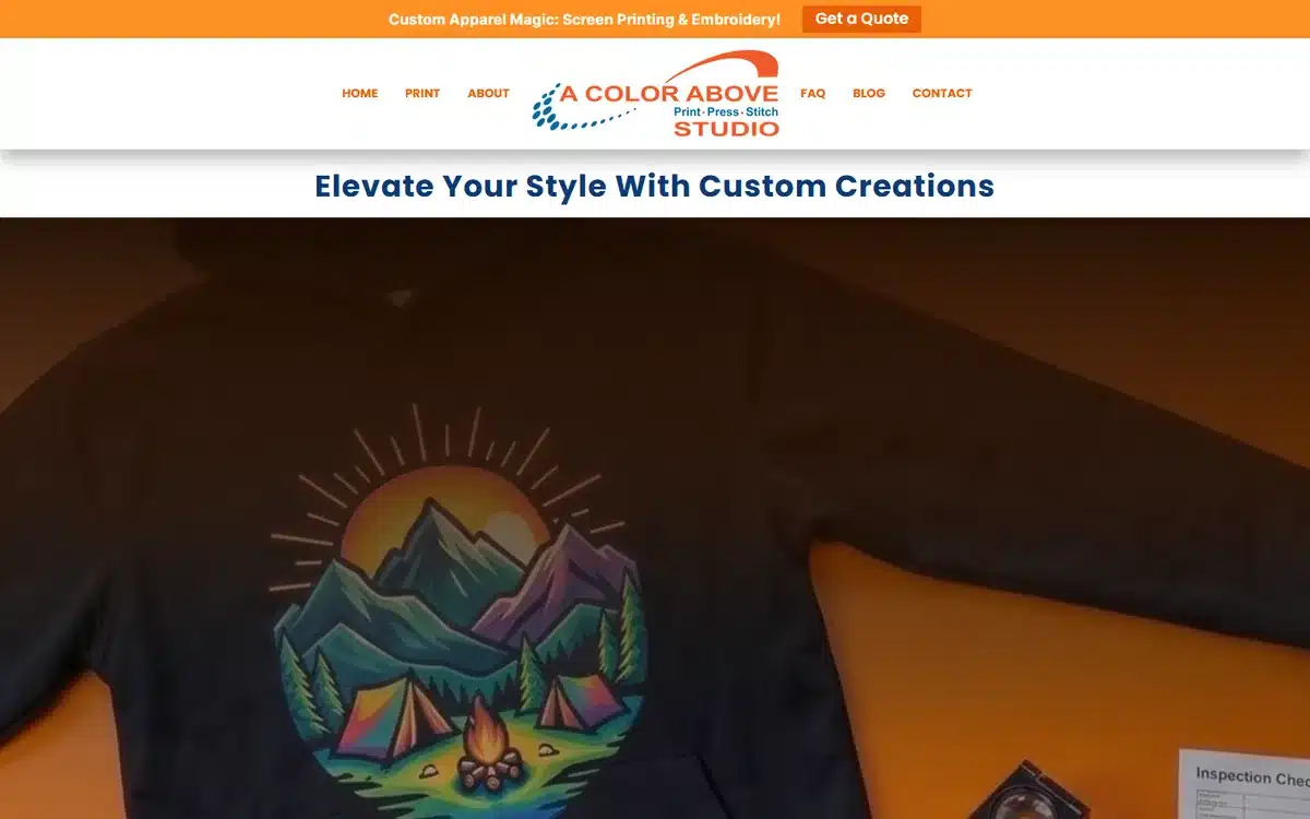
A Color Above in Encino, California heroes its actual product — a vivid printed hoodie — instead of a generic “we do printing” graphic. For a custom-apparel shop, showing a real finished piece proves quality far better than describing it.
Borrow this: custom-product businesses should hero a real finished piece, not a description of the service. The work is the proof.
8. Code 3 Designs
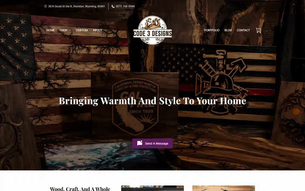
Code 3 Designs in Sheridan, Wyoming makes handmade wood-and-flag art with a richly textured hero and a firefighter-themed badge logo. The site leans hard into a specific identity (first-responder craftsmanship), which is exactly right for a maker brand competing on story.
Borrow this: maker and craft businesses win on identity. Commit fully to a specific story and let the texture and logo carry it.
9. Geo San Music
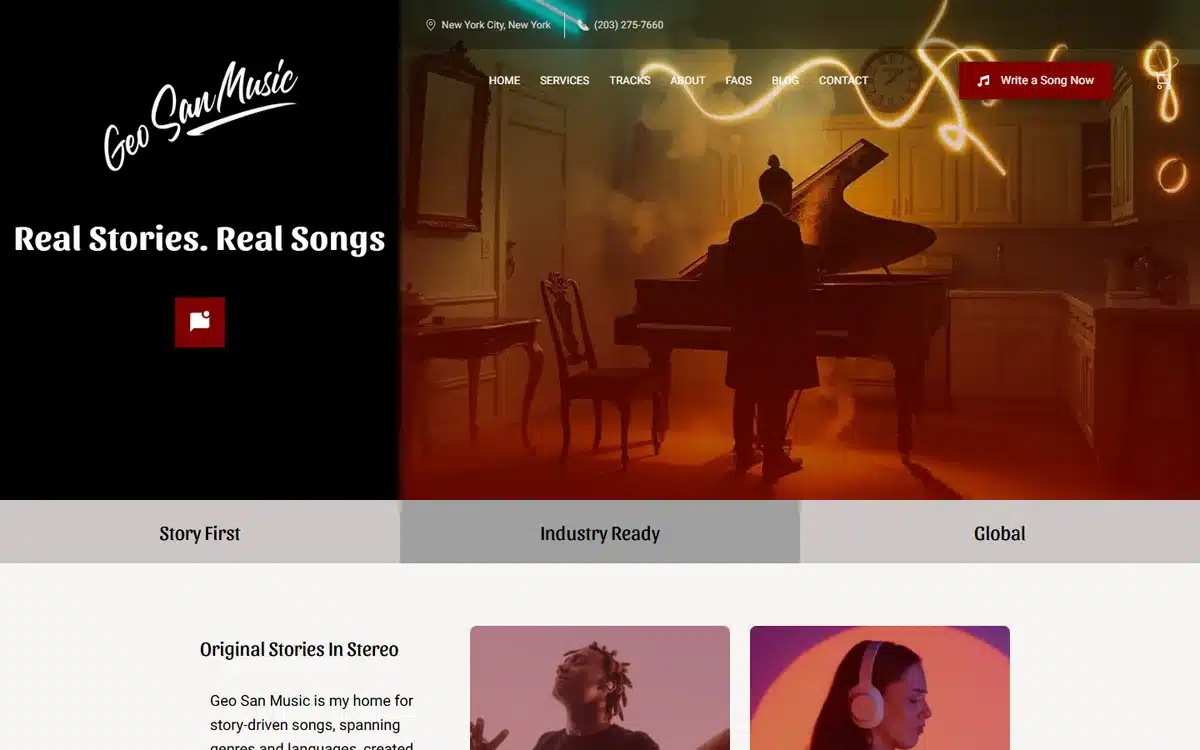
Geo San Music in New York City opens with a cinematic, moody pianist shot and the line “Real Stories. Real Songs.” For a creative service, the homepage has to demonstrate taste, and this one does it through photography and restraint rather than a feature list.
Borrow this: creative-service businesses should demonstrate taste on the homepage, not list features. The aesthetic IS the portfolio.
10. Sultry Dreams Entertainment
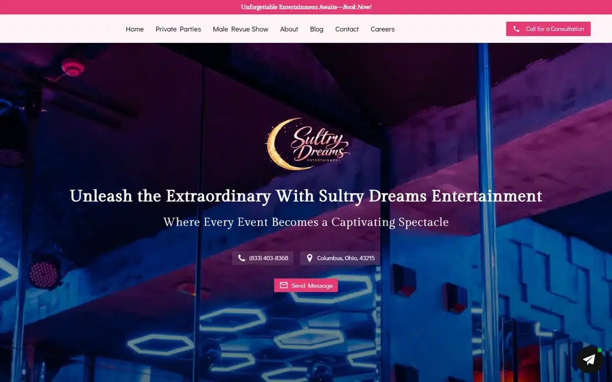
Sultry Dreams Entertainment in Columbus, Ohio uses a vibrant neon-lit venue hero and a gold script logo. For an events and entertainment brand, energy is the product, and the saturated nightlife palette sells the vibe before any copy is read.
Borrow this: experience businesses (events, nightlife, hospitality) should sell the feeling through saturated, high-energy imagery. Calm palettes undersell the offer.
11. Ticket King
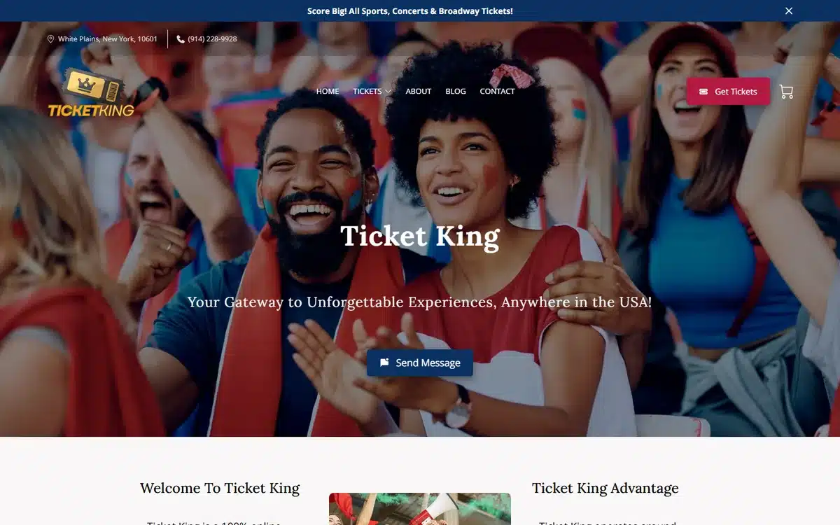
Ticket King in White Plains, New York fronts a vibrant sports-crowd hero with the line “Your Gateway to Unforgettable Experiences”. The crowd shot does the emotional selling — it shows the outcome (being there) rather than the transaction (buying a ticket).
Borrow this: sell the outcome, not the transaction. A crowd having a great time beats a picture of a ticket.
12. Seasoned Sistas Travel
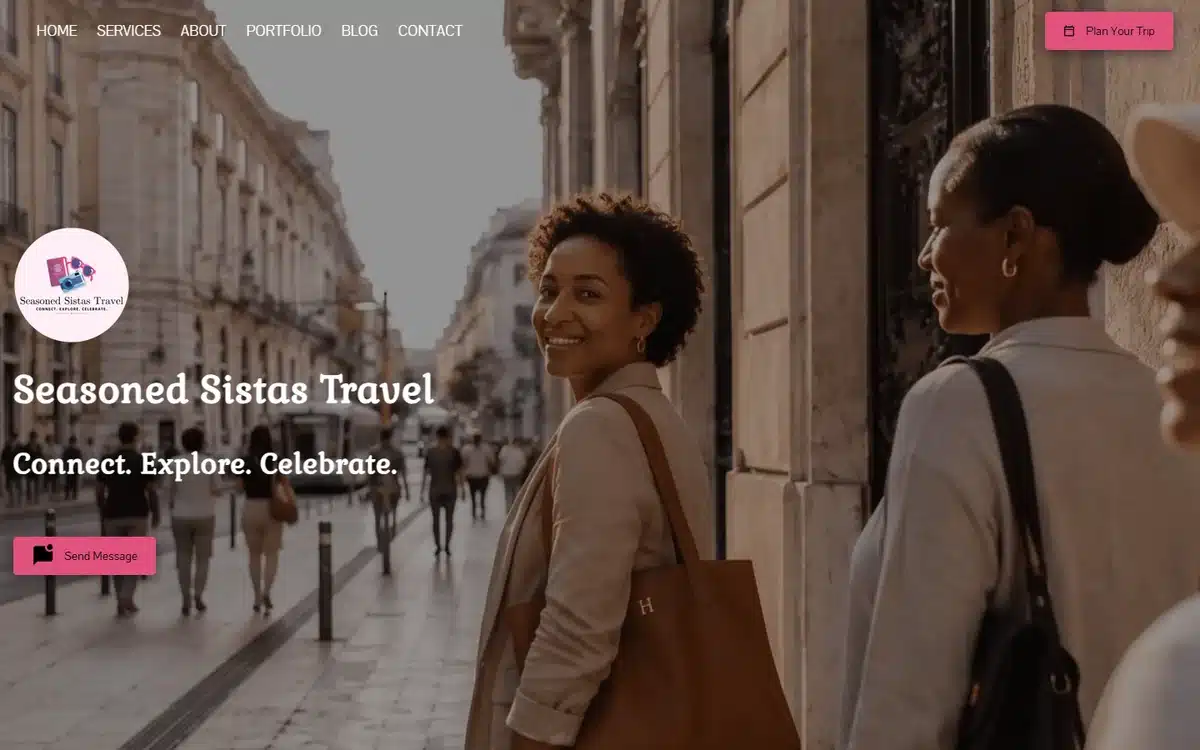
Seasoned Sistas Travel in Farmville, Virginia uses warm street-photography and the tagline “Connect. Explore. Celebrate.” It speaks to a specific audience (a community of travellers) rather than trying to appeal to everyone, which is what lets a small agency stand out against the big booking sites.
Borrow this: niche travel and lifestyle brands win by speaking to a specific community, not the whole market. Specificity is the moat against the giants.
13. Let’s Buy A Vehicle
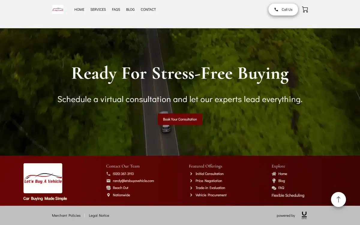
Let’s Buy A Vehicle in Green Bay, Wisconsin uses an aerial winding-road hero and the promise “Ready For Stress-Free Buying”. The headline names the customer’s biggest pain (car-buying stress) and immediately resolves it, which is sharper than leading with the service description.
Borrow this: lead the headline with the customer’s pain and your resolution of it (“stress-free buying”), not with a description of what you do.
14. QSR Playsets
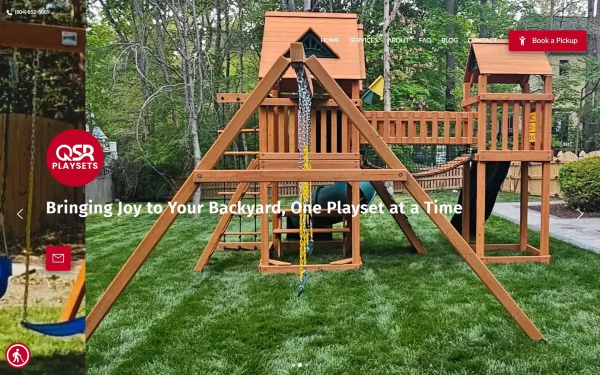
QSR Playsets in Rockville, Virginia heroes a real wooden swing-set in an actual backyard, with a clear “Book a Pickup” CTA. Showing the product in its real-life setting (a family backyard) helps the buyer picture it in their own.
Borrow this: physical-product businesses convert better when the hero shows the product in the customer’s real-life context, not on a white studio background.
15. Mission Accomplished Foundation
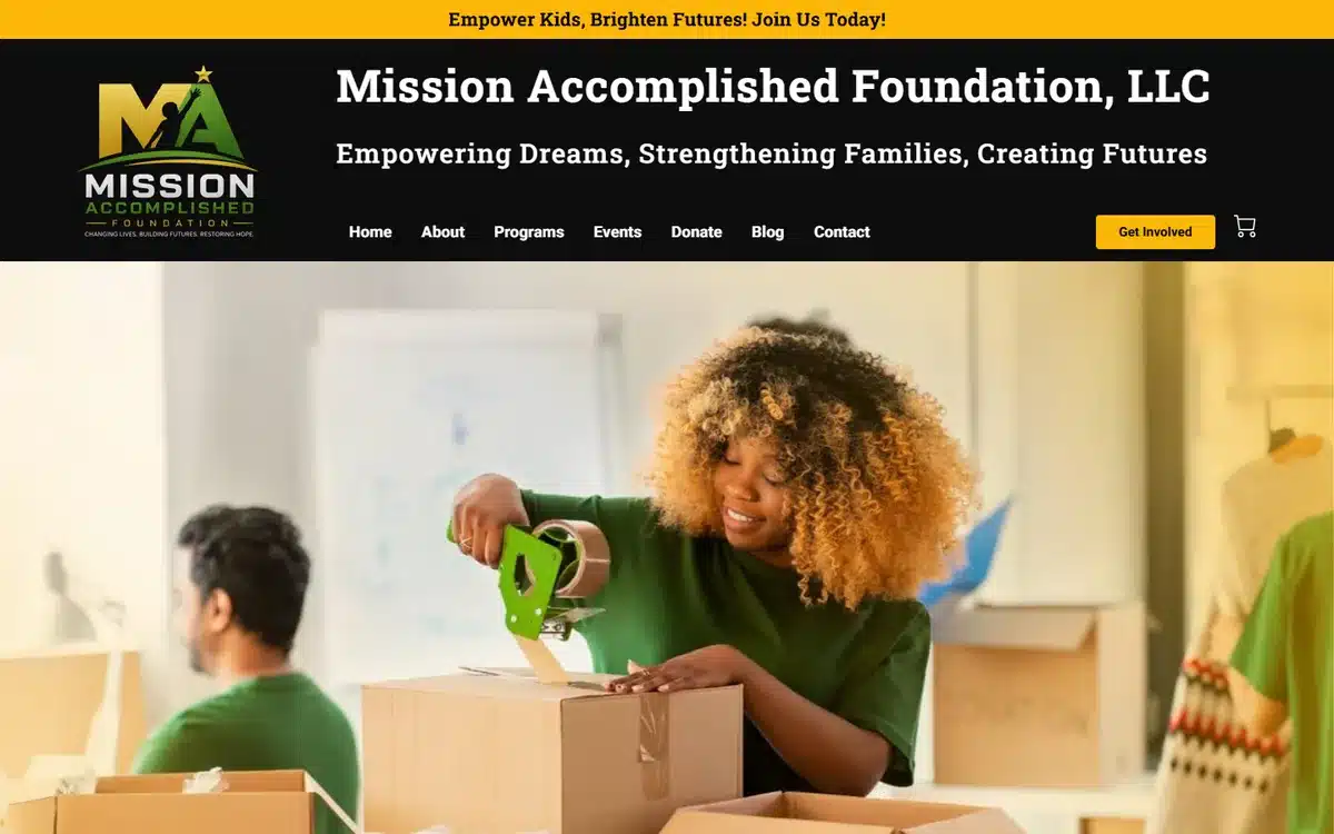
Mission Accomplished Foundation in New York uses a genuine volunteer-packing-boxes photo and a clear “Get Involved” CTA. Nonprofits convert on authenticity, and a real, slightly imperfect photo of actual volunteers beats any polished stock image.
Borrow this: nonprofits should hero real, candid photos of the actual work and people. Authenticity raises more than polish does.
16. 1st Look Sports
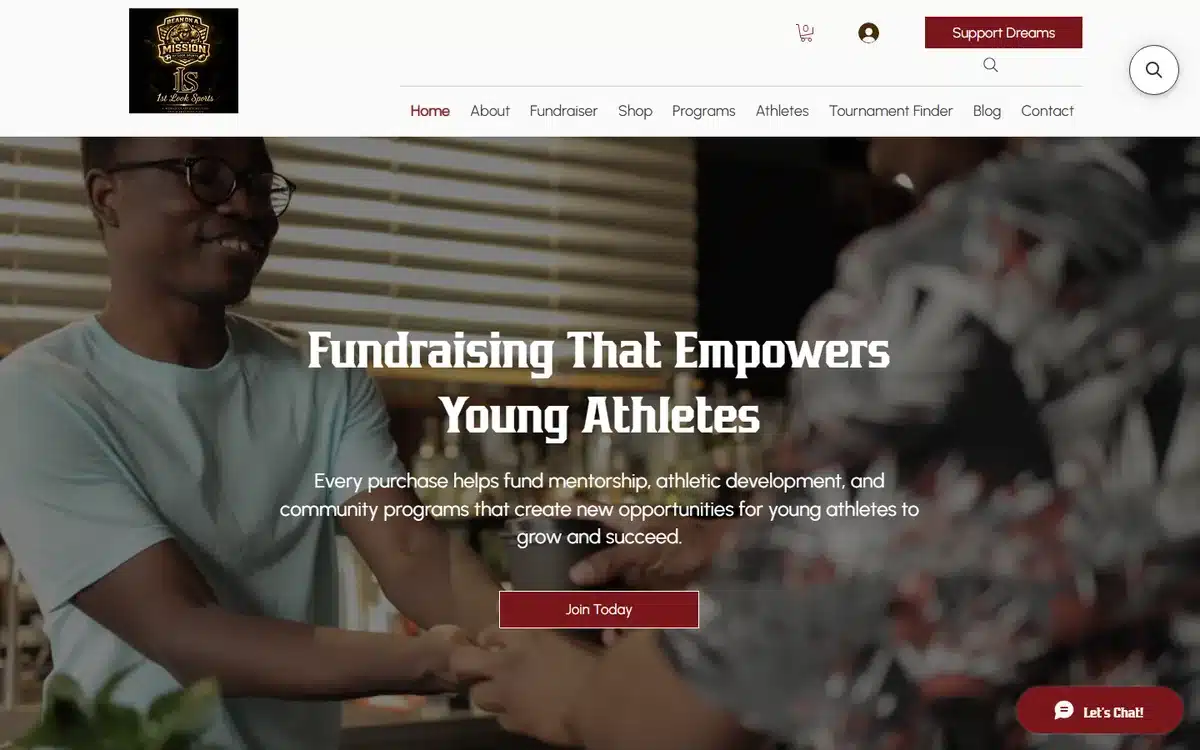
1st Look Sports in Amherst, New York leads with “Fundraising That Empowers Young Athletes” over a warm mentorship photo. The headline names exactly who benefits and how, which is more persuasive than a generic mission statement.
Borrow this: mission-led organisations should name the specific beneficiary and outcome in the headline (“empowers young athletes”), not a vague mission.
17. 30 Compressions
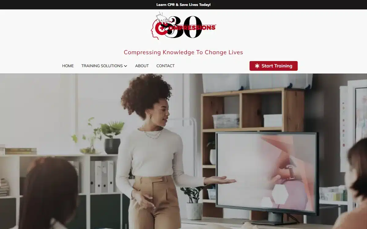
30 Compressions in Houston, Texas pairs a confident instructor hero with a 30-year anniversary badge. For a training and certification business, the tenure badge is a powerful trust shortcut — it tells prospects the credential is established and respected.
Borrow this: training, certification, and consulting businesses should surface tenure or accreditation badges prominently. They’re instant credibility.
18. Stream Team Services
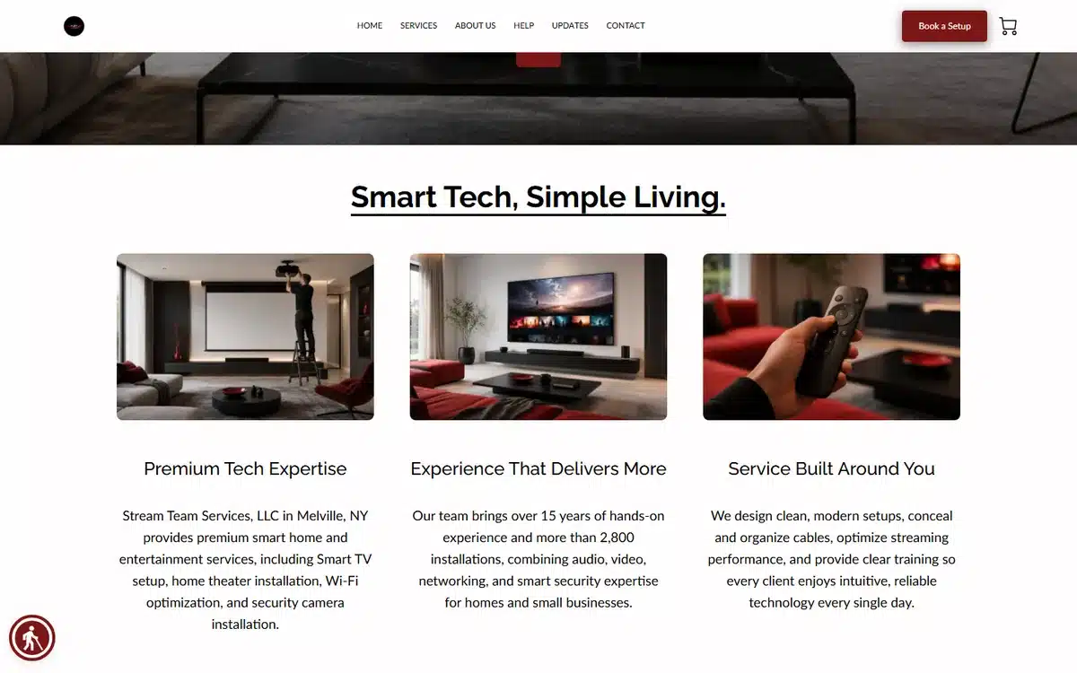
Stream Team Services in Melville, New York uses a dark home-theater hero with “Smart Tech. Simple Living.” and three value-prop cards directly below. The cards do quick work — they answer “what exactly do you install?” without making the visitor scroll or click.
Borrow this: technical-service businesses should put three value-prop cards right under the hero so visitors grasp the offer instantly, no scrolling required.
Frequently asked questions about small business website examples
What should a small business website include?
At minimum: a clear headline saying what you do and for whom, one obvious call-to-action above the fold (book, buy, call, or enquire), real photos of your work/product/team, your services or products, current contact details with click-to-call on mobile, and your location or service area. Everything beyond that (blog, testimonials, about page) is helpful but secondary to those essentials.
How much does a small business website cost?
It ranges from $0 to $10,000+ upfront. A DIY website builder can be free to start but takes your time and often looks it. A done-for-you service that builds the site, sources photography, and sets up your Google Business Profile typically runs a few hundred to ~$1,000 one-time plus hosting. A custom agency build usually starts around $5,000. For most small businesses, a done-for-you platform hits the best balance of speed, cost, and quality.
What makes a small business website look professional?
Three things, none of which require a big budget: real photography instead of stock, one consistent colour palette and logo used everywhere, and a focused layout that gives the visitor one clear next step. The small business website examples above all share those traits despite spanning very different industries and budgets.
Do I need a website if I have social media?
Yes. Social media is rented space — the platform controls reach, can change the rules, or can suspend an account overnight. Your website is the one online asset you fully own. It also ranks in Google search (social profiles rarely do for commercial queries), and it’s where customers expect to find your hours, services, and a way to buy or book.
How do I make a small business website?
Three routes. Build it yourself on a small-business-friendly platform like UENI, Squarespace, or Wix (a weekend or two of work if you have photos ready). Hire a freelancer through Upwork or Fiverr ($300-$3,000, 2-4 weeks, variable quality). Or use a done-for-you service that builds the whole thing — site, photography, Google Business Profile — in a single package, which is usually the fastest route to a result that looks like the examples above.
How do I get my small business website to rank on Google?
Start with a complete Google Business Profile matched to your website’s name, address, and phone — that’s the biggest lever for local businesses. On the site itself, give each service its own page with location-specific wording, collect Google reviews, and make sure the site loads fast on mobile. For the full marketing picture, our guide to small business advertising ideas covers the channels that work alongside SEO.
Next steps
Pick the two or three moves from these small business website examples that fit your business — the hero-image approach, the three-word tagline, the value-prop cards, the tenure badge — and start there. You don’t need every idea; you need the few that match how your customers actually decide.
If you’d rather skip the build entirely, UENI builds a done-for-you small business website in seven days, with Google Business Profile setup, photography, and SEO basics included. Every example in this list was built that way.
Sources
- Live homepages of the 18 UENI customer small businesses linked from each example above, reviewed in May 2026. Each is a real, currently-trading UENI customer; the description is based on direct observation of the homepage at time of review.
Observations in this article (design and functionality patterns across the 18 examples, cost ranges in the FAQ) are based on UENI’s experience building small business websites and direct review of the live sites in May 2026. Presented as typical ranges, not figures attributed to a single external source.