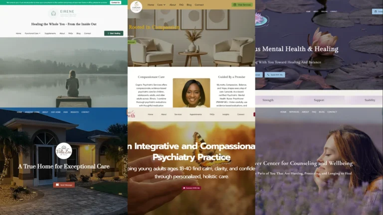
A healthcare website carries an unusual amount of emotional weight. A prospective patient researching mental-health counselling, home care for an aging parent, or an integrative psychiatry practice is rarely in a neutral state when they land on the page. The site either matches their emotional moment and earns the consultation booking, or feels off and loses them in seconds. To show what works, this guide collects 30 healthcare website examples from UENI customer practices across the US, covering mental health, psychiatry, home care, holistic wellness, physiotherapy, and integrative practices. Each is a working clinic or practitioner’s live site, and each shows a specific design choice you can borrow.
Key takeaways
- Strong healthcare website examples lead with calming imagery — nature, soft palettes, real practitioner portraits, or warm caregiver-patient moments. Clinical-sterile aesthetics lose patients to warm-and-modern ones at the same price point.
- The non-negotiable functionality stack for a healthcare site in 2026: a visible “Schedule a Consultation” or “Book Now” button above the fold, click-to-call on mobile, named specialties and conditions treated, insurance acceptance if applicable, and a clear telehealth indicator when offered.
- Each healthcare sub-vertical has a different design tone. Mental-health practices lean calming-and-empathetic; home-care lean warm-caregiver-moment; psychiatry leans clinical-yet-human; holistic leans nature-and-integration. Mixing tones across one site is the most common conversion killer.
- Most prospects arrive at a healthcare site already partway through a difficult decision. The homepage’s job is to lower the emotional barrier to the first call, not to oversell. Practices that match the patient’s emotional state convert higher than practices that don’t.
- Most healthcare prospects find practices via Google search or Google Business Profile. Optimising both — with a specific primary category (Psychiatrist, Mental Health Counsellor, Physiotherapist, Home Care Service, Holistic Medicine Clinic) — usually moves more leads than either does alone. Our Google Business Profile guide covers the profile side.
What makes a good healthcare website?
Before the 30 healthcare website examples, it helps to set the bar. A healthcare site’s job is narrower than most: convert an emotionally-loaded, often-searching-from-stress visitor into a booked first consultation. Two things matter most: the design and the functionality.
The design
The design is the emotional-state filter. Patients arriving from a “therapist near me” or “home care services” search are not in a neutral mood, and the website’s tone has to meet them where they are. The strongest healthcare website examples share three traits. The hero image is calming — nature, soft natural light, real practitioner portrait, or warm patient-caregiver moment — never sterile stock photography of stethoscopes on white backgrounds. The colour palette is soft and grounded — soft teals, sage greens, warm earth tones, navy with cream — never aggressive reds or sharp clinical blues. And the typography mixes a friendly humanist sans-serif with a refined serif so the site reads as warm and credible at once.
The functionality
Functionality is what turns the emotional moment into a booked consultation. Healthcare websites that perform usually nail four things. A prominent “Schedule a Consultation”, “Book Now”, or “Get Started” button sits above the fold on desktop and as a sticky element on mobile. Phone numbers are tap-to-call on phones. The conditions treated, services offered, and insurance acceptance are surfaced near the hero — patients evaluating a therapist or psychiatrist usually filter on these three before scheduling. And the telehealth option (when offered) is visible without scrolling, because remote sessions are now the default ask in mental health and psychiatry. The single most common failure pattern we see is healthcare sites that look elegant but bury the conditions-treated information three clicks deep.
30 best healthcare website examples (2026)
Every example below is a real UENI customer’s live site, captured in May 2026. They cover mental health counselling, psychiatry, home care and nursing services, holistic wellness, physiotherapy, and integrative practices across the US, on purpose: a good healthcare website example for a mental-health practice looks nothing like one for a home-care agency, and the variety is the point.
1. Eirene Integrative Wellness
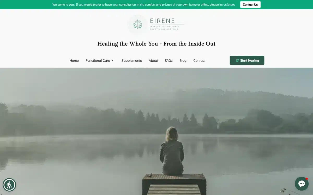
Eirene Integrative Wellness in the Greater Triangle area of North Carolina opens with a calming foggy lake photograph and the tagline “Healing the Whole You — From the Inside Out”. The hero communicates the integrative-functional-medicine positioning before any prospect reads a word: stillness, depth, whole-person focus.
Borrow this: integrative practices should lead with imagery that signals stillness and depth — water, mist, dawn light. The patient is looking for an antidote to conventional medicine’s clinical aesthetic.
2. Lotus Mental Health & Healing
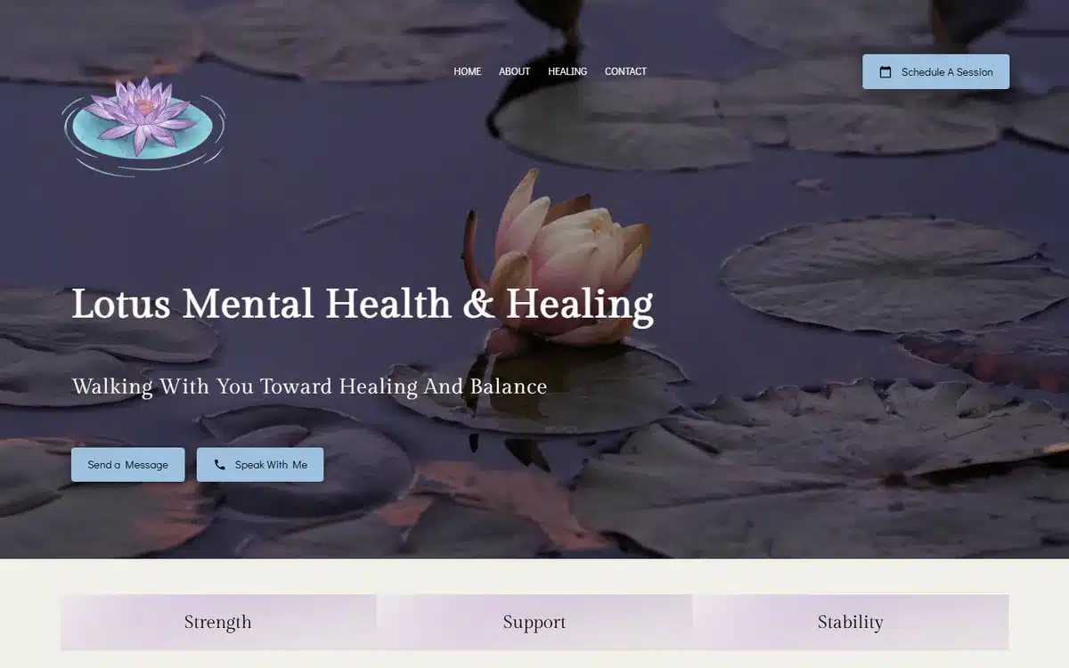
Lotus Mental Health & Healing in Lancaster, California pairs a serene lotus-on-water hero with elegant serif typography. The lotus metaphor is overused in wellness, but executed with this much restraint — a single bloom, no decorative clutter — it lands.
Borrow this: visual metaphors work in mental health when they’re singular and quiet. One symbol photographed beautifully outperforms three symbols stacked together.
3. Cognis Psychiatric Services
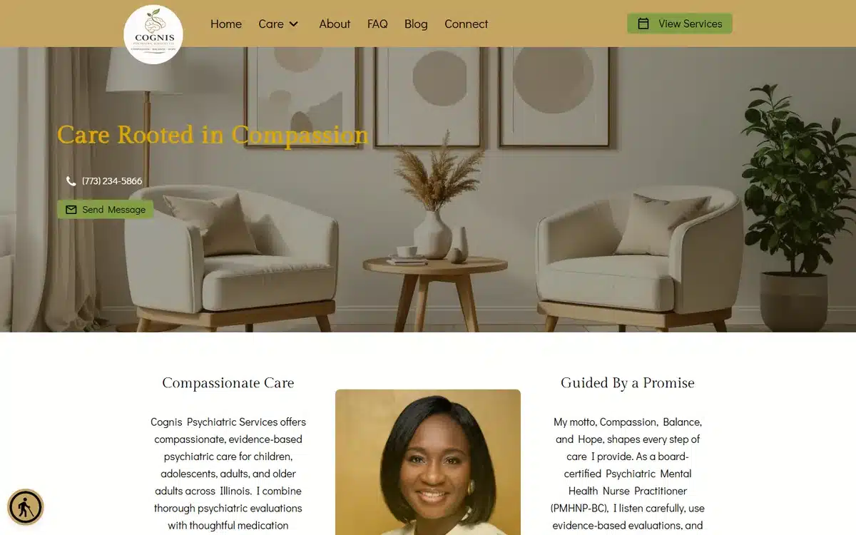
Cognis Psychiatric Services uses a refined waiting-room interior with a muted-gold palette and the headline “Rooted in Compassion”. The premium aesthetic is intentional — psychiatry practices charging above category average need to look closer to a wellness retreat than to a county-clinic.
Borrow this: if you charge premium for psychiatry or psychotherapy, the visual codes should match — refined interior photography, restrained palette, no clinical-stock imagery.
4. Wildflower Center
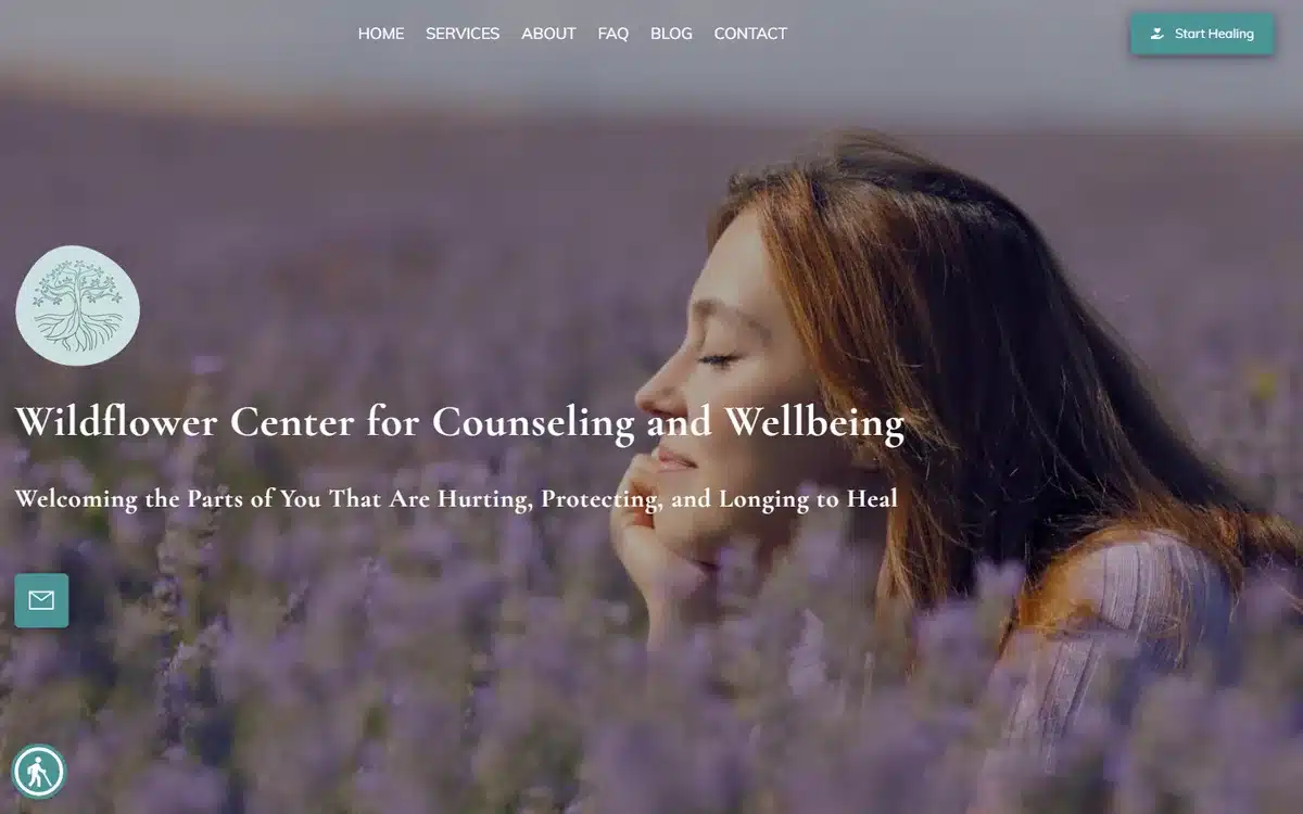
Wildflower Center in Asheville, North Carolina opens with a woman in a lavender field and the tagline “Discover the Parts of You That Are Hurting, Protecting, and Longing to Heal”. The copy is unusually specific for a counselling site — and that specificity is exactly what differentiates a Wildflower from the dozens of generic counsellor sites around it.
Borrow this: in saturated mental-health markets, naming the specific internal experience your therapy addresses (“hurting”, “protecting”, “longing to heal”) outperforms broad value props (“we help you feel better”).
5. Ground & Growth Integrative Psychiatry
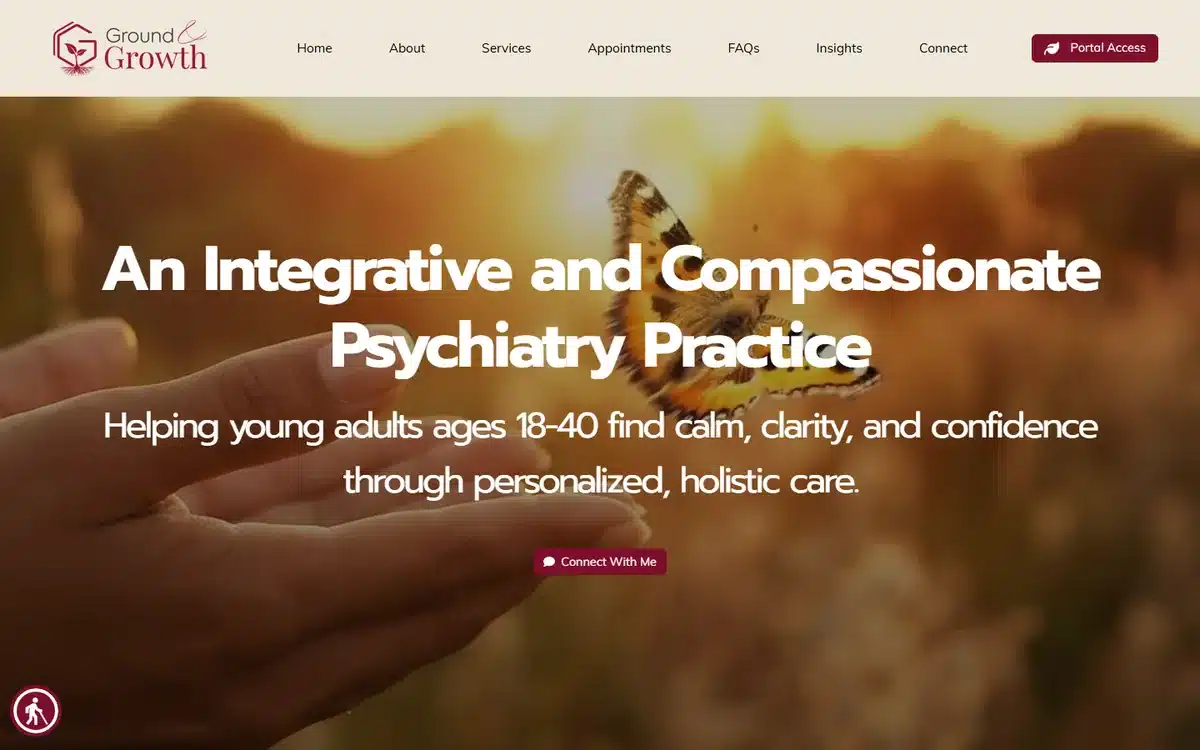
Ground & Growth Integrative Psychiatry in Boston uses a warm sunset butterfly hero with the tagline targeting young adults 18-40. The butterfly is a more literal “transformation” symbol than is fashionable, but it works because the target demographic and the copy specificity carry it.
Borrow this: practices targeting a specific age range should name it in the hero copy. “Ages 18-40” or “Adults 55+” or “Adolescents 14-18” filters in the right patients and out the wrong ones immediately.
6. Seasons Reproductive Psychiatry
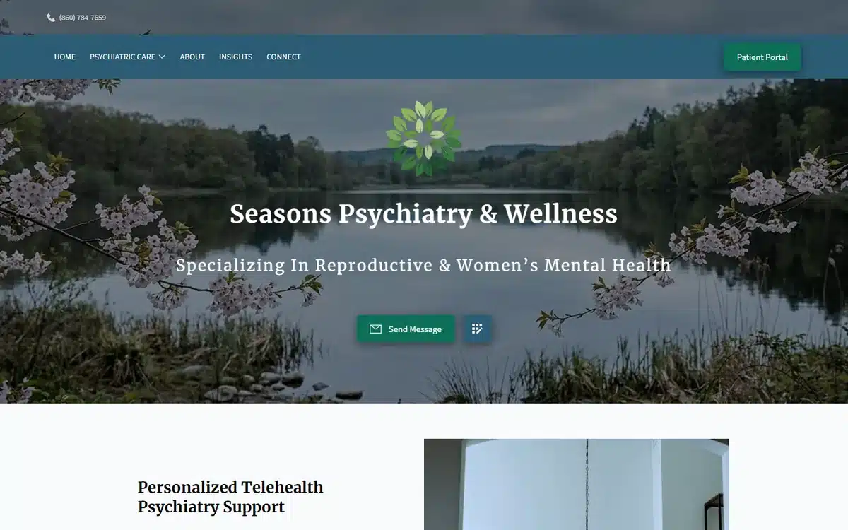
Seasons Reproductive Psychiatry in Connecticut uses cherry-blossom lakeside imagery for a reproductive-and-perinatal-psychiatry niche. The image is gentle and specific to the patient population (women navigating fertility, pregnancy, postpartum, and menopause). A generic clinical hero would have signalled “we’ll see anyone with anything”; this one signals “this specific season of your life is what we do”.
Borrow this: niche psychiatry and therapy practices should hero imagery specific to the patient population’s life stage, not to mental health generally.
7. Villa Lea at Viera
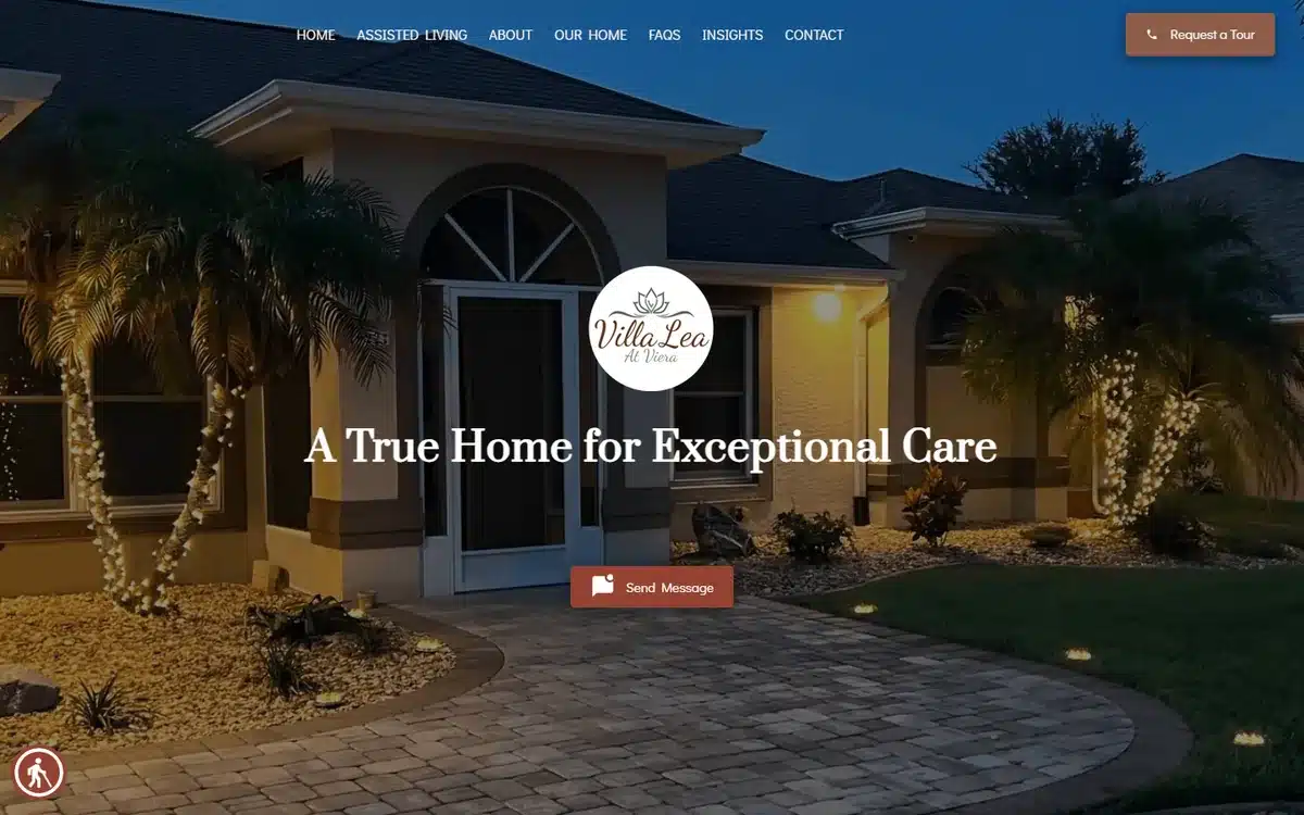
Villa Lea at Viera in Melbourne, Florida heroes a beautifully-lit residential-home exterior at twilight with the tagline “A True Home for Exceptional Care”. Senior-living and assisted-living facilities should never look like a nursing home; they should look like a home that happens to have care included. This image executes that perfectly.
Borrow this: assisted-living and senior-care websites should hero the residential exterior or interior, not staff in scrubs. Families are buying the feeling of “this is where mom would live”, not “this is where mom would be looked after”.
8. Sankofa Institute for Wellness
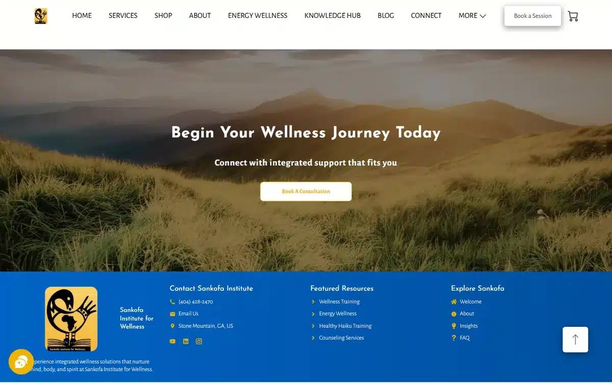
Sankofa Institute for Wellness in Decatur, Georgia opens with an expansive dune landscape and integrated-care positioning. The hero pulls double duty: the landscape signals breadth (mind, body, community) and the brand mark anchors the practice’s cultural focus.
Borrow this: integrative and community-rooted practices benefit from heroing landscape over portrait. Landscape implies “we treat the whole context”; portrait implies “we treat one person at a time”.
9. The Regulation Station
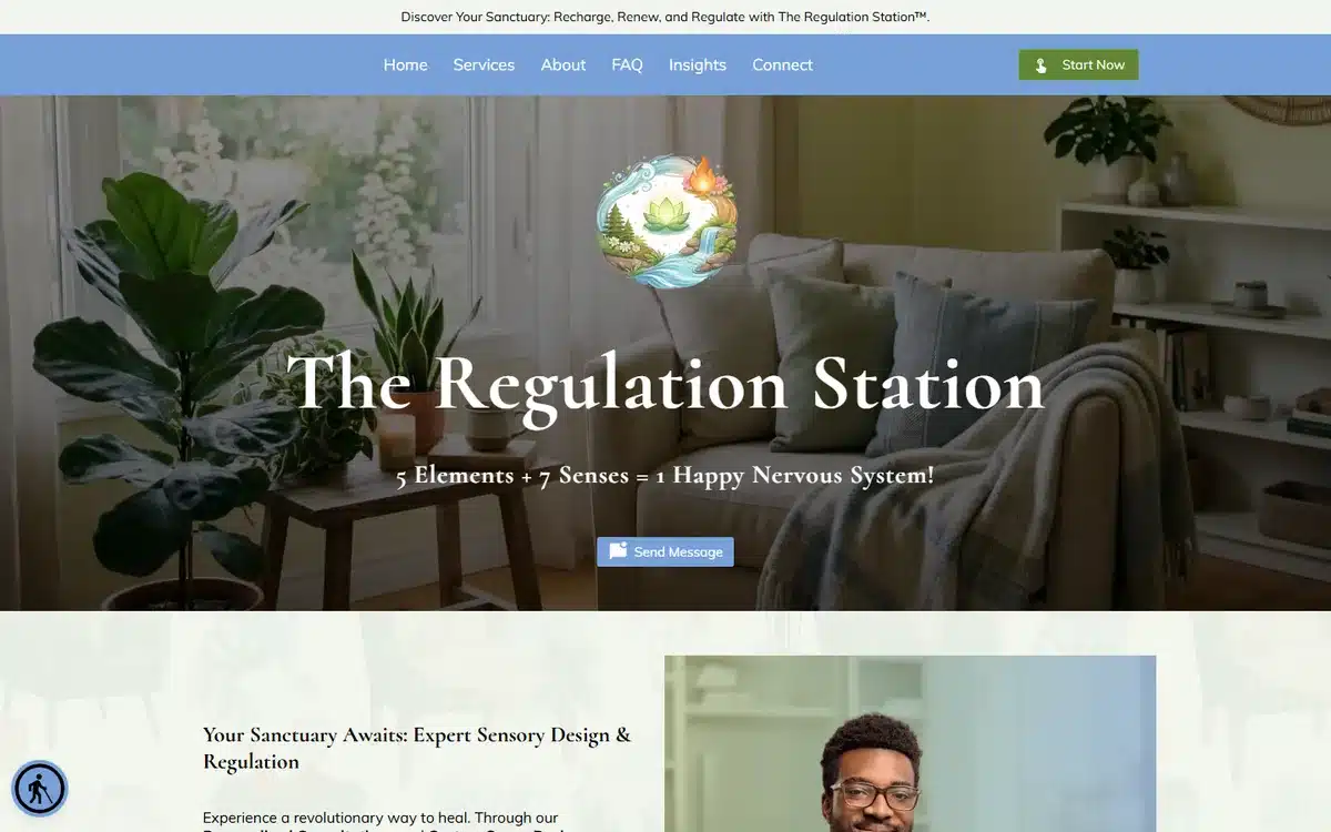
The Regulation Station in Manchester, New Hampshire uses a plant-filled biophilic-design office interior. The niche — sensory regulation and nervous-system support — is highly specific, and the interior photography signals the kind of room a sensory-sensitive patient would feel safe entering.
Borrow this: practices serving sensory-sensitive populations (autism, ADHD, anxiety, trauma) should photograph the actual treatment space. The room itself is a credibility marker for the patient population.
10. Anointed Behavioral Health
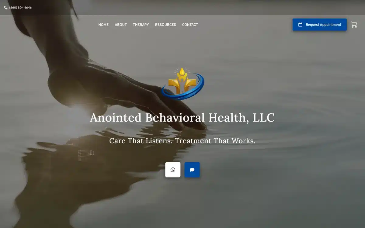
Anointed Behavioral Health in Avon, Connecticut uses calming gold-on-blue water imagery. The visual tone is religious-adjacent (“anointed”) without being explicit, which lets the site speak to faith-aligned patients without alienating secular ones.
Borrow this: faith-rooted practices should signal the values through visual tone, not explicit copy. Imagery does the work; explicit theology can narrow the patient pool faster than intended.
11. Mind Matters NP
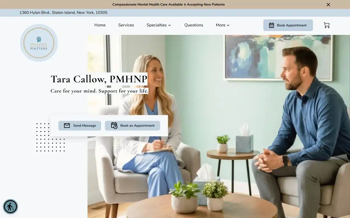
Mind Matters NP in Staten Island uses an authentic therapy-session photo and prominently surfaces the PMHNP credential. For nurse-practitioner-led practices, the credential acronym does heavy work — patients shopping for psychiatric care often filter explicitly on prescriber type.
Borrow this: NP, PA, LCSW, and other practitioner credentials matter to mental-health patients. Surface the credential acronym above the fold, not in a “Meet the Team” page three clicks down.
12. Luxury Life Counseling
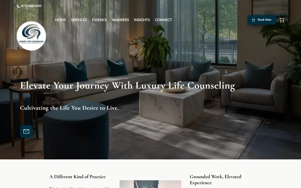
Luxury Life Counseling in Atlanta uses upscale interior photography and sophisticated typography. The name and the visuals are both unapologetically premium — exactly right for a practice charging above-average rates and not accepting most insurance plans.
Borrow this: cash-pay premium counselling practices should commit to the price-tier signal at every layer. Half-premium positioning attracts neither premium-pay clients nor insurance-shoppers.
13. Breathewell Psychiatry & Wellness
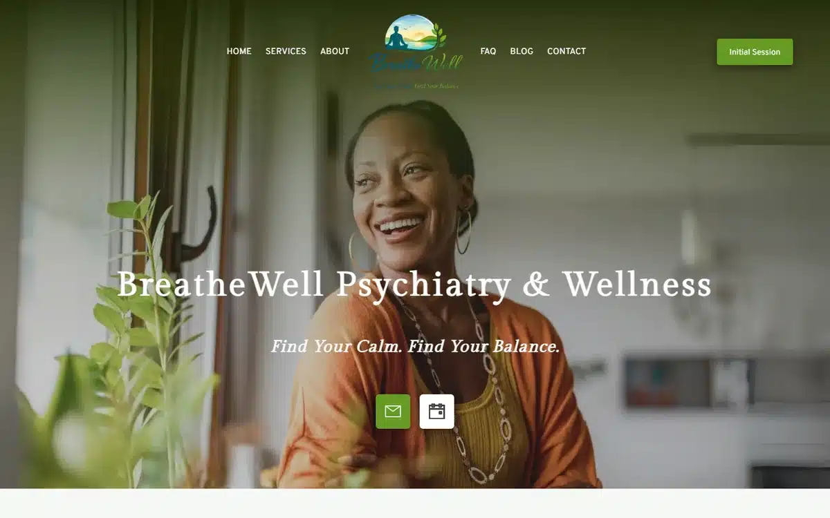
Breathewell Psychiatry & Wellness in Pennsylvania uses an approachable hero portrait with a warm palette. The site reads as “this practitioner is kind”, which for psychiatry is often the highest-converting first signal.
Borrow this: psychiatry practices should hero a real practitioner photo. Patients are evaluating whether they could speak honestly to this specific person; faceless practices lose to face-forward ones.
14. Epiphany Mindworks
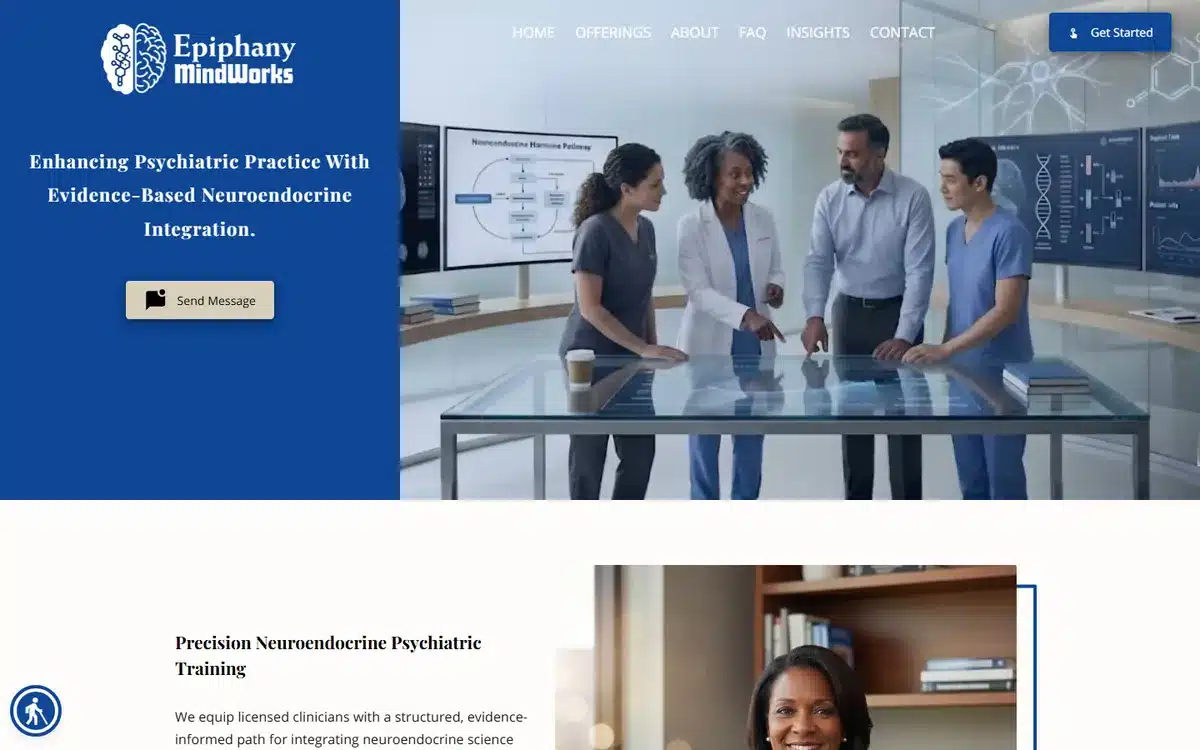
Epiphany Mindworks in Louisville, Kentucky heroes a clinical team photo with explicit evidence-based positioning. For patients who want the clinical rigour signal (often patients who’ve tried softer approaches first), the team photo + the methodology label do the work.
Borrow this: when your differentiator is clinical rigour or evidence-based methodology, name it explicitly. “Evidence-based” is a filter many patients are explicitly searching on.
15. Gentle Path Home Care
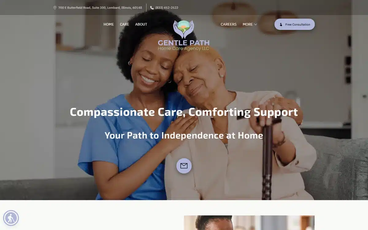
Gentle Path Home Care in Lombard, Illinois opens with a compassionate caregiver moment — heartfelt and intentional, no stock-photo polish. Home care websites sell to adult children making decisions for their parents, and the caregiver hero answers the buyer’s main question: “would I trust this person with my mother?”
Borrow this: home care heroes should answer the adult-child buyer’s trust question. The caregiver in the photo should look like someone you’d trust with your own parent.
16. Graceful Caregiving LLP
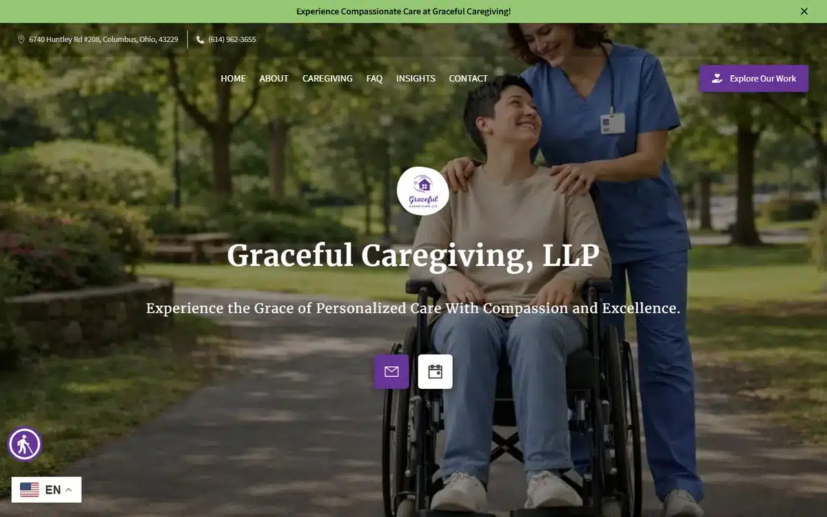
Graceful Caregiving in Columbus, Ohio uses an outdoor wheelchair-caregiving scene, which is unusual for the category — most home care sites stay indoors. The outdoor shot signals “life beyond the four walls”, which is a powerful counter to the “warehouse mom away” anxiety adult children carry into the decision.
Borrow this: home care websites can differentiate by showing care happening outdoors — walks, gardens, day trips. Indoor-only photography signals confinement; outdoor photography signals quality of life.
17. Accucare Home Health
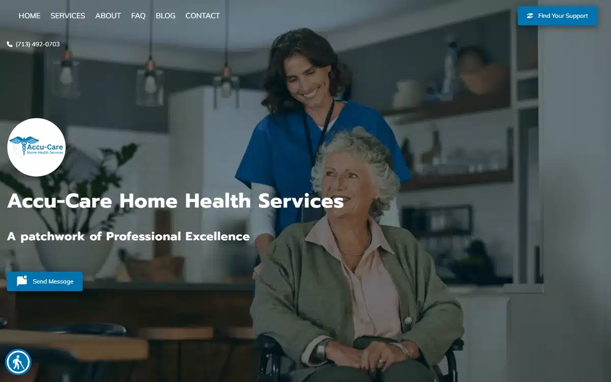
Accucare Home Health in Houston uses warm caregiver imagery anchored in real moments. The site doesn’t try to look corporate — and that’s correct positioning for home care, where corporate-feeling brands often lose to family-feeling ones.
Borrow this: home care is a family-feel category. Corporate-looking brand systems work against you here. Lean into warmth, not polish.
18. Premium Senior Services
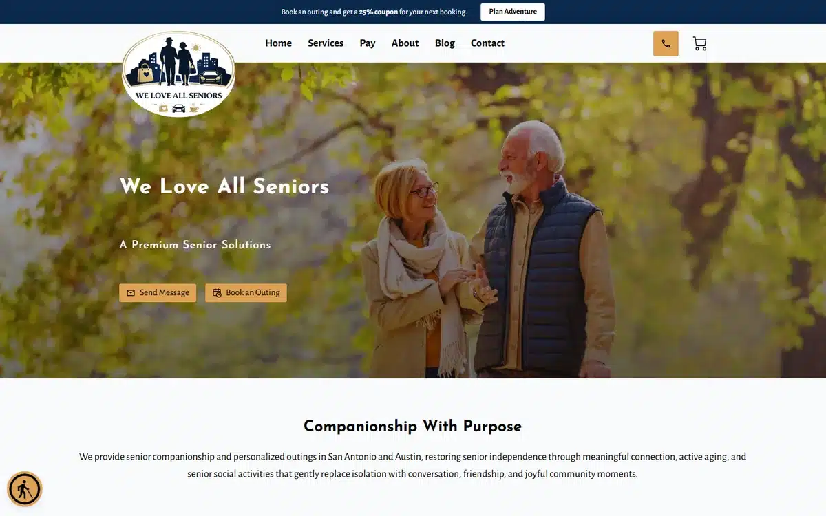
Premium Senior Services in San Antonio uses tender senior-couple autumn photography. The “two people who love each other ageing together” framing converts strongly with adult-child buyers — it’s the outcome they’re trying to preserve.
Borrow this: senior-care heroes should occasionally show two seniors together, not a senior alone. Coupled imagery preserves the dignity and identity the family is buying.
19. Empower Home Care Agency
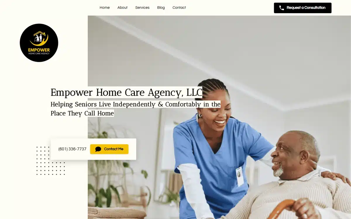
Empower Home Care Agency in Hattiesburg, Mississippi heroes a genuine caregiver moment — authentic posture, real lighting, no stock-photo gloss. For small-town home care, authenticity beats production value every time.
Borrow this: small-town home care can win on real photography taken locally. A staff member at your actual office is a stronger trust signal than a polished stock photo.
20. Seeding Hope Home Healthcare
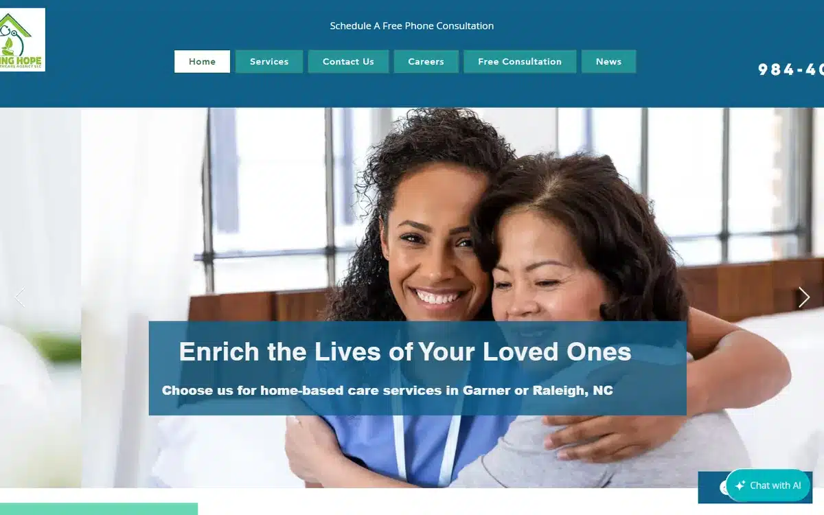
Seeding Hope Home Healthcare in Garner, North Carolina pairs a joyful caregiver-patient hug with a free-consultation CTA. The hug is more intimate than most home-care heroes — and that intimacy is exactly the trust signal that converts “researching options” into “booking the visit”.
Borrow this: when an embrace in the hero is authentic (real caregiver, real patient, not models), it outperforms any polished alternative. Intimacy reads as care.
21. Stewardship Healing Collective
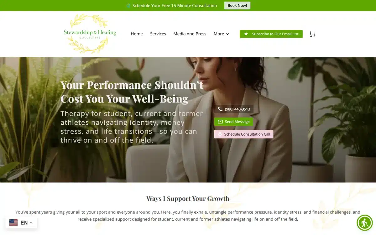
Stewardship Healing Collective in Charlotte, North Carolina specialises in student-athlete therapy. The hero and copy commit fully to the niche — not generic counselling, not even sports counselling, specifically student-athletes. Niche specificity is the strongest counselling-website differentiator.
Borrow this: counselling practices win on niche specificity, not on breadth. “Therapy for student-athletes” or “therapy for clinicians” outperforms “therapy for adults” every time.
22. Finding Her — Hey Girl, Let’s Talk
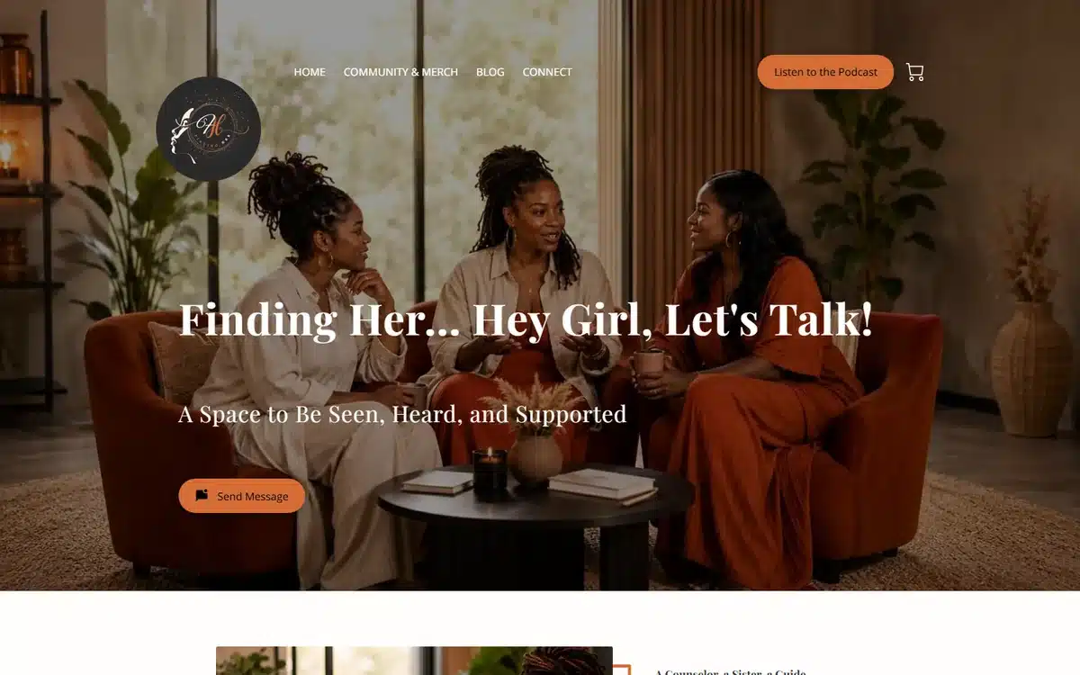
Finding Her — Hey Girl, Let’s Talk in Georgia uses culturally-specific community-circle imagery. The brand name and the visuals both speak directly to Black women — a patient population systematically underserved by mainstream mental-health marketing. Speaking directly to them in their visual and verbal language is the entire pitch.
Borrow this: serving an underserved patient population well means speaking their visual and verbal language unapologetically. Generic-friendly brand systems fail those communities precisely by being generic.
23. Healing Hub Therapy
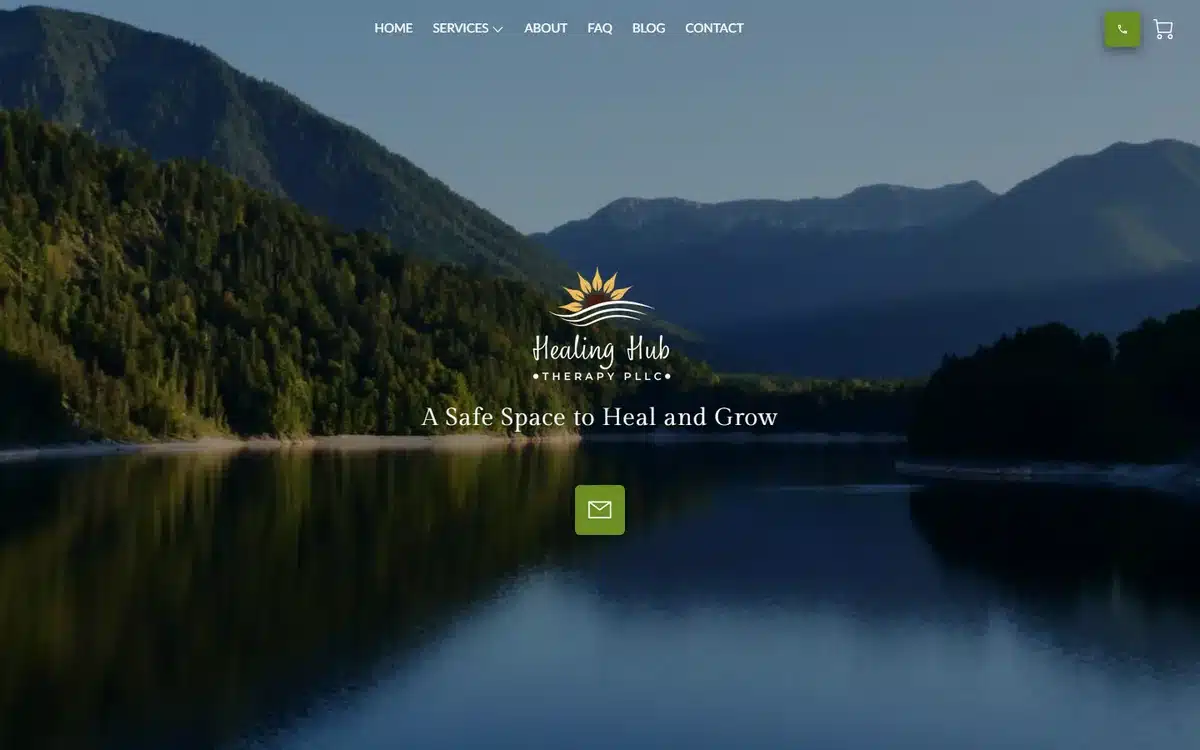
Healing Hub Therapy in Puyallup, Washington uses a tranquil mirror-lake aesthetic. The reflective composition is a quiet metaphor for therapy itself — and the quietness is what differentiates it from the noisy hero-photo norm.
Borrow this: therapy practices can win by lowering the visual volume rather than raising it. A quiet, slow-feeling hero often converts higher than a colourful saturated one.
24. Natural Springs Counseling
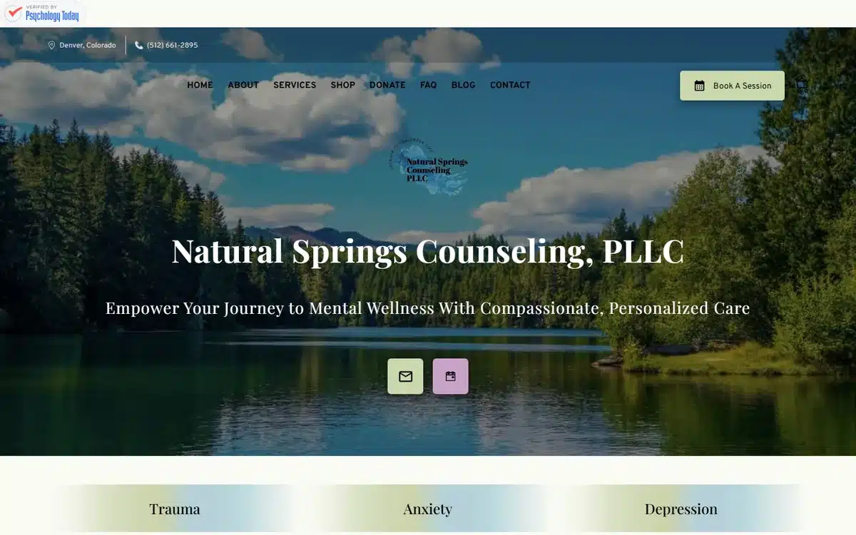
Natural Springs Counseling in Denver uses a pristine lake-and-mountains backdrop. For practices in mountain-west or PNW markets, leaning into the regional landscape is a strong local-relevance signal — both for prospects and for Google’s local-ranking algorithm.
Borrow this: regional landscape imagery is a Google trust signal as well as a brand one. Mountain practices look mountain; coastal practices look coastal. Don’t generic-stock past the geographic specificity.
25. Jonnie May Cares
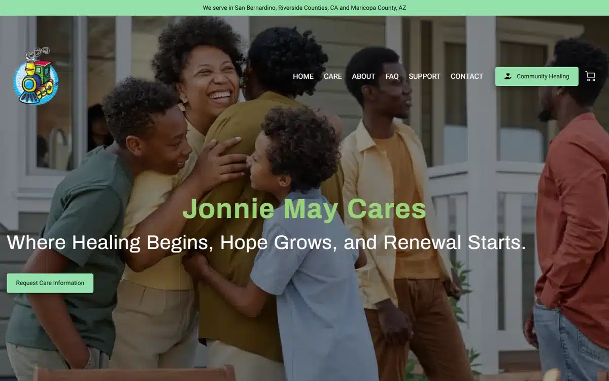
Jonnie May Cares uses warm family-embrace photography and an inviting headline. The brand is personality-led — named after a specific person — which works particularly well for solo-practitioner mental-health and family-services practices.
Borrow this: solo-practitioner healthcare practices should consider personality-led brand names. “Jonnie May Cares” reads warmer than “ABC Counseling Services” and converts accordingly.
26. The Institute for Athletic Performance
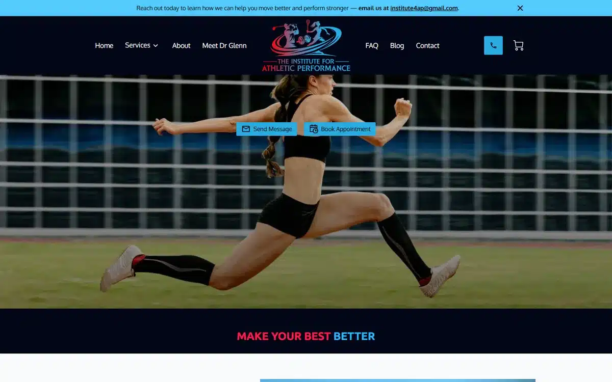
The Institute for Athletic Performance in West Palm Beach uses a dynamic mid-leap athlete hero. For sports-medicine and performance-focused physiotherapy practices, motion in the hero is the entire pitch — patients are buying the ability to keep moving.
Borrow this: sports-medicine and athletic-performance heroes should show motion, not static posture. The patient is buying movement; sell movement.
27. Palmetto Restorative Therapy
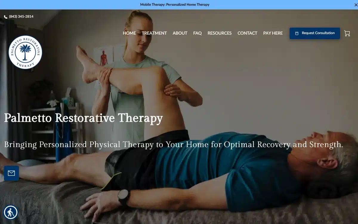
Palmetto Restorative Therapy in Wando, South Carolina uses a real in-home PT session photo. For mobile and in-home physical therapy, the in-home setting IS the differentiator — and a homepage photo taken in an actual patient’s home converts much better than a clinic-floor stock shot.
Borrow this: mobile and in-home healthcare services should photograph the service happening in someone’s home. The setting is the product.
28. Blossom Metabolic Health
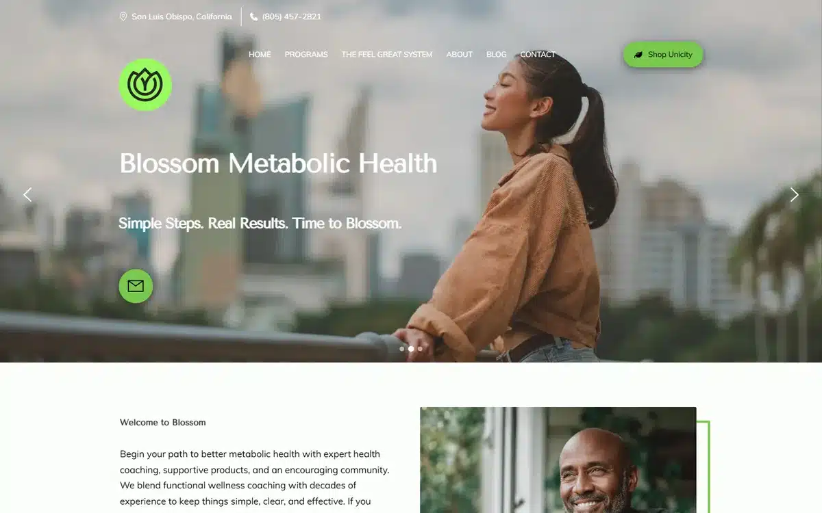
Blossom Metabolic Health in San Luis Obispo, California pairs a bright joyful wellness hero with metabolic-health positioning. Metabolic and longevity practices walk a tight rope between medical credibility and lifestyle warmth; this site lands on the warm side without losing the credibility cue.
Borrow this: longevity, metabolic, and functional-medicine practices should lean lifestyle-warm in imagery and medical-rigorous in copy. The combination outperforms either pure approach.
29. Horizon Behavioral Health
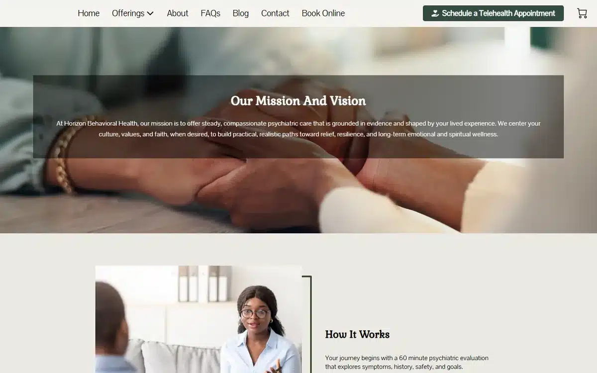
Horizon Behavioral Health in Windsor, Connecticut features a prominent telehealth-appointment CTA above the fold. For mental-health and psychiatry practices with telehealth as a primary delivery model, surfacing it in the hero is the highest-ROI design move available.
Borrow this: if telehealth is a real offering, name it in the hero. Don’t bury it in a “Services” page. Telehealth-shopping patients filter on visibility, not deep navigation.
30. Tranquil Living Care
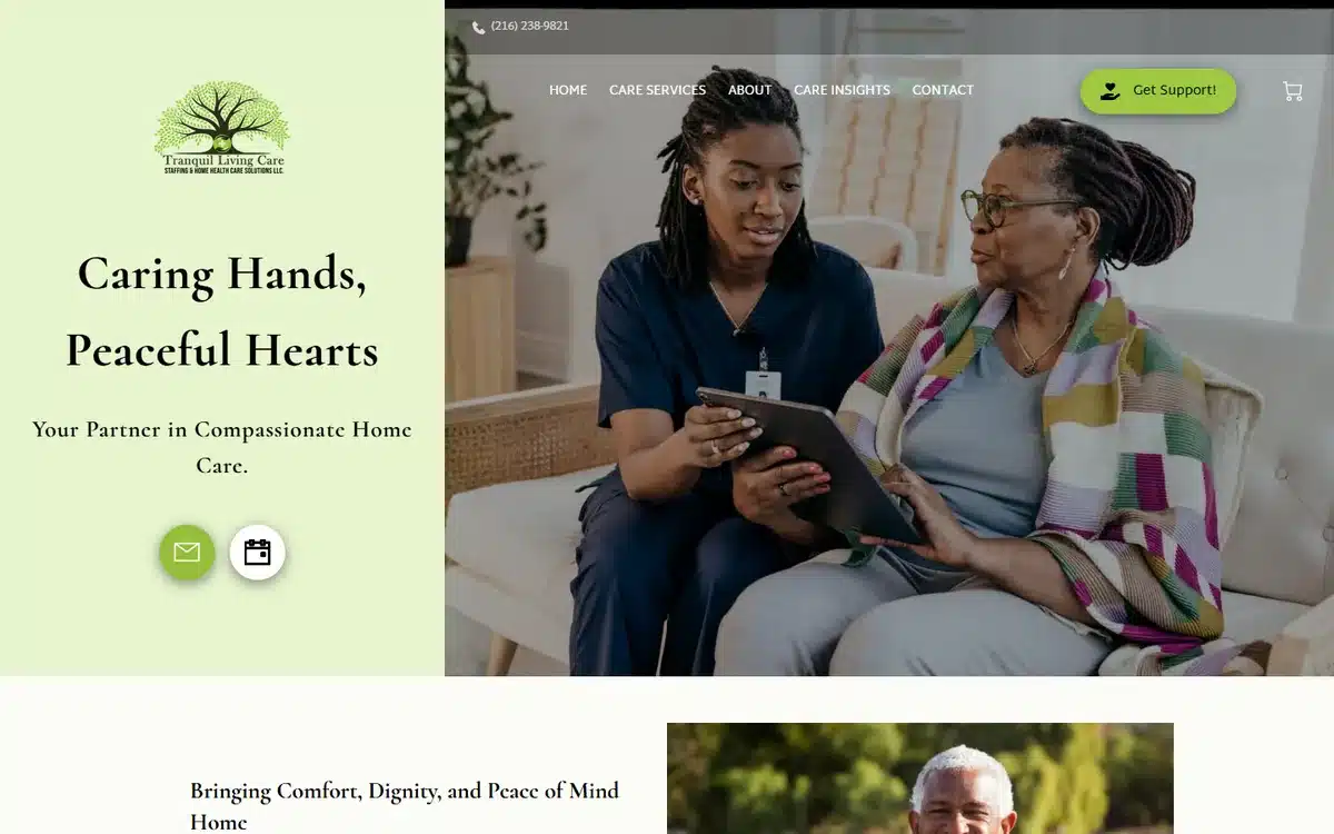
Tranquil Living Care in Cleveland closes the list with an authentic nurse-reading-with-patient moment. The shared activity — reading, gardening, watching, listening — is what families want to know is part of the daily care, not just clinical tasks.
Borrow this: senior and end-of-life care heroes should show shared moments, not procedural tasks. Adult children buy companionship as much as care.
Frequently asked questions about healthcare website examples and design
Below are the six questions we hear most from operators researching healthcare website examples before commissioning a build of their own.
How much does a healthcare website cost?
A professionally built healthcare website typically lands somewhere between $0 and $10,000 upfront. Done-for-you builds with practitioner photography, service pages, and Google Business Profile setup typically range from $500 to $2,500 one-time, plus hosting. Healthcare-agency builds with HIPAA-compliant intake forms, telehealth integration, and ongoing content usually start around $5,000 and run higher.
What features should a healthcare website have in 2026?
The non-negotiables: a visible “Schedule a Consultation” button above the fold, click-to-call on mobile, named conditions treated and services offered, insurance acceptance and self-pay rates if applicable, telehealth indicator when offered, and an SSL certificate (HIPAA compliance also requires a Business Associate Agreement with any tool handling protected health information). The highest-ROI additions are Google review ratings near the hero, practitioner bios with credentials, and a secure intake form.
Do healthcare practices need a website?
Yes. Most prospective patients research a healthcare practice online before contacting it, evaluating the practitioner’s specialty, experience, conditions treated, and insurance acceptance. A sparse or amateur site loses patients to better-presented competitors at the moment of comparison. This is especially true in mental-health and psychiatry, where the patient is filtering on practitioner fit before scheduling.
How do I make a website for my healthcare practice?
Three realistic routes. Build it yourself with a healthcare-friendly website builder like UENI, Squarespace, or Wix (typically 10 to 30 hours, and reasonable if you have practitioner photos to start with). Hire a freelancer through Upwork or a healthcare-specialised local agency (typically $1,000 to $4,000 and 3 to 6 weeks). Or use a done-for-you healthcare-website service that builds the site, organises practitioner photography, and configures Google Business Profile in a single package — usually the fastest route to a professional result.
What’s the best platform for healthcare websites?
There’s no single best answer, but the practical filter is HIPAA. If your site handles any protected health information — even a contact form with a “what brings you in today?” field — the platform and any third-party tools must support a HIPAA Business Associate Agreement. Healthcare-specific platforms (Brighter Vision, TherapySites, PatientPop) include HIPAA-compliant intake forms natively. General-purpose builders need a separate HIPAA-compliant form provider (Jotform HIPAA tier, Hushmail forms) layered on top.
How do healthcare websites rank on Google?
Three factors carry most of the weight. Specific service or condition pages with city or neighbourhood in the URL (“/anxiety-therapist-denver/”, “/home-care-services-houston/”) outrank generic homepage content on commercial queries. A complete Google Business Profile with the most specific category (Mental Health Counsellor, Psychiatrist, Home Care Service, Physiotherapist) signals legitimacy. And reviews on Google plus healthcare-vertical directories (Psychology Today, Zocdoc, Healthgrades) feed the prominence signal Google uses for local rankings. Long-form practitioner bios with conditions treated and treatment modalities help more than most practices realise.
Next steps
If these healthcare website examples have given you ideas, pick the two or three trust-and-warmth moves that fit your practice. The best healthcare website examples in this list all share one pattern: they over-invest in real practitioner photography and warm patient imagery and under-invest in clinical-rigour copy. Reversing the conventional ratio is the highest-ROI design change available.
If you’d rather skip the build and have a professional healthcare website delivered for you, UENI builds a done-for-you small business website in seven days, complete with Google Business Profile setup, service-page templates, and SEO basics included.
For the marketing side of small-practice growth once the site is live, our guide to small business advertising ideas walks through 12 channels that work for healthcare practices and other local businesses.
Sources
- Live homepages of the 30 UENI customer healthcare practices linked from each example above, reviewed in May 2026. Each practice is a real, currently-trading UENI customer; the description is based on direct observation of the homepage at time of review.
Observations in this article (design patterns, cost ranges, typical timelines, ranking-factor weightings, HIPAA considerations) are based on UENI’s experience supporting healthcare website builds and direct review of the live sites in May 2026. Presented as typical ranges, not figures attributed to a single external source. HIPAA compliance specifics should be reviewed with qualified counsel before launch.