Come aboard as we embark on a culinary voyage into the digital realm of restaurant websites and design examples. Restaurant sites aren’t just static online pages; they’re dynamic digital spaces where culinary artistry intertwines with modern technology and creative design.
Good restaurant websites aren’t just about showcasing a menu; they’re about conveying your brand story, enhancing customer convenience, and enticing the senses even before a single dish is tasted. They’re about setting the stage for an unforgettable culinary journey.
Through this blogpost, we offer you a glimpse into the world of restaurant websites, demonstrating the best practices, design trends, and 20 awe-inspiring examples from 2023. We strive to highlight the essential elements of effective restaurant websites, and show you how you can craft a top-tier website with our team’s assistance.
So grab a seat, prepare your palate, and let’s dive into the delectable world of restaurant websites.
Table of Contents
Trending Restaurant Website Design Elements
As we navigate the vivacious landscape of restaurant website design, we can’t help but marvel at the blend of creativity and functionality at play. Here, digital architecture meets culinary imagination to orchestrate an unforgettable dining experience in the online world. And as we see the embodiment of these elements on the best restaurant websites, we’re compelled to acknowledge the powerful interplay of design, technology, and gastronomy that forms the backbone of these platforms.
Let’s immerse ourselves in the trending restaurant website design elements, which not only enchant visitors but also effectively communicate the essence of the dining establishment they represent.
Minimalistic and Clean Layouts
As we enter the era of minimalism, we find that less indeed tends to be more. Clean layouts and streamlined designs take center stage in the world of restaurant websites. There’s something incredibly appealing about the interplay of simplicity and elegance on the best restaurant websites of 2023.
Through muted color palettes, sleek navigation, and succinct calls to action, these websites exude a sense of clarity and order. They weave an inviting digital atmosphere that diners can’t resist, rendering a dining experience that is as pleasing to the eyes as it is to the palate.
Mobile-Responsive and User-Friendly Designs
In a world where smartphones have become our pocket-sized portals to the digital world, restaurant websites must rise to the occasion. The coolest restaurant websites are ones that seamlessly adapt to the small screens, providing a mobile dining experience par excellence.
These sites offer interactive, easy-to-navigate designs that make the online ordering process as simple as a few taps on the screen. With mobile-responsive designs, they bring the joy of food exploration right to the palm of your hand, transforming smartphones into gourmet food courts.
High-Quality Visuals and Food Photography
One cannot discuss restaurant websites without acknowledging the reign of visuals. A perfectly captured image of a delicious dish is a powerful weapon in a restaurant’s arsenal. High-quality food photography, with its ability to entice and engage, becomes the soul of good restaurant websites.
A captivating image of your signature dish can evoke taste, aroma, and texture, making taste buds tingle even miles away. In the realm of restaurant websites, a picture indeed speaks a thousand words – or perhaps a thousand flavors.
Creative Typography and Font Choices
Just as every dish tells a story, so does the typography on your website. The choice of fonts can add layers of personality to your restaurant’s digital presence, reflecting its ethos and style. Creative typography is not merely an embellishment but a powerful tool that great restaurant websites use to stand out.
Whether it’s a flamboyant script echoing the sophistication of a high-end bistro or a rugged letterpress reflecting the rustic charm of a downtown burger joint, typography and fonts play a pivotal role in conveying your brand’s story.
As we wrap up our exploration of these key design elements, let’s turn our attention to some shining examples. We’ll see how these design ingredients blend harmoniously to create some of the most awesome restaurant websites of 2023. Stay tuned, the visual feast is about to begin!
20 Awesome Restaurant Website Examples
As we journey through the digital landscape of restaurant websites, we’re not merely visiting an online space.
We’re stepping into a virtual gastronomic extravaganza where restaurants put forth their best foot (or dish, if you will) forward. From the choice of color schemes that evoke the ambiance of the establishment, to the font that lends a voice to the brand, each element of these websites contributes to a grand narrative. But a narrative is only as compelling as its characters.
So, let’s now explore the stars of this show – the best restaurant websites that have nailed their digital presence. They offer not just a sneak peek into their culinary prowess, but serve an immersive experience that excites the senses and teases the palate even before the first bite.
1. Localis Restaurant
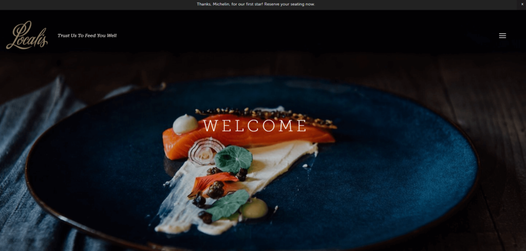
Localis offers an innovative restaurant website that effortlessly showcases its modern culinary approach. The minimalist design paired with vibrant food photography invites visitors to explore the restaurant’s exquisite dishes.
Key Website Features:
- Minimalist Design: The sleek and uncluttered design emphasizes the restaurant’s modern culinary philosophy.
- Vibrant Food Photography: High-quality images of the restaurant’s dishes visually translate their focus on fresh, locally sourced ingredients.
The Localis restaurant website captures the essence of its modern and innovative cuisine through minimalist design and vibrant food photography. Now, let’s move on to our next intriguing restaurant website example.
2. THE OG - Denver Restaurant
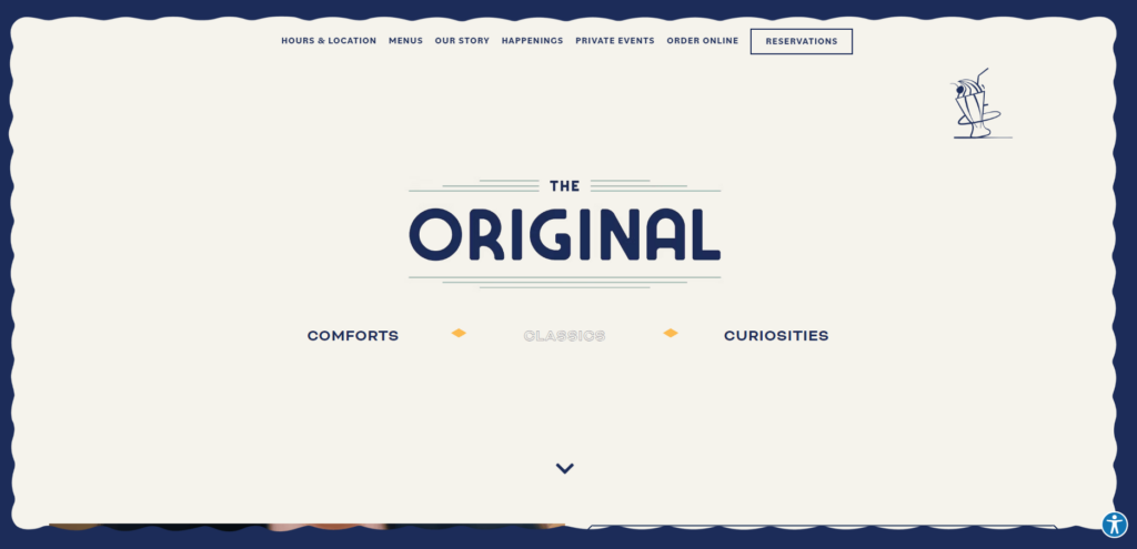
THE OG Restaurant exhibits a modern, chic restaurant website design that instantly captures visitors’ attention. With a dark theme interspersed with vibrant food images, it creates a visual contrast that is both compelling and engaging. The intuitive interface and minimalist layout make navigation a breeze.
Key Website Features:
- Contrasting Theme: The website uses a dark theme with vibrant food images to create an engaging visual contrast.
- Intuitive Interface: With a minimalist layout and easy-to-use interface, it offers seamless navigation through the site.
THE OG – Denver’s website perfectly encapsulates the brand’s modern and sophisticated vibe. The striking design elements paired with its intuitive navigation make it a standout example in the realm of restaurant websites. Now, let’s proceed to our next impressive example.
3. Stacks Pancake House and Restaurant

With a warm and welcoming vibe, the Stacks Pancake House and Restaurant website is a reflection of its homely dining environment. The design and enticing visuals immediately draw in the visitor, while its organized structure makes for an easy browsing experience.
Key Website Features:
- Welcoming Design: The website’s colorful design and enticing food visuals create a welcoming online presence.
- Organized Structure: An easy-to-navigate layout and clear menu section make for a user-friendly browsing experience.
Stacks Pancake House and Restaurant’s website does an excellent job of creating a cozy, welcoming digital platform. Its inviting design and clear structure make it a delightful example of restaurant website design. Let’s explore the next fantastic example.
4. Rock Salt Restaurant
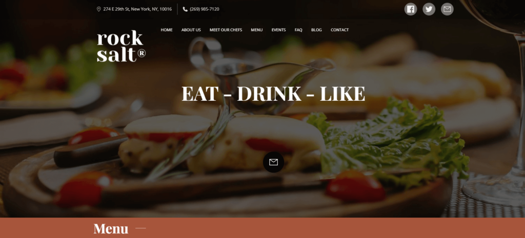
Rock Salt presents a restaurant website that exudes warmth and comfort. Its rustic design elements echo the restaurant’s homely atmosphere, and high-quality food photography entices the visitor’s palate. With a well-organized layout and detailed menu section, the website offers an easy-to-navigate user experience.
Key Website Features:
- Rustic Design: The website utilizes warm, earthy tones and rustic design elements that mirror the restaurant’s inviting atmosphere.
- High-Quality Food Photography: Vibrant, mouth-watering images of the dishes provide a visual treat, creating a strong desire to dine at the restaurant.
Rock Salt’s restaurant website embraces its warm and homely appeal, providing a cozy digital platform that reflects their inviting dining experience. Let’s explore the next restaurant website example.
5. Chris Burger Place
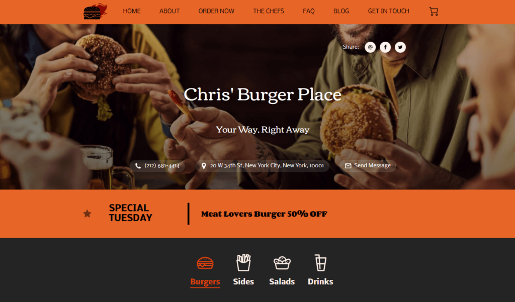
Informal yet inviting, the Chris Burger Place restaurant website reflects the brand’s commitment to a laid-back but at the same time juicy dining experience. Its design is simple yet effective, with clear navigation and eye-catching food visuals that immediately draw in the visitor.
Key Website Features:
- Informal Design: The casual, friendly vibe of the website perfectly encapsulates the restaurant’s laid-back dining experience.
- Clear Navigation: The site features a well-organized layout, making it easy for customers to find information and browse the menu.
The Chris Burger Place website, with its simple design and clear navigation, successfully captures the essence of the restaurant’s informal atmosphere. Now, let’s move on to the next vibrant example.
6. Federalist Pig Diner & Catering
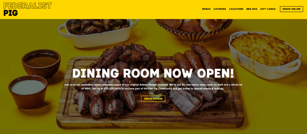
The Federalist Pig offers a rustic and inviting restaurant website, reflecting its laid-back and casual dining experience. With an earthy color palette and straightforward navigation, the site is user-friendly and welcoming.
Key Website Features:
- Rustic Design: The site adopts a rustic theme which aligns perfectly with the casual and comforting dining experience they offer.
- Straightforward Navigation: Users can easily navigate the site and find what they’re looking for, such as menu and location information.
The Federalist Pig’s restaurant website provides a seamless online experience mirroring their casual, laid-back vibe. It’s a perfect example of how a website can embody a restaurant’s ethos. Let’s transition to our next fascinating example.
7. D.I.S.C.O. Burger Restaurant
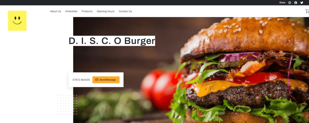
The D.I.S.C.O. Burger restaurant website is a fun fusion of the disco era and delicious burgers. It boasts an exciting design that is as vibrant as its food offerings, creating a unique and memorable digital experience for visitors. A straightforward menu and catchy graphics add to its appeal.
Key Website Features:
- Fun Fusion Design: The website’s fun and unique design combines disco elements with the delicious appeal of their burgers.
- Straightforward Menu: A concise and easy-to-navigate menu provides visitors with a clear view of the restaurant’s offerings.
The D.I.S.C.O. Burger’s restaurant website, with its fun, unique design and straightforward menu, adds a dash of disco to the world of restaurant websites. Let’s move on to explore the next outstanding example.
8. Philadelphia Catering Services

The Philadelphia Catering restaurant website blends professional appeal with a customer-friendly design. The site gives off a warm, welcoming vibe, showcasing their catering services with class and ease. The information-rich layout combined with a seamless user interface, makes for a great first impression.
Key Website Features:
- Information-Rich: The website offers detailed information about the catering services, helping customers to make an informed decision.
- Professional Design: The site’s design is both clean and professional, reflecting the high-quality services they offer.
The Philadelphia Catering website, with its neat layout and informative content, serves as a great example of a catering service restaurant website. Let’s examine another brilliant example next.
9. Portland City Grill
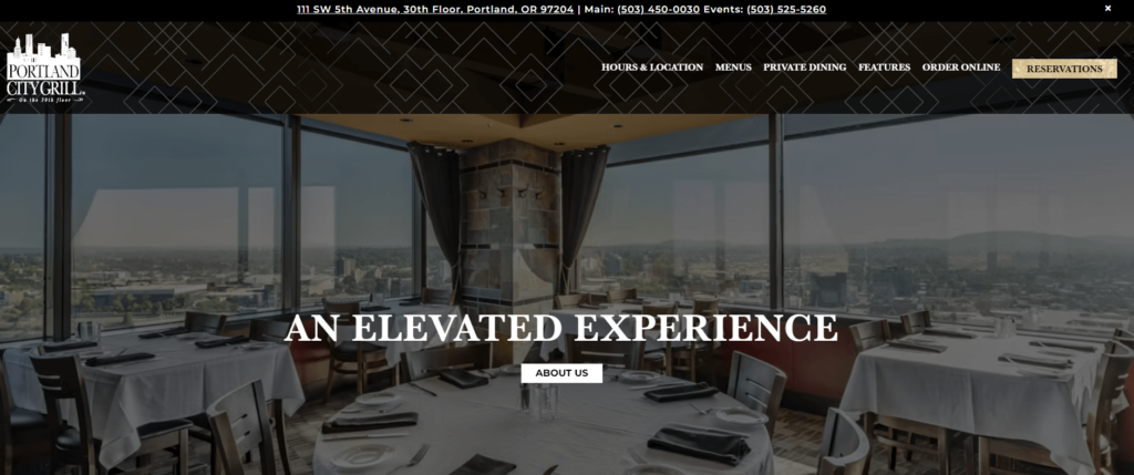
The Portland City Grill website exudes sophistication and elegance. Its clean design, complemented by high-quality food imagery, conveys a sense of luxury that matches the dining experience it offers. The site’s effective organization makes it easy for visitors to explore the restaurant’s wide array of offerings.
Key Website Features:
- Elegant Design: The website’s clean and sophisticated design matches the restaurant’s luxury dining experience.
- Effective Organization: Clear menu categories and easy-to-find information help visitors navigate the site smoothly.
Portland City Grill’s restaurant website serves as a digital extension of its luxurious dining experience. The elegant design, paired with its well-organized structure, creates a visually appealing and user-friendly platform. Now, let’s move on to the next captivating example.
10. Pyrgio's Restaurant
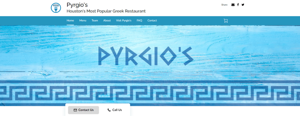
Pyrgio’s Restaurant greets you with a compelling, minimalist design that accentuates its elegant dining offerings. The website exudes a sense of class and sophistication, reflecting the restaurant’s premium positioning. Its clean layout, interactive menu and vivid food imagery all enhance the visitor experience.
Key Website Features:
- Minimalist Design: The clean and sleek design adds an air of elegance and sophistication, resonating with the brand’s image.
- Interactive Menu: The site features an interactive menu, showcasing their exquisite dishes, further enticing the visitor.
Pyrgios restaurant website elegantly showcases their premium dining experience with a clean, minimalist design and interactive menu. Let’s move forward to explore the next outstanding example.
11. BoilerRoom Restaurant
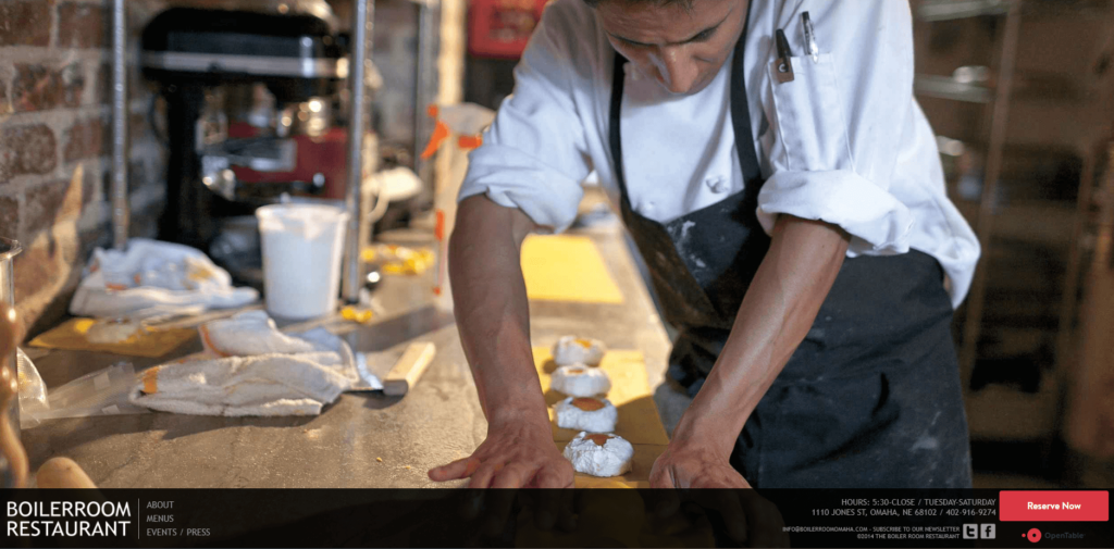
The BoilerRoom restaurant website takes a minimalistic approach to design, focusing on what’s important – the food. The main image carousel showcases high-quality photographs of their delicious dishes, with a simple navigation bar for seamless user experience.
Key Website Features:
- Minimalistic Design: A clean and simple layout that draws attention to the featured food photography.
- Easy Navigation: A well-organized navigation bar that makes it effortless for visitors to find information.
The Boiler Room’s website is a testament to the power of simplicity in restaurant website design. Its minimalistic layout paired with high-quality food images makes it an effective digital platform. Let’s move on to the next excellent example.
12. Scratch Kitchen & Cocktails
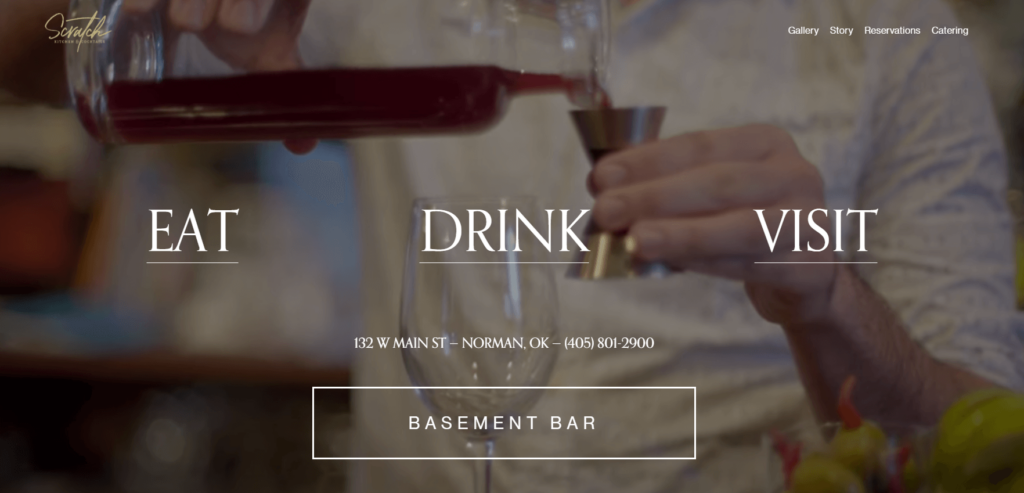
The Scratch Kitchen & Cocktails website brilliantly captures the lively atmosphere of their restaurant. High-quality visuals, dynamic backgrounds, and engaging copy create an inviting and fun browsing experience for visitors.
Key Website Features:
- Dynamic Visuals: High-quality images paired with dynamic backgrounds effectively capture the restaurant’s lively atmosphere.
- Engaging Copy: Fun and inviting text that keeps visitors interested and engaged.
Scratch Kitchen & Cocktails’ website design perfectly mirrors the energy and creativity of their dining experience. The dynamic visuals and engaging copy make it an exciting and effective restaurant website. Let’s proceed to the next impressive example.
13. Costera Restaurant and Bar
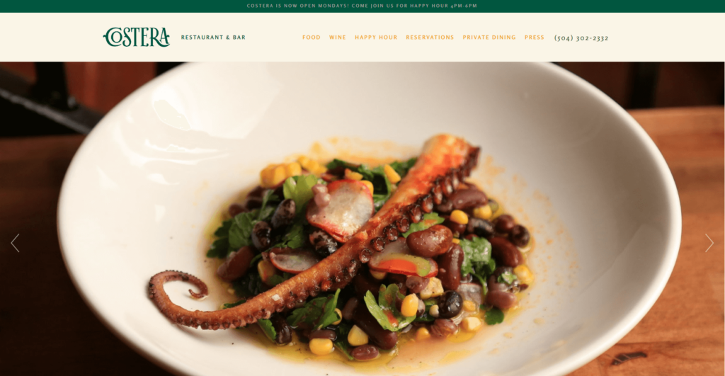
Sophisticated and visually stunning, the Costera Restaurant and Bar website is a blend of stylish design elements and beautiful food photography. The site’s use of white space and earth-toned color palette gives it a relaxed yet upscale feel.
Key Website Features:
- Sophisticated Design: The website uses a combination of white space and an earth-toned color palette to create an upscale aesthetic.
- Beautiful Food Photography: High-quality images of the restaurant’s dishes add to its appeal and effectively communicate the quality of their offering.
Costera’s restaurant website strikes the perfect balance between sophistication and visual appeal. Its elegant design and beautiful food photography create a compelling and user-friendly platform. Now, let’s move on to the next captivating example.
14. Lobzter Seafood Restaurant
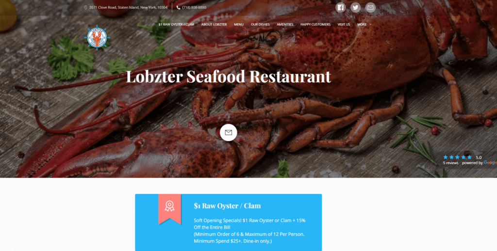
The Lobzter Seafood Restaurant website takes you on a virtual maritime journey. With its cool color palette and nautical-themed design, it embodies the oceanic adventure that the restaurant promises. Its engaging layout and appealing dish photos enhance the overall user experience.
Key Website Features:
- Nautical Theme: The website’s design incorporates nautical elements and a cool color palette that perfectly evoke a sense of the ocean.
- Engaging Layout: The layout is user-friendly and engaging, with vivid dish photos and straightforward navigation.
Lobzter Seafood Restaurant’s website beautifully translates the oceanic ambiance into a digital platform, making it an impressive example of a themed restaurant website. Let’s proceed to our next interesting example.
15. Drexel Restaurant
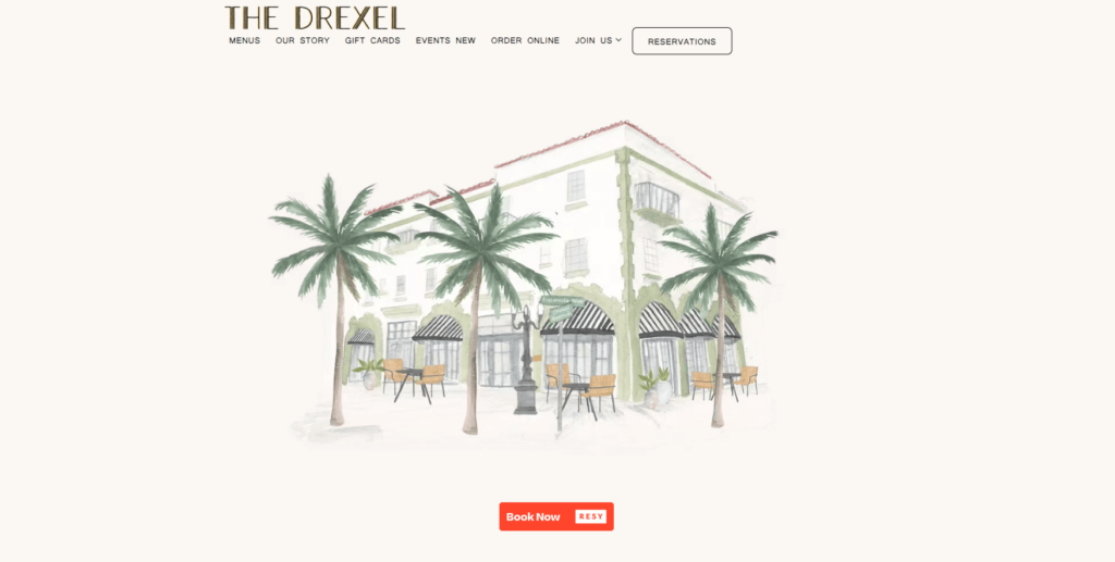
Drexel restaurant presents a cool restaurant website with a modern and interactive design. Using vibrant colors, lively graphics, and animated transitions, the site reflects the fun and energetic vibe of the establishment.
Key Website Features:
- Unique and Modern Design: The use of vibrant colors and unique graphics makes the website exciting and engaging.
- Interactive Elements: Animated transitions and interactive elements contribute to a dynamic user experience.
Drexel’s website offers an interactive and modern design that’s both engaging and user-friendly. Its vibrant aesthetic perfectly mirrors the energy of their pizza place. Moving forward, let’s take a look at our next standout example.
16. The Tops Diner
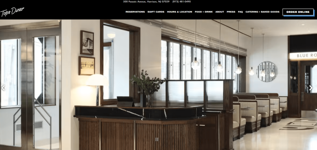
The Tops Diner restaurant website is a feast for the eyes. The mix of high-quality food photography and modern design elements create a visually appealing and engaging online experience for visitors.
Key Website Features:
- High-Quality Food Photography: Beautiful images of the diner’s dishes create a tantalizing visual experience.
- Modern Design Elements: From the sleek fonts to the modern layout, the design reflects the upscale yet comforting vibe of the diner.
The Tops Diner’s restaurant website combines modern design elements with striking food photography to create an engaging online platform. It’s an excellent example of a restaurant website that’s as appetizing as its food offerings. Now, let’s dive into the next impressive example.
17. Sunday in Brooklyn
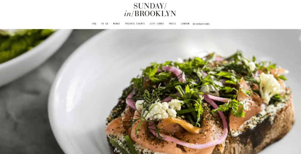
Sunday in Brooklyn is a shining example of a restaurant website that exudes warmth and charm. Its design is a beautiful blend of soft pastel colors, sleek fonts, and engaging animations that invite you in for a cozy Sunday meal.
Key Website Features:
- Warm and Charming Design: The pastel colors, modern typography, and light-hearted animations foster a warm and inviting atmosphere.
- Interactive and User-friendly Layout: The website layout makes it easy for users to navigate through the menus, reservation system, and restaurant’s story.
With its charming design and interactive layout, Sunday in Brooklyn’s restaurant website mirrors the warm, inviting vibe of the physical location. Up next, we explore another captivating restaurant website example.
18. Juicy Moment Restaurant
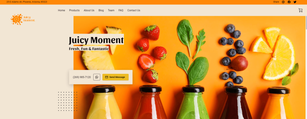
Juicy Moment invites visitors into its vibrant, fruity world with a restaurant website that is as refreshing as its beverages. The design integrates lively colors and visuals, resonating with the brand’s fun, healthy and youthful image. Easy navigation and mobile-friendly design further augment the user experience.
Key Website Features:
- Colorful Design: The vibrant colors perfectly reflect the lively and youthful spirit of the brand, making the site visually appealing.
- Mobile Optimization: The website offers a seamless mobile experience, making it accessible and easy-to-use on any device.
The Juicy Moment restaurant website example serves as a refreshing and colorful spectacle, providing visitors a delightful user experience. Let’s proceed to the next example.
19. Canon Restaurant
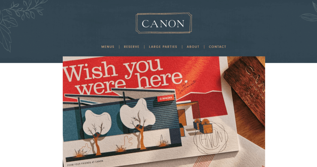
Canon presents a unique restaurant website that pairs a vintage aesthetic with modern design elements. The site’s clean lines, muted colors, and vintage-inspired typography reflect Canon’s sophisticated and timeless dining experience.
Key Website Features:
- Vintage-inspired Aesthetic: The blend of modern and vintage elements creates a distinct and timeless feel.
- Clear and Intuitive Navigation: The website’s layout makes it easy for visitors to find information about the menu, location, and reservations.
Canon’s restaurant website beautifully communicates its refined and timeless brand through a unique mix of design elements. Now, let’s transition to our next fascinating restaurant website example.
20. Spruce Restaurant
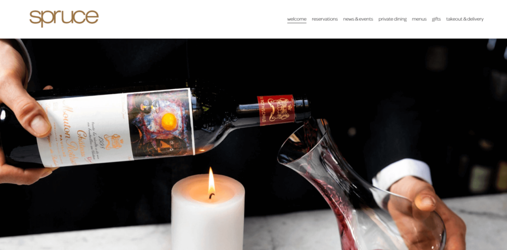
Spruce serves up a sophisticated restaurant website that matches its elegant dining experience. The clean layout, muted color palette, and high-quality photography create a luxurious online presence.
Key Website Features:
- Elegant Design: The clean layout and muted color palette echo the elegance of the restaurant’s dining experience.
- High-Quality Photography: Images of the restaurant’s dishes and interior provide a visually immersive experience for visitors.
Spruce’s website offers a luxurious and refined experience that’s in line with the restaurant’s sophisticated dining offerings. Moving on, we’ll explore the next standout example in our restaurant website showcase.
Having navigated through the pinnacle of restaurant website design, let’s explore the elements that contribute to their success. Just as an exquisite dish is made of well-balanced flavors, a great website is a medley of well-orchestrated components.
Essential Elements For Restaurant Websites
Think of your restaurant’s website as a digital extension of your establishment. It’s not just a space to share information; it’s where you curate experiences, evoke emotions, and leave a lasting impression.
So, what makes a restaurant website resonate with its audience?
What are the essential elements for creating great restaurant websites that are both functional and delightful?
Who is Your Target Audience
A website should be a mirror reflecting your restaurant’s unique persona to the digital world. It should emulate the ambiance, the vibe, and the culinary journey your establishment promises.
The best restaurant websites are those that create an online environment just as inviting as their physical counterparts, enticing visitors to transform into diners.
Where is Your Restaurant’s Location
Location is about clarity and accessibility. Great restaurant websites make location info easy to find and understand. They ensure that even first-time visitors can effortlessly navigate their way to your establishment.
It’s all about bridging the gap between the digital and physical world.
What is The Type of Cuisine Served
In the universe of restaurant websites, your online menu is your ultimate salesperson. It’s more than a list; it’s a tantalizing showcase of your culinary repertoire. It’s essential to ensure it’s easy-to-navigate and updated with all your offerings – dine-in, takeout, and delivery.
Interactive HTML menus get a thumbs up over simple plain PDFs, enhancing the user experience and setting the stage for a delightful dining experience.
Why Your Restaurant
Every restaurant has a story to tell. And your “About Us” or “Our Story” page is the perfect platform to share yours. As you narrate your journey, you weave an emotional connect with your patrons. It’s not just about serving food; it’s about serving experiences.
A well-told story can make your customers fall in love with not just your food, but your brand as a whole.
These are the fundamental building blocks of an engaging restaurant website. However, these ingredients need to be skillfully combined to cook up a digital experience that leaves a lasting impression.
As we transition to the next section, we’ll uncover additional tips and tricks that can add a dash of extra flavor to your restaurant website.
Additional Restaurant Website Tips
Now that we have our essential ingredients ready, let’s add some gourmet flair to the mix. Just like a touch of exotic spices can elevate a dish, these additional tips can turn good restaurant websites into great restaurant websites. They will not only enhance your digital presence but also ensure a more immersive and satisfying user experience.
Remember, a great restaurant website is not just about the individual elements; it’s about how these elements come together harmoniously to create a holistic, engaging, and mouth-watering digital experience.
Integrate Social Media Links
Social media is the new-age town square, the modern word-of-mouth. Integrate social media links into your restaurant website to amplify your online footprint. It allows you to engage directly with your patrons, cultivate a loyal community, and generate buzz around your culinary delights.
User-friendly Menus and Online Ordering
In the world of online food ordering, convenience is king. A user-friendly menu and a smooth, intuitive ordering process can enhance the user experience significantly. Remember, your customers are here for a satisfying meal, not a challenging puzzle.
Show off High-Quality Photos
A picture is worth a thousand words. In the restaurant business, a picture can also be worth a thousand orders! High-quality, tantalizing food visuals can be the deciding factor between a curious website visitor and a confirmed booking.
Remember, a great restaurant website is not just about the individual elements; it’s about how these elements come together harmoniously to create a holistic, engaging, and mouth-watering digital experience.
Make a Great Restaurant Website with UENI
Creating an impressive restaurant website might seem like a daunting task, but it doesn’t have to be. At UENI, we make it our mission to help restaurants like yours carve out a unique digital identity. We understand that your website is an extension of your brand, and we ensure it reflects your unique culinary story.
We offer a perfect blend of customizable design templates and advanced features like mobile optimization and seamless social media integration. But more than just tools and templates, we offer a partnership. We walk alongside you on your digital journey, helping you build not just a website but a powerful online presence for your restaurant.
So why wait?
Embark on this exciting digital journey with UENI and start building your dream restaurant website today! Together, we can make your restaurant’s online experience as memorable as the cuisine you serve.

