In the fast-paced world of the travel industry, a powerful online presence is more than a mere accessory; it’s a necessity. Your travel agency website is more than a business portal. It’s the stepping stone for your customers’ dream journeys, and it must instill inspiration, spark engagement, and ignite a desire for potential travelers to set off on their next adventure with you.
Consider the countless hours you might have spent daydreaming about your next vacation, leisurely browsing through a plethora of travel agency websites. Mesmerized by the vivid pictures, captivated by the detailed descriptions of exotic destinations, and drawn in by the promise of a seamless travel experience. You’ll find that the ones that linger in your mind, the ones that truly stand out, are the websites that transport you to your dream destination even before you’ve booked a ticket. They all create a tantalizing preview of what’s to come.
And now, let’s take this discussion a step further. Stay with us as we explore some of the best travel agency website examples available today. These will provide not only inspiration but also practical insights into successful design and content strategies. Each website is a testament to what a potent combination of innovative design, personalized content, and user-friendly interfaces can achieve.
So buckle up and prepare to embark on a journey through the world of awesome travel agency websites.
Table of Contents
20 Best Travel Agency Website Examples
Just as a fashion designer takes cues from the latest runway trends, we too can draw invaluable lessons from the crème de la crème of travel agency examples.
Let’s embark on a virtual tour to uncover some of the finest examples and figure out who made the list of the best travel agency websites.
1. Eugene Toriko Travels
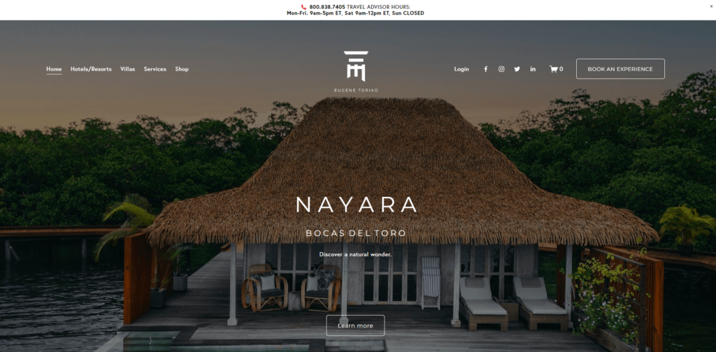
Right from the get-go, you’re greeted by breathtaking imagery on Eugene Toriko‘s website. It whisks you away into an immersive travel experience, giving the feeling of being a part of an adventurous journey rather than simply being a spectator. The website’s design is elegant and minimalistic, keeping the focus squarely on the destinations and experiences on offer.
Key features:
- Spectacular Visuals: What’s striking about this Travel Agency Website is the sheer quality and appeal of its visuals. The photographs are not just eye-catching, but they tell a story, offering a sneak peek into the adventures that await.
- User Experience: Navigating through the website is a breeze, thanks to its clean layout and well-structured information architecture. The design is intuitive, making it easy for visitors to find the information they need.
In a nutshell, Eugene Toriko’s website is a shining example of how compelling visuals and user-friendly design can work together to create a captivating digital journey. Keep this example in mind as we delve deeper into the specifics of ‘Travel Agency Website Design’ in the following section at the end of this list.
2. Susan's Travel Services
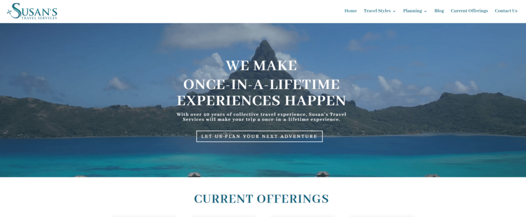
Susan’s Travel Services‘ website offers a warm welcome, capturing the essence of personal travel experiences. It reflects the agency’s personal touch and attention to detail, which can be seen in the array of customized travel packages offered.
Key features:
- Personalized Approach: This Travel Agency Website excels at showcasing its personalized approach to planning travel. The introductory video of Susan herself provides a personal touch and fosters a sense of trust with potential clients.
- Informative Content: The website offers comprehensive information on various travel packages and services, thereby helping potential clients make an informed decision.
Reflecting on Susan’s Travel Services’ website, it becomes evident how a personal touch and comprehensive information can transform a travel agency website into a trusted advisor for potential travelers. With this in mind, let’s continue our exploration to the next website.
3. TravelStore - Your Travel Partner
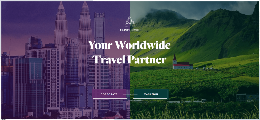
TravelStore‘s website is sleek and sophisticated. It communicates the brand’s professionalism while simultaneously igniting visitors’ travel aspirations through high-quality imagery and engaging content.
Key features:
- Professional Design: The TravelStore website embodies professionalism, presenting each destination and travel package in a sophisticated manner.
- Detailed Itineraries: The detailed itineraries provide potential travelers with an in-depth look into what each package offers, hence easing the decision-making process.
This travel agency website underscores the importance of a professional layout and comprehensive travel information in attracting and retaining potential clients. Let’s carry these insights forward as we visit our next website.
4. My Way Travel
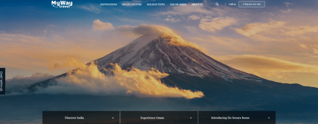
The My Way Travel website effortlessly showcases the joy and adventure of traveling. Its lively colors, attractive layout, and engaging content work together to create a dynamic user experience.
Key features:
- Engaging User Interface: The website’s design is vibrant and welcoming, inviting users to explore the various travel options available.
- Client Testimonials: Real customer testimonials are prominently displayed, adding credibility to the agency’s offerings and reassuring potential clients of their service quality.
My Way Travel’s website is a testament to how a vibrant design and authentic client testimonials can create a persuasive and inviting travel agency website. As we take these insights onboard, let’s proceed to the next website.
5. Quallo World Travel

Quallo World Travel‘s website stands out with its simple yet effective design. The focus is on their expert services, emphasizing the agency’s commitment to crafting perfect travel experiences for their clients.
Key features:
- Clear Messaging: The website’s clear and concise copy communicates the agency’s services effectively, letting potential clients know exactly what they can expect.
- Easy Navigation: The user-friendly layout makes it easy for visitors to find what they are looking for, making the planning process a breeze.
Quallo World Travel’s website is a good example of how clear messaging and easy navigation can enhance user experience and convert visitors into clients. With these insights, let’s explore the final website in our list.
6. Lorraine Travel
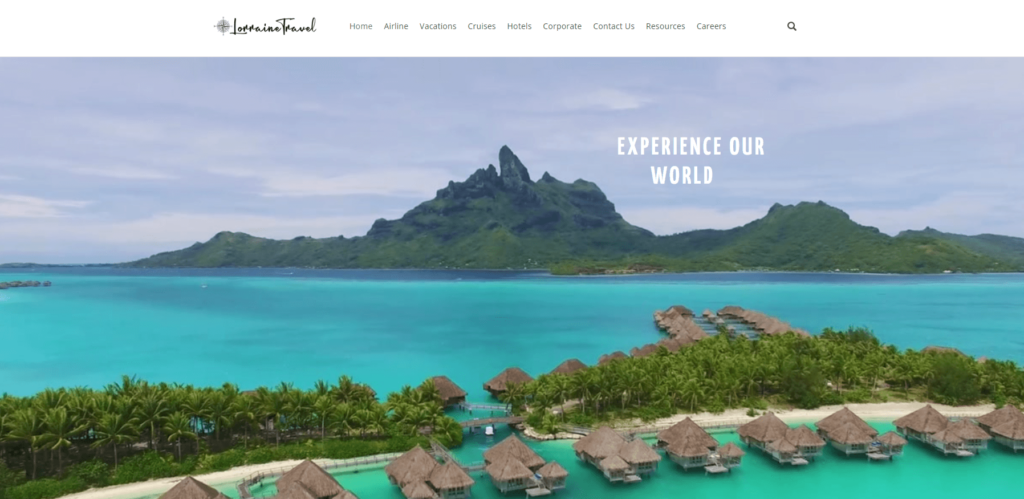
Lorraine Travel‘s website exudes elegance and sophistication. It invites visitors to explore the world of luxury travel with its eye-catching images and comprehensive service descriptions.
Key features:
- Luxury Aesthetic: The website’s design and imagery are designed to reflect the luxurious experiences that the agency offers, enticing visitors who seek high-end travel experiences.
- Detailed Service Descriptions: Comprehensive information on various travel services is provided, ensuring potential clients have all the necessary details to make informed decisions.
In summary to Lorraine Travel’s website, it’s evident how a luxurious aesthetic and detailed service descriptions can create a compelling travel agency website for a high-end market segment. By examining these awesome travel agency websites, hopefully you havegained valuable insights.
7. Chelax Adventures
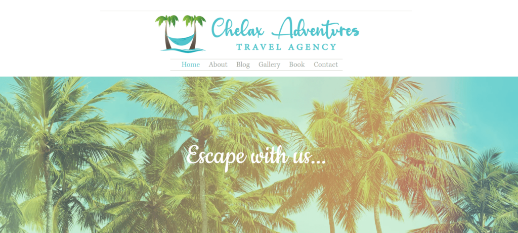
The Chelax Adventures website is a vivid invitation to experience the joys of travel. Its lively design coupled with enticing adventure-filled content truly immerses the visitor in the travel experiences offered.
Key features:
- Dynamic Imagery: The website is enriched with high-quality images capturing various adventures, which is not only eye-catching but also instantly communicates what Chelax Adventures is all about.
- Thorough Package Descriptions: Each adventure package is detailed comprehensively, offering potential travelers a clear picture of what they can expect.
Reflecting on the Chelax Adventures site, we see a clear example of how powerful imagery and thorough descriptions can create a compelling travel agency website that excites and informs potential travelers. Armed with these insights, let’s voyage onwards to the next example.
8. Edge of Wonder Travels
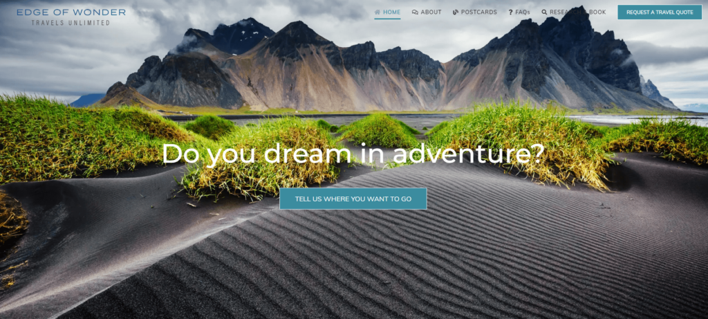
Edge of Wonder Travels‘ website truly stands on the frontier of inspirational travel. The clean, minimalist design, combined with emotive storytelling, reflects the agency’s focus on curating extraordinary travel experiences.
Key features:
- Storytelling Approach: The website brilliantly incorporates storytelling into its content, creating a more personal and engaging narrative that can capture the imagination of potential travelers.
- Easy Booking Process: A clear and user-friendly booking process is presented, making it easy for visitors to take the next step in their travel planning.
The Edge of Wonder Travels website exemplifies the power of a storytelling approach and a straightforward booking process in crafting the best travel agency website. Imbued with these lessons, let’s journey onto the next website.
9. Boutique Travel
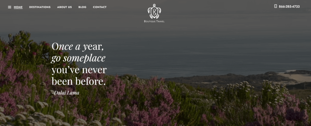
Boutique Travel’s website exudes elegance, mirroring the bespoke travel experiences the agency offers. Its beautiful design and tailored content offer visitors a taste of the luxury that awaits them.
Key features:
- Elegant Design: The website’s design is chic and refined, reflecting the luxury and exclusivity of the travel experiences offered by the agency.
- Tailored Travel Packages: Boutique Travel showcases a selection of carefully curated travel packages, reflecting their commitment to providing personalized experiences.
Observing Boutique Travel’s website, we witness how an elegant design and tailored travel packages can come together to create a persuasive and luxurious travel agency website. Enriched with these insights, let’s proceed to our next example.
10. Campbell Travel

Campbell Travel‘s website reflects their legacy of providing professional travel services with a personal touch. The website is streamlined and comprehensive, reflecting the agency’s expertise and attention to detail.
Key features:
- Professional Interface: The website has a professional design that underscores the agency’s long-standing experience and reliability in the travel industry.
- Diverse Travel Options: Campbell Travel offers a wide array of travel services, which are displayed clearly on their website, giving potential travelers plenty of options.
Examining Campbell Travel’s website, we understand how a professional interface and a diverse array of travel options can help a travel agency website appeal to a broad audience. Let’s carry these insights forward to our final website.
11. Specially Designed Travel
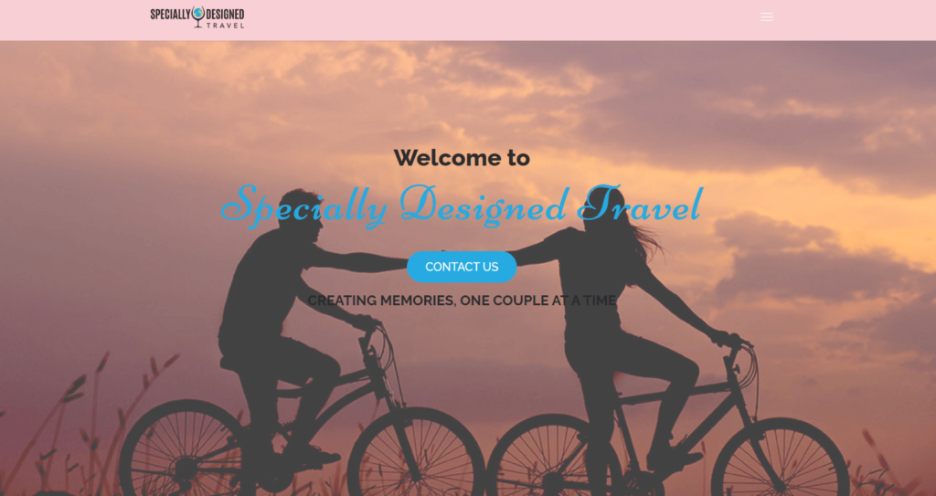
Specially Designed Travel’s website is a tribute to their customer-centric approach. The friendly design and tailored travel options invite visitors to explore the unique experiences that the agency can offer.
Key features:
- Customer-Centric Messaging: The website shines with its client-focused approach, ensuring visitors feel understood and valued from the moment they land on the homepage.
- Personalized Travel Packages: The agency’s commitment to creating unique experiences is evident in their selection of tailored travel packages.
Reflecting on the Specially Designed Travel website, we comprehend how crucial a customer-centric approach and personalized travel packages are in creating a welcoming and effective travel agency website.
12. Roundabout Travel Agency

Roundabout Travel Agency invites you into an exquisite world of luxury travel experiences, instantly capturing your attention with a well-chosen color palette and elegant design. Aesthetics aside, the site also provides comprehensive information about its unique and personalized offerings, thereby striking a fine balance between form and function.
Key Features:
- Striking Visuals: The use of high-quality and visually-striking images is a standout feature of Roundabout Travel Agency. These pictures not only captivate the viewers but also create a dreamy allure, accurately reflecting the brand’s luxury ethos.
- User Experience: The website’s information architecture is well-structured and intuitive, making navigation effortless. Key information is presented clearly, and the user journey is thoughtfully mapped out.
Roundabout Travel Agency is a superb example of how a travel agency website can use aesthetic brilliance and meticulous organization to create an engaging and informative user experience. As we move forward, we’ll see how this trend continues in the realm of travel agency website design.
13. Star Travel Tours
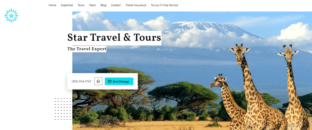
Diving into the Star Travel Tours website, you’re greeted by a dynamic, vibrant atmosphere that immediately ignites a sense of excitement. This Travel Agency Website successfully balances a playful, colorful design with a professional layout, focusing on their range of adventure-filled tours.
Key Features:
- Intuitive User Experience: The website shines with a highly navigable layout, making it simple for potential customers to explore and find the information they’re looking for.
- Engaging Visuals: The use of vivid, energetic images complements the agency’s adventurous spirit, fostering an engaging visual storytelling experience for visitors.
Star Travel Tours showcases a masterclass in how to inject energy and passion into a travel agency website design. With a distinctive brand identity conveyed through every element of the website, it stands as a strong example in our list. As we move forward, let’s step into a different world of travel with Asia Pacific Destinations.
14. Asia Pacific Destinations
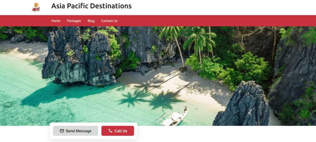
The moment you land on the Asia Pacific Destinations website, you are met with an array of awe-inspiring images showcasing the diversity of Asia Pacific destinations. The website presents a simple and clean design, letting the destinations take center stage.
Key Features:
- Destination Highlights: The website places a strong emphasis on highlighting different destinations, offering comprehensive overviews to give visitors a taste of what each location offers.
- Easy Navigation: The user-friendly interface and clearly marked sections make it effortless for visitors to explore the various destinations.
Asia Pacific Destinations’ website is a testament to the effective use of well-structured content and breathtaking visuals in travel agency website design. Keeping this in mind, let’s travel to our next example, Uplifting Travel.
15. Uplifting Travel
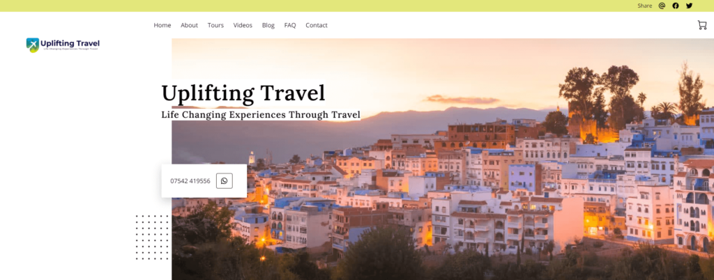
Uplifting Travel introduces a warm, inviting atmosphere with its minimalist design and calming color palette. The website shines in its ability to convey a sense of tranquility and relaxation, aligning perfectly with the wellness-focused travel experiences the agency offers.
Key Features:
- Wellness Travel Focus: The agency’s focus on wellness travel is effectively communicated through their website, with in-depth descriptions of wellness programs and retreats.
- High-Quality Imagery: High-quality images of serene and peaceful locations help reinforce the wellness theme, creating an appealing visual narrative that entices visitors to explore more.
Uplifting Travel’s website is a shining beacon among travel agency websites that focus on niche markets, demonstrating how design and content can be effectively tailored to reflect a specific travel theme. As we prepare to explore more examples, remember how these websites have brilliantly incorporated design and content elements to cater to their target audiences.
16. Heartland Oasis Jamaica
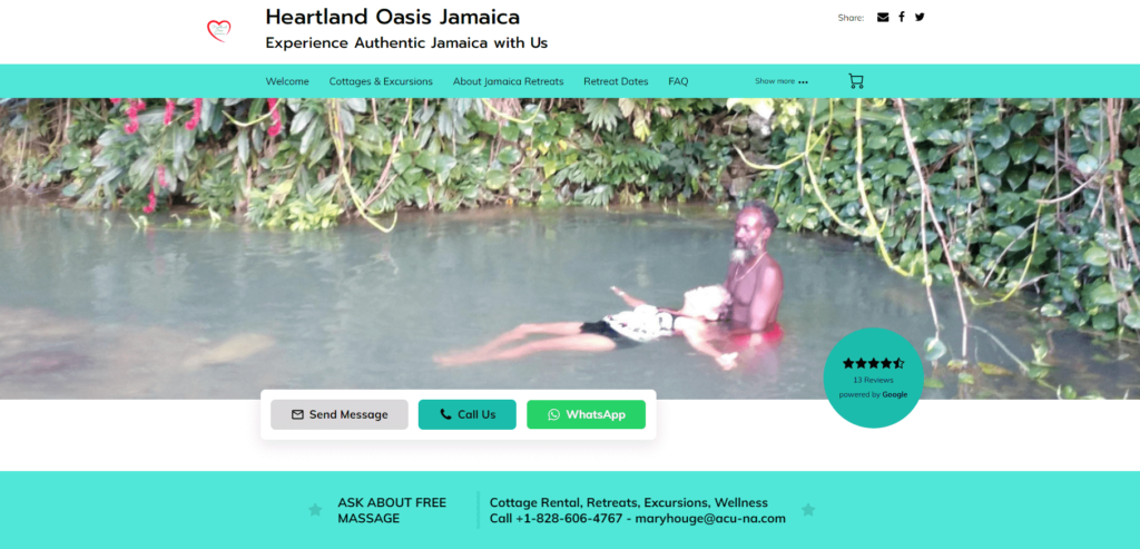
Heartland Oasis Jamaica‘s Travel Agency Website invites you into a tropical paradise with its warm, vibrant design. The website adeptly showcases the unique culture and breathtaking landscapes of Jamaica, enticing visitors with the promise of an authentic Jamaican experience.
Key Features:
- Local Experience: The agency’s focus on providing a genuine Jamaican experience is evident throughout the website, from the vibrant visuals to the detailed descriptions of local tours and experiences.
- Intuitive User Interface: An easy-to-navigate layout ensures visitors can effortlessly explore the various offerings, making for a seamless user experience.
Heartland Oasis Jamaica’s website is an excellent example of a localized travel agency website, spotlighting the rich cultural experiences that set them apart from broader-ranging agencies. Our journey continues as we navigate to our next exemplary website, Desired Vacations Inc.
17. Desired Vacations Inc.
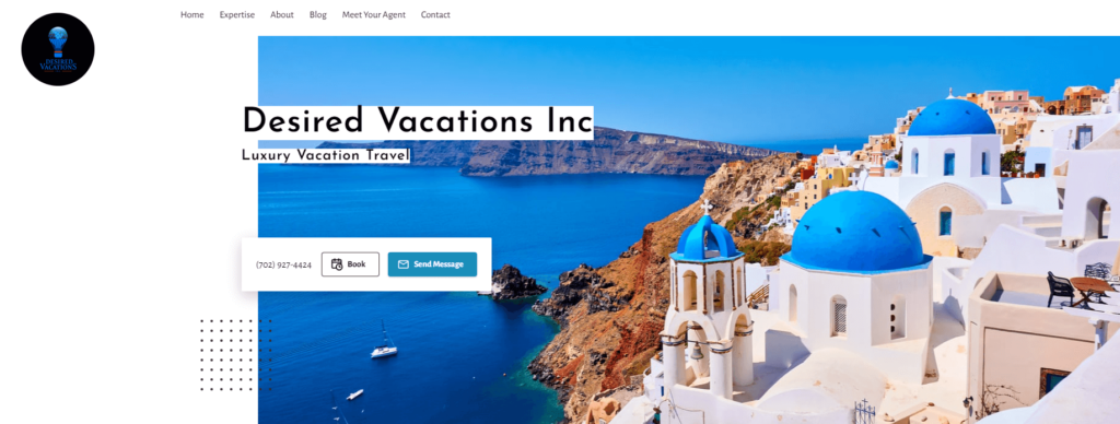
Desired Vacations Inc.‘s travel agency website captures the essence of dream vacations with a sleek, modern design. The website masterfully communicates the agency’s expertise in planning luxurious and memorable holidays, enticing visitors with a taste of the incredible experiences on offer.
Key Features:
- Luxury Focus: The website excels at creating a sense of luxury and exclusivity, with high-quality images and detailed descriptions of luxury travel experiences.
- Effective User Interface: The site’s user-friendly interface and logically organized content make it easy for potential clients to explore and find the luxury travel services that suit them best.
Desired Vacations Inc.’s website is a prime example of a high-end travel agency effectively communicating its brand’s identity and value proposition. Coming up next, Premier Source Travel, another unique take on the travel agency website.
18. Premier Source Travel
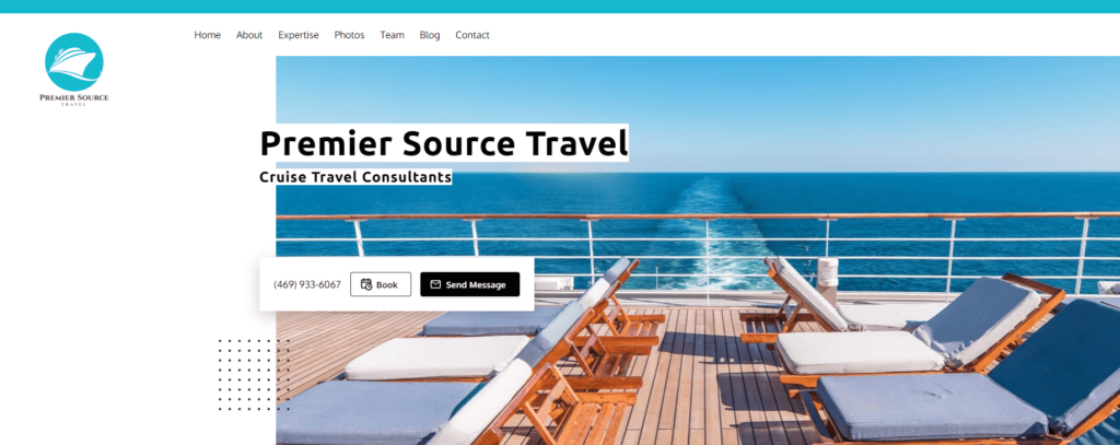
When visiting the Premier Source Travel agency website, you’re immediately greeted with vibrant visuals showcasing diverse travel destinations. The design and layout are neat and organized, directing attention towards the variety of travel packages and services.
Key Features:
- Variety of Options: The website does an excellent job of presenting an extensive range of travel services, from package tours to cruise vacations, appealing to a broad audience.
- User-Friendly Navigation: The site utilizes a clear, intuitive navigation system, making it easy for visitors to browse through different offerings and find the information they need.
In essence, Premier Source Travel’s website strikes an impressive balance between offering variety and maintaining a streamlined, user-friendly experience. It’s a significant example of effective travel agency website content that caters to diverse traveler interests. We move on next to explore Joymaker Journeys.
19. Joymaker Journeys
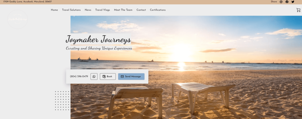
Joymaker Journeys’ travel website successfully emanates a sense of joy and adventure, with a cheerful color scheme and lively imagery. The website is teeming with inviting descriptions of various travel experiences, emphasizing the agency’s mission to craft journeys that bring joy.
Key Features:
- Joyful Aesthetics: The website’s design and color palette are uplifting, reinforcing the agency’s brand and mission to deliver joy-filled travel experiences.
- Personalized Approach: The site highlights the agency’s dedication to crafting personalized journeys, a factor that sets them apart from many other agencies.
Joymaker Journeys’ website clearly communicates their unique value proposition through engaging content and appealing design elements, providing a standout example of a niche-focused travel agency website. Our final example in this section is Aurora Heights Travel.
20. Aurora Heights Travel
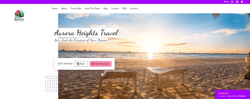
Aurora Heights Travel’s website is characterized by its contemporary design, complemented by beautiful imagery. The layout is exceptionally user-friendly, showcasing various travel services and packages in a clean and organized manner.
Key Features:
- Visual Appeal: The site boasts stunning visual content, capturing the imagination of potential travelers and offering them a glimpse into the experiences they can expect.
- Informative Content: Each travel package on the website is accompanied by detailed descriptions, providing potential customers with ample information to make informed decisions.
Aurora Heights Travel exemplifies how comprehensive, well-structured content, coupled with an attractive design, can significantly enhance the appeal of a travel agency website.
From the serenity of secluded beaches to the pulsating energy of bustling cities, each of these websites brings destinations to life. These aren’t mere digital platforms; they’re immersive experiences, transporting potential travelers to foreign landscapes, enticing them to explore further.
A great travel agency website goes beyond pretty pictures and engaging descriptions, though. The nuances of design, the intuitiveness of the user interface, the compelling call to actions, and the strategically placed customer testimonials all contribute to a well-rounded user experience. Indeed, when you dive deeper into the anatomy of these websites, you’ll find a common theme – every element is meticulously crafted, keeping the user’s journey in mind.
But what makes these websites not just good, but the best?
The secret lies in their ability to personify the travel agency’s brand, to tell a captivating story, and to evoke emotions that resonate with their target audience.
Takeaway Tips on How to Create a Travel Agency Website
Lorem ipsum dolor sit amet, consectetur adipiscing elit. Ut elit tellus, luctus nec ullamcorper mattis, pulvinar dapibus leo.
Travel Agency Website Design & Templates Tips
Indeed, first impressions matter a lot, especially in the digital world. When potential customers land on your travel agency website, they should immediately be taken on a visual journey. That’s where a visually appealing and user-friendly design comes into play.
Choosing a suitable website template or theme for a travel agency website is crucial. Notably, you need to choose a design that complements your travel agency’s brand identity and philosophy. For example, if you specialize in luxury travel, a minimalist and sophisticated design would work well. Conversely, a family-focused agency might choose a colorful and playful design.
Some key design elements to consider are the colors, fonts, imagery, and layout. A harmonious color palette, readable fonts, engaging imagery, and intuitive layout can all contribute to a great user experience. As a case in point, take a look at some of the best travel agency websites out there, and you’ll notice these common elements.
When it comes to travel agency website design, there are plenty of templates available. Using a template as a starting point can help you create a cohesive and professional-looking website. Furthermore, templates can be customized to better align with your brand, giving you the best of both worlds.
Travel Agency Website Content Ideas
Moving on, we can’t emphasize enough the importance of compelling and informative content for a travel agency website. Just like the design, your content needs to transport visitors to their dream destinations, stirring their wanderlust and enticing them to book their next trip with you.
A well-planned site architecture is fundamental. Key sections include the homepage, destination pages, services, and testimonials. Each of these pages serves a specific purpose in your customer’s journey, leading them closer to the booking button.
Content ideas for a travel agency website:
- Destination Guides: In-depth information about various destinations, including must-visit places, local cuisine, culture, best time to visit, and travel tips. This not only acts as an informative guide for travelers but also boosts your SEO through location-specific keywords.
- Travel Blog: Regularly updated blogs featuring travel stories, experiences, travel hacks, and updates on the travel industry. This keeps your audience engaged and can also boost your SEO with relevant and trending keywords.
- Service Details: Comprehensive information about the services offered, such as booking flights, hotels, rental cars, tour packages, etc. It helps potential customers understand the value you provide and can influence their decision to book with your agency.
- Customer Reviews and Testimonials: Sharing feedback from satisfied customers can greatly enhance your website’s credibility. This can be further boosted by featuring case studies of previous successful trips.
- Photo and Video Gallery: A showcase of high-quality visuals from various destinations can entice potential customers. It gives them a glimpse of what they can expect when booking with your agency.
- FAQs: A section dedicated to frequently asked questions can address common queries or concerns of potential customers, improving user experience.
- Interactive Tools: Tools like travel cost calculators, personalized itinerary builders, and virtual tours can enhance user experience and increase engagement.
- Special Deals and Offers: Highlighting special deals, discounts, or offers can attract potential customers looking for budget-friendly travel options.
But it’s not just about what you say, but how you say it. Writing engaging copy that is tailored to your audience can significantly enhance your website’s appeal. Equally important is showcasing stunning visuals that bring your destinations to life. Also, remember to incorporate strong calls to action that guide visitors on what to do next.
Finally, given the competitive nature of the travel industry, SEO-friendly content is a must for any travel agency website. From including keywords in your text to optimizing images, there are many ways to make your website more visible to search engines.
Why UENI is The Best Website Builder for a Travel Agency
To sum up, creating an effective travel agency website involves many moving parts. From the design to the content, every element needs to work together seamlessly to provide a memorable user experience. Thankfully, this is where the UENI travel agency website builder comes in.
UENI is a robust tool designed specifically for travel agencies. It provides user-friendly features that allow you to create a professional and attractive website without any technical knowledge. With UENI, you can choose from a range of travel agency website templates, customize them to your liking, and fill them with engaging, SEO-friendly content.
By using the UENI travel agency website builder, you can apply all the tips and inspiration we’ve discussed in this article. From design to content, UENI gives you the tools to create a travel agency website that not only stands out from the crowd but also drives bookings.
Having discussed some exceptional travel agency examples, provided tips on creating an attractive design, and highlighted the importance of compelling content, it’s now over to you. Harness the power of UENI and start building your dream travel agency website today. Embark on this exciting journey and create a digital portal that entices potential travelers and showcases the unique value of your travel services.

