Barbershops are a staple of the local community, and like many other small businesses, they don’t necessarily see the need for a website. Many of them rely on foot traffic and word of mouth. Surely that’s enough, right?
A website offers many advantages for a business. You’ll appear in local search results, you can showcase your services, and you can quickly establish credibility with potential customers.
As websites have become more affordable and easier to create, there are fewer and fewer excuses left for not having one.
But what makes a good barber website? And where can you get one?
Let’s look at 30 great examples of barbershop websites. We’ll spend a bit of time discussing why these pages, in particular, really do a good job promoting their businesses.
Before we do that, let’s discuss some general rules that are relevant to all websites.
Table of Contents
What Makes A Good Barber Website?
There are really two elements that you need to keep in mind when evaluating a barber’s website: the design of the page — which governs the layout and aesthetics — as well as the usability, which refers to how functional the page is.
A good barber website is going to look great and be easy to use. All 30 of our example websites pair excellent functionality with strong visual signals, making sure their page looks great, and visitors can easily book a cut or a trim.
The Design
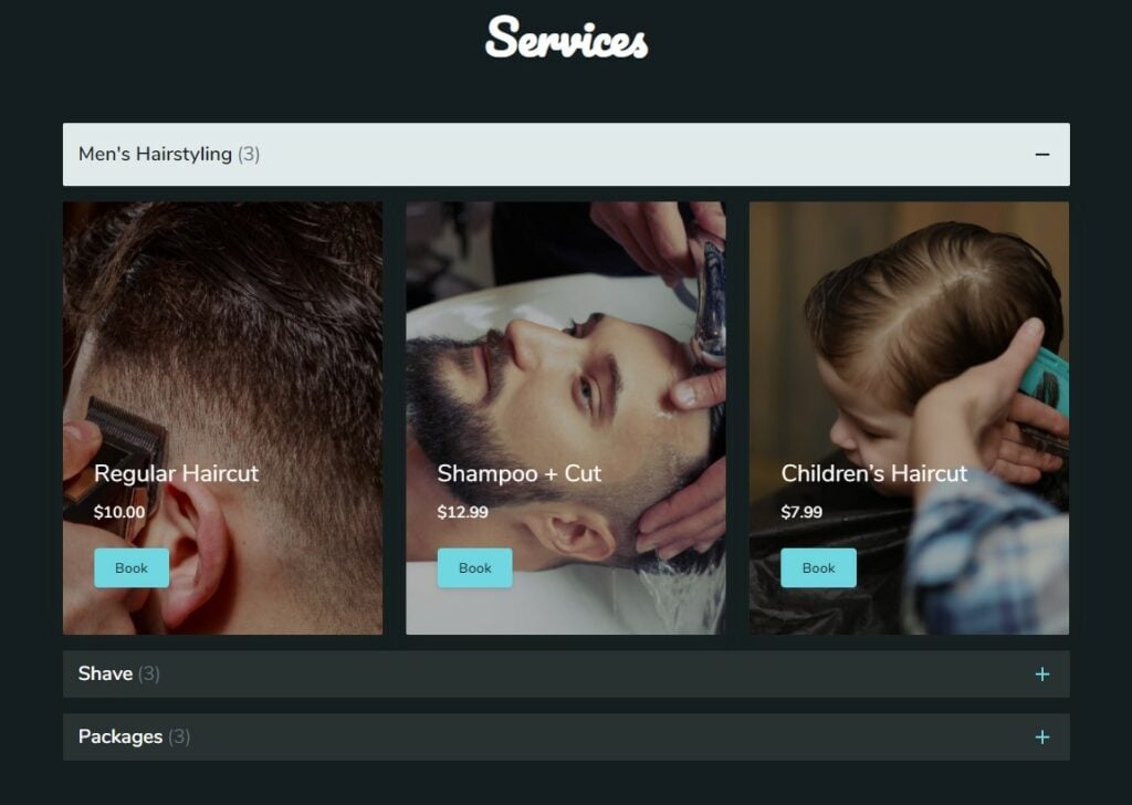
A website’s design is the packaging of the business. It’s often where customers form their first impressions regarding the business.
A website that is designed poorly risks alienating visitors from the start.
It can cause them to assume that because the website is bad, so are the products, or that the owner does not know what he or she is doing.
Using established templates or using a graphic designer are both good ways to make sure your website will be aesthetically pleasing.
The Usability
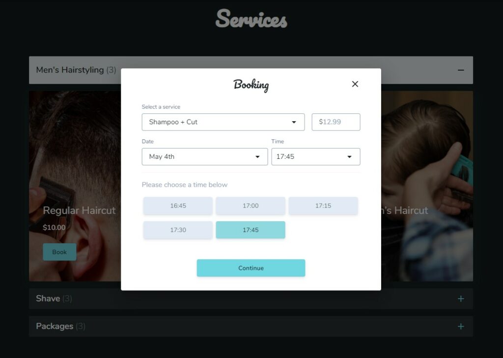
Good design refers not only to the appearance of the website, but also to its usability, and the overall user experience.
To the greatest possible extent, a website should incorporate design elements that make it ergonomic and user-friendly. This means the website’s functions should be intuitive, sections should be well-labelled and easy to find, and call to action buttons should be bold.
These general principles improve the overall user experience and help to keep visitors engaged. This will translate to users staying on the website for longer, improving the chances they will make a purchase and increasing the website’s SEO.
Now let’s look at 30 excellent examples of barbershop websites and examine what features make them effective.
30 Excellent Barbershop Websites
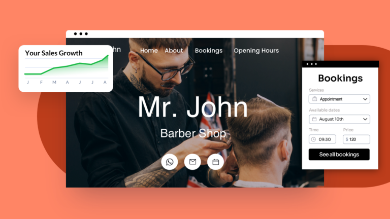
Billy the Barber – UENI ready-made solution for barber websites.
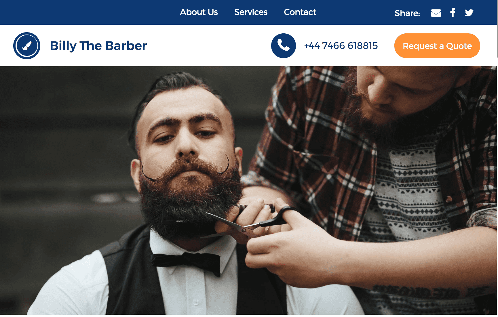
UENI’s simple, minimalist websites have everything small businesses need including a prioritisation on the guiding principles above: usability, aesthetics and great content.
This website for a small barbershop in Birmingham, designed and hosted by UENI, incorporates a minimal, sleek design and utilises a single scrolling page as its fundamental structure. Visitors can instinctively scroll onto the next section of the website without having to leave the page. This intuitive feature makes the website user-friendly, improves the overall user experience and, in doing so, lends credibility to the business.
The following features are incorporated into all UENI barbershop websites:
- Images: Premium, high-quality images capture the visitor’s attention, improve the aesthetic characteristics of the website and provide visual context for the services on offer.
- Content: Customised, engaging and well-written content welcomes visitors to the page, sets the scene of the business’ story/mission, and clearly and concisely informs the reader of what he or she needs to know about the business.
- Services: A services section makes visitors aware of the products/services on offer, invites the visitor to seek more information if necessary, and includes online booking functionality, allowing the user to make a request for service directly from the page.
- Map: An interactive map with zoom functionality allows visitors to quickly and effortlessly pinpoint the exact location of the business
- Opening hours: The business’ opening hours are clearly displayed for users in a readily digestible format.
- Additional services and support: Along with the above, UENI takes care of establishing a Google My Business listing, creating listings on appropriate online business directories, and search engine optimisation, ensuring that the website appears among the top search results when people search for that type of business in the area.
Rust Belt Barbering
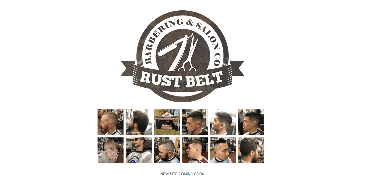
This barbershop website is straightforward, combining uncomplicated design, images of the services on offer, and the key business information into a single landing page. The business’ logo is front and centre, ensuring visitors cannot miss it. The webpage also includes booking functionality (although this is outsourced to a separate application).
Boardroom
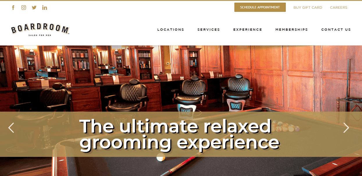
The home page of Boardroom’s website is taken up almost entirely with a high-quality image of the beautiful interior of the shop itself, giving visitors to the website the sense they are already there. Call to action buttons invite the user to share the website with friends on social media, increasing Boardroom’s reach and popularity.
Junior & Hatter
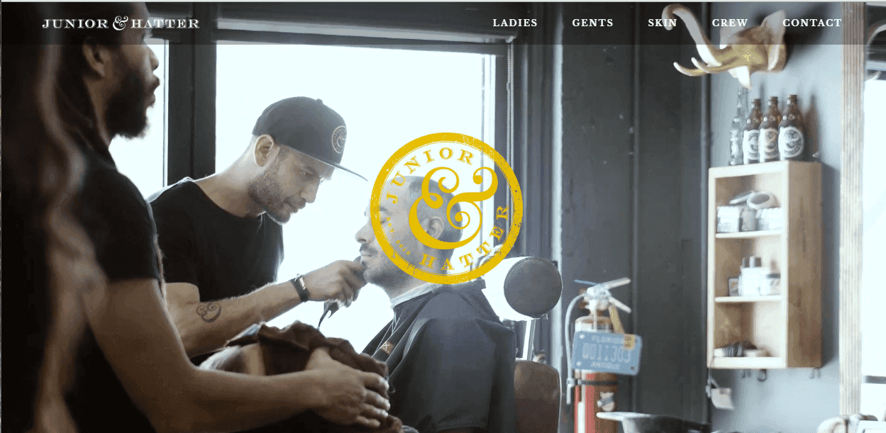
Junior & Hatter’s landing page features a moving image background, which is an excellent way of conveying a sense of the people, place and the services on offer in an aesthetically pleasing way. While the website is more complex than some others on this list, it is engaging and makes the visitor want to stay.
Barbra Barbershop
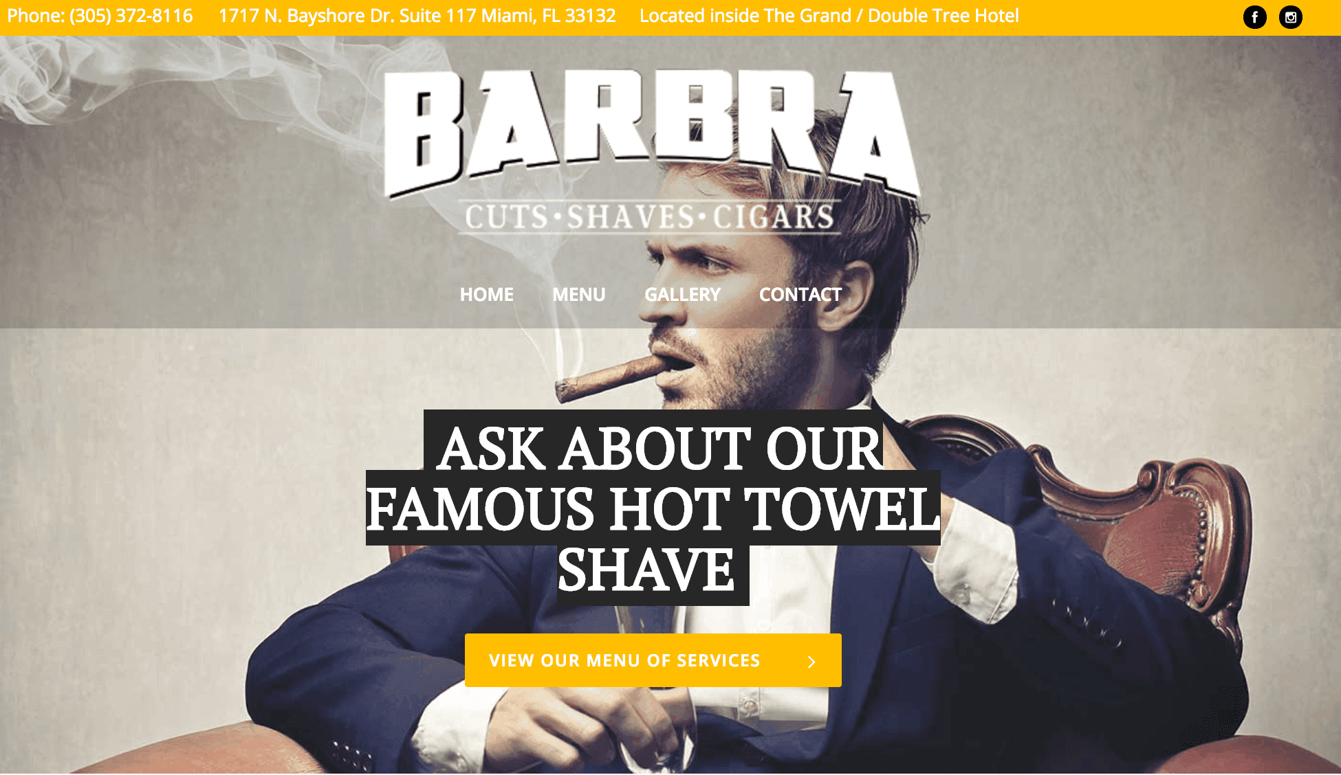
Barbra’s nifty website features a navigation bar that follows the user as he or she scrolls down the page, making it easy to locate the sections of the website no matter where the user is on the page. The logo (which is captioned with the three principal offerings of the business) and high-quality imagery ensures visitors know exactly what the business is about.
Barber & Parlour
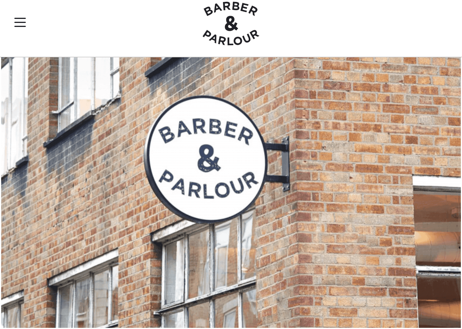
This simple and attractive website welcomes visitors with its approachable and clean style. Informative content is clear and concise, providing visitors with the necessary details of the business’s many services on offer and important contact and location details.
Mustache Barbershop
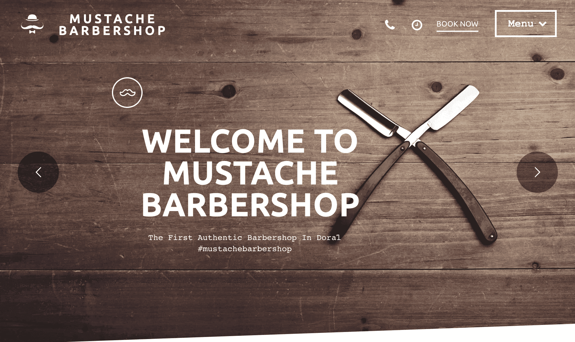
Mustache Barbershop’s website clearly sets out the products and services and invites users to click on these for more information, keeping the main page free of dense boxes of text. A further section offering visitors tips on various styles adds value to the user experience, helping them to decide what the business can help them with.
Chivalry Grooming Parlour
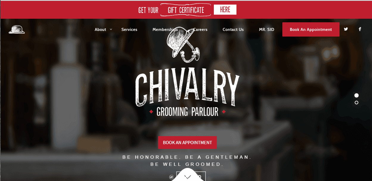
Chivalry Grooming Parlour’s website utilises bold colours and classic style branding to grab the attention of visitors. A clear navigation panel and an emboldened call to action button make the website easy to use and helps to get visitors to convert.
Legends
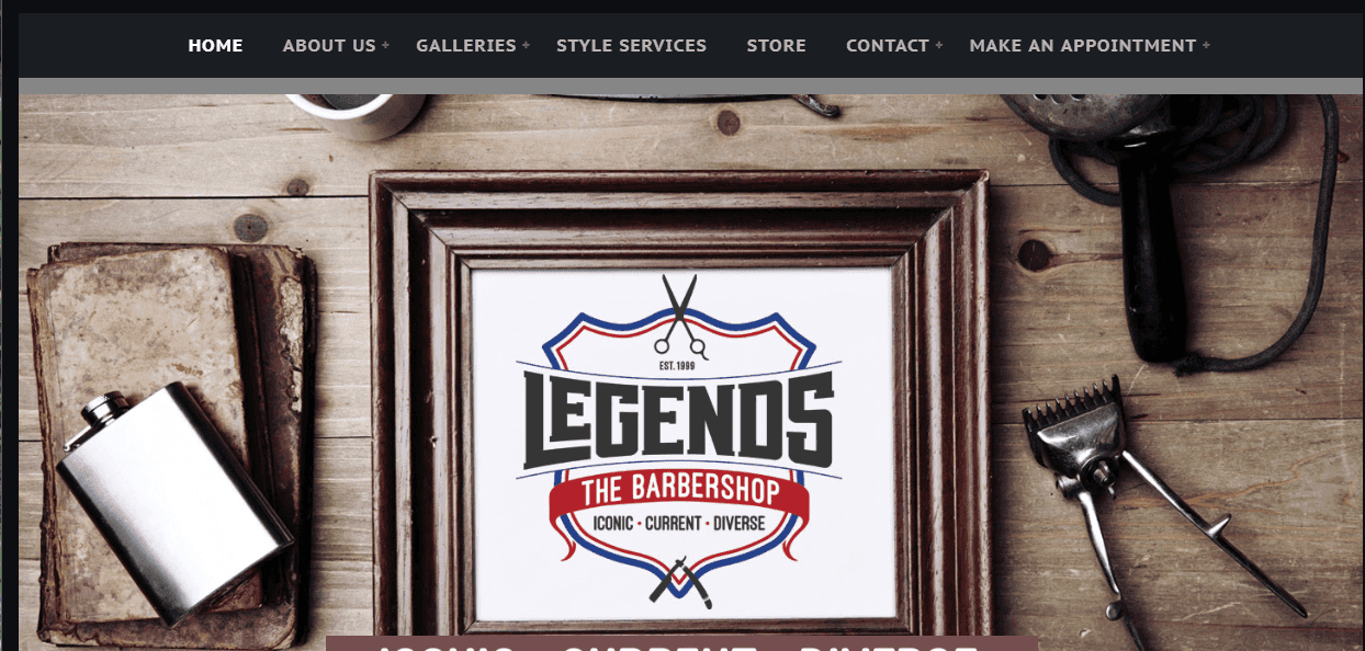
Along with premium classic imagery, Legends’ website uses great video content and music for a more engaging experience. Legends has capitalised on their experience working with celebrities by including a photo gallery, lending credibility and status to the business.
Stan’s Downtown
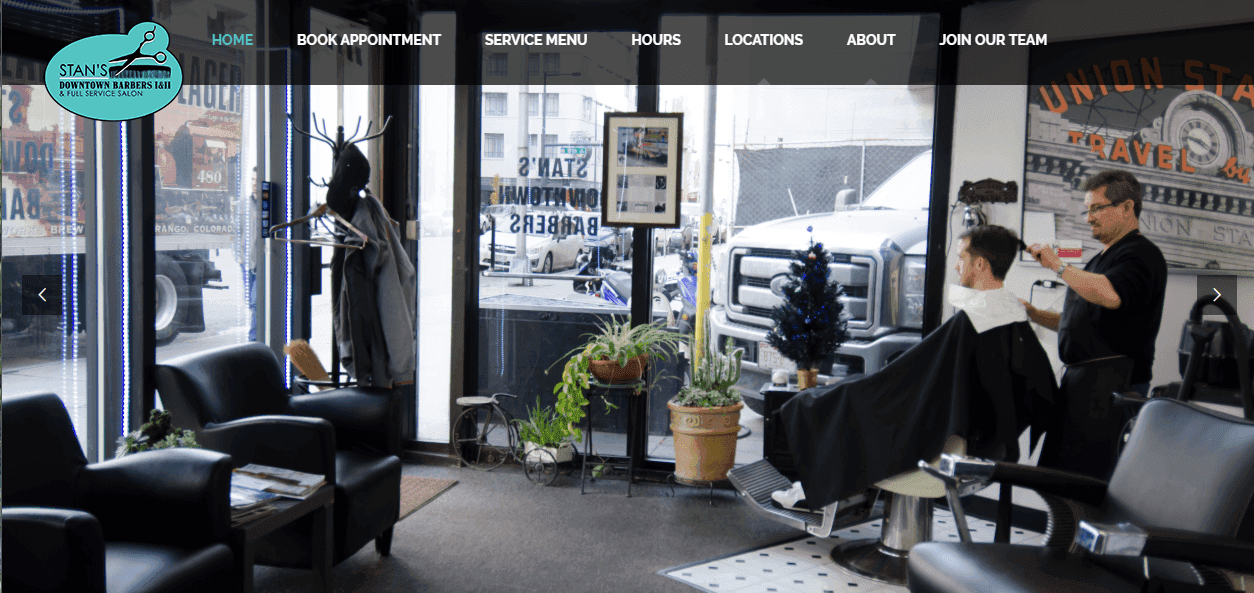
Stan’s Downtown’s website is straightforward and easy to use. The landing page sets out all the key information a potential customer will need to know, including services and pricing. A style gallery guides visitors through the options available, working to improve the customer experience.
Scissors & Scotch
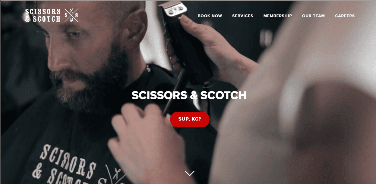
Scissors & Scotch’s landing page communicates a friendly and welcoming vibe with colloquial language and light-hearted, humorous content. Integrated testimonials establish trust with potential customers. The page also includes a ‘buzz’ section (showcasing press the business has received), a great way of showing customers the business is respected and reputable.
Proper Barbershop
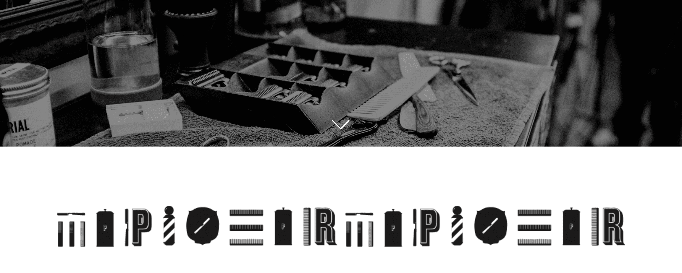
Proper Barbershop’s website benefits from the business’ excellent branding and a beautiful design. The black and white motif communicates style and sophistication whilst providing the perfect backdrop for bright coloured CTA buttons. High-quality images give the website visual appeal, while the subject matter offers potential customers a sense of what they can expect. The unpretentious and sometimes coarse language utilised in the website’s content is clearly aimed at a male-dominated customer base and works to develop its appeal to the everyman.
Rob’s Chop Shop
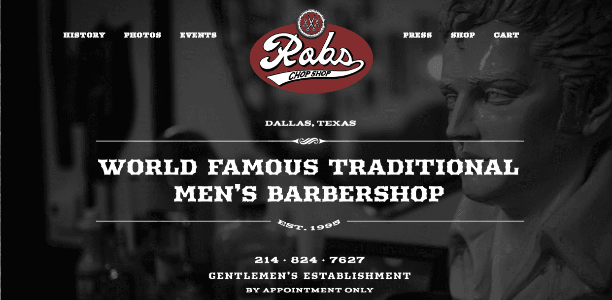
Rob’s Chop Shop’s website uses a mixed styling to captivates visitors’ attention. A ‘history’ page tells customers the story of the business – a simple yet effective way of seeking to establish a relationship with potential clients. The ‘Events’ page serves to inform visitors of what’s coming up and situates the business amongst the local culture and community. Finally, online shopping functionality makes it easy for the business to make sales at all times of the day.
Pankhurst London
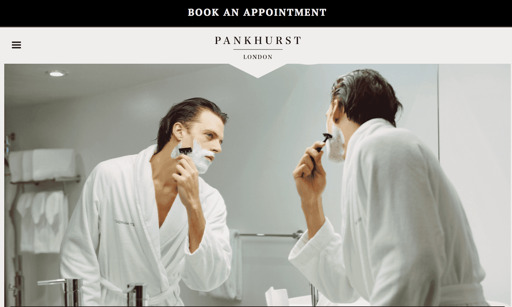
Pankhurst London has combined a James Bond-worthy style and excellent upmarket branding into a sophisticated and classy website. The design and content speak directly to the business’ male target audience, highlighting the ‘masculine haven’ that is Pankhurst London. A testimonials page (featuring reviews by esteemed clients) and a dedicated grooming advice page with exceptional, comprehensive content confer authority and cachet on the business.
Al’s Barbershop
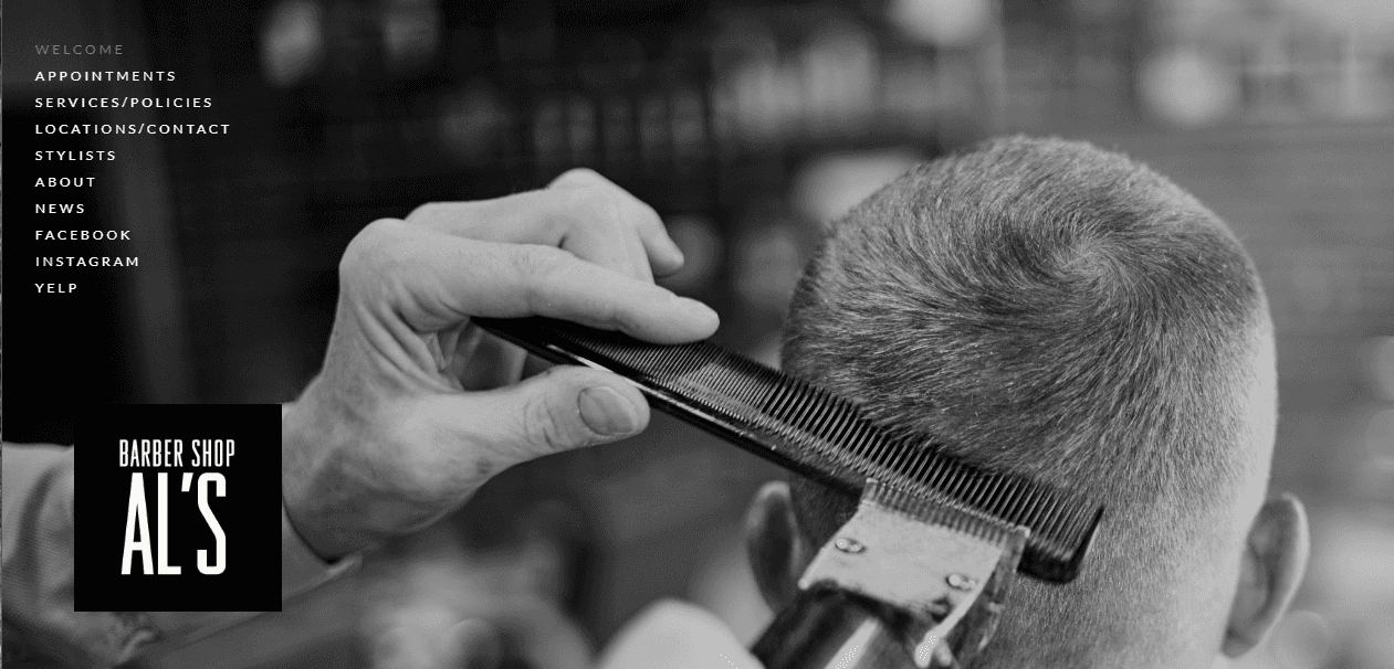
Al’s Barbershop has a website that exemplifies a fusion of aesthetics and simplicity. The homepage is dominated by a high resolution, black and white photograph, which contextualises the business’ offering and sets a tone of sophistication. A neat navigation panel guides users to whatever they are looking for and includes outbound links to both the shop’s Yelp review page and Facebook page where the customer can interact directly with the business.
Neighborhood Cut & Shave
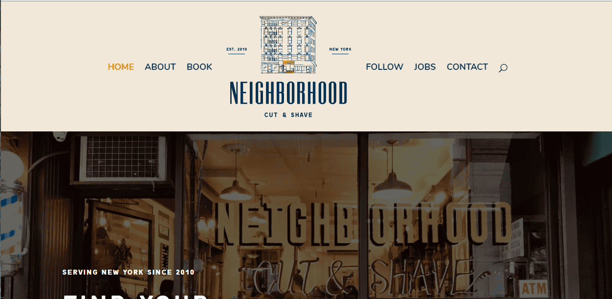
Neighborhood Cut and Shave’s website includes an excellent scrolling page design where all the business information is immediately accessible to visitors. The business’ services are displayed alongside quality images for a fuller experience. A tagline in the middle of the page welcomes customers and instils a sense of community.
Lucky’s Barbershop
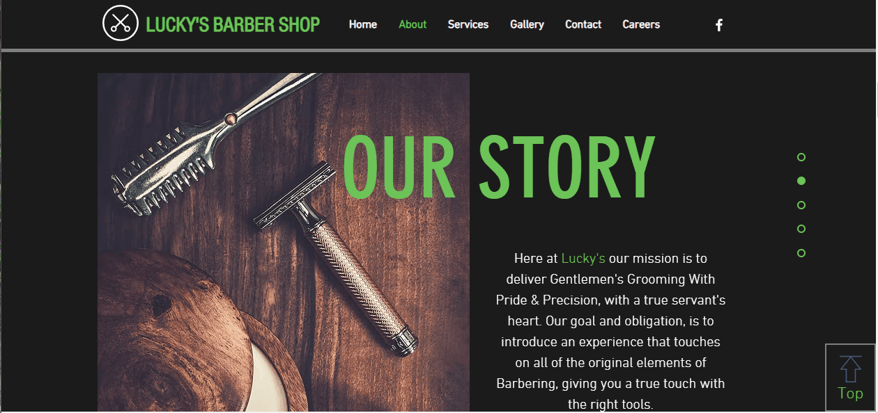
Lucky’s Barbershop website includes eye-catching and conspicuously placed call to action buttons, making it effortless for customers to book their services. An interactive map assists customers to find their shop locations, and they have taken advantage of using the website to display promotional sales in a catching way.
Churchills Barbershop
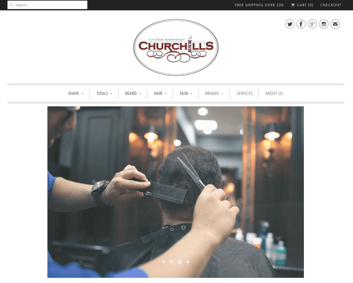
Churchills Barbershop’s places a strong focus on the products the business has on offer. Tabs on the navigation panel offer visitors specific information about different categories of products and care, whilst expert use of photography lets visitors see what they are buying. The website also features very well designed call to action buttons that invite visitors to spread the word and interact.
The Proper Barbershop
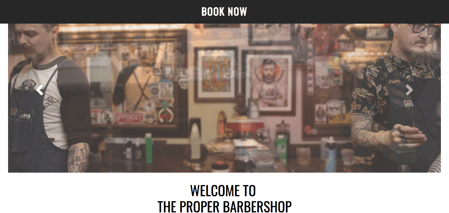
The Proper Barbershop’s uncomplicated one-page website makes a point of addressing the customer immediately with the story and mission of the business. This is a great way of setting the tone at the outset and instilling in visitors a sense of the passion that the business brings to its craft. An integrated appointment booking system tells customers what they need to know about the services and lets them book without having to do anything further.
Mauvais Garcons
The website for the barbershop Mauvais Garcons makes use of compartmentalised sections on its landing page, making for easy navigation (along with the navigation bar). The business capitalises on the media it has received by placing a video immediately available on the home page, contributing to its credibility. Language options for French or English make the page accessible to a wider range of customers and improve the user experience.
Ollie’s Barbershop
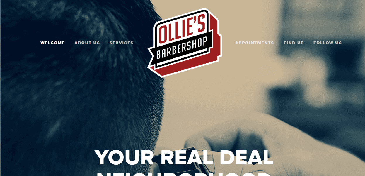
The tagline on the website for Ollie’s Barbershop instantly establishes a sense of unpretentiousness and authenticity with visitors. The website uses excellent branding and imagery that is engaging and gives the business a ‘cool’ style. A gallery provides visual guidance for the business’ offerings, and mention of its services to animal charities establishes a connection to – and involvement with – the local community.
Floyd’s Barbershop
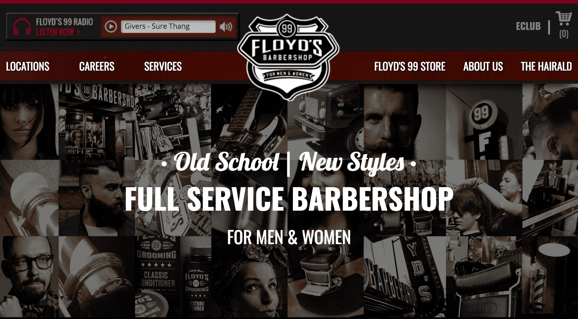
Floyd’s Barbershop’s website combines stylish rock n’ roll imagery with great content. Fantastic location functionality allows users to effortlessly find the closest of the business’ many locations by simply inputting their postcode. Worth a look: ‘The Hairald’ section, which features quality content on various brand-adjacent topics, including events, promotions and style, among others.
The Barbershop Club
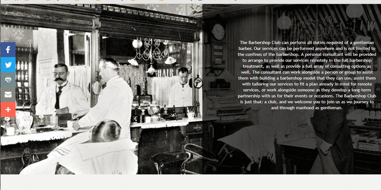
Whilst the branding and design is relatively plain, The Barbershop Club’s website is easy to use and navigate. Call to action buttons move with users as they go down the page, making it a simple process for them to interact or share wherever on the website they are. The website pays homage to the history of the business in its imagery and content, making the most of the business’ long-standing relationship with the community.
Baxter Finley
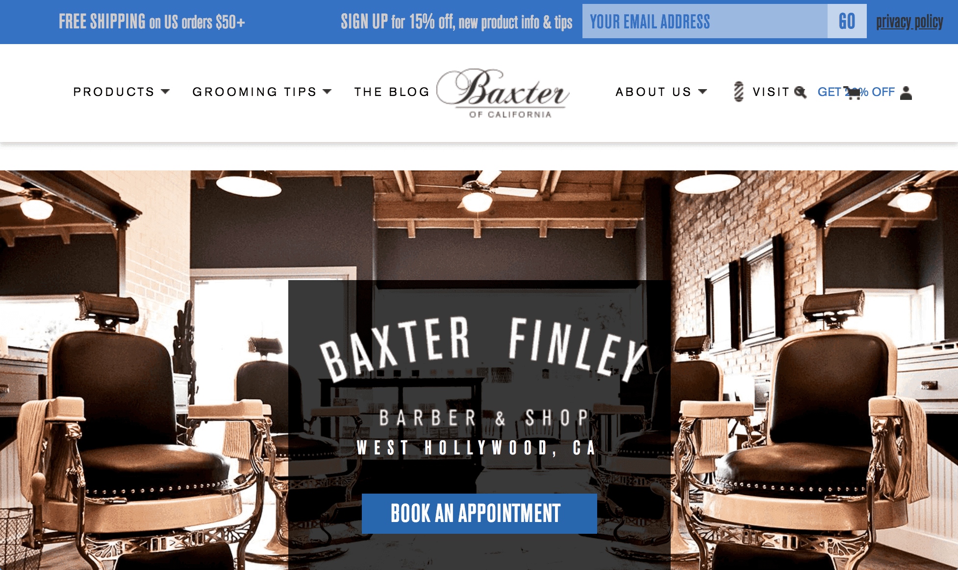
Baxter Finley’s website demonstrates the benefit of a scrolling page structure, where a single beautiful page features everything a potential customer needs. The website takes advantage of options for promotion by offering visitors to sign up to a mailing list for a discount. In addition, the website features a blog with interesting and wide-reaching content about life in California, where the business is based.
Buck’s Barbershop
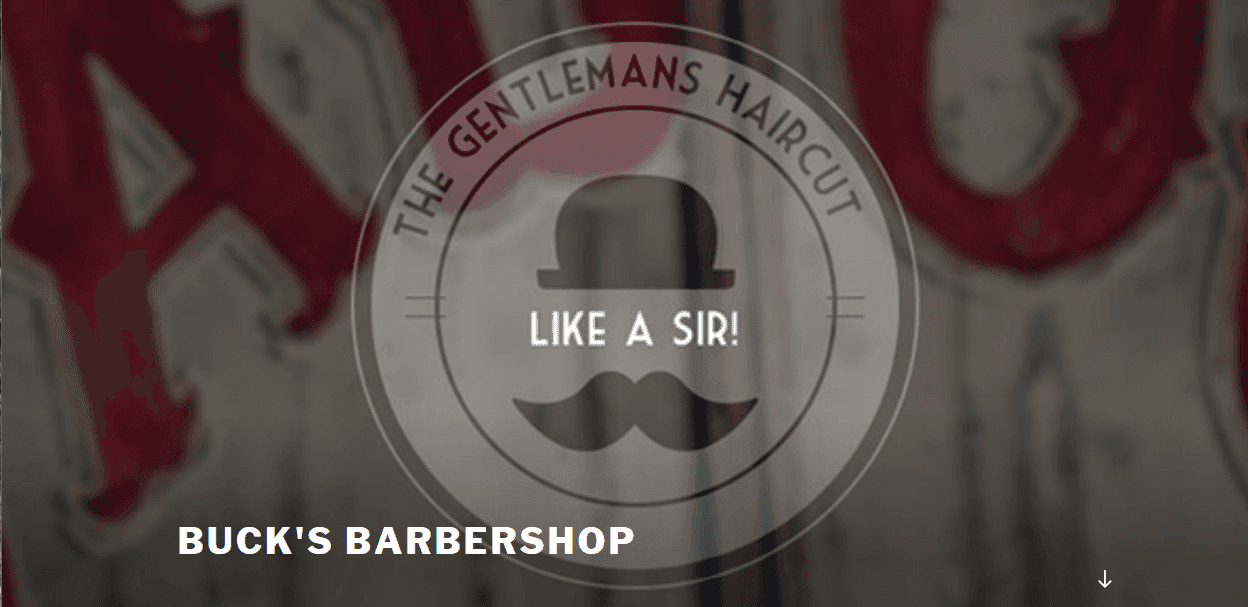
This website is a straightforward one-page WordPress powered site. Location and contact details are clearly available, as are details of the services on offer and prices. The website incorporates outsourced booking functionality, so a customer can make an appointment without having to call the business directly.
Legends Barbershop
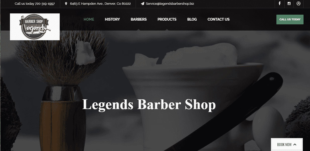
Not to be confused with number 10 on our list, we highlighted this Legends Barbershop’s website because of its simple yet effective design. Important contact information and call to action buttons are featured at the top of the page, where a user can immediately see them upon arrival. Staff biographies complete with pictures add a personal touch by introducing potential clients to the barbers who will look after them.
Mr. Hobbs Barbershop
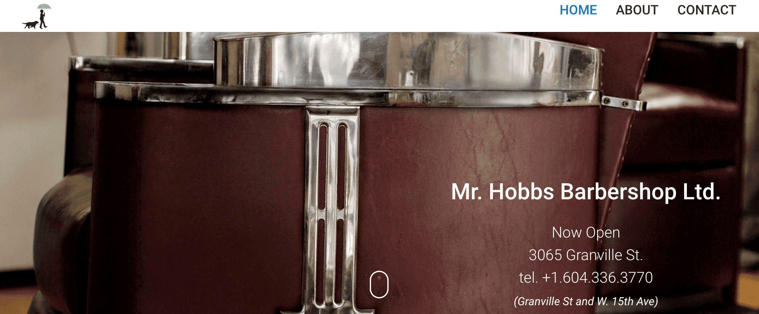
The design of the website for Mr Hobbs Barbershop focuses strongly on high-quality photography. The images are crisp and stylish, giving the business a sense of elegance and refinement while subliminally indicating to potential customers that they can have this too. As with some other web pages, the navigation bar follows the reader as they scroll down the page, allowing for effortless navigation to other sections.
Westside Barbershop & Shave Lounge
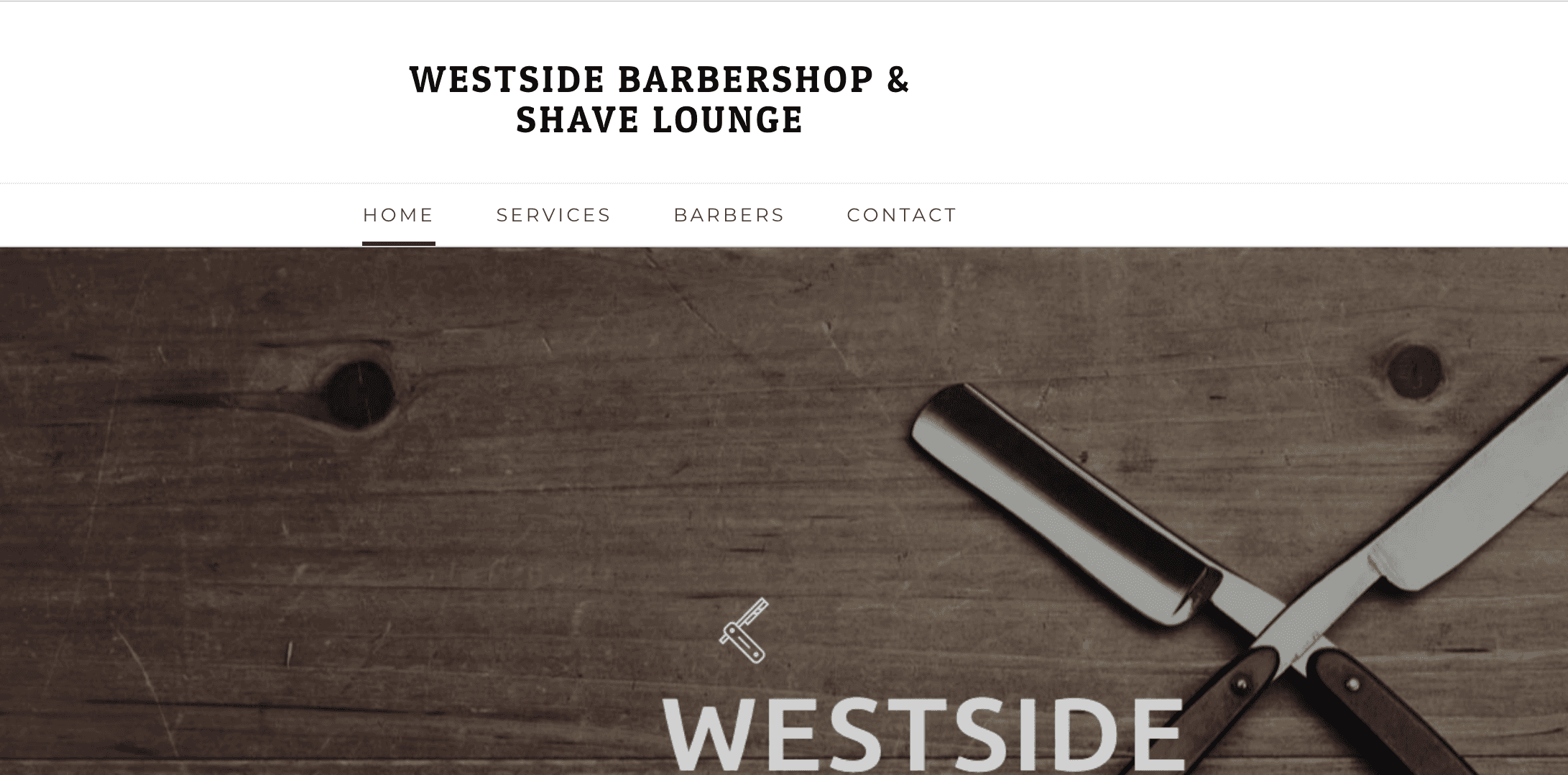
Westside Barbershop and Shave Lounge’s website uses a minimal, contemporary theme that is urbane and engaging. The business makes a point of advertising the awards it has received and features a social media section that provides a direct link to the business’s Facebook page where users can see what the business has been posting about, including available promotions. A testimonials section adds value by allowing customers to see what others have had to say about their experience.
Roosters Men’s Grooming Center
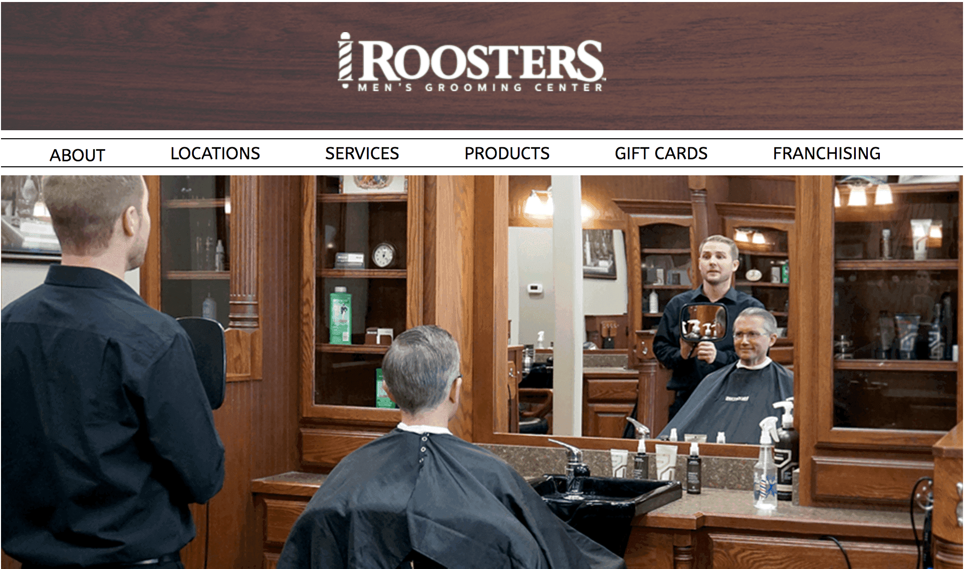
It is clear from Roosters’ website that the business’s mission is about welcoming men to a classic barbershop experience, and the website’s design reflects that goal. The website is uncomplicated and unpretentious – two factors that give the business an approachable vibe. High-resolution photographs give users a glimpse of the shop itself, and good functionality makes it easy to interact with the page.
Next steps
So there we have it – 30 exceptional barbershop websites with an array of features that business owners can seek to emulate. A good website is quite possibly the most potent tool for marketing a small business and connecting with its potential customers.
These days, getting a small business online with a website doesn’t have to be complicated, with agencies such as UENI that offer a variety of website packages at low prices.
If you’re keen to get your business online with a website and need some assistance, get in touch.

