Were you investigating on home bakeries and the best bakery websites in order to expand your bussiness? Or… are you just interested in learning how to create a beautiful bakery website? We’ve got your back.
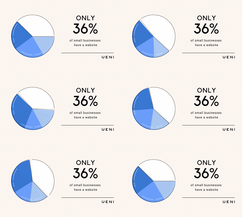
Consider the fact that only about one-third of small businesses have a website, and you will be way ahead of the competition after you build yours.
In other words, there are still lots of possibilities for your brand to stand apart. Bakeries, for example, may not be aware of the many advantages of having a website or may believe they lack the necessary expertise.
What are the benefits of having a bakery? Your website will become much more professional, and customers will be able to find you on Google and Google Maps (if you also create a Google Business Profile).
During the past several years, getting a website has become significantly easier. If you want to build a website for your bakery, there are a range of options. However, you will need some time and expertise if you do it yourself. The good news is that you can have a high-quality bakery website designed for a very inexpensive cost with UENI.
There are a few ways to identify high-quality websites. Here, we’ll show you how to recognize well-designed bakery website.
We will go through the most important aspects to consider when building a website, followed by an examination of 10 of the best bakery websites to see what makes them so exceptional.
Table of Contents
What are the qualities of a high-quality bakery website?
Knowing what elements your small business website should have might be tough. There are, however, certain crucial common aspects that apply to all websites, whether you run a real bakery or a home bakery.
The Design
If a website doesn’t present a nice design, buyers can feel that their items or services are of low quality, or that the business isn’t truly legitimate.
The Functionality
Good design is not just how good a website appears; it is also about its usability. A website needs to be simple to browse. Intuitive functionalities, clear call to action buttons and distinctive sections are crucial aspects.
If visitors believe a website to be excellent looking and simple to use, they are likely probably stay longer time on it, which enhances the chance of them purchasing one of your products.
10 Excellent Bakery Websites
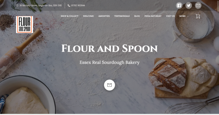
1. Flour and Spoon – A UENI website example
UENI’s bakery websites focus on a few key features that all websites should incorporate: a beautiful appearance, usability and exceptional content. This website for a small bakery in Essex, built and hosted by UENI, has a minimal design and leverages a single scrolling page as its core framework. High-quality bakery photography draws the visitor’s attention and adds value to the site.
This website features a single scrolling page design that enables visitors to naturally move on to the next area of the website rather than load a new page. This has a beneficial influence on the website’s efficiency since visitors do not have to wait for pages to load, and it also means that the vital facts are quickly accessible. A single scrolling page design allows for a website that is straightforward to navigate, giving a better user experience.
GET YOUR WEBSITE IN A FEW CLICKS
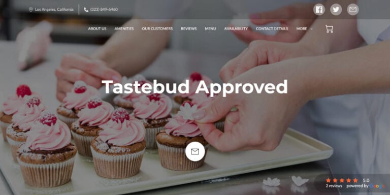
2. Tastebud Approved
Tastebud Approved’s is a fantastic cake bakery website example . A single scrolling page makes it straightforward, never needing to leave the page. A reviews area makes the bakery trustworthy for the visitors.
Customised images establish a personal, friendly tone and offer visitors with compelling visual representations of the products available.
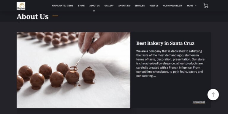
3. Santa Cruz Confetti
Santa Cruz Confetti bakery website incorporates lovely bakery pictures that emphasizes the company objective. The ‘About Me’ section is well-written and detailed, which gives the visitors a very excellent picture of the business, while the content boxes offer extensive information for the customers.
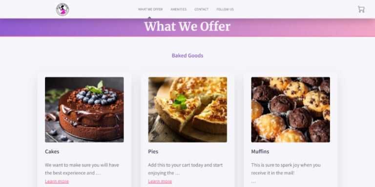
4. Beauty and The Bundt
The website for Beauty and The Bundt bakery features a neat design helps to a great user experience. This simple and appealing website greets visitors with its friendly and clean appearance. The information is clearly presented, giving clients with the vital data about the business’s various services on offer and crucial contact and location details.
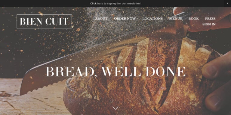
5. Bien Cuit Bakery
Bien Cuit’s bakery website is neatly put together and a superb example of a well designed home bakery website. The identity is beautifully presented, and visitors to the website will simply access the information relating to the services on offer. Equally, well-placed call to action buttons enables customers to purchase things immediately away, which enhances the user experience.
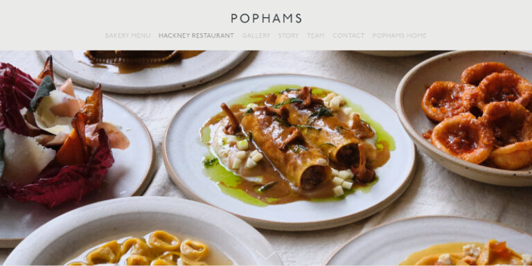
6. Pophams Bakery
Pophams’ bakery website utilizes appealing pictures and provides a wonderful experience for the visitors. High-quality imagery lets visitors feel as though they are really at the bakery. The website features everything a bakery website requires while ensuring that critical information is easily shown.
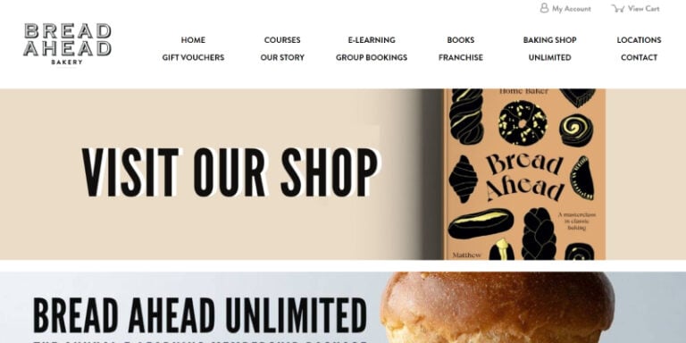
7. Bread Ahead Bakery
Bread Ahead’s website is incredibly vibrant. A carefully considered color selection gives the page a lively air. A navigation panel replete with images for each part makes it easier to discover information on the website.
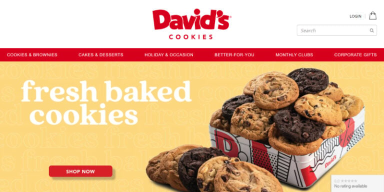
8. David’s Cookies
David’s cookies website has a lot of bold colors and simple branding to make people want to look at it right away. A clear navigation panel and buttons that are very different from each other make the website easy to use and make it more likely that people will buy cookies from the website.
9. Brickhouse Bread
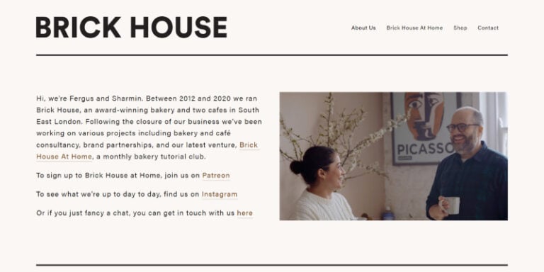
The website for Brickhouse Bread’s Bakery is simple and attractive, with an emphasis on use. The about us section and services offered are presented very clearly on the main landing page, along with a photograph of the founders, and the visitor is asked to click a button if they desire additional information, keeping the page clutter-free.
10. Magnolia Bakery
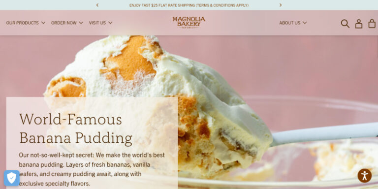
Magnolia’s bakery’s website is a lot of fun. Possibly one of the greatest bakery websites around. The photos are aesthetically appealing and do an excellent job of describing the items and services. The website makes creative use of content boxes to deliver information in an easy-to-read and consumable fashion.
The must have features
You know understand that beautiful design and an optimized functionality are vital qualities that a bakery website must have.
But on top of that, there are some key elements that can’t miss on a website:
- Clear and visible contact buttons
- Reviews about your business
- A shopping cart with different payment methods
- Your social media icons visible, so that visitors can follow you on different channels
- Your about us section, so that customers get to know you better.
- A section with your products with great imagery and clear descriptions.
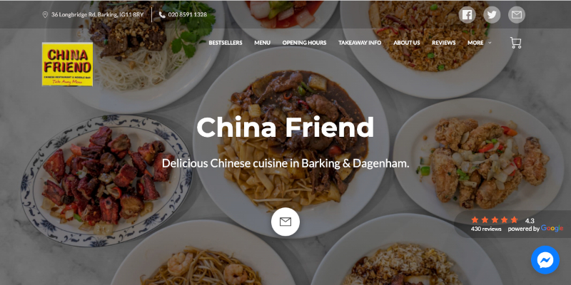
Prominent Contact Buttons
Social Media Channels Visible
Reviews Synced With Your Google Profile
Messenger Live Chat Button
Easy Navigation Bar
Shopping Cart
Striking Images to Market Your Business
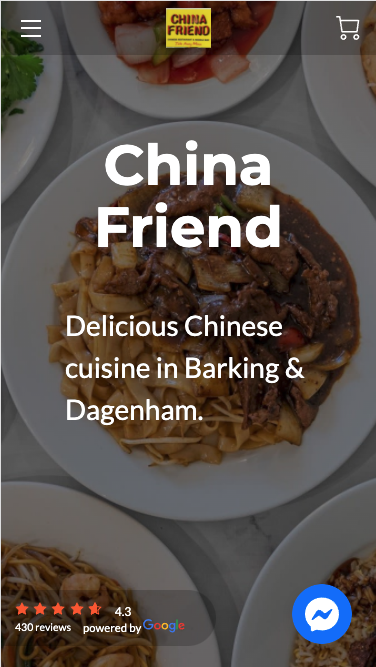
Shopping Cart
Reviews Synced With Google Profile
Messenger Live Chat Button
Great Images That Sell
Your Business
Summary: All about the greatest bakery websites
So now you have it – ten magnificent bakery website examples demonstrating many of the features and functionalities that a successful bakery website requires. Most likely, you will draw inspiration from them for your own website.
A well-designed bakery website is, without a doubt, one of the most effective tools for promoting a business and interacting with new customers.
Getting a small business online with a website doesn’t have to be difficult these days; UENI provides a solution for non-tech savvy individuals who want to promote their products or services online effortlessly and economically.


