
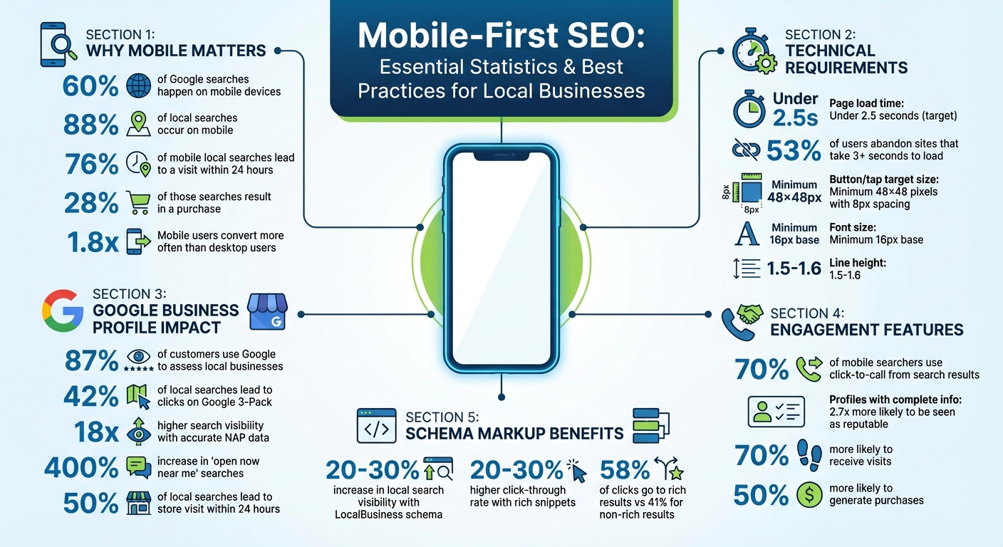
Mobile SEO is now the standard. With over 60% of Google searches happening on mobile devices – and 88% for local searches – your business website must be mobile-friendly to stay competitive. Google’s mobile-first indexing, fully implemented in 2024, prioritizes mobile versions of websites for search rankings. If your site performs poorly on mobile, it could harm your visibility across all devices.
Here’s why this matters:
- 76% of mobile local searches lead to a visit within 24 hours.
- 28% of those searches result in a purchase.
- Mobile users convert 1.8x more often than desktop users.
To succeed, focus on:
- Fast load times (under 2.5 seconds).
- Responsive design and easy navigation.
- Accurate Google Business Profile details and local schema markup.
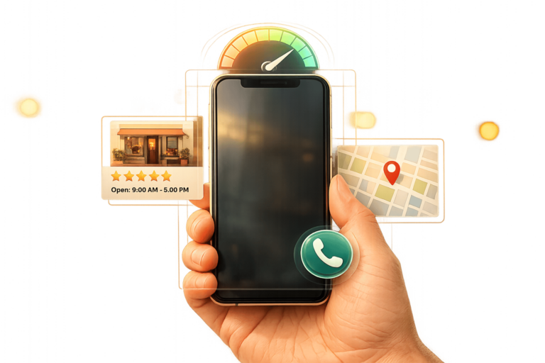
- Mobile-friendly features like click-to-call buttons and geotargeted content.
Key takeaway: A mobile-optimized site isn’t just helpful – it’s essential for driving local traffic and sales.
Mobile-First SEO Statistics and Best Practices for Local Businesses 2024
Core Principles of Mobile-First Website Design
Making your mobile design a priority is essential for grabbing local search traffic and turning nearby users into customers. Your mobile site needs to perform seamlessly because mobile is the focus. With responsive design, flexible grids and media queries ensure your content adjusts to fit any screen size. This means you can use a single codebase for all devices, which is not only convenient but also aligns with Google’s SEO preferences. The best approach? Start with the mobile layout and then scale up for larger screens, instead of shrinking a desktop design.
Responsive Design and Mobile Usability
To improve usability, ensure that interactive elements like buttons and links are at least 44×44 pixels with an 8-pixel gap to reduce accidental clicks. Place key navigation tools and calls-to-action (CTAs) where they’re easy to reach – typically in the bottom third of the screen or in sticky headers that stay visible as users scroll.
Text readability is another priority. Use a base font size of 16–18 pixels, maintain a line height of 1.5–1.6, and ensure high color contrast for clarity. Since every pixel matters on mobile, highlight essential details – like your business name, services, and contact info – right at the top of the page. Combine this with a responsive layout and fast load speeds to deliver a smooth mobile experience.
Fast Page Load Speeds
Page speed plays a huge role in local SEO rankings. Did you know that 53% of mobile users will leave a site if it takes longer than 3 seconds to load? And for every extra second of load time, conversions can drop by 7%. For example, pages that load in 2 seconds might see a bounce rate of around 9%, but at 5 seconds, that rate could jump to 38%.
To speed things up, convert images to WebP or AVIF formats, compress large visuals like hero images to under 100KB, preload above-the-fold images to reduce Largest Contentful Paint (LCP) time, and use lazy loading for images further down the page. Don’t forget to minify CSS and JavaScript files using defer or async attributes.
Here’s a real-world example: In 2025, a local restaurant cut its mobile site load time from 8 seconds to just 2.1 seconds by swapping a heavy video background for an optimized static image and minifying CSS/JS. The result? A 40% jump in mobile bookings in just one month.
Mobile Navigation Best Practices
Navigation can make or break your mobile user experience. Keep it simple – users should be able to reach essential pages within three taps. Use hamburger menus or bottom tab bars to make navigation intuitive, and ensure that CTAs like contact and booking options are always visible. For added convenience, make phone numbers clickable with a tel: link so users can call you instantly. Also, use input types like type="tel" to trigger the appropriate mobile keyboard and enable autocomplete.
Between 2024 and 2025, a local restaurant revamped its mobile site after identifying issues like overlapping text and buttons that were too small to tap. By fixing these problems and speeding up menu load times, they saw a 147% boost in local search visibility and tripled the number of phone calls from Google searches within three months. These mobile-first strategies not only improve user experience but also elevate your local SEO game.
sbb-itb-5b82b38
Optimizing Google Business Profile for Mobile Users
Your Google Business Profile is a key tool for connecting with mobile users who are ready to act. With 87% of customers using Google to assess local businesses and 42% of local searches leading to clicks on the Google 3-Pack, it’s clear that mobile optimization is essential. Most local searches now happen on mobile devices, so your profile must be tailored for small screens and fast decision-making. Here’s how to make your profile mobile-friendly and effective.
Keep Business Information Accurate
Start by claiming and verifying all your business locations. Verified profiles not only gain better visibility but also unlock additional mobile-friendly features. Make sure your Name, Address, and Phone number (NAP) are consistent across your website and all directory listings. Even minor discrepancies can confuse users and harm your rankings. Businesses with the most accurate details enjoy 18 times higher search visibility than those with inconsistencies.
Pay special attention to your business hours. Use the "Hours" section to include regular, special, and holiday hours. This is critical because searches for "open now near me" have surged by 400% in recent years. Also, choose your primary and secondary categories carefully. Use Google’s autocomplete suggestions to identify high-intent categories that align with the services you offer.
Accurate information is just one piece of the puzzle. Adding visuals and reviews can further enhance your credibility, especially on mobile.
Add Photos and Reviews
Mobile users rely heavily on visuals and reviews to make quick decisions. For photos:
- Upload JPG or PNG files between 10 KB and 5 MB, with a minimum resolution of 720×720 pixels.
- Include key visuals like your logo, cover photo, and pictures of your exterior and interior to help users recognize your location.
- Keep videos under 30 seconds, under 100 MB, and at least 720p resolution.
- Geotag your photos to help Google link them to your service area.
When it comes to reviews, they’re a powerful trust signal. A complete profile makes customers 2.7 times more likely to see your business as reputable, while 70% are more likely to visit, and 50% are more likely to make a purchase. Use the "Get your first reviews" feature to create a direct link for customers to leave feedback, but don’t offer rewards – this violates Google’s policies. Always respond to reviews professionally and include local references in your replies to boost relevance.
Enable Click-to-Call and Directions
Mobile users want instant action, so make it easy for them. Enable click-to-call so they can contact you with a single tap, and ensure your phone number is prominently displayed. These behavioral signals, like mobile clicks-to-call, rank as the third most important factor for local organic search results.
Also, enable the directions feature to guide users to your physical location. This is crucial since 50% of local searches lead to a store visit within 24 hours. As Google increasingly evaluates profiles based on engagement, freshness, and user intent, it’s important to stay responsive. Enable messaging and assign someone to reply promptly. You can also integrate third-party booking tools to let users schedule appointments directly from your profile. These zero-click actions – like booking, viewing menus, or placing orders – are becoming the norm as users complete tasks directly within the Google Business Profile interface.
Mobile-Specific Technical SEO Tactics
Building a solid technical foundation is key to improving mobile performance and search rankings. With mobile-first indexing now the standard for all websites, your site’s technical setup directly impacts whether you appear in local searches or get overlooked. Prioritize three main areas: structured data, clean URLs, and essential technical elements. Let’s dive into how schema markup and URL strategies can work together to enhance local SEO.
Use Schema Markup for Local SEO
Think of schema markup as a cheat sheet for search engines. It helps them instantly understand your business details – like your name, address, phone number, hours, and services. The best way to implement this is through JSON-LD, a lightweight script that won’t slow down your mobile pages. This is especially important because schema markup boosts your visibility in Google’s Knowledge Graph, making it easier to appear in AI-generated overviews and the Local 3-Pack.
The benefits are clear. Properly using LocalBusiness schema can increase local search visibility by 20–30%, and listings with rich snippets – like star ratings, prices, and hours – can see a 20–30% higher click-through rate. In fact, rich results account for 58% of clicks in certain local niches, compared to 41% for non-rich results. Schema also powers mobile-friendly features like "Click-to-Call" buttons, real-time "Open Now" badges, and accurate map pins.
"AI search engines are becoming the new local directory. When someone asks ChatGPT for ‘the best Italian restaurant near me,’ your local schema determines whether you’re in that conversation."
- Yue Zhu, Product Manager, Seenos.ai
To get the most out of schema, avoid generic tags like LocalBusiness. Use specific subtypes such as Restaurant, Dentist, or BeautySalon to improve accuracy. Add GeoCoordinates (latitude and longitude) to ensure mobile users are directed to the correct location – not just a general street address. Link your verified social media profiles using the sameAs property to establish credibility with Google. Lastly, run your schema through the Google Rich Results Test to catch errors before they impact your visibility.
Once your schema is in place, the next step is optimizing your site’s URL structure for mobile users.
Mobile-Friendly URLs and Site Structure
Google recommends Responsive Web Design, which uses the same HTML and URL for both desktop and mobile versions. This approach ensures content consistency and is easier to manage. Maintaining content parity between your desktop and mobile sites is crucial for search visibility.
Simplify your site navigation. Users should be able to reach key pages in no more than three taps. This not only improves user experience but also helps search engines crawl your site more efficiently. Breadcrumb navigation is another helpful tool – it clarifies site hierarchy for users and boosts the chances of appearing in rich snippets. Additionally, include the viewport meta tag (<meta name="viewport" content="width=device-width, initial-scale=1">) to ensure your site scales correctly across devices.
Avoid using anchor fragment URLs (#) as primary mobile URLs, as they are often not indexable. Make sure your mobile URLs don’t lead to error pages when the desktop version works, or Google might drop them from its index. Use Google Search Console’s URL Inspection tool to check how Googlebot Smartphone renders your mobile pages, and ensure no critical CSS or JavaScript is blocked by robots.txt.
Mobile Optimization Elements Comparison
Not all technical elements are equally important for mobile SEO. Here’s what to focus on in 2026:
| Element | Importance | 2026 Best Practice |
|---|---|---|
| Page Speed (LCP) | Critical | Keep it under 2.5 seconds on a 4G connection |
| Schema Markup | High | Use JSON-LD with specific LocalBusiness subtypes |
| Clickable Phone | High | Use href="tel:+1..." for instant dialing |
| GeoCoordinates | High | Include precise latitude and longitude for maps |
| Tap Target Size | Medium | Minimum size of 48×48px with 8px spacing |
| Font Size | Medium | Set at least 16px to avoid zooming |
Page speed is a dealbreaker. Your Largest Contentful Paint (LCP) should load in under 2.5 seconds on a 4G connection. If your site takes more than three seconds to load, 52% of users will leave. Considering that 76% of local searches on mobile lead to a store visit within 24 hours, speed is critical. Use modern image formats like WebP or AVIF and a Content Delivery Network (CDN) to ensure fast load times.
For usability, implement tel: links on phone numbers to enable one-tap calling. Ensure tap targets are at least 48×48 pixels with 8px spacing to avoid accidental clicks. Set a minimum font size of 16px to eliminate the need for zooming. These technical strategies, combined with thoughtful design, can significantly improve your local search performance on mobile devices.
Creating Location-Specific Content for Mobile Intent
Mobile users often search with a sense of urgency. In fact, 97% of consumers look online for local services, and 88% of mobile users who search for a local business either visit or call within 24 hours. This makes crafting location-specific content essential, especially when paired with the mobile-first strategies discussed earlier. Your goal should be to address these immediate, location-based needs directly through your content.
Target Hyper-Local Keywords
Think beyond broad city names – hone in on neighborhoods, ZIP codes, and even well-known landmarks. For instance, if someone searches for "pizza near me" while in the Mission District, Google prioritizes businesses that reference "Mission District" over those that only mention the city name. Tools like Google Autocomplete and the "People Also Ask" section can help you identify how locals phrase their searches. Additionally, comb through customer reviews and competitor Google Business Profile titles to uncover commonly used local terms. Whether your audience says "sub", "hoagie", or "grinder", using the right regional language can make all the difference.
"Local SEO keyword research in 2026 must account for conversational search queries and natural language patterns." – Megan Ragab, Founder, Topical Map AI
Focus on conversational, long-tail questions that reflect voice search habits, such as "Where’s the closest plumber open now?" Avoid awkwardly forcing "near me" into your text – it can sound robotic. Instead, opt for phrases like "near you", which Google treats the same way but keeps your content natural. Encourage customers to mention how they found you in their reviews. For example, a review that says, "I was looking for a dentist near me and found this place", naturally boosts your local keyword relevance.
Once your hyper-local keyword strategy is in place, ensure your content is optimized for mobile users.
Write Mobile-Friendly Blog Posts and FAQs
Mobile users prefer content that’s quick and easy to digest. Keep paragraphs short – 3–4 sentences max – and use clear H2 and H3 subheadings to guide readers. For longer posts, include a table of contents with anchor links at the top, so users can jump directly to the sections they care about. Use bullet points sparingly, reserving them for steps or lists, and write concise sentences that offer immediate value. This approach not only improves user experience but also helps with search rankings.
For FAQs, accordion menus are a great way to save screen space while keeping all content indexable. Ensure your mobile content mirrors its desktop counterpart, including the same primary text, internal links, and structured data – content parity is essential for maintaining rankings. Use a font size of at least 16px with a line height of 1.5–1.7 to avoid forcing users to zoom. Also, make things easier for mobile users by adding click-to-call phone numbers (href="tel:...") and embedding Google Maps links directly into your HTML.
Use Geotargeting Features
To align even more closely with local search intent, use geotargeting. Create dedicated landing pages for each physical location or service area you cover. A generic "Services" page won’t cut it – especially when over 90% of "near me" searches come from mobile devices. Each location page should have a unique headline (e.g., "Emergency Plumbing in Boise’s North End"), address specific neighborhood challenges, and include at least 800 words of original content to avoid thin content penalties. Swap out generic calls-to-action for geo-targeted ones, like "Contact Our St. Louis Team Today".
Embed Google Maps with pins for your locations so mobile users can get directions with a single tap. Showcase testimonials from customers in specific neighborhoods to build localized social proof, which helps establish trust with potential customers. Add LocalBusiness schema with precise latitude and longitude coordinates to ensure search engines match your business to "near me" searches. Lastly, double-check your NAP (Name, Address, Phone) consistency across your website, Google Business Profile, and directories. This consistency is key to improving your relevance in local search results.
Improving Mobile UX with Click-to-Call and Navigation Features
When designing for a mobile-first audience, making it easy for users to contact you or navigate your site is crucial. Once you’ve set up location-specific content, the next step is ensuring mobile visitors can take action effortlessly. Here’s why this matters: 70% of mobile searchers use click-to-call directly from search results, and 88% of local Google searches happen on mobile devices. Features like click-to-call buttons and straightforward navigation aren’t just nice to have – they’re essential for turning visitors into customers.
Add Click-to-Call Buttons
Mobile users expect instant access to local services, and click-to-call buttons deliver exactly that. By using the tel: protocol (e.g., <a href="tel:+1234567890">), you allow users to connect with just one tap. To maximize their impact:
- Place these buttons in a sticky header or above the fold for easy access.
- Use contrasting colors to make them stand out visually.
- For businesses with set hours, dynamic buttons that appear only during open times can reduce customer frustration by 35%.
Click-to-call interactions also send positive signals to Google, potentially boosting your local rankings in both organic results and the Map Pack.
Create Simple Navigation Menus
Overcomplicated menus are a common pitfall for mobile sites. Mobile users prefer simplicity, so aim for:
- Menus with no more than five items and a structure that lets users reach key pages within three taps.
- Positioning navigation in the bottom third of the screen (the "thumb zone") for better usability.
"Your menu is the steering wheel of your mobile experience. If users fumble their grip, they crash – into confusion, back buttons, and abandon rates." – Tailored Edge Marketing
Icons paired with text labels work best, as symbols alone can confuse users. Include a prominent search icon at the top of the screen for quick access to specific content. To enhance the user experience further, add visual feedback, like brief animations under 250ms, to confirm successful taps. Also, ensure text meets a minimum contrast ratio of 4.5:1 for readability.
Add Mobile-Friendly Booking and Contact Forms
Streamlined forms are a key part of capturing leads, especially outside business hours. To optimize these forms for mobile:
- Limit fields to essentials like name, phone number, and the service needed – three to four fields is ideal.
- Enable auto-fill to make typing less tedious.
- For longer forms, break them into steps with a progress indicator to reduce overwhelm.
Use a single-column layout designed for vertical scrolling, and place customer reviews or star ratings near calls-to-action to build trust. Since Google’s mobile-first indexing prioritizes usability, poorly designed forms can hurt your site’s rankings. Businesses that incorporate these best practices, including social proof near forms, have seen conversion rates improve by as much as 400%.
Conclusion
Mobile-First SEO Best Practices Summary
Mobile-first SEO is no longer optional – it’s the backbone of modern local search strategies. With Google’s mobile-first indexing now fully implemented as of 2024, your mobile site determines rankings for both mobile and desktop users. The numbers speak volumes: 76% of mobile local searches lead to a physical visit within 24 hours, and 28% of those visits result in a purchase. For local businesses, this represents a golden opportunity to connect with customers who are ready to act.
To succeed, prioritize three key areas: speed, content parity, and mobile usability. Aiming for a Largest Contentful Paint (LCP) under 2.5 seconds is critical since 53% of mobile users abandon sites that take more than 3 seconds to load. Ensure your mobile site mirrors your desktop version in terms of primary content, internal links, and structured data to avoid ranking discrepancies. Additionally, make phone numbers clickable, design buttons that are at least 48×48 pixels with sufficient spacing, and streamline contact forms to include only essential fields.
"If your mobile site is broken, slow, or hard to use, it doesn’t matter how polished your desktop site is. Your search rankings will suffer regardless." – Monsoft Solutions
Consider the example of Denver Plumbing Co. By optimizing their load time to 1.8 seconds and incorporating a clear “Call Now” button alongside consistent NAP (Name, Address, Phone) data, they achieved a top 3 ranking in the Local Map Pack for "plumber near me", leading to a 20% increase in calls. In contrast, Metro Plumbing Pros – despite having more backlinks – lost 40% of call volume due to a 6-second load time and broken mobile menus.
These strategies are essential for building a strong local SEO foundation, and professional guidance can make all the difference.
Professional Support for SEO
Keeping up with mobile SEO demands ongoing effort, especially for small businesses without dedicated technical teams. Professional support can bridge the gap, ensuring your site stays optimized and competitive. UENI offers tailored solutions for local businesses, delivering mobile-friendly, SEO-optimized websites in just 7 days. Their services include verified Google Business profiles, click-to-call functionality, and concierge support for updates and edits. These features align perfectly with the mobile-first principles discussed here.
With mobile users converting 1.8x more often than desktop users when they find what they need, investing in a properly optimized mobile presence is no longer just a good idea – it’s a necessity for staying visible and driving long-term local success.
FAQs
How can I check my mobile LCP speed?
To evaluate your mobile Largest Contentful Paint (LCP) speed, rely on performance tools designed to measure Core Web Vitals. Popular options include Google PageSpeed Insights, GTmetrix, Lighthouse, and Milten’s Speed Scanner. These tools assess how quickly the largest content element on your site loads and becomes visible on mobile devices. They also offer practical suggestions to help you improve your mobile LCP performance.
Which schema markup should my business use?
Your business needs to implement the LocalBusiness schema markup. This structured data is a game-changer for local SEO because it helps search engines grasp important information about your business – like your location, services, operating hours, and customer reviews. When done correctly, this markup can boost your visibility in local search results, making it easier for potential customers to find you.
Do I need a separate mobile site URL?
No, you don’t need a separate mobile site URL if you’re using responsive design. Google advises using a single URL with the same HTML code that adapts to various screen sizes. This method provides a smooth experience for users and supports mobile-first indexing guidelines effectively.


