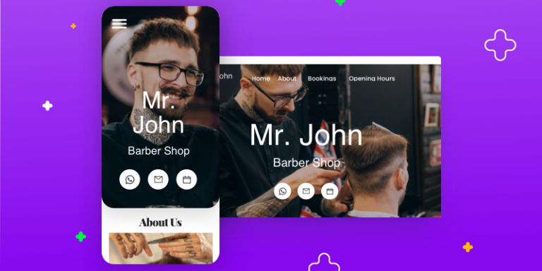
One of the most common things our clients ask us is: what makes a good website? The truth is, what makes a good website great is a strong appeal to its intended audience.
That means that there are no universal solutions because no two websites are the same.
However, we can say that all good websites share the following features:
- A Clear Message and Purpose
- Amazing Aesthetics
- Strong Technical Foundations
- Real Appeal in Your Business Niche
In this post, we’ll break down these elements and explain what they mean, so that you can learn the answer to the question of what makes a good business website.
Table of Contents
Clear Message, Clear Purpose
Intent matters. People need to see that you mean business when they land on your website. The golden rule? Keep your messaging direct and give the visitor an easy ride.
It’s about usability and visibility.
With clear messaging and an obvious purpose, your website will be immediately relevant and usable for your prospective customer. The better you do this, the easier it will be to connect with your customer base.
How do you do establish this message and purpose?
Offer a High Value Proposition
A good website immediately tells prospective customers three things:
- Who you are
- What you’ll do for them
- How you’ll do it better than everyone else.
In other words — The best business websites communicate a powerful value proposition to users landing on their homepages.
For UENI, our value proposition is that we can get your small business website online in less than 7 days. And that’s the first thing you see on our homepage.
Provide Accurate Contact Details
People need to know how to get in touch with your business. A Contact page makes it easy for people to find you online and in the real world, converting leads into prospects.
The best practice here for physical shops is to include the business name, address, email, and phone number.
For online businesses, you can omit your physical address and phone number in most cases.
Many of the best business websites have listings in local directories as well, increasing their opportunities for traffic and improving their Google ranking. We recommend this approach, just make sure your details are consistent across all platforms.
Include an About Us Page
An about us page is another great resource for informing customers about your brand philosophy, offering you the chance to really hammer home your value proposition.
Explaining the story behind your business is your chance to humanise your brand and build trust.
Remember, it’s about personality as well as purpose: the best pages are relatable and speak to the visitor’s pain points or the problems that your business can solve.
A Smart Keyword Strategy
This is another bread and butter feature of what makes a good website. At a basic level, it’s about telling potential customers (and the search engines indexing your site) what your focus is.
Good websites will have keyword strategies focusing on very specific informational and commercial phrases. These phrases are called long-tail keywords and will help you stand out from the big brands in your sector.
Tailoring your website to specific searches will help you to increase your traffic and pair you up with the right customers.
We outline a full strategy for this in our guide to SEO for small business: How to rank higher on Google.
Easy Navigation
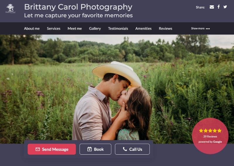
Think about what people will want to see when they go to your site.
What makes a good website when it comes to navigation? Making it easy for the visitor to find what they want. People want to be able to find things without a struggle. Good business websites keep things simple with clear navigation tabs.
Tactical Calls to Action (CTAs)
The best websites don’t just look good, they make people do things.
You don’t want people to visit your website and leave, do you?
A call to action is a tool that gently nudges your website visitors to:
- Book A Service
- Buy A Product
- Use An Offer
- Contact The Business.
The best websites also use layout to make these more effective, tactically placing their “contact us”, “learn more” or “buy now” buttons in headers at the top of the page, at the end of informational blog posts, or in tasteful pop-ups that appear as the user scrolls down the page.
Amazing Aesthetics
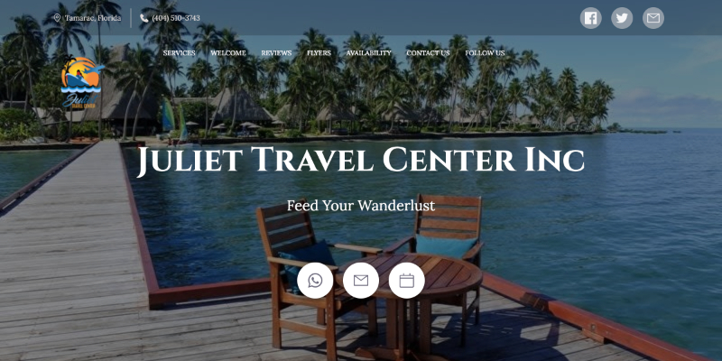
Design matters. People will make snap decisions about your business on the basis of colour, font type, layout and images: so you need to come up with a design that’s consonant with your offer.
There are some basics you need to get right here, but the real challenge lies in parsing out how consumers perceive visuals.
Images
Low-quality images are likely to cost you customers. Think about it, would you buy something online if the attached image was bad?
For customers, a low-quality image equals low-quality product or service.
But you don’t need to pay an arm and a leg for a professional photographer. We have an entire guide to creating great photos on a budget.
Colour
There have been full studies published on the psychology of colour in marketing. It’s a massive part of making an emotional appeal to your customers.
As a starting point, understand that different palettes fit different moods. If you’re on a lawyer’s website, it’s unlikely to be neon green.
Another pro tip is to associate your brand with a colour that differentiates you from competitors in your space.
In the UK financial industry, Natwest’s branding cleverly uses the colour purple to help them stand out in a sea of blue and red (think Barclays, HSBC, Santander, Nationwide).
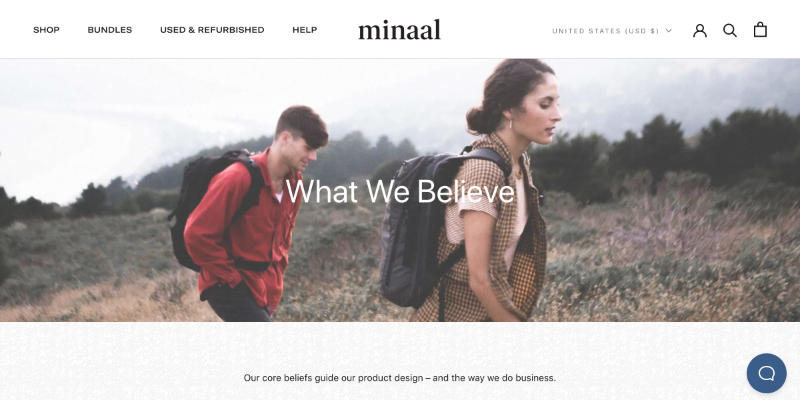
That’s why we offer a constantly growing palette of different colours for you to choose from and this is constantly growing and developing based on feedback from clients and consumers.
Font type
When it comes to fonts, readability is your first priority.
This doesn’t mean you shouldn’t do things differently to try and stand out, but prioritising aesthetics over functionality sends the wrong message about your business.
No one is going to follow up with your business if they can’t actually read your text.
Layout
How your page is laid out says a lot about your brand. When it comes to layout, minimalist design is in fashion. You can say a lot with very little.
The best websites know how to break up content into subheadings and boxes to make pages easily digestible and navigable.
Multimedia content can also add value to your pages as part of an improved user experience (UX). Video content can sometimes be a more engaging way of presenting information than a wall of text.
Mega Marketing Features
The best websites have a suite of integrated marketing features that help them attract online users and keep them coming back.
Reviews & Testimonials
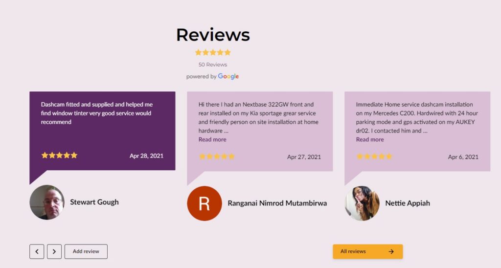
Customer Reviews and Testimonials are an invaluable resource for promoting trust in your business. These testimonials show your customers how your business has helped real people and can do the same for them. It’s all about creating trust.
Blog
Maintaining a consistent blog is essential for small businesses in the internet search era. It’s one way of building your own online community by making your website a hub of discussion for your chosen industry. It’s also an opportunity to showcase your business credentials and advertise as a go-to guru.
Keyword research is going to be key here. If you publish SEO content with the right keywords, you can generate a lot of extra traffic. Focus on informational searches within your niche.
Email marketing sign up
Having a sign-up button on your webpage is all about keeping people coming back for more.
The best mailing list CTAs do two things right:
- They place the Sign Up button in a high conversion places
- In the header
- At the bottom of a blog post.
- They provide a sign up incentive
- An introductory offer
- Free shipping
- Exclusive content or events.
The best websites also leverage online transactions to build a database of contacts with an opt-in button to receive marketing emails.
Working this way, you can cultivate a long-term relationship with your buyers — people who buy from you once are likely to buy from you again if you give them offers.
Visible social media buttons
Giving people the chance to keep up with your brand on social media means giving yourself the chance to build an ongoing relationship and convert them at a later date.
You can also look to include share buttons on blog posts and products to encourage people to spread the word.
Sound Technical Foundations
The best websites are built on sound technical foundations.
These are the important features that are invisible to site users but nonetheless indispensable.
Getting the technical fundamentals in place is a more clear-cut area than the other factors we’ve considered in what makes a good website: you either get these right or you severely limit your chances of making a good impression with your business.
At UENI, we keep on top of the latest technical trends in web design and incorporate these into your site to make sure it’s looking fresh, loading fast and showing up when people search for it.
That leaves our clients free to concentrate on building businesses up to their best without having to think about added technical complexities.
Here are just some of the most important features we work on behind-the-scenes when we’re making a new website.
Strong search engine optimization (SEO)
The best websites are highly visible to the people they are targeting. In practice, this means that the content of their website is a good match for what people are looking for from their business.
Think of your business listing in a Google search as a billboard on the online highway. You want this to be as appealing a prospect as possible, matching the reason people are travelling that way in the first place.
No matter who builds your website, SEO is something that you’ll need to invest time and money in. Read how to rank higher on Google to get more info.
Fast loading speeds
People don’t like to be held up, especially when they’re online. They expect web pages to load quickly and may even click off your website if things are too slow.
Load speeds aren’t just about enhanced user experience though, they also influence user behaviour. Around 53% of mobile users will be put off by pages that take longer than three seconds to load.
No matter what industry you’re in, having pages that loads fast is integral to keeping visitors on your site and turning them into customers.
Rapid responsive design
Responsive design means your website will adjust to the dimensions of the device it is being viewed on.
Does it look good on a desktop computer? A laptop? What about your mobile phone?
Mobile-friendliness
Mobile functionality has become an increasingly important feature of web design as online shopping moves into the palm of our hands. These days, Google effectively penalises websites that aren’t mobile-friendly.
The best way to avoid this is by creating a pared-back design that renders easily to the smaller display of a phone screen.
Google’s mobile site speed test analyses the speed of your website, giving it an overall rating for mobile-friendliness. It will also offer specific recommendations about how to improve your site for mobile users.
Security features
Having an (SSL) Secure Sockets Layer for your website will give you a small ranking boost. More importantly, it will give your customers peace of mind when buying from you and exchanging personal information.
Cyberattackers will always target sites with weak security. If you’re handling sensitive information over the web, you might also want to level up with a security solution to help you protect customer data.
An SSL is part and parcel of every UENI plan. As far as we’re concerned, you can’t afford to go without.
Sites without SSL encryption result in Google Chrome displaying a Not Secure message in the address bar, or can even lead people seeing to this page instead of your website:
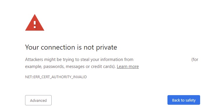
As you can guess, this can definitely damage your business’s credibility.
Structured site architecture
A well-planned website will help you with two things: UX and SEO. Some web designers talk about the three-click principle; the idea that you should be able to navigate to any given page on your site within key clicks.
This also raises a related principle: that you should make sure your site isn’t too baggy with too many categories etc.
Having a sitemap on your website is also important for your SEO score because it shows Google that the website in question is well-organised and easy to navigate for potential users.
Niche appeal makes a good website great
All the best websites have a few things in common. Getting the technical fundamentals in place is perhaps the most quantifiable measure of success. Good websites are clean, simple and easy to navigate on any given device.
From Google search to social media, they’re also visible to their target audience.
Finally, they inspire confidence and trust in potential customers in a range of different ways: by offering security, testimonials and a positive user experience.
Get A Great Website With UENI
Small business web design is what we do. We know the best websites in this space are visible in local searches and attract customers who want the services on offer. That’s why we provide a complete visibility package for your business.
In other words, we don’t just build you a great, professional website. We’ll also help you lay the foundations of an impressive online presence that puts you in front of your customers.
Why? Because you can have the best website in the world, but it won’t matter if no one visits it. That’s why we think of ourselves as a company that combines agency service with the pricing you get from the usual DIY suspects.
To learn more about UENI, read our founder’s interview on Website Planet.
And if you’re still unconvinced, check out what other people have to say about our service: UENI Reviews: Where To Find Them Online.

