A great photographer website earns the booking before you ever reply to an email. It loads fast, leads with your strongest images, and makes the next step obvious, whether that is checking your packages, seeing your availability, or sending an inquiry. Every photographer website example below does exactly that, and each one belongs to a real working studio rather than a big agency.
We pulled 30 live photographer websites built by small studios across the US, spanning weddings, portraits, landscape and fine art, aerial and drone work, real estate media, events, pets, and more. Use them as a swipe file: borrow the layout ideas that fit your work, skip the ones that do not, and pay attention to how the strongest sites turn a visitor into a booked client.
Key takeaways
- Your homepage hero should be a single, scroll-stopping image, not a slow slideshow.
- Put packages or a starting price within one click. Buyers compare on clarity before they ever call.
- A short, obvious contact or booking button beats a long “About me” essay every time.
- Half of these studios shoot a niche (newborns, drones, real estate, pets). A focused photographer website ranks and converts better than a generalist one.
What Makes a Good Photographer Website?
Two things separate a photographer website that books clients from one that just sits online: how it looks, and how it works. Get both right and the site does the selling while you are out shooting.
The design
For a photographer, the website is the portfolio, so the images have to carry it. The best examples below lead with one large, high-quality hero shot, keep the galleries clean and uncluttered, and use a consistent editing style so the whole site feels like one body of work. White space, a restrained color palette, and one or two readable fonts let the photography stay the star. Just as important: large images must be compressed properly so the page still loads in a couple of seconds, because a slow gallery loses the visitor before the work even appears.
The functionality
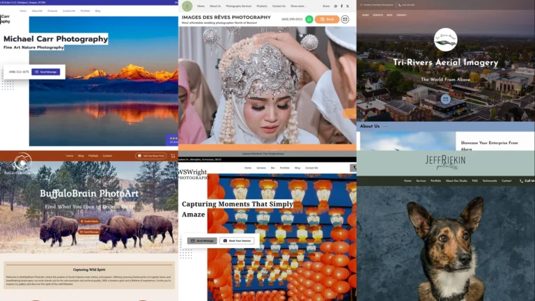
A beautiful gallery that hides the price or buries the contact form leaves money on the table. A strong photographer website makes the path to booking short: clear packages or a starting price, an easy inquiry or scheduling button, and contact details that are never more than a tap away. It should look perfect on a phone, since most people will first find you on mobile. Add real social proof (reviews, a client logo, press), basic SEO so you turn up for “[your city] photographer,” and an integrated booking or payment tool if you take a lot of sessions.
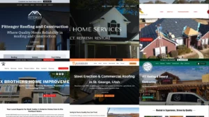
30 of the Best Photographer Website Examples for 2026
The studios below are ordered loosely by niche, from weddings and portraits through landscape, aerial, real estate, fine art, events, and specialty work. Each is a real UENI customer site.
1. Brittany Carol Photography
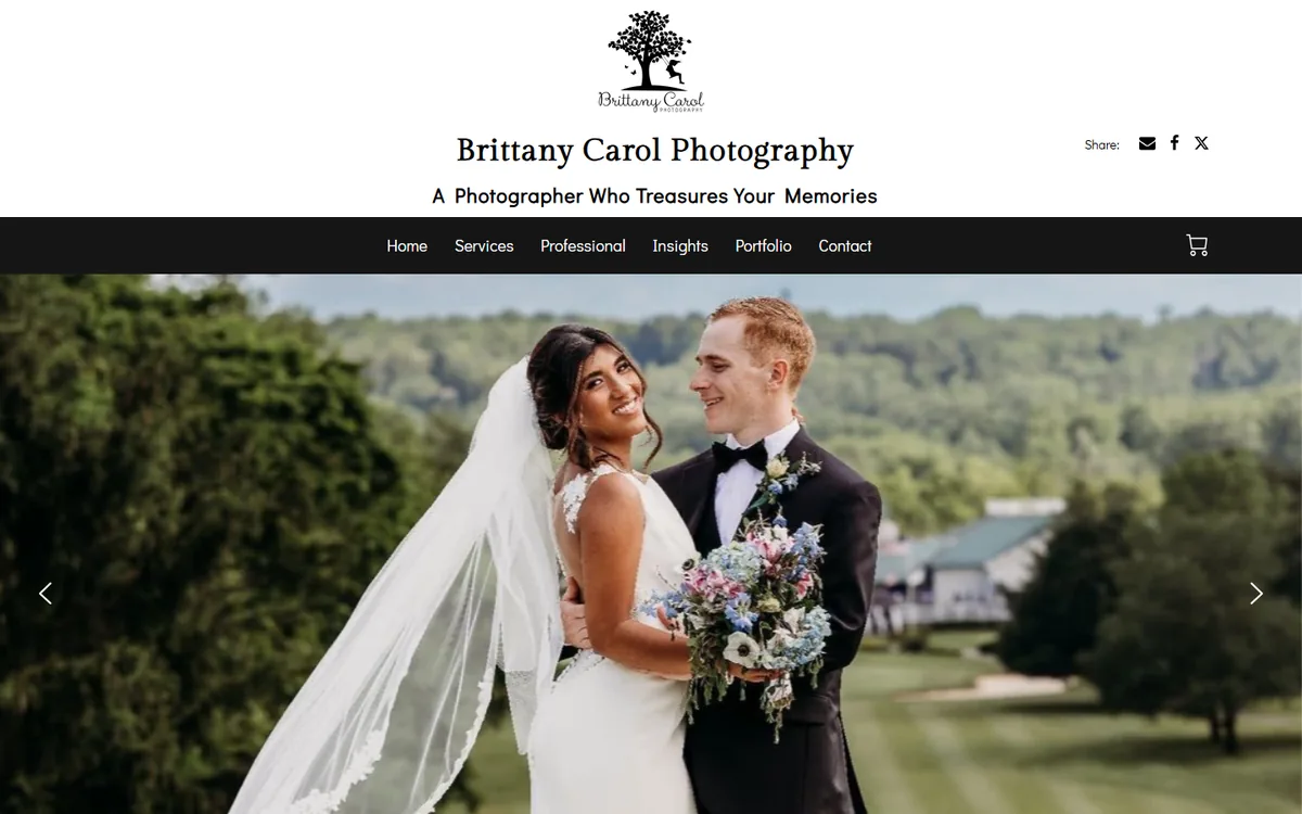
A joyful bride-and-groom hero shot sets the tone instantly, and the warm, romantic palette signals exactly what kind of wedding photographer Brittany is. Galleries are generous and the booking path is short.
Borrow this: lead with the single most emotional image in your portfolio, not a grid of ten.
2. Images Des Reves Photography
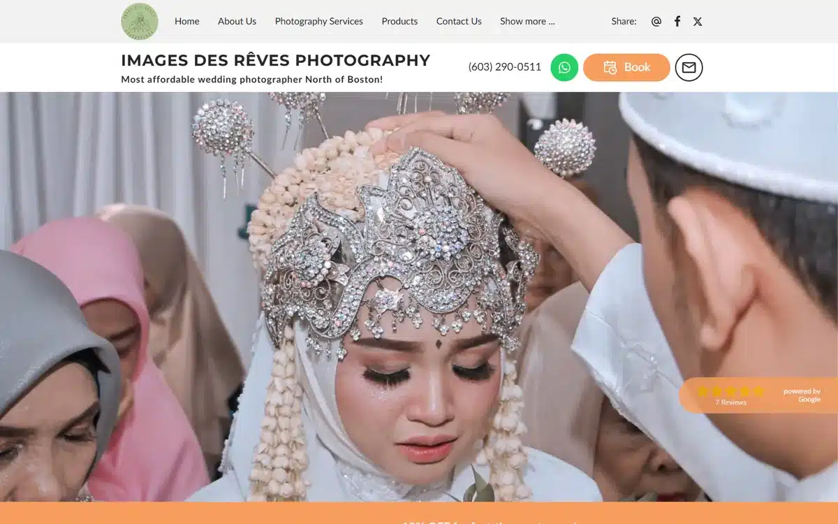
A striking cultural bridal portrait anchors the homepage and immediately tells multicultural couples this studio knows their traditions. The styling is confident and the contrast makes the work pop.
Borrow this: let your hero image speak to the specific clients you most want to attract.
3. Paul Hirsch Photography
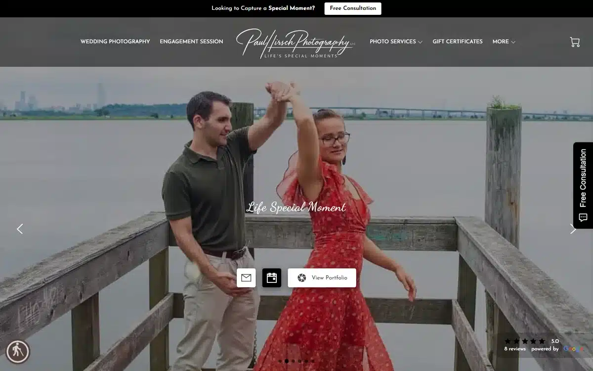
An engagement-dance hero captures real motion and emotion, and two clear calls to action sit right beside it so couples can view work or get in touch without scrolling.
Borrow this: pair an emotive hero with two buttons, “See the work” and “Check your date.”
4. Tailey Photography
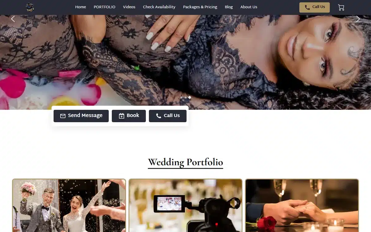
A soft lace-detail portrait opens the page, then a tidy portfolio grid lets couples browse full galleries quickly. The whole site feels calm and editorial.
Borrow this: follow a single hero with a clean grid so visitors can self-serve into your best work.
5. VMAC Photography
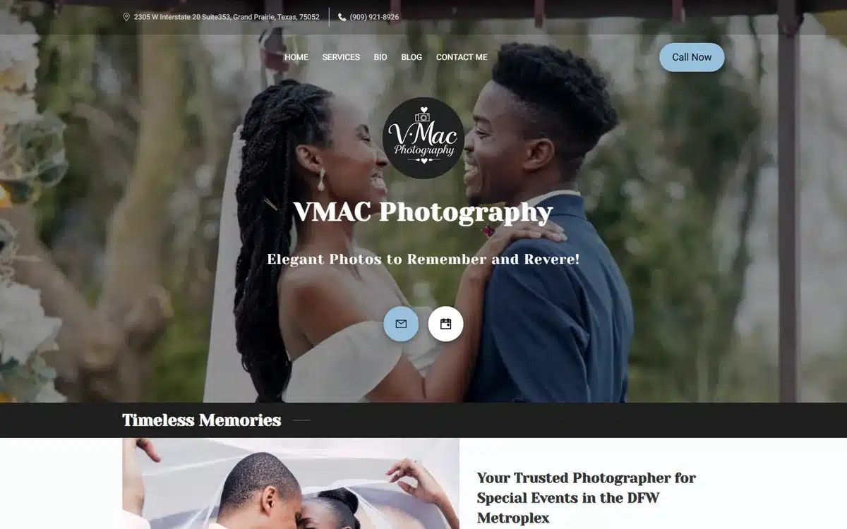
A romantic couples hero paired with an elegant serif typeface gives this site a high-end, timeless feel that matches the price point of wedding work.
Borrow this: typography sets the price perception. A refined serif reads as premium.
6. Candid Moments Studio
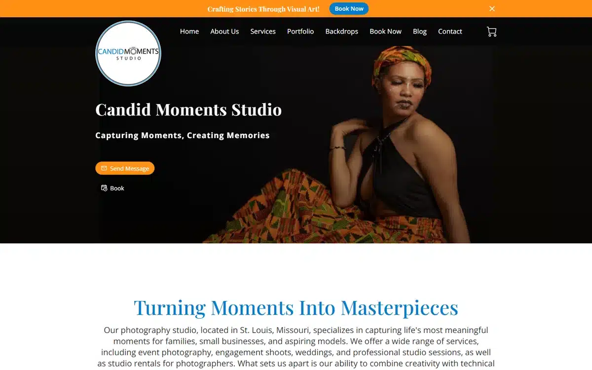
A bold headwrap portrait against a black background is impossible to scroll past, and the dark theme makes the colors in the photography glow.
Borrow this: a dark background can make vivid portraits look gallery-grade.
7. Claro Studios
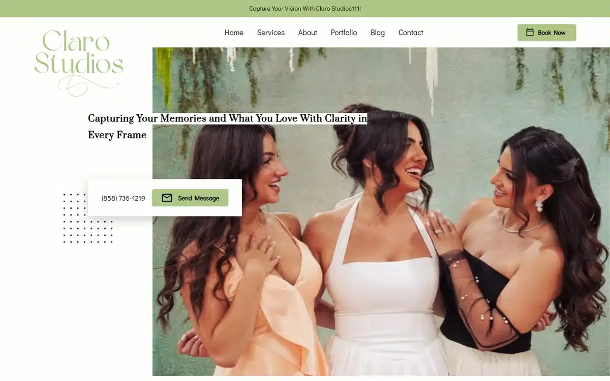
A candid, laughing trio and an airy light palette make this portrait site feel friendly and approachable, the opposite of a stiff studio.
Borrow this: if your brand is warm and casual, show real laughter, not posed stares.
8. Just Because Photography Studios
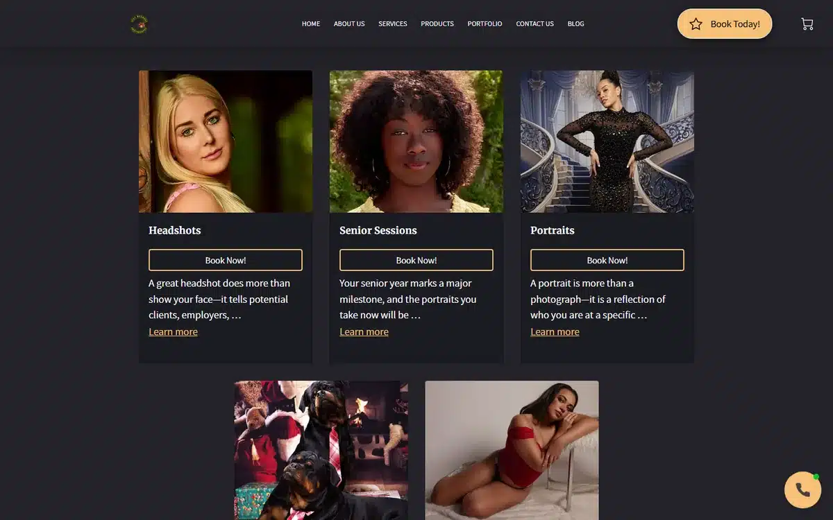
A dark, luxe card grid of headshots and portraits lets visitors jump straight to the session type they need. It feels organized and premium.
Borrow this: use cards to route different clients (headshots, families, branding) to the right gallery fast.
9. Leonard Anderson Headshot Photography
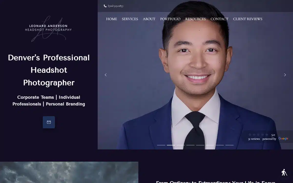
A navy hero and clean typography signal corporate, professional headshots, exactly the buyer this studio wants. Nothing is wasted.
Borrow this: match your color and type to your client’s world. Corporate buyers trust restraint.
10. Quaran Ahmad
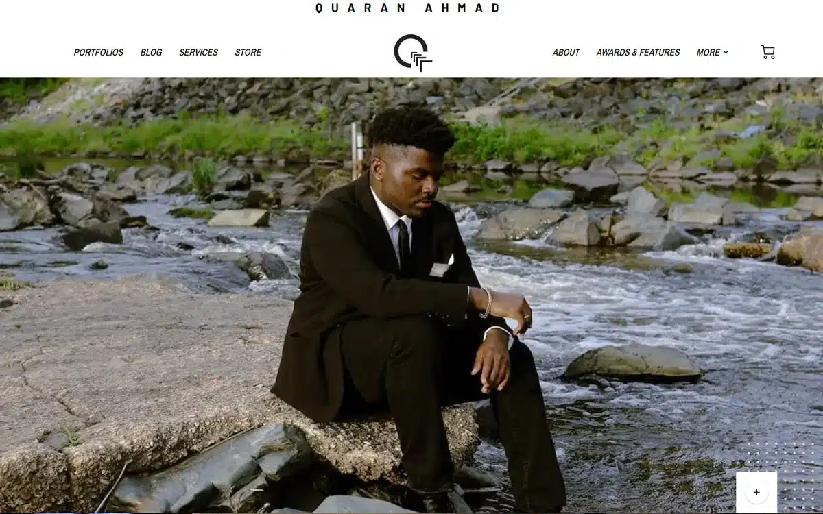
A minimalist, editorial layout with a riverside fashion shot reads like a magazine. The restraint makes each image feel deliberate and expensive.
Borrow this: fewer images, more space. Editorial restraint signals a higher tier of work.
11. James Caprio Photography
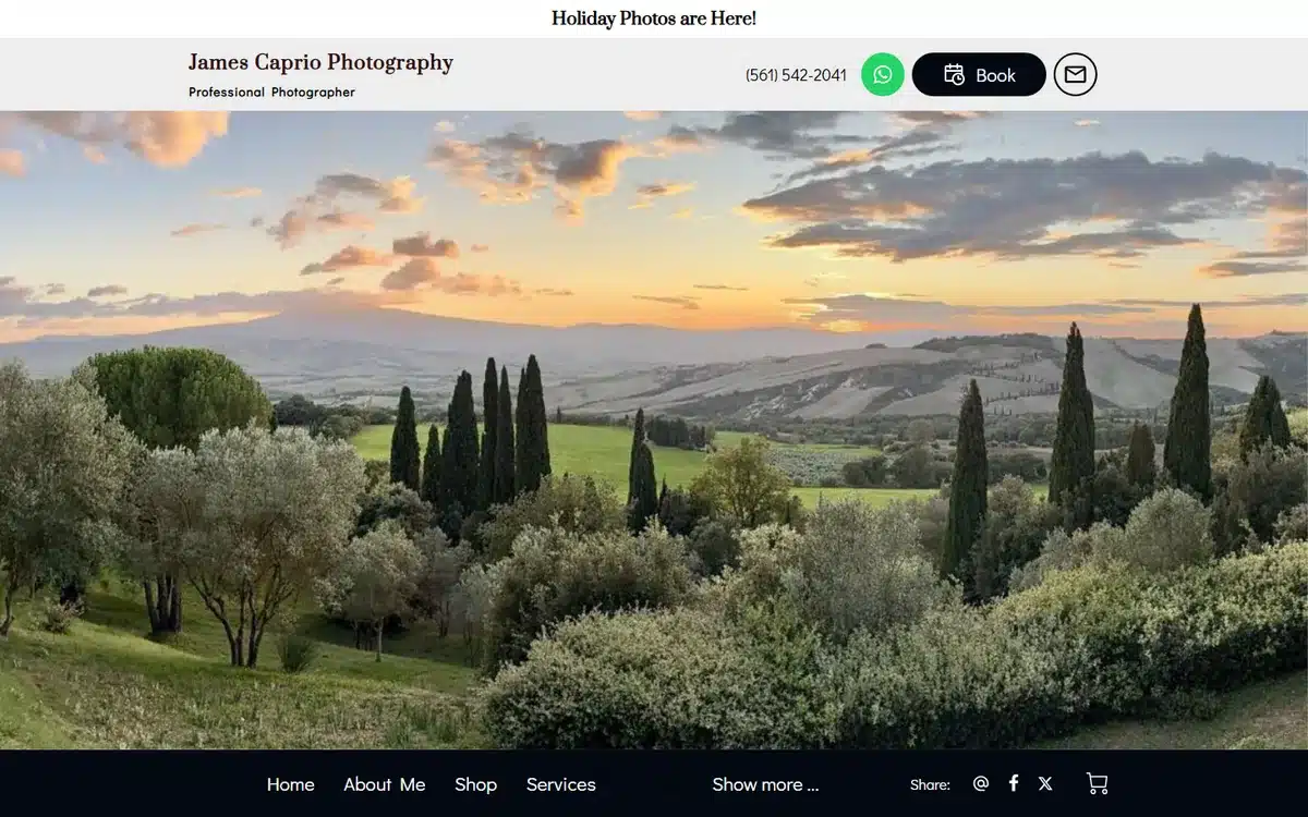
A sweeping Tuscan-sunset panorama fills the screen and instantly establishes this as a travel and landscape specialist with serious range.
Borrow this: for landscape work, go full-bleed. Let one wide image own the whole viewport.
12. Michael Carr Photography
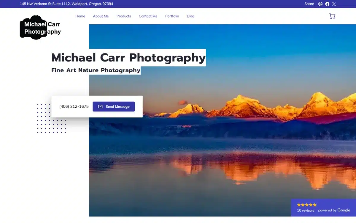
A mirror-still alpenglow mountain reflection is the kind of image people buy as a print, and the site sensibly puts it front and center.
Borrow this: if you sell prints, your homepage hero should be your best-selling print.
13. Wildlife Wanderings Photography
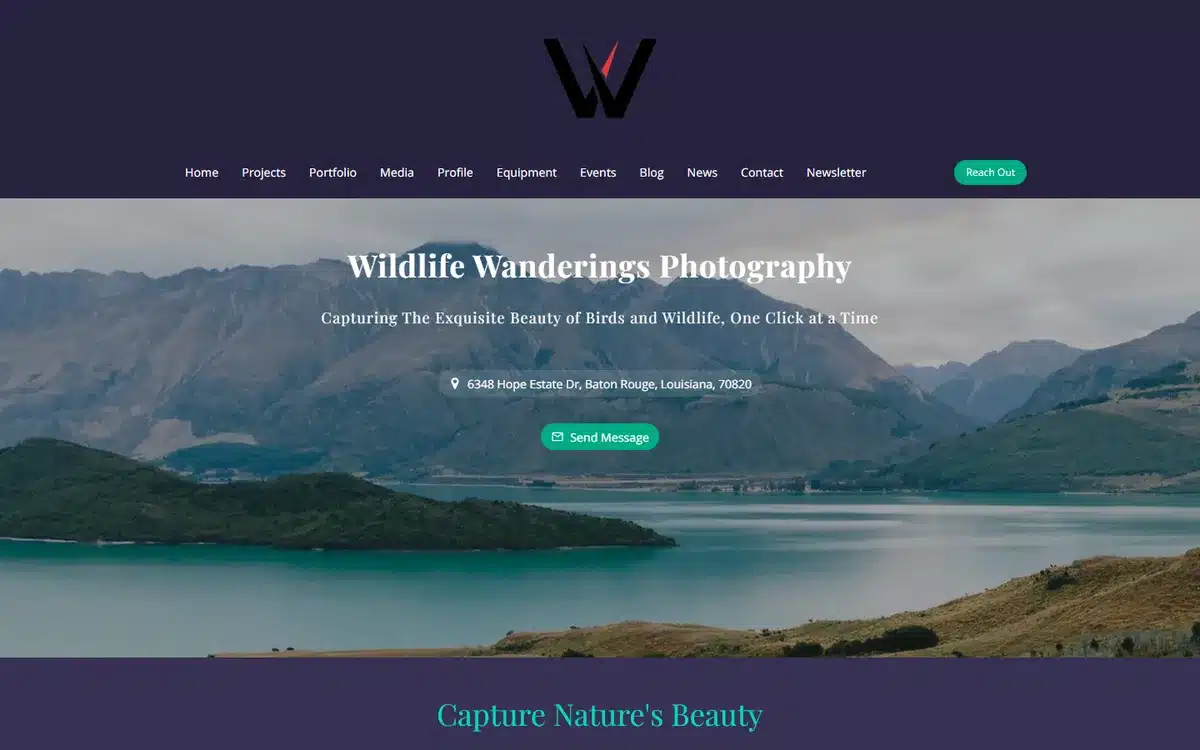
A serene lake-and-mountains banner suits the calm, patient nature of wildlife work. The site never rushes the viewer.
Borrow this: let the mood of your niche set the pace and palette of the whole site.
14. Andrew Roque Photography
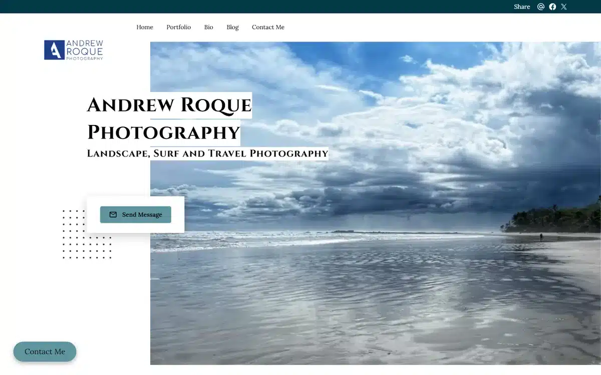
A dramatic cloudscape over a wet beach gives this landscape and surf site real atmosphere, and the clean nav keeps the focus on the imagery.
Borrow this: weather and light are free drama. Pick a hero with mood, not just a pretty view.
15. DronePHD
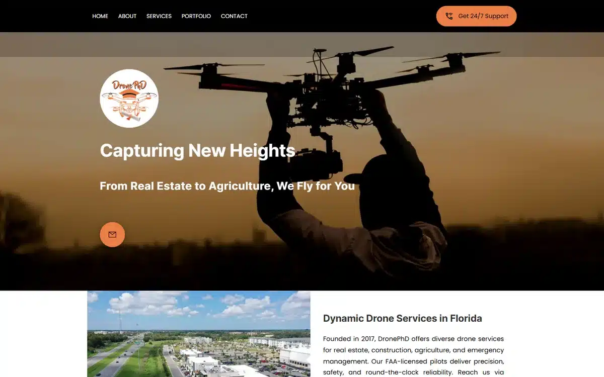
A sunset drone-in-hand hero tells visitors exactly what this business does in one image. The aerial niche is clear before you read a word.
Borrow this: show the tool of your trade in action. It explains your service instantly.
16. Redwood Sky Media
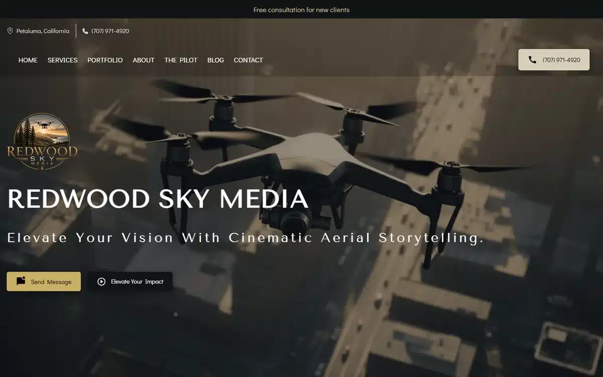
A cinematic drone hero on a gold-on-dark theme looks like a film studio reel. It positions aerial work as high production value.
Borrow this: a dark theme with a single accent color makes video and aerial work feel cinematic.
17. Tri-Rivers Aerial Imagery
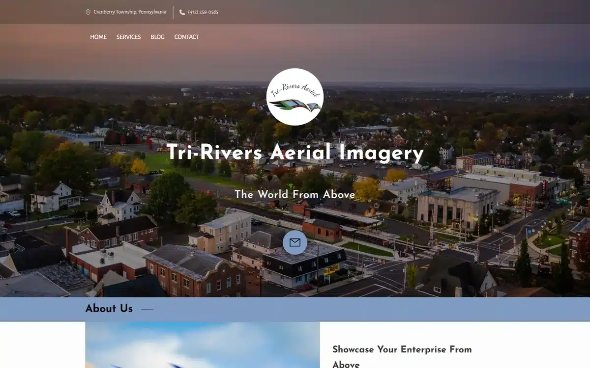
A sweeping townscape aerial shows the scale only a drone can capture, with the tagline reinforcing the “world from above” angle.
Borrow this: a one-line tagline over the hero tells visitors what you do before they scroll.
18. Vector Aerial Solutions
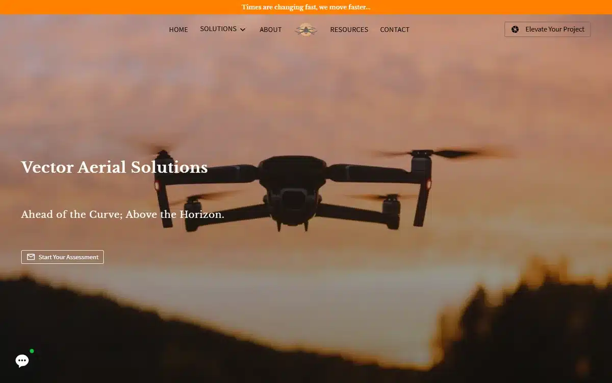
A drone silhouette against a sunset sky is simple, graphic, and memorable, proof that an aerial site does not need a busy hero to land.
Borrow this: a clean, graphic hero can be more memorable than a packed collage.
19. Tatiana Bursh Real Estate Photography
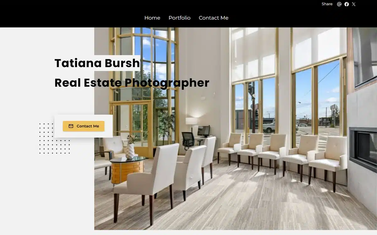
A bright, airy interior hero and a clean minimal nav mirror exactly the look agents want for their listings. The site sells the service by example.
Borrow this: for real estate media, your site’s look should match the listings you shoot.
20. Tom Z Productions
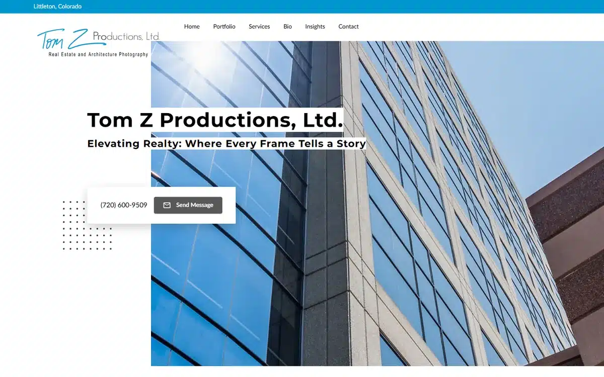
A bold blue architectural hero gives this real estate and commercial studio a confident, corporate edge that appeals to developers and agencies.
Borrow this: a strong brand color makes a service site feel established, not freelance.
21. DreamNest Property Media
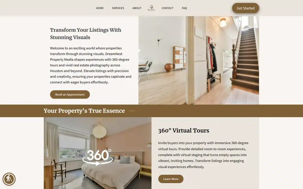
Clean interior shots sit alongside 360 virtual-tour blocks, showing agents the full menu of media services in one scroll.
Borrow this: if you offer more than stills, show the add-ons (tours, video, floor plans) as their own blocks.
22. BuffaloBrain PhotoArt
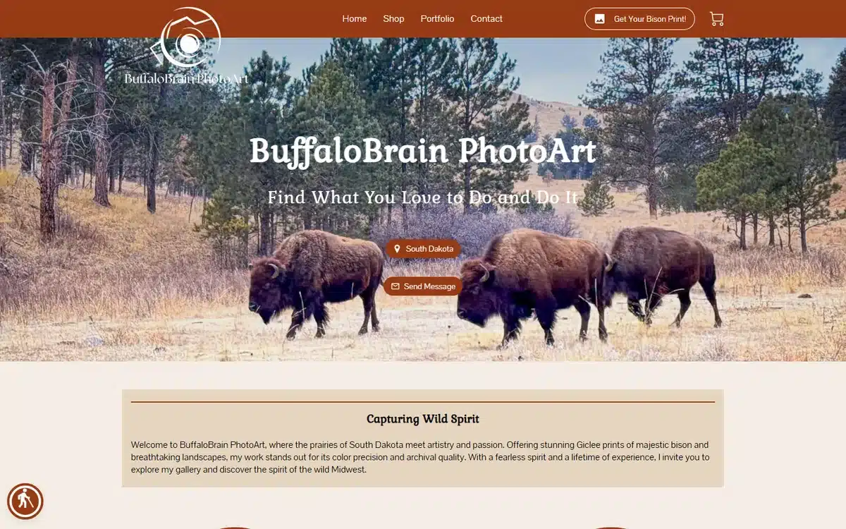
A wild bison herd on the prairie doubles as both portfolio and product, since this fine-art studio sells the shot as wall art.
Borrow this: if you sell prints, make the hero a buyable piece and link straight to the shop.
23. Cosmic Arts
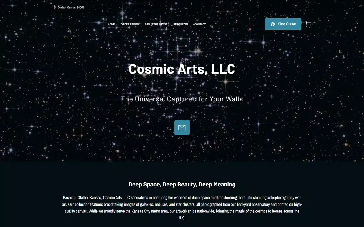
A deep starfield theme leans all the way into the astrophotography niche, giving the whole site a distinct identity no generalist could copy.
Borrow this: a niche this specific is a gift. Theme the entire site around it.
24. Gregory C. Scott Photography
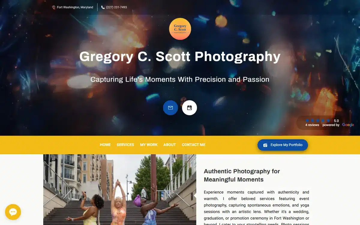
A confetti-celebration hero captures peak energy, and the polished layout around it keeps the excitement from tipping into clutter.
Borrow this: high-energy work still needs a calm layout so the photos, not the page, do the shouting.
25. Timeless Image Creation
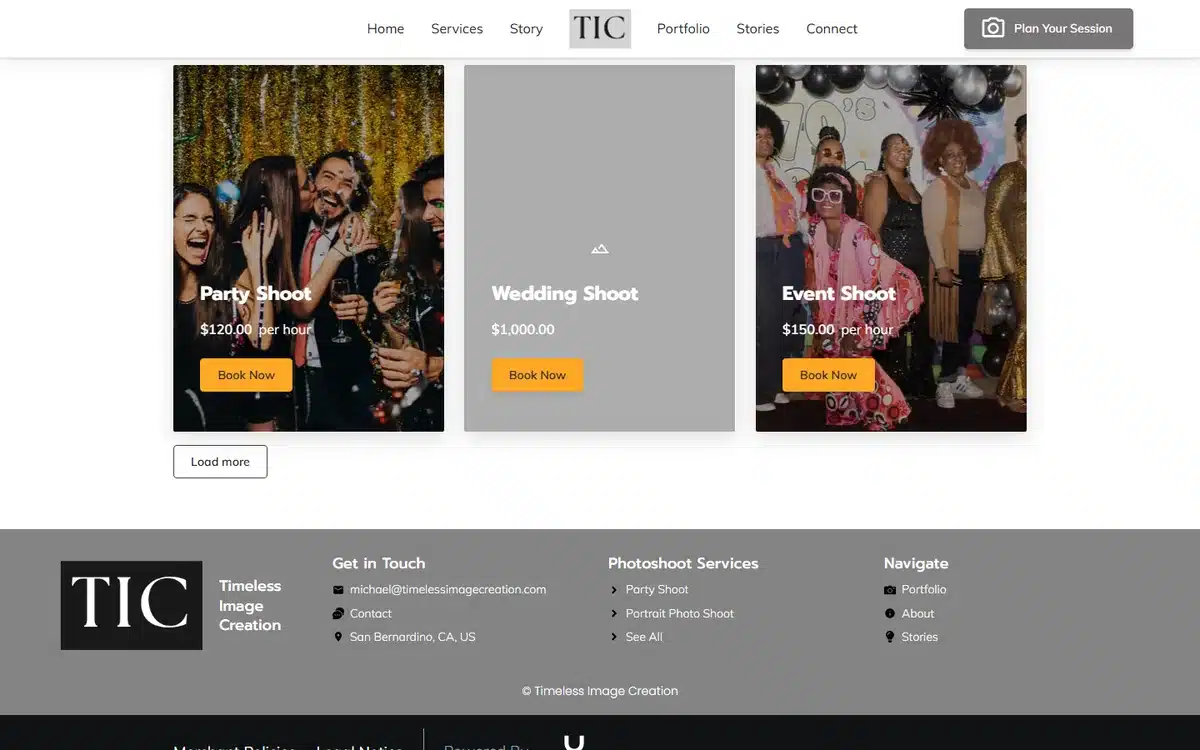
Three clear shoot-type cards let event clients pick their lane immediately, a smart move for a studio that covers several occasions.
Borrow this: when you serve several event types, give each its own card and gallery.
26. WSWright Photography
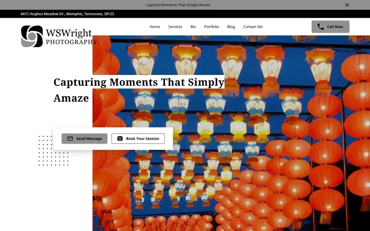
A vibrant red-lantern full-bleed hero shows real cultural-event range and proves how much a single saturated image can carry a homepage.
Borrow this: one richly colored, full-bleed image can be your entire hero. No slideshow needed.
27. Jeff Rifkin Portraits
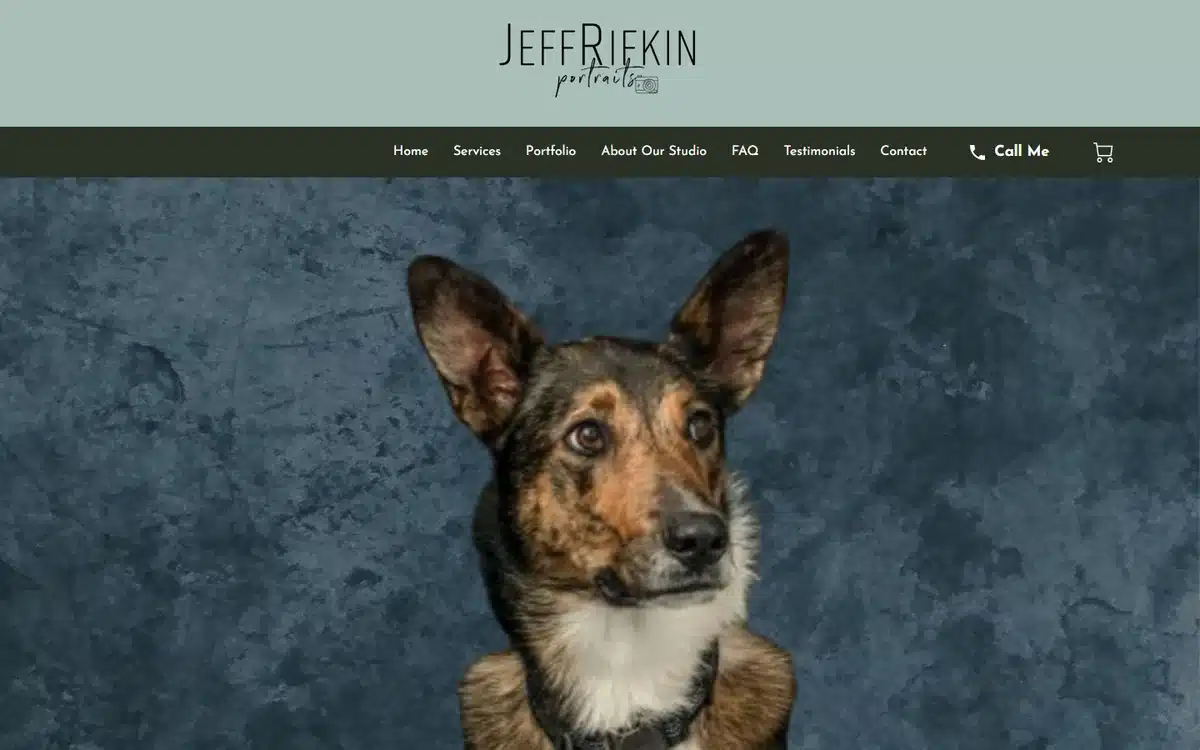
A crisp studio dog portrait against a textured backdrop shows the pet-photography niche at a professional, gallery level rather than a casual one.
Borrow this: treat a “fun” niche seriously. Studio-grade lighting elevates pet work into art people buy.
28. All Star Photography
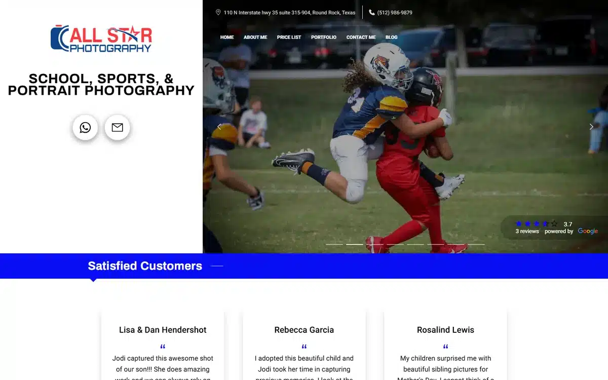
A vivid youth-football action shot speaks straight to sports parents and leagues, the exact audience this studio books.
Borrow this: show your subject mid-action so the visitor pictures their own kid or team in the frame.
29. Gary Whipple Photography
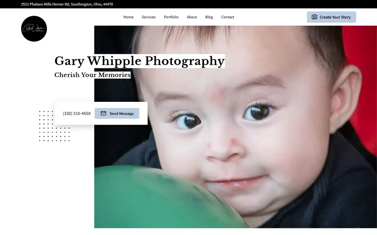
A close-up newborn portrait leads with the tenderness that sells this niche, and the soft treatment reassures nervous first-time parents.
Borrow this: for newborn and family work, lead with emotion and warmth over technical flash.
30. Nova Images
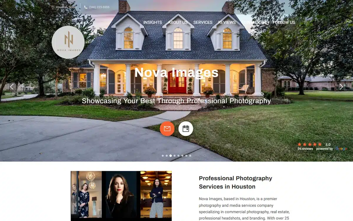
A full-bleed property hero with a gold monogram gives this commercial studio a polished, branded identity that reads as established and trustworthy.
Borrow this: a simple monogram or logomark over a strong hero instantly raises your perceived professionalism.
Photographer Website FAQs
What should a photographer website include?
At minimum: a strong hero image, a clean portfolio of your best work, clear packages or a starting price, an easy contact or booking button, a short about section with social proof, and your service area. Those elements cover what a visitor needs to decide you are the right photographer and take the next step.
How much does a photographer website cost?
It ranges widely. A do-it-yourself site builder can be a few dollars a month, a freelance web designer might charge several hundred to a few thousand for a custom build, and a done-for-you service handles the design, copy, and setup so you can stay behind the camera. Pick the option that matches how much time you want to spend building a site versus shooting.
Do photographers really need a website, or is Instagram enough?
You need a website. Social media is rented space where an algorithm controls who sees your work, and there is no clean way to show packages, take bookings, or rank on Google. A photographer website is the one storefront you own outright, and it is where serious clients go to check your portfolio and prices before they reach out.
What is the best platform to build a photographer website?
The best platform is the one you will actually keep updated. DIY builders give you full control but take real time to learn. If you would rather not build or maintain it yourself, a done-for-you service designs and launches the site for you. Whatever you choose, prioritize fast image loading and a mobile-first layout.
How many photos should I put on my photography website?
Fewer than you think. A tight, curated gallery of your strongest 15 to 30 images per category beats a sprawling archive that buries your best work and slows the page down. Quality and loading speed matter more than volume, so cut anything that is not clearly among your best.
How do photographers get found on Google?
Name your services and the towns you serve in your page text, keep your business name, address, and phone identical everywhere online, gather steady reviews, and claim your Google Business Profile. Our Google Business Profile guide walks through that setup step by step.
Next Steps
The studios above prove the same point thirty different ways: a focused, fast, image-led photographer website turns browsers into booked clients. If you would rather spend your time shooting than building, UENI can create a professional photography website for you, with your galleries, packages, and booking set up and ready to go.
Explore a done-for-you website to see how it works, then learn how to fill your calendar with our guide to small business advertising and how to win local search with a strong Google Business Profile.
Sources
All 30 examples are live websites built by real UENI customers, reviewed in June 2026 and selected for design quality and range across photography niches. Business names and imagery belong to the respective studios, linked above. Guidance on website cost, platform choice, and getting found on Google reflects UENI’s experience building and hosting tens of thousands of small-business websites.