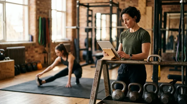
Good fitness website design answers three questions before anyone scrolls: what happens here, when, and what does it cost to try it once. Gyms and studios lose more prospects to a hidden timetable and an unstated price than to any design flaw. Below are 20 real gym and studio websites, all live, that answer those three fast.
Key takeaways
- Fitness is growing fast. The Bureau of Labor Statistics projects 12% employment growth for fitness trainers and instructors from 2024 to 2034, which it labels much faster than average, on a base of 370,100.
- Clicks are cheap here by comparison. LocalIQ’s 2026 benchmarks put Sports & Recreation at $2.77 a click and $44.26 a lead, against $5.42 and $66.69 across all industries and $8.33 and $90.92 in Home & Home Improvement.
- Reviews get people to the site. BrightLocal’s 2026 survey of 1,002 US consumers found 54% visit a business’s website after reading positive reviews, up from 32% in 2019.
- The rating bar has jumped: 31% of consumers will only use a business at 4.5 stars or better, up from 17% a year earlier, and 47% will not use one with fewer than 20 reviews.
- Only 40% of small businesses have a dedicated website, per BrightLocal’s survey of 778 US SMB owners, so a working site is still a real advantage.
What makes good fitness website design
Joining a gym is an emotional purchase with a rational blocker. The prospect already wants to train. What stops them is uncertainty about whether they will feel out of place, whether the class times fit their week, and how much they are committing to. Effective fitness website design removes those three doubts rather than adding more photographs of people lifting.
Design: fitness website design should show the actual room and the actual people
Stock gym photography is worse than none, because the prospect is trying to work out whether they will fit in. Several sites below use a photograph of their own floor, their own members or their own competition squad. That is the single highest-value image on the page, and it is also the one nobody else can copy.
Functionality: the timetable and the first session
Fitness website design has to make two things trivially easy: seeing the schedule and booking a first session. Sites that bury the timetable behind a third-party booking widget lose people who were ready. LocalIQ’s 2026 Search Advertising Benchmarks, published on 26 May 2026 from thousands of Google Ads and Microsoft Ads accounts, put Sports & Recreation at $2.77 per click with a 7.69% conversion rate and Health & Fitness at $6.17 per click with 6.94%, against an all-industry average of $5.42 and 8.18%. Traffic here is comparatively cheap, which makes wasting it more annoying rather than less.
Why fitness website design is doing more work than it used to
The market is growing quickly. The US Bureau of Labor Statistics counts 370,100 fitness trainers and instructors in 2024, projects 12% growth to 2034 which it labels much faster than average, and expects about 74,200 openings each year over that decade. BLS notes that many of those openings come from the need to replace workers who transfer to other occupations or leave the labour force, so they are not all new positions. Median pay is $46,180 a year. Fast growth means more studios opening near you.
How people arrive has changed too. BrightLocal’s Local Consumer Review Survey 2026, a panel of 1,002 US adult consumers published on 11 February 2026, found 54% of consumers visit a business’s website after reading positive reviews, up from 32% when the question was last asked in 2019. Your Google reviews earn the click; the site decides whether it becomes a trial.
The standards attached to those reviews have tightened. In the same survey, 31% of consumers said they would only use a business rated 4.5 stars or higher, up from 17% a year earlier, 68% would only use one at four stars or better, and 47% will not use a business with fewer than 20 reviews. Meanwhile BrightLocal’s SMB Marketing in 2025 report, based on 778 US small-business owners and managers and published on 7 August 2025, found only 40% of small businesses have a dedicated website and 35% a Google Business Profile. Our guide to asking customers for reviews covers the collection side.
20 real gym and fitness studio websites worth borrowing from
All 20 are live UENI customer sites, grouped roughly by format, because a 24/7 gym and a reformer pilates studio are selling different things and their homepages show it.
1. P2 Power Pilates, Los Angeles, California
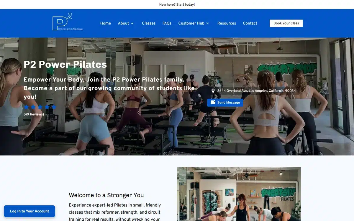
The hero carries a five-star rating with the review count of 49 and the street address, both inside the first screen alongside a booking call to action. Proof and location before anything else.
Borrow this: put the review count, not just the star rating, in the hero. The number is the credibility.
2. Gone Feral Athletics, Fort Walton Beach, Florida
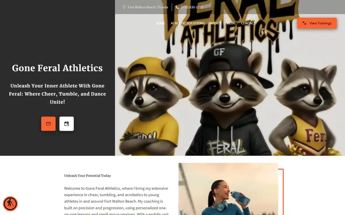
A split hero pairs custom mascot artwork with the city and phone number in the top bar. The illustration gives a tumbling and acrobatics business a personality that photography would not.
Borrow this: custom illustration works where the product is a culture rather than a facility.
3. 78155 Family Athletic Club, Seguin, Texas
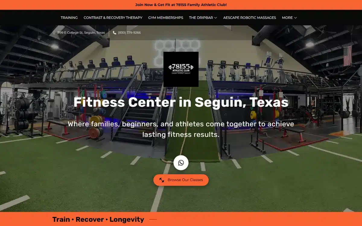
The navigation names each revenue line separately: gym memberships, recovery therapy, drip bar, robotic massage. A visitor who came for one discovers the other three without reading a paragraph.
Borrow this: give every revenue line its own navigation item. Ancillary services do not sell from inside a services page.
4. UPLFT Fitness, Shaker Heights, Ohio
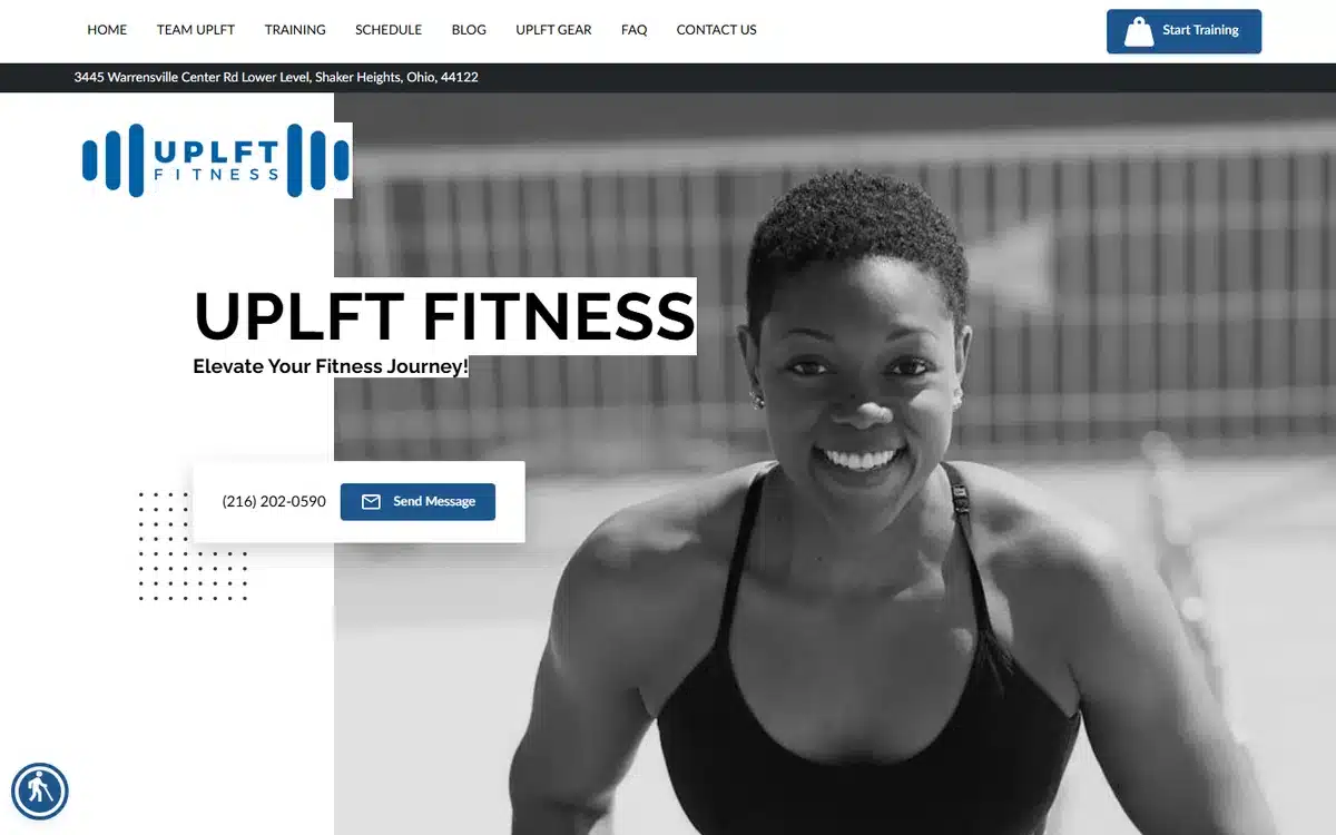
A clean monochrome hero with readable branding and no overlays, and the full street address in a dark strip directly below the navigation. For a neighbourhood gym, the address is the offer.
Borrow this: a full address strip under the nav answers the first question a local prospect has.
5. WOW Weights on Wheels, Warner Robins, Georgia
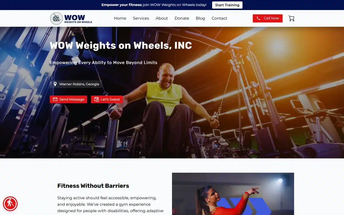
An adaptive gym for people with disabilities, with a city location chip and two calls to action, Send Message and Let’s Sweat, stacked under the headline. The specialism is stated plainly rather than softened.
Borrow this: if you serve a specific population, say it in the headline. Vagueness loses the people you are for.
6. The Stretch Den, Clarksville, Tennessee

An assisted-stretching and recovery studio with a Google 5.0 badge showing 71 reviews pinned into the corner of the hero. For an unfamiliar service category, social proof has to arrive before the explanation.
Borrow this: unfamiliar services need the review badge in the hero, not halfway down the page.
7. BEFITNJ, Forked River, New Jersey
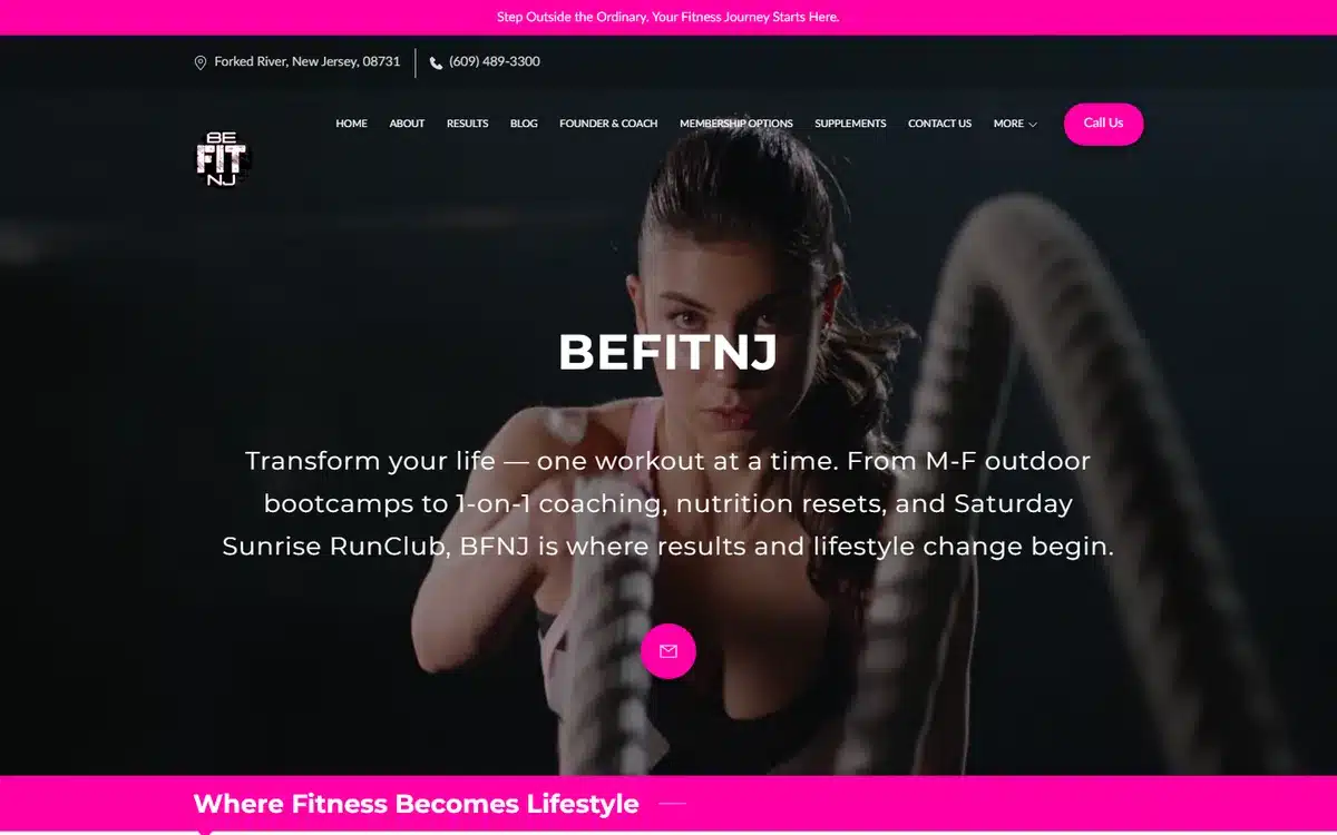
The hero copy names the actual programmes: weekday bootcamps, one-to-one training, Saturday RunClub. No visitor has to guess what happens or when, which is the whole job of the first screen.
Borrow this: name your programmes and their days in the hero. Generic “classes for all levels” tells nobody anything.
8. Park Club Fitness, Perkasie, Pennsylvania
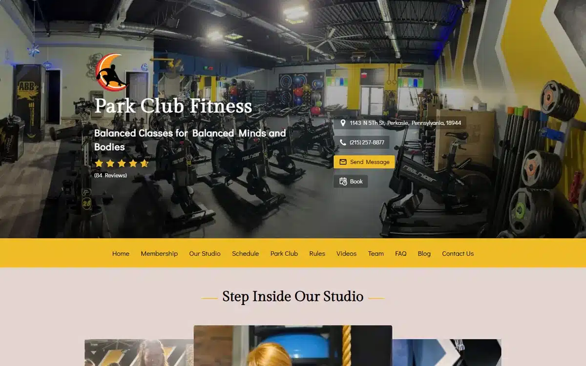
A dense but legible hero holding the address, phone number, star rating and a Book button in one block. It is more information than most designers would allow in a first screen, and it works.
Borrow this: density beats elegance when every item answers a real question.
9. Ann Marie Pilates, Brookline, Massachusetts
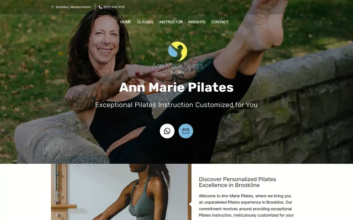
A clean hero with readable branding, and the logo carries Est. 1999, so more than two decades of practice is visible above the fold. In an instructor-led business, tenure is the product.
Borrow this: build the founding year into the logo. It travels to every page for free.
10. CrossFit Breaking Barbells, Lakeland, Florida
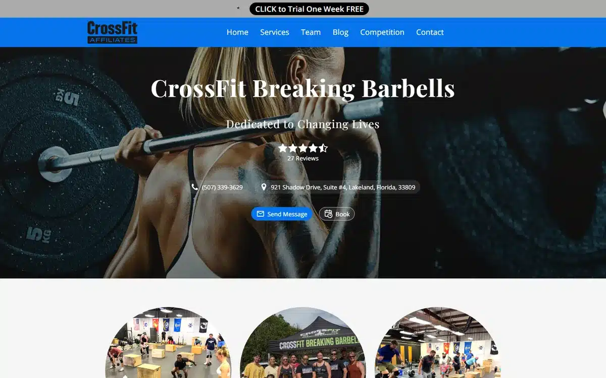
A free one-week trial bar runs across the top with the rating, phone number and address all in the hero underneath. The trial offer is the conversion event and it is the first thing on the page.
Borrow this: put the trial offer in a bar above everything. It is the only thing a cold visitor will act on.
11. Human Anatomy in Symmetry, Colorado Springs, Colorado
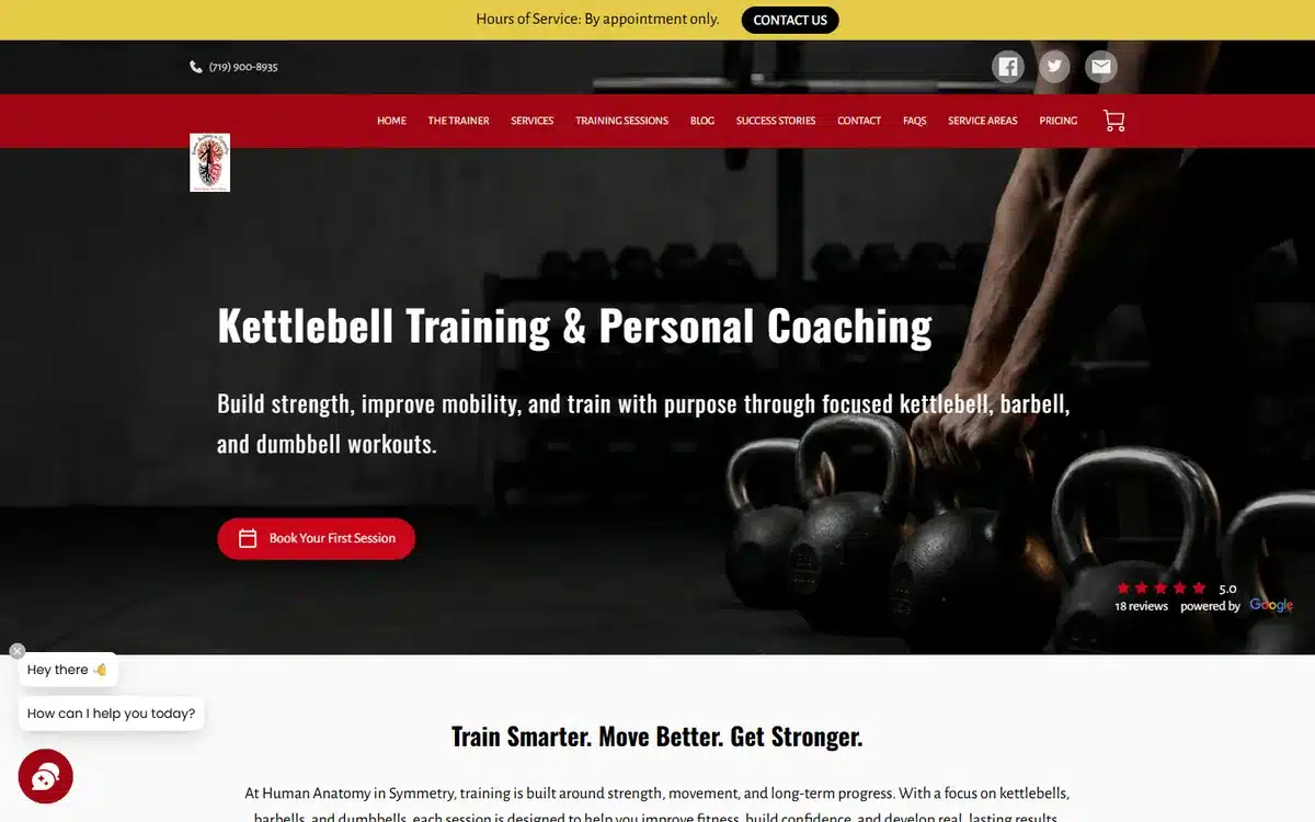
One button under the headline reading Book Your First Session, with Pricing and Service Areas both in the navigation. A single call to action plus published pricing removes two rounds of email.
Borrow this: a Pricing link in the navigation converts better than a Contact Us that hides the number.
12. Bent Bar Gym, Clearwater, Florida
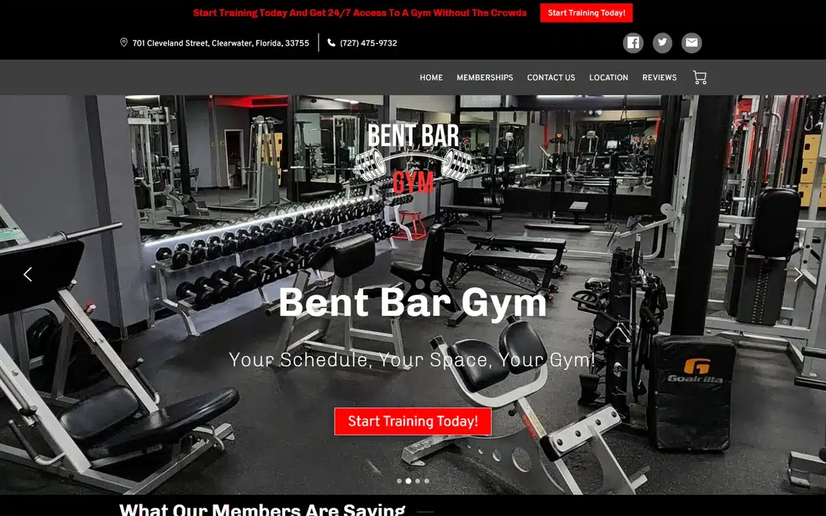
A real facility photograph behind a promo bar selling 24/7 access without the crowds, echoed by a Start Training button in the hero. The promise and the action say the same thing twice.
Borrow this: repeat the offer in the promo bar and the hero button. One reinforces the other.
13. Fitness Marietta, Marietta, Georgia
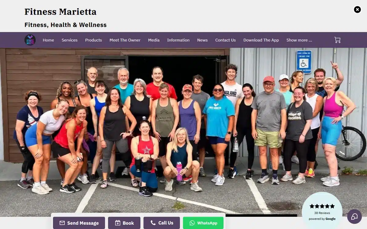
A row of four contact buttons including WhatsApp, sitting next to a Google badge showing 38 reviews, over a real photograph. Group fitness runs on messaging more than on phone calls.
Borrow this: offer WhatsApp. Class enquiries are short questions people would rather type than phone.
14. My Open Workout, Chesapeake, Virginia
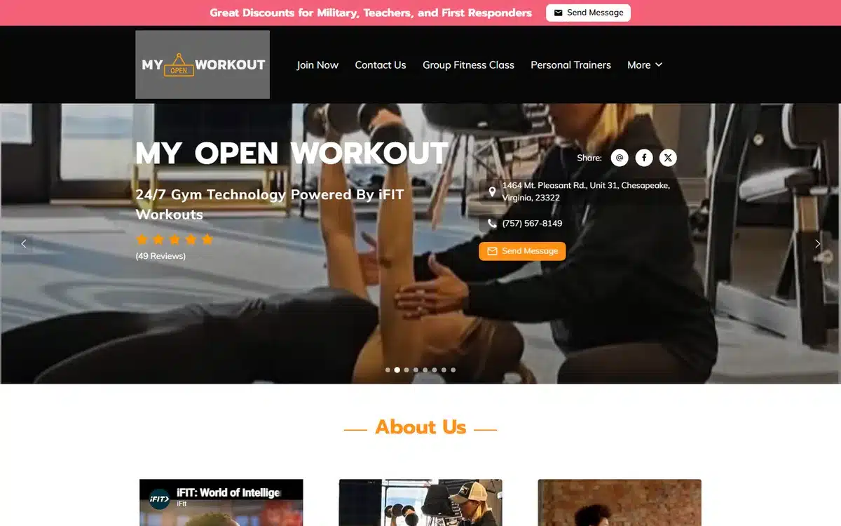
A 24/7 gym leading with a banner offering military, teacher and first-responder discounts, above the rating and full address. Naming the professions is far more persuasive than a generic percentage off.
Borrow this: name the specific groups your discount applies to. It reads as belonging, not as a coupon.
15. Uncommon Wellness Collective, Long Island, New York
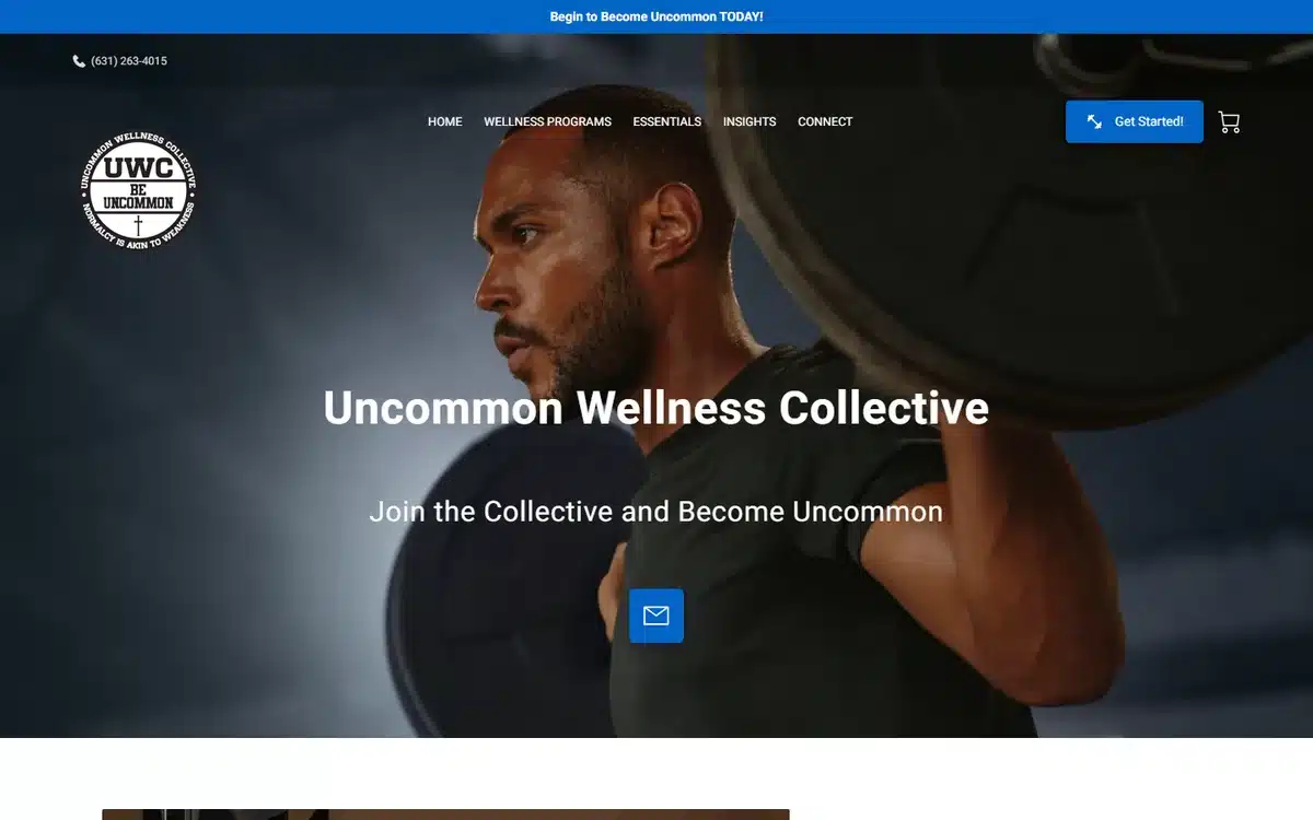
A strength-training gym with readable branding, no overlays, and the phone number in a bar above the navigation next to a blue Get Started button. Two routes, both above the fold.
Borrow this: pair the phone number with a single Get Started button so both intent levels are served.
16. ModTabata, Johnston, Iowa
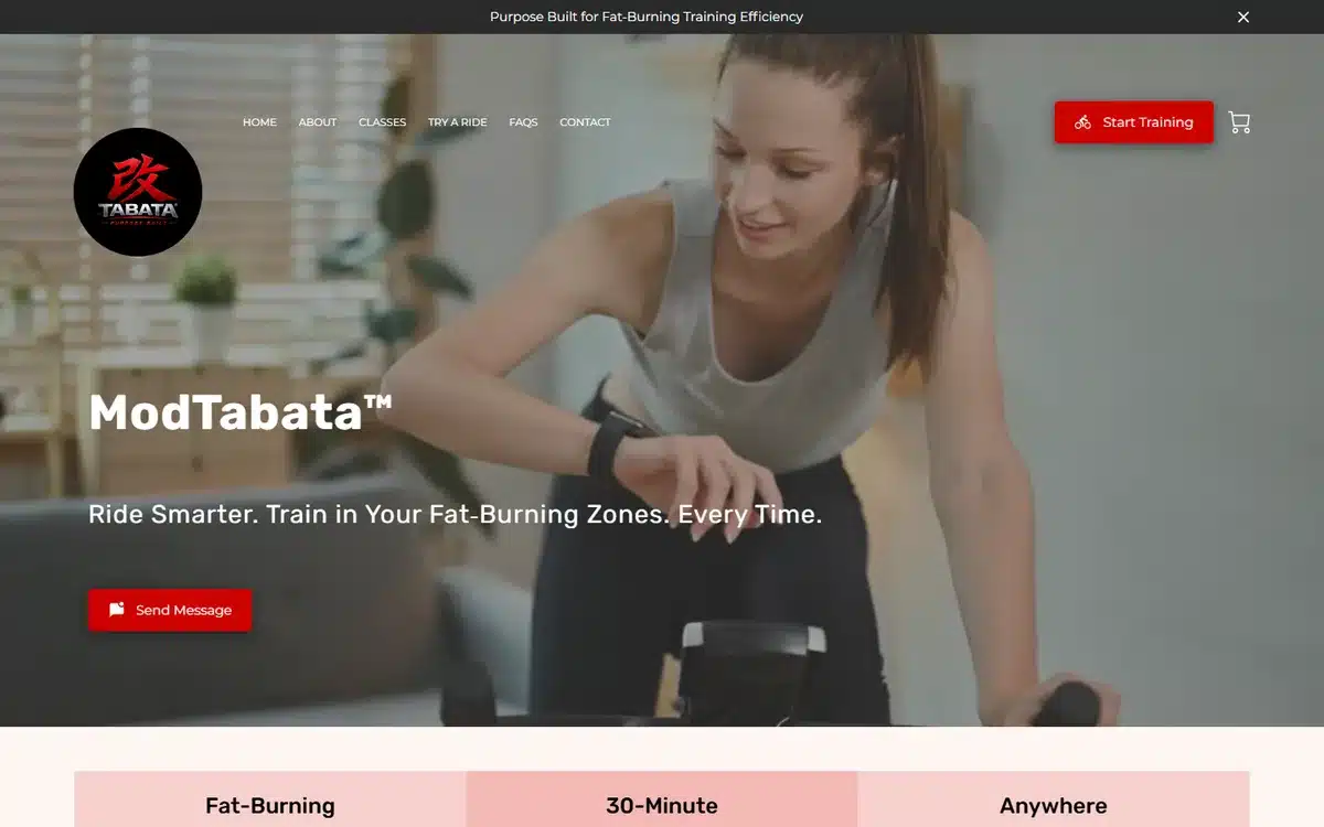
Three benefit tiles sit directly under the hero reading Fat-Burning, 30-Minute and Anywhere. The middle one is the real hook, because time is the objection most people actually have.
Borrow this: lead with session length. It answers the objection people are too polite to raise.
17. Naturally Defined Fitness, Denver, Colorado
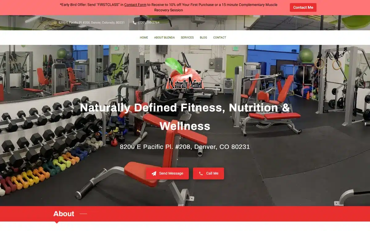
The hero is a photograph of the actual gym floor rather than a stock interior, with the full street address under the business name. A promo bar sits above without covering anything.
Borrow this: photograph your own floor even if it is not photogenic. Prospects are checking whether they will fit in.
18. The Fitness Lounge, Fresno, California
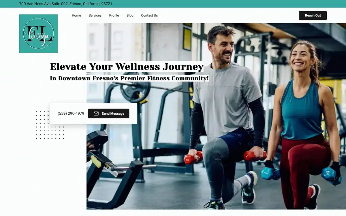
A gym floor photograph with a readable logo and address, and the phone number paired with a message button inside a single white card over the image. Simple and legible on a phone.
Borrow this: one white card holding both contact routes reads more clearly on mobile than buttons scattered over a photo.
19. The Double Jab Boxing, Manchester, New Hampshire
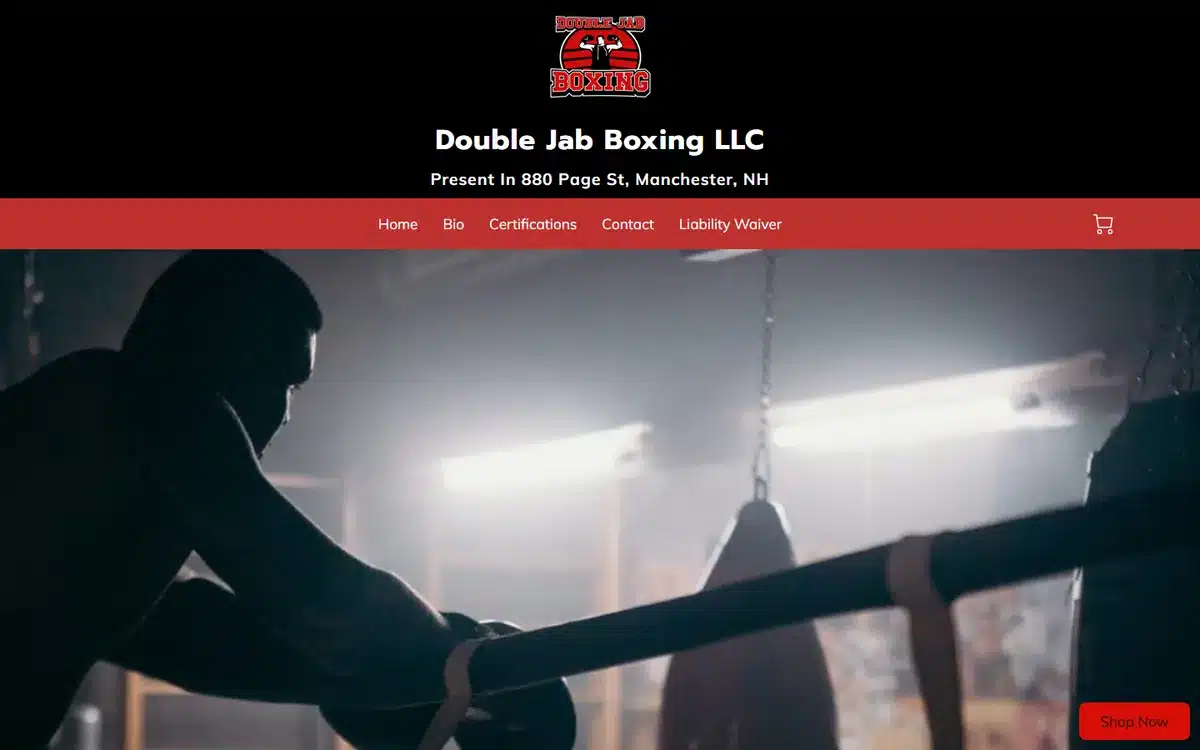
A full-bleed hero photograph with a readable logo, and the business name and street address stacked above the navigation so location is read first. For a boxing gym, the neighbourhood is half the appeal.
Borrow this: stacking name and address above the nav puts location ahead of everything, which suits a single-site gym.
20. Aussiefit, Clearwater, Florida
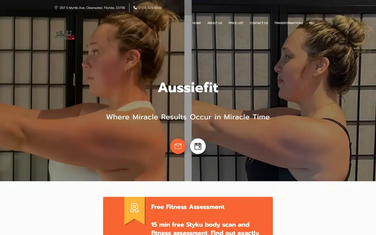
The hero is a real before-and-after client comparison split down the middle. It is the oldest device in fitness marketing and it still works when the photographs are visibly of the same person.
Borrow this: a before-and-after belongs in the hero if it is real. Keep the pose, lighting and framing consistent.
What the 20 have in common
The recurring moves in effective fitness website design are practical rather than aesthetic. The real room and the real members appear in the hero. The trial offer, where there is one, sits above everything else. Location shows up as a full address rather than a map pin. Programmes and session lengths are named. Review counts appear next to star ratings. And pricing is either published or one navigation click away.
The weakest pattern, common on sites that did not make this list, is a beautiful full-screen photograph with a single word over it and no timetable, price or address anywhere in the first screen. It photographs well in a portfolio and converts badly.
The fitness website design failure that costs you trials
Fitness sites are built on large photography, which puts them at risk on speed. The HTTP Archive Web Almanac 2025, published on 15 January 2026 from Chrome User Experience Report data, found only 48% of mobile websites pass Core Web Vitals against 56% on desktop, with 62% of mobile sites achieving a good Largest Contentful Paint and 13% rated poor.
The same report found 76% of mobile pages have an image as their LCP element, that JPG accounts for 57% of those images against 11% for WebP, and that 62% of mobile pages fail to set dimensions on at least one image. Every site above leads with a photograph, which is correct. Compress it, set explicit width and height, serve WebP, and lazy-load the gallery further down.
Getting a gym or studio website built
If you train clients one to one rather than running a facility, our guide to personal trainer websites covers that case specifically and how much a personal trainer website costs covers the pricing. For the wider market, how much a website costs in 2026 sets out the options. UENI builds the site for you rather than handing you an editor, starting at $24.99 a month plus a $79 setup fee.
Once it is live, the work is being found locally. Local SEO for small business covers the fundamentals, and Google Maps SEO covers the map pack, which is where most “gym near me” searches resolve. If you also offer bodywork or recovery services, massage websites is a useful companion.
Frequently asked questions about fitness website design
What should be on a gym website homepage?
The class timetable or a link straight to it, the full street address, your trial offer, your star rating with review count, and one obvious booking action. A photograph of your actual floor rather than a stock interior does the reassurance work.
Should a gym publish its membership prices?
Publishing or linking them from the navigation converts better than hiding them behind an enquiry form. Several sites above put a Pricing link in the main navigation. The prospect who leaves because the price is too high was never going to join, and the one who cannot find it leaves too.
Do gyms and studios need a website if they use a booking platform?
Yes. A booking platform handles the transaction but does not do the persuading, and it will not rank for local searches. BrightLocal’s 2026 survey found 54% of consumers visit a business’s website after reading positive reviews, and that visit needs somewhere to land.
How many reviews does a gym need?
At least 20. BrightLocal’s 2026 panel of 1,002 US consumers found 47% will not use a business with fewer than 20 reviews and only 9% would use one with five or fewer. Rating matters alongside volume, since 31% now require 4.5 stars or higher.
What kind of photographs work best for a fitness business?
Your own space and your own members. Prospects are working out whether they will feel out of place, and stock imagery of professional models answers the opposite question. A real before-and-after works too, provided the framing and lighting are consistent.
Why is my gym website slow on phones?
The hero photograph, almost always. The Web Almanac 2025 found 76% of mobile pages have an image as their slowest-loading element and that JPG makes up 57% of those. Compressing it, setting explicit dimensions and serving WebP fixes most of it.
Sources
- US Bureau of Labor Statistics, Occupational Outlook Handbook, Fitness Trainers and Instructors. US Bureau of Labor Statistics
- LocalIQ, 2026 Search Advertising Benchmarks, published 26 May 2026. LocalIQ
- BrightLocal, Local Consumer Review Survey 2026, panel of 1,002 US adult consumers, published 11 February 2026. BrightLocal, Local Consumer Review Survey 2026
- BrightLocal, SMB Marketing in 2025, 778 US small-business owners and managers, published 7 August 2025. BrightLocal, SMB Marketing in 2025
- HTTP Archive, Web Almanac 2025, Performance chapter, published 15 January 2026. HTTP Archive Web Almanac 2025