Constructing a top-notch home services website shares many similarities with building a house. Each component, from design and content to user experience, plays a critical role in creating a robust digital presence.
Just as you wouldn’t rush the construction of a house, crafting an impressive website requires thoughtful planning, consistent efforts, and the right blend of creativity and functionality.
So, buckle up as we set off on an insightful journey.
Our first stop?
Displaying 11 stellar home service website designs that demonstrate the possibilities when the right elements come together seamlessly.
Table of Contents
Showcasing 11 Home Service Websites
Home service companies listed below have a multitude of commendable features, making it challenging to highlight them all. Instead, we’ve focused on one or two design elements they’ve particularly excelled at, serving as inspiration for your website development. We’ll delve into these specific elements with examples for clarity.
Additionally, each design shines in its own right when considering how much a website costs. Their ability to encapsulate quality, aesthetics, and functionality, all within affordable ranges, truly underlines the efficiency and financial feasibility of exceptional website design.
1. Sacramento Painting Specialists
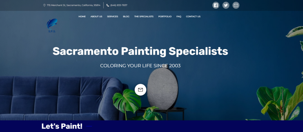
Sacramento Painting Specialists‘ website delivers a crisp, uncluttered design that makes navigation effortless. Its extensive portfolio showcases a variety of completed projects, offering a glimpse into the high-quality services they provide.
Additionally, the strategic use of pop-up forms aids in capturing leads and encouraging visitor interaction. The inclusion of a blog section demonstrates their commitment to providing value beyond just their services, enhancing their online presence and internet marketing efforts.
Highlight Features:
- The clean design and extensive portfolio demonstrate professionalism and quality, making it easy for potential customers to gauge their work.
- The use of pop-up forms enhances lead generation efforts, while the blog section serves as a valuable tool for internet marketing and client engagement.
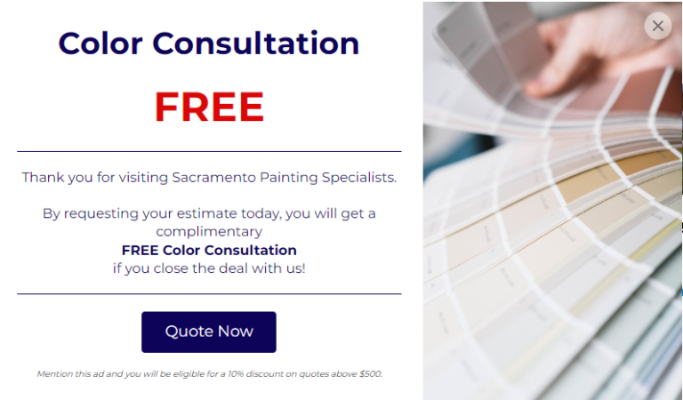
How to implement this: Prioritize speed and user experience in your website design, as well as lay emphasis on pop-up forms if you want to capture more leads from your site. We’ll explore these aspects further later in this blog post.
2. Artistic Windows and Doors
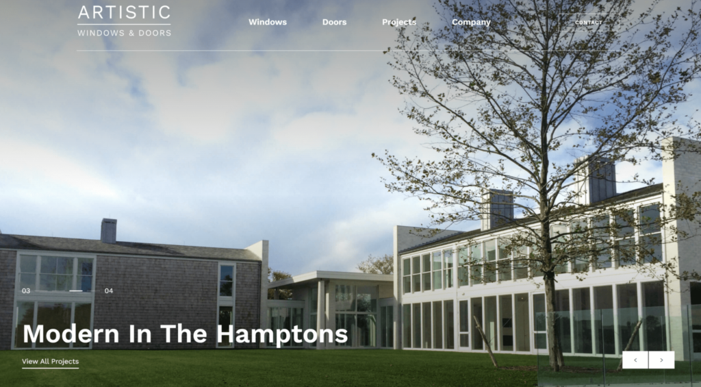
Artistic Windows and Doors’ website exudes elegance, complemented by an array of high-quality content.
Simple and intuitive navigation adds to the site’s ease of use. Visitors are treated to a rich portfolio of work and detailed explanations of services, providing immense value and enhancing the potential for lead conversion.
Highlight Features:
- Website is filled with high-quality content, including detailed descriptions of services and extensive product showcases, which provide immense value to visitors.
- Navigation system is organized and user-friendly, making it easy for visitors to explore their offerings.

3. Punch List - Repair & Maintenance Services
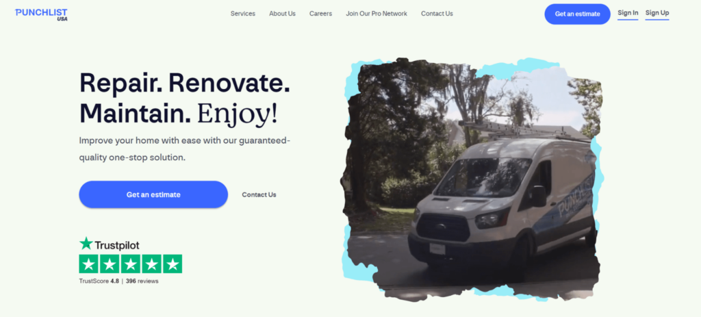
Punch List‘s website is modern and appealing, with a highly visible and compelling call-to-action on the homepage.
Website’s design exudes professionalism, effectively encouraging visitors to engage with their services. Well-placed Trustpilot reviews on the homepage enhance their credibility.
Highlight Features:
- Punchlist does a stellar job with their call-to-action — a bold, easy-to-spot button that encourages visitors to schedule a free quote.
- The Trustpilot reviews featured on the homepage help to build trust and reassure potential customers about the quality of their services.
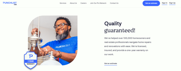
Key Takeaway: Use compelling CTAs and leverage third-party review platforms to build credibility. We will delve deeper into these elements after all of the examples.
4. Armadillo - Home Warranty Services
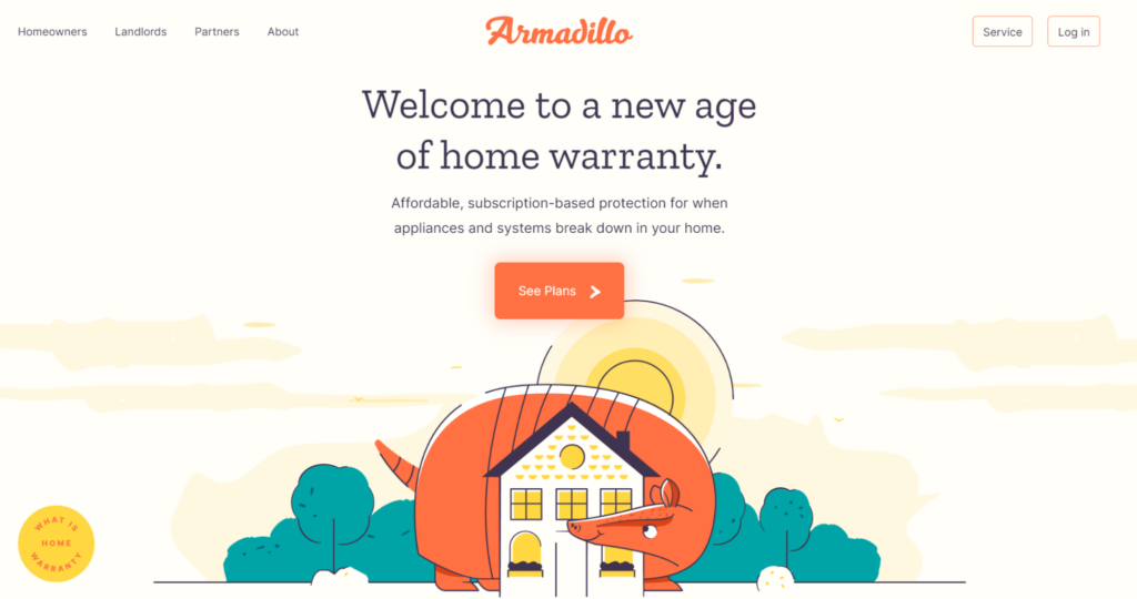
Armadillo‘s website leaves a lasting impression with its distinctive, custom design.
The website establishes itself as an authority through its featured articles, while professional photography and a sleek layout augment the overall aesthetic appeal. Armadillo does an excellent job of standing out in a saturated market, which is an approach worth emulating for businesses looking to carve their unique identity.
Highlight Features:
- Custom design of Armadillo’s website is engaging and represents their brand effectively.
- The site also builds credibility by showcasing links to articles featured in authority publications, lending further proof of their expertise.
5. Mr. Handyman
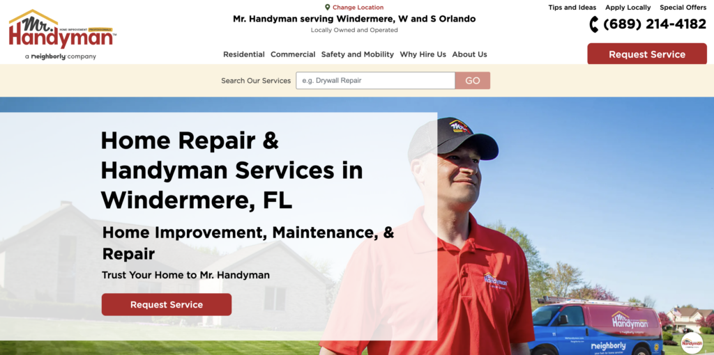
Mr Handyman‘s website exemplifies a design built for usability.
A fast-loading website ensures that visitors aren’t left waiting, and the straightforward navigation minimizes frustration, improving user experience. Understanding that user time is valuable and a complex website might drive potential customers away, Mr. Handyman adopts a ‘simplicity is key’ approach.
Their emphasis on fast load times and easy navigation provides lessons for businesses in creating a hassle-free online journey. We will delve into the specifics of these strategies in the following sections.
Highlight Features
- Loading speed is a key strength of this website, enhancing the overall user experience and making it more likely that visitors stay and explore their offerings.
- The navigation system is also remarkably simple, making it easy for visitors to find what they’re looking for.
6. Fixr - Home Remodeling Services
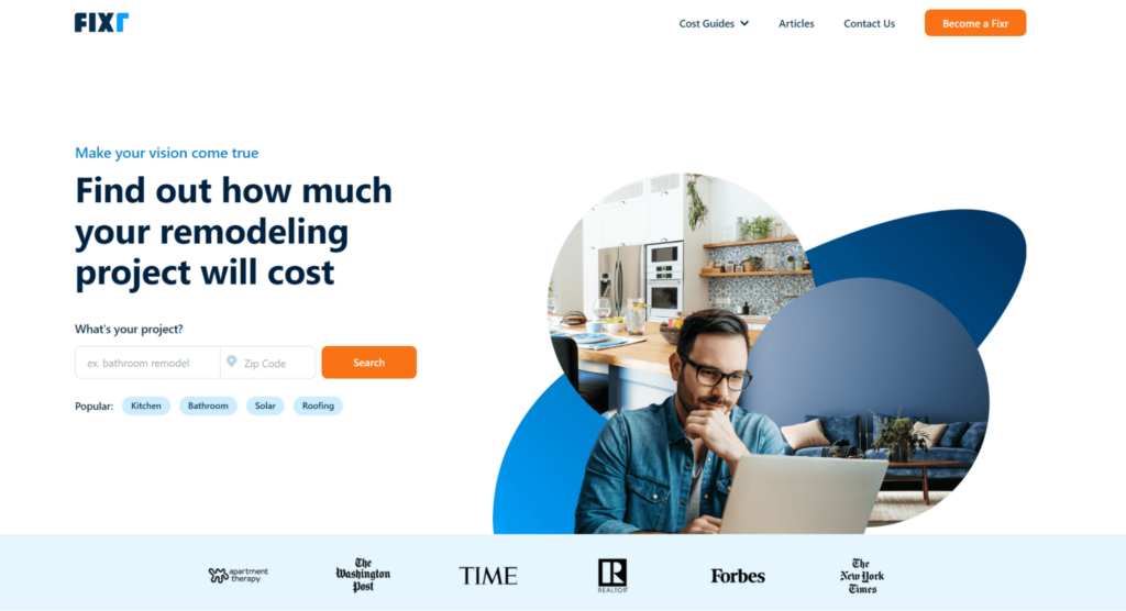
Fixr‘s website is a masterclass in simplicity and effectiveness, featuring a dedicated landing page that immediately presents users with their services. Their website makes it easy for visitors to understand what they offer.
They also prominently display logos of reputable publishers where they’ve been featured, establishing a trust factor right at the onset.
Highlight Features:
- Fixr’s landing page eliminates any ambiguity about their offerings, enhancing user experience by presenting clear, concise information about their services.
- Their strategic use of logos from high-profile publishers on their homepage leverages the power of social proof, instilling trust in prospective clients.
7. Tidy Casa - Home Cleaning Services
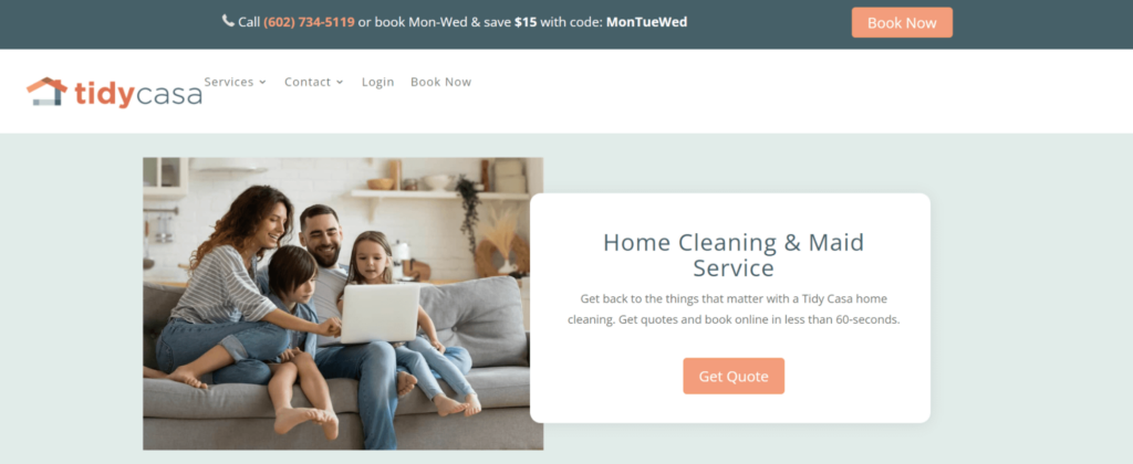
Tidy Casa‘s website provides an immersive experience through high-quality content, including an introductory video. The clean, uncluttered design underscores their services and CTAs, reinforcing their main offering to the site’s visitors. Tidy Casa illustrates the power of utilizing multimedia content to engage the audience and the effectiveness of a clean design that helps highlight key service offerings and CTAs.
Highlight Features:
- The content quality is exceptional, providing prospective clients with all the necessary information about their services. An engaging video further enhances the user experience.
- The website also makes excellent use of prominent CTAs, guiding visitors towards booking a cleaning service. We will further discuss the potential of multimedia content and minimalist design in improving user engagement later in the blog post.
8. Clean Panda - Garbage Removal Services
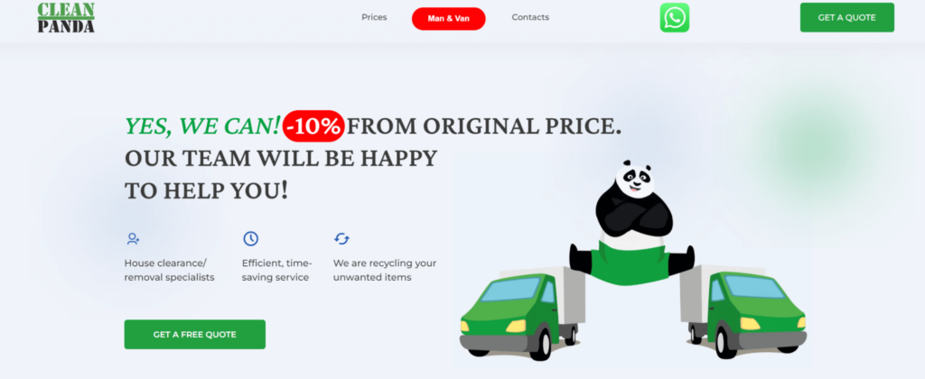
Clean Panda‘s website stands out with its vibrant, engaging design. By simplifying navigation and innovatively integrating call-to-actions with social media, the design enhances customer engagement and accessibility. Clean Panda’s strategic use of social media for enhancing interaction and their intuitive navigation system underline the importance of modern tools for engagement and user-friendly design.
Highlight Features
- The website creatively incorporates CTAs with WhatsApp buttons, enabling direct communication with clients via a familiar platform.
- The navigation system is also simple and intuitive, allowing users to easily find the information they’re looking for.
9. Skoup - Waste Removal Services
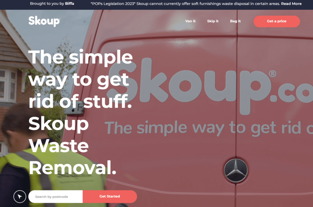
Skoup‘s website delivers a speedy, user-friendly, and engaging experience, enriched by high-quality content, including a personalized video on the homepage. Their modern design and fast load times make the website a breeze to navigate, holding visitor attention while conveying the company’s ethos. The utilization of high-quality video content and a quick-loading website, as illustrated by Skoup, underscores the importance of visual storytelling and optimized web performance.
Highlight Features:
- The website’s fast loading speed provides a seamless browsing experience.
- The use of high-quality video content on the homepage adds a personal touch, effectively capturing visitors’ attention and conveying the company’s services and ethos.
10. HomeCleaningNYC - Home & Office Cleaning Services
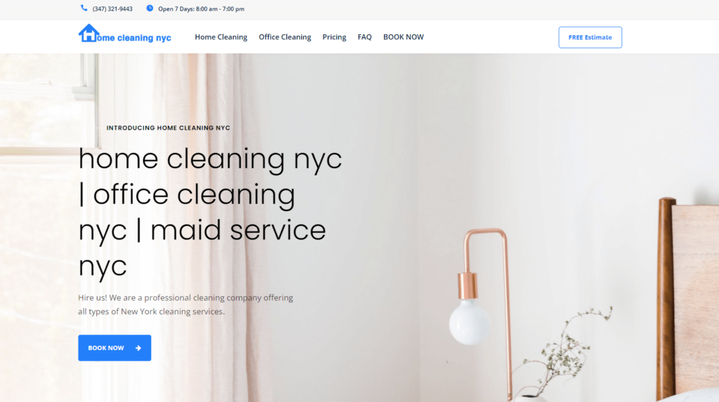
HomeCleaningNYC‘s website stands out with its immaculate, easy-to-navigate design that encapsulates the essence of their cleaning service. The website effectively utilizes prominent call-to-action buttons, encouraging visitors to book their services effortlessly.
Additionally, the comprehensive description of their services coupled with transparent pricing offers a clear overview of what clients can expect, thus setting realistic expectations and promoting trust.
Highlight Features:
- The clean design and prominent call-to-action buttons facilitate a smooth user experience, guiding visitors towards booking a service.
- The detailed description of services alongside transparent pricing helps visitors make an informed decision, while the extensive FAQ section further aids in addressing any potential queries or concerns.
11. GreenPal - Lawn Care Services
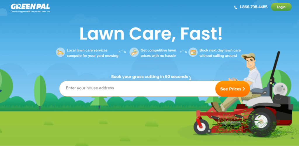
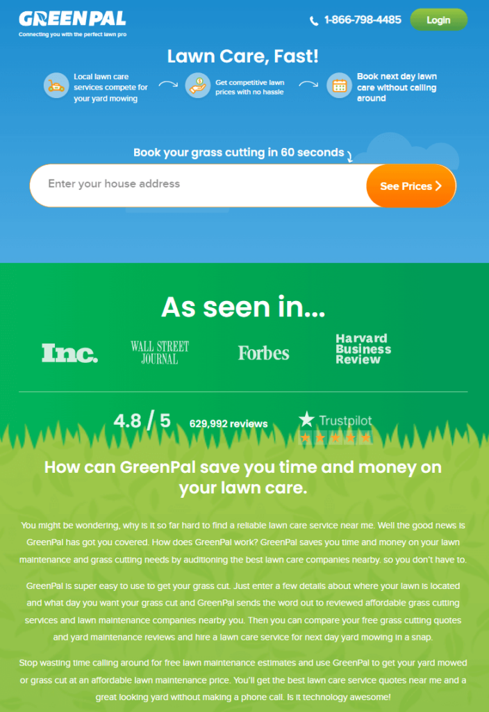
GreenPal‘s website exemplifies a clean, easy-to-navigate design complemented by high-quality content and design elements that provide an immersive user experience.
Straightforward navigation system is not just user-friendly, but it also enables visitors to explore their offerings with ease, reflecting the thoughtfulness behind the design. The richness of their content and the high-quality design elements add a layer of professionalism to the user experience, setting a high standard for competitors.
Highlight Features:
- Navigation is straightforward and user-friendly, enabling visitors to easily explore their offerings.
- High-quality content and design further enhance the user experience, providing value and showcasing the company’s professionalism.
Essential Elements To Make A Great Home Services Website
Crafting an outstanding home services website is akin to preparing a gourmet dish. It calls for a mix of several vital ingredients that, when combined, result in a delightful user experience.
Each ingredient brings something unique to the table, and their perfect blend can satiate the most discerning of palates. Whether it’s a well-structured navigation menu, engaging content, or compelling visuals, every component plays a role in ensuring your website is not just good, but exceptional.
User-Friendly Navigation
Envision your website as a city roadmap. An unclear, complex map will frustrate travelers, whereas a simple, well-structured map will make their journey enjoyable. Similarly, a website with clear, intuitive navigation keeps visitors engaged, reducing the chances they’ll exit prematurely.
To create user-friendly navigation for your home services website, start by mapping out the main sections of your site. Typically, these will include home, services, about us, blog, and contact us. Use clear, intuitive labeling for these sections to avoid any confusion.
Once you have your main sections, consider any subpages that might be required under each section. For instance, under ‘services’, you might have different pages for each type of service you offer.
Ensure your navigation menu is visible across all pages and doesn’t clutter the page. Dropdown menus can be useful for housing several options without overwhelming the page.
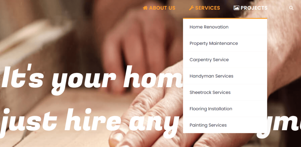
A prime example of this is Repair Home Service. The website makes navigation effortless with a clearly organized list of various services and completed projects. The site is easy to navigate, making the user’s journey both straightforward and enjoyable.
Strive to make the journey through your home services website as straightforward and seamless as possible.
Mobile-Optimized Design
People seek instant access to information. Many potential clients will access your website on-the-go from their mobile devices, meaning your website must be responsive and mobile-friendly.
A mobile-optimized design is no longer a feature —it’s a necessity. Your website must be responsive. This means it should automatically adjust its layout, images, and functionalities to suit the device it’s being viewed on.
You can achieve this by using responsive web design techniques or choosing a responsive theme if you’re using a website builder.
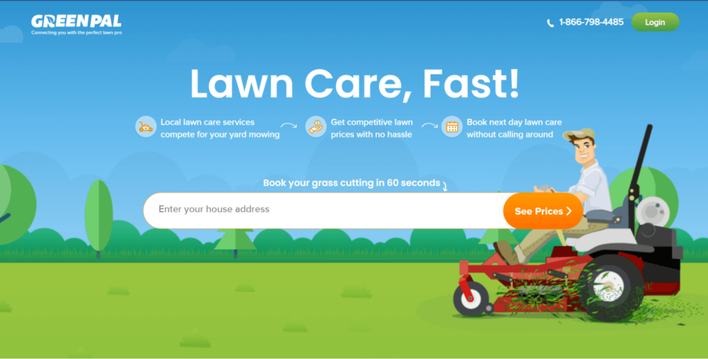
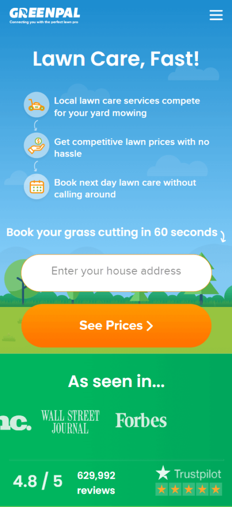
Remember, mobile optimization also means ensuring your site loads quickly on mobile devices, and that interactive elements like forms and buttons are easy to use on a small screen.
High-Quality, Engaging, and Relevant Content
Content is, and always will be, king. It’s not enough to provide content for content’s sake—what you offer must provide value to your audience.
Engaging users with relevant information starts with understanding your audience’s needs and preferences. Create buyer personas to help you understand who your audience is, what information they need, and how they prefer to consume it.
Once you have a clear picture of your audience, create content that addresses their needs, interests, and pain points. Use a mix of formats – blogs, infographics, videos, and more – to keep your content fresh and engaging.
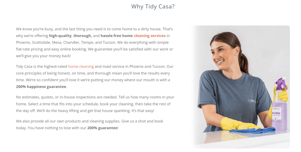
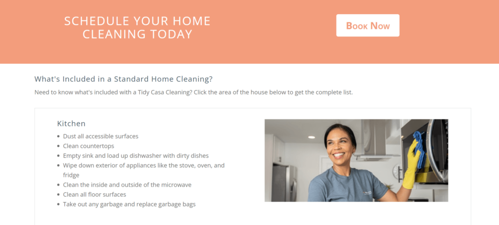
Tidy Casa offers an excellent example of this. The website features engaging content that showcases the company’s values, and provides a 200% guarantee for their services, helping customers understand precisely what they’re signing up for.
Make your homepage educational, engaging, and, above all, relevant. Outstanding content will not only captivate users but also make them want to share your insights, amplifying your reach.
Quick Loading Speed to Reduce Bounce Rate
Nothing sends a potential client away faster than a slow-loading website. In the digital era, speed and efficiency rule. Each second of loading time dramatically increases the likelihood a visitor will abandon your site, increasing your bounce rate and negatively impacting your SEO. Optimizing your home services website for speed ensures a seamless experience that leaves users satisfied.
Reducing your site’s load time starts with optimizing your images and videos. Large media files can significantly slow down your site, so consider compressing them or using a content delivery network (CDN) to speed up delivery.
Other strategies to improve load speed include minimizing the use of unnecessary plugins, using browser caching, and minimizing your HTML, CSS, and JavaScript files.
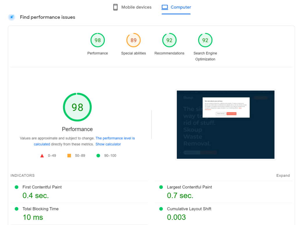
A website with quick loading times, like Skoup, offers a seamless experience to its visitors. Despite having a video on its homepage, the website remains fast and responsive, showcasing excellent speed optimization.
Crafting Convincing Call-to-Actions
Your home services website should be more than a digital brochure; it’s a platform for interaction and engagement. Compelling call-to-actions (CTAs) are the catalyst for this interaction. Whether you want visitors to request a quote, book a service, subscribe to your blog, or simply learn more about your offerings, your CTAs should be persuasive and clear.
All CTAs should be clear, concise, and persuasive. Begin with a strong command verb, such as “Book now,” “Get a quote,” or “Free Estimate”


Make your CTA stand out visually with a contrasting color or design element, and create a sense of urgency with time-limited offers if possible.
Make them bold and direct.
Here are some more examples of great call to actions on a home services page.
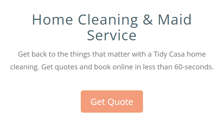
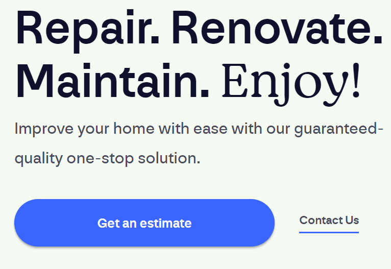
TidyCasa utilizes CTAs effectively, gently steering visitors to request a quote. This type of clear and relevant CTA can transform casual browsers into dedicated customers.
Remember, a well-crafted CTA can make the difference between a casual browser and a committed customer.
Using Reviews and Testimonials to Build Trust
Trust is the cornerstone of any service-based business. When potential clients visit your website, they’re looking for reassurances that you deliver what you promise. Customer reviews and testimonials are the digital equivalent of word-of-mouth referrals. They give your website visitors confidence in your services.
To build trust through your website, encourage satisfied customers to leave reviews and testimonials. You might do this by following up with customers after a job and asking them to provide feedback, offering incentives for leaving a review, or simply including a review form on your website.
Once you’ve collected reviews and testimonials, display them prominently on your site. You might include them on your homepage, on a dedicated testimonials page, or even as pop-ups on various pages.
A great example of this is the Window Service Company website, which integrates Google reviews into a visible widget on the page, providing an instant confidence boost to prospective clients.

Creating an exceptional home services website might seem like a daunting task, but by focusing on these essential elements, you can ensure a delightful user experience that keeps visitors on your website as well as turns them into dedicated clients.
Your journey to building a remarkable home services website can become significantly smoother with this a free tool to visualize your online presence, gain a clear analysis of your performance, and identify untapped opportunities. It’s all about making the right choices and using the right resources. And remember, creating an effective website is not a destination, but a journey of constant improvement and adaptation.
Make A Great Home Services Website & Grow Your Business
The journey to a top-tier home services website can be daunting, particularly for busy small business owners. The responsibilities of managing services, addressing customer queries, and upkeeping physical premises, doesn’t leave much room for the intricate work of website building.
This process could be smoother and much more rewarding with the right partner. This is where UENI shines. A professional team of website builders, specialized in providing affordable, high-quality website building services, custom-tailored for small businesses. Shouldering the burden of website creation, letting you focus on what you do best – running your business.
To build an effective home services website, several key elements need attention. Thankfully, UENI can handle each one. They deliver a mobile-optimized design, providing a done-for-you, mobile-friendly website that aligns with your brand. The importance of high-quality, engaging, and relevant content is met by UENI’s expertise in content creation. UENI also includes handpicked images that align with your brand, adding visual appeal and relevance to your site.
In a nutshell, if you’re a small business owner in the home services sector, you need a stellar website. And we can help you build one.

