A great restaurant website earns its keep before a single guest walks through the door. Diners check the menu, scroll the food photography, eye the booking widget, and decide whether to make the reservation, all before they ever pick up a fork. To help you see what good looks like, this guide collects 30 real restaurant website examples from operators using UENI, ranging from BBQ joints and pizzerias to omakase sushi bars, food trucks, and fine-dining rooms. Each one is live, each one is built by a working restaurant, and each one shows a specific design or functionality choice you can borrow for your own site.
Key takeaways
- Strong restaurant website examples lead with food photography, not stock imagery. Hero photos do more for conversion than any other single design choice.
- The non-negotiable functionality stack for restaurants in 2026: a visible menu, online ordering or reservations one click from the homepage, click-to-call on mobile, and Google Business Profile-aligned location and hours.
- Cuisine identity should come through on the homepage in under three seconds: colour palette, typography, and photography all do this work, not the tagline.
- Small touches separate the best restaurant website examples from the rest. Sticky reservation buttons, real interior shots, a one-tap call link, and dietary-friendly menus all signal professionalism.
- Restaurants are well past the “do I need a website?” question. A basic website is now table stakes — the harder question is whether yours earns bookings or just exists. The 30 restaurant website examples below show what earning the booking looks like in practice.
What makes a good restaurant website?
Before walking through the 30 restaurant website examples, it helps to set the bar. A restaurant website has a narrower job than most small business sites. It has to make a hungry visitor confident enough to book a table, place an order, or drive over. Two things matter most: the design and the functionality.
The design
The design is the first impression. A restaurant’s website typically sets the tone before anyone smells the kitchen, so its appearance shapes whether a visitor sees a place worth trying. If the site looks dated, generic, or thrown-together, potential guests tend to assume the food matches. The strongest restaurant website examples we see share three traits. The hero image is custom food photography, not stock. The colour palette and typography match the cuisine and the room. And the homepage gives one job at a time, usually “see the menu” or “book a table”, instead of a wall of every possible action.
The functionality
Functionality is what turns a pretty page into a paying customer. Restaurant websites that perform usually nail four things. The menu is visible in one click, not buried as a downloadable PDF. Online ordering or reservations are no further than the top-right corner on desktop and a sticky button on mobile. Phone numbers are tap-to-call on phones, not plain text. And location, hours, and parking notes appear above the fold so a visitor planning their evening doesn’t have to scroll. When design and functionality work together, the website stops being a brochure and starts behaving like an extra member of the front-of-house team.
30 best restaurant website examples (2026)
Every example below is a real UENI customer’s live site, captured in May 2026. They cover BBQ, pizza, sushi, soul food, Caribbean, Mexican, Mediterranean, Italian, vegan, dessert, food trucks, and cafés, on purpose: a good restaurant website example for a steakhouse looks nothing like a good one for a churro stand, and the variety is the point.
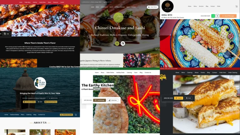
1. Bodip’s Smokin’ Que
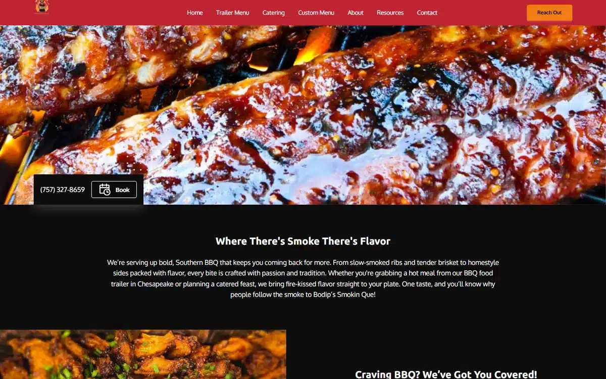
Bodip’s Smokin’ Que uses one of the strongest BBQ heroes in this list: a fiery, close-up shot of glazed ribs that fills the viewport. The dark backdrop and saturated colour treatment make the food the entire pitch. There’s no clutter, no carousel, no welcome paragraph. Just food and a clear path to “order online”.
Borrow this: dedicate the entire hero to one mouth-watering close-up. Resist the urge to crowd it with badges or sliders.
2. Mookie’s Boys Barbecue
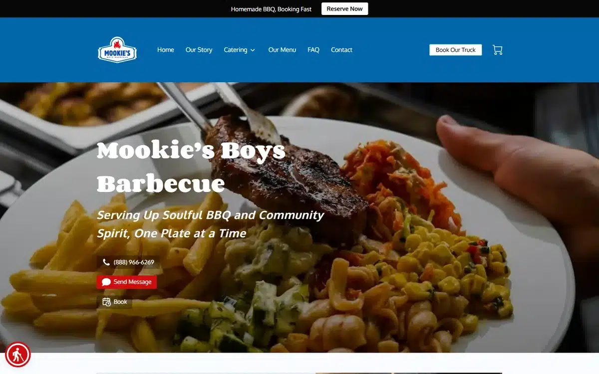
Mookie’s Boys Barbecue in Clearwater, Florida pairs a hearty platter with a strong tagline (“Serving Up Soulful BBQ and Community Spirit”) and clear contact pathways. The booking-and-call buttons sit directly under the headline. The navigation is restrained: Our Story, Catering, Menu, FAQ, Contact, in that order.
Borrow this: use the homepage tagline to express both the food and the values. Diners increasingly choose restaurants on community fit, not just cuisine.
3. Silver Rush Burger
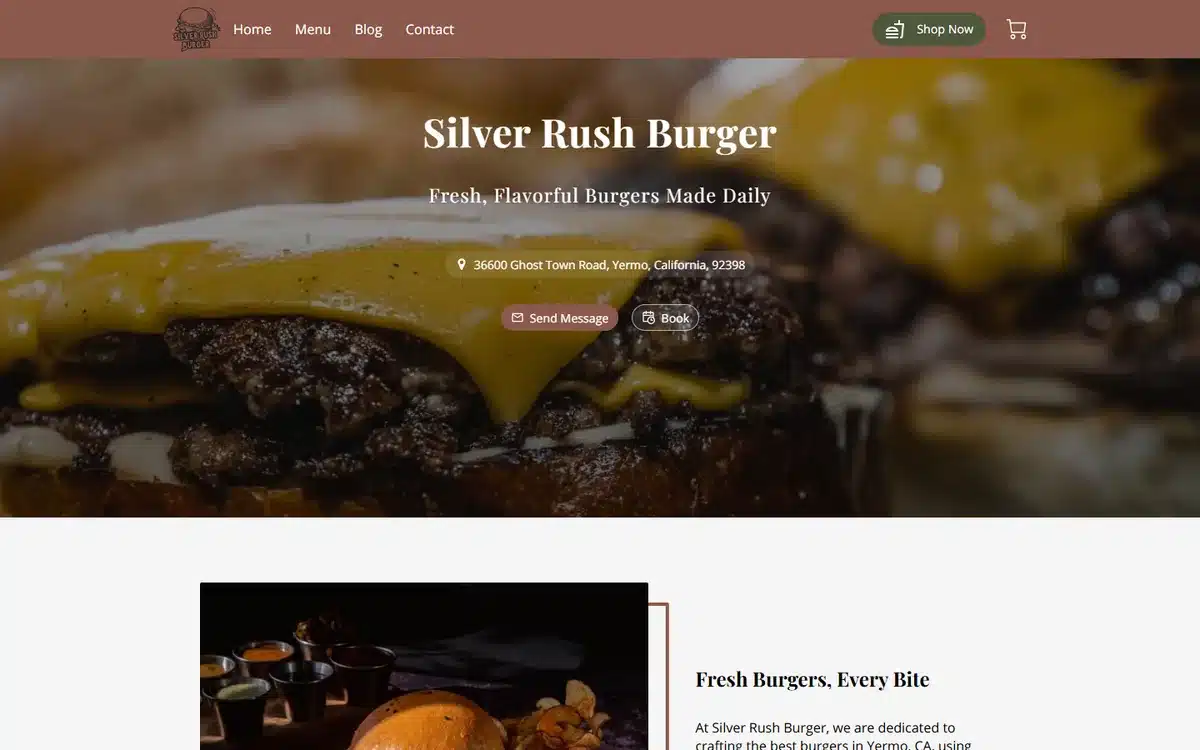
Silver Rush Burger in Yermo, California leans on a single juicy burger close-up with cheese melting over the patty. The warm brown brand palette and minimal navigation make the food the loudest thing on the screen. Roadside burger joints win on craving appeal, and this site delivers it.
Borrow this: if your dish is the draw, use one perfect shot rather than five mediocre ones. Restraint reads as confidence.
4. Rob’s Deli
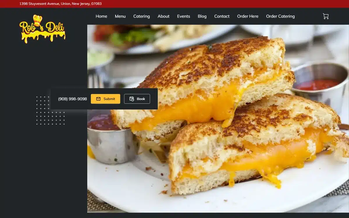
Rob’s Deli in Union, New Jersey uses a bold red and black brand bar over a hero shot of a layered grilled cheese sandwich. It’s straightforward, confident, and gives the visitor one job: order. Below the fold, the menu is just one click away.
Borrow this: deli, sandwich, and counter-service restaurants benefit from saturated brand colours that read clearly on small mobile screens.
5. The Big Grill
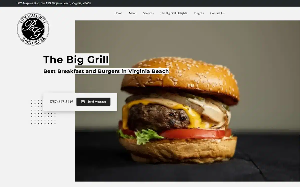
The Big Grill in Virginia Beach uses confident burger photography with the patty and bun in tight focus. The hero answers the only two questions a hungry visitor has: what do they serve, and how do I order. The rest of the page works as proof.
Borrow this: name the most photogenic dish on the menu and make sure it appears in your hero. Don’t lead with the room or the chef.
6. Chi-Town Maxwells
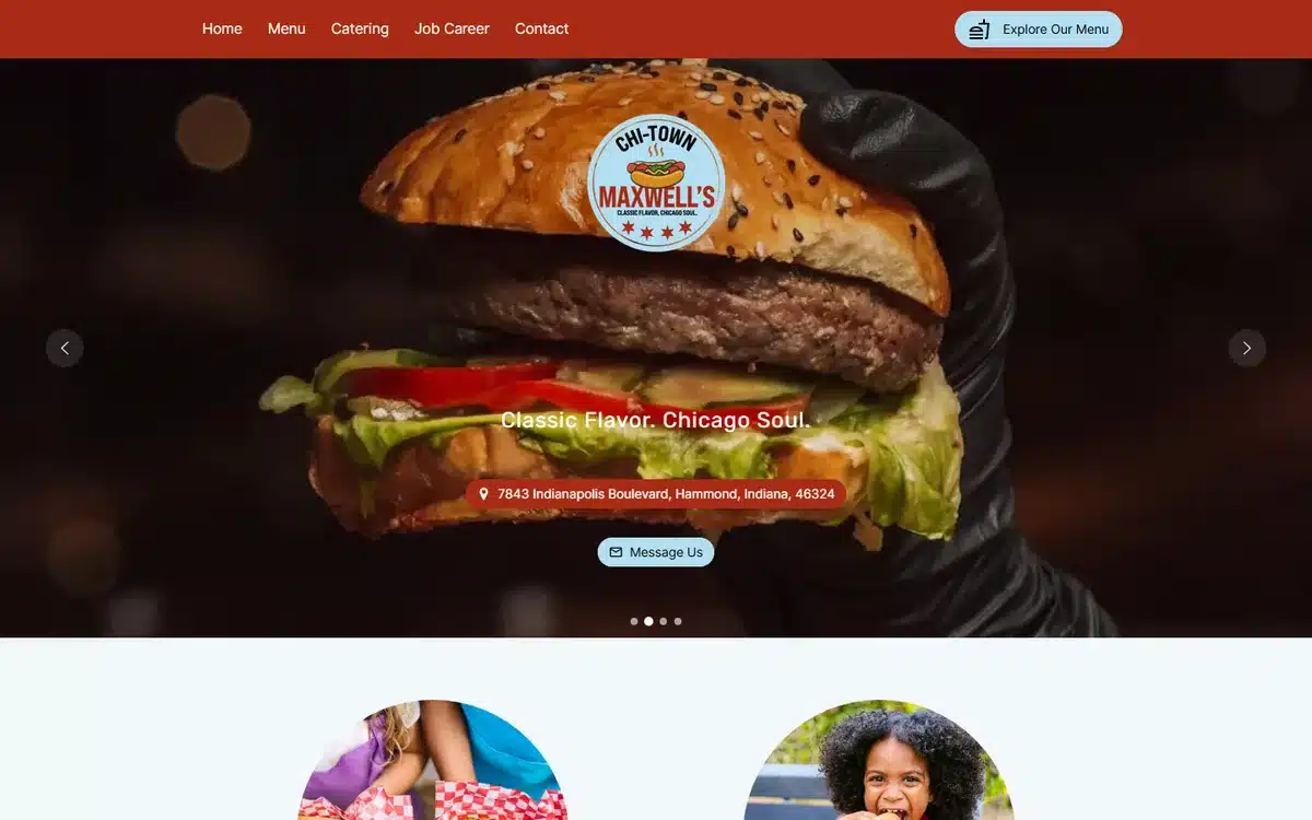
Chi-Town Maxwells in Hammond, Indiana ups the production value with a gloved-hand burger shot in dark, moody lighting. A bold red navigation strip frames the hero. The composition is editorial more than promotional, and it works.
Borrow this: dark backgrounds and dramatic lighting can elevate burger and grill restaurants out of the “fast casual” bucket and into something diners take more seriously.
7. Mr. Roland Selling Food
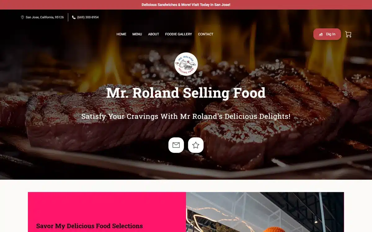
Mr. Roland Selling Food in San Jose plays it bold: a wall of flame and grilled steak as the hero, with the brand mark dropped cleanly over the top. The site doesn’t try to be everything. It commits to one idea (“we cook over fire”) and lets the photography sell it.
Borrow this: if your kitchen has a signature technique, build the whole homepage around showing it.
8. Black Sicilian Pizza Company
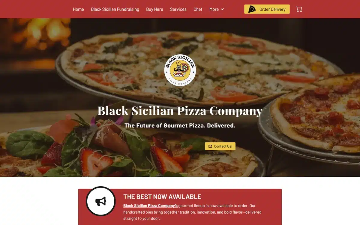
Black Sicilian Pizza Company in Upper Marlboro, Maryland uses a deep red brand colour, a badge-style logo, and a tight crop of a Sicilian-cut pizza. Pizzeria websites tend to over-design. This one keeps it simple and lets the dough do the talking.
Borrow this: for pizzerias, a single confident hero shot and a clear menu link beat any amount of stock imagery or quirky illustration.
9. Ollin NYC
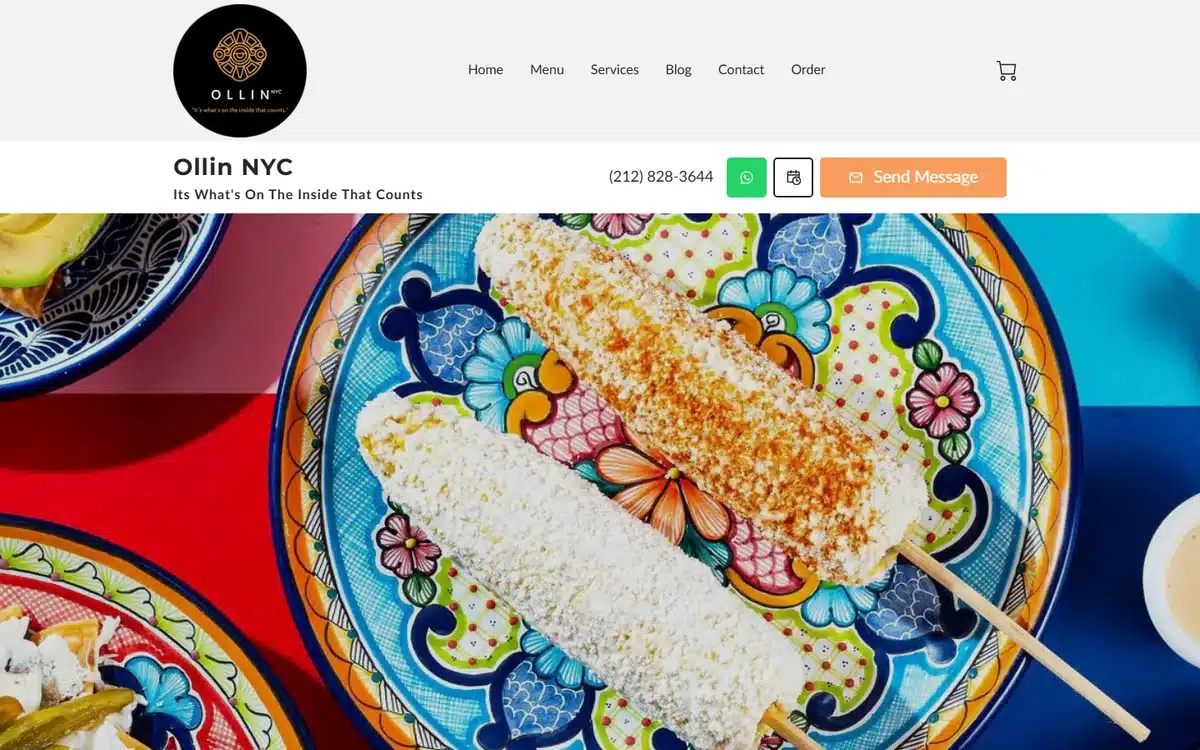
Ollin NYC stands out among the Mexican restaurant website examples for its editorial sensibility. A blue Talavera plate, a single piece of grilled elote, and premium black-on-white typography make the page feel more like a magazine spread than a takeout menu. The “Send Message” CTA is unusual but on-brand for a hospitality-led concept.
Borrow this: when your restaurant has a strong design point of view, the website should reflect it. Premium positioning starts with premium typography.
10. Fiesta Mexican Restaurant
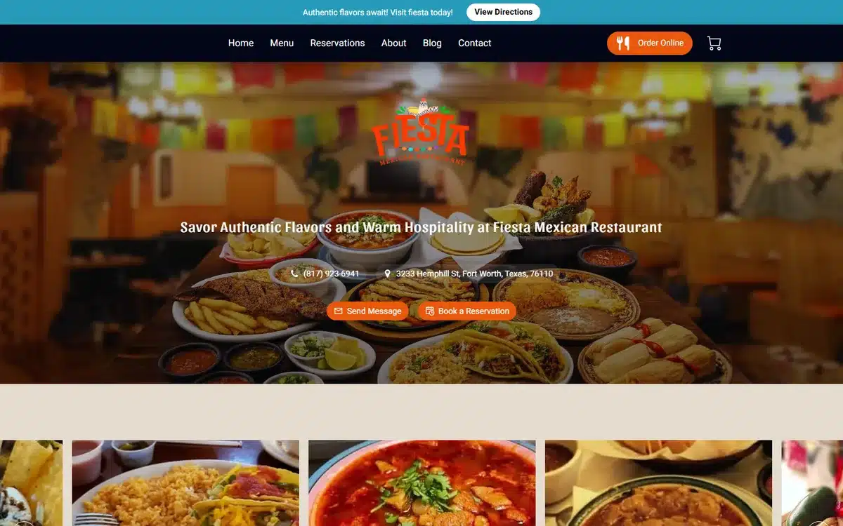
Fiesta Mexican Restaurant in Fort Worth, Texas leans into atmosphere over plated food: a wide shot of the room with papel picado banners across the ceiling. It communicates “celebration spot” before anyone reads a word. Family-celebration Mexican restaurants benefit more from showing the room than the food.
Borrow this: if your restaurant is bought on occasion (birthdays, anniversaries, family dinners), lead with the room, not the plate.
11. D’ Pura Cepa
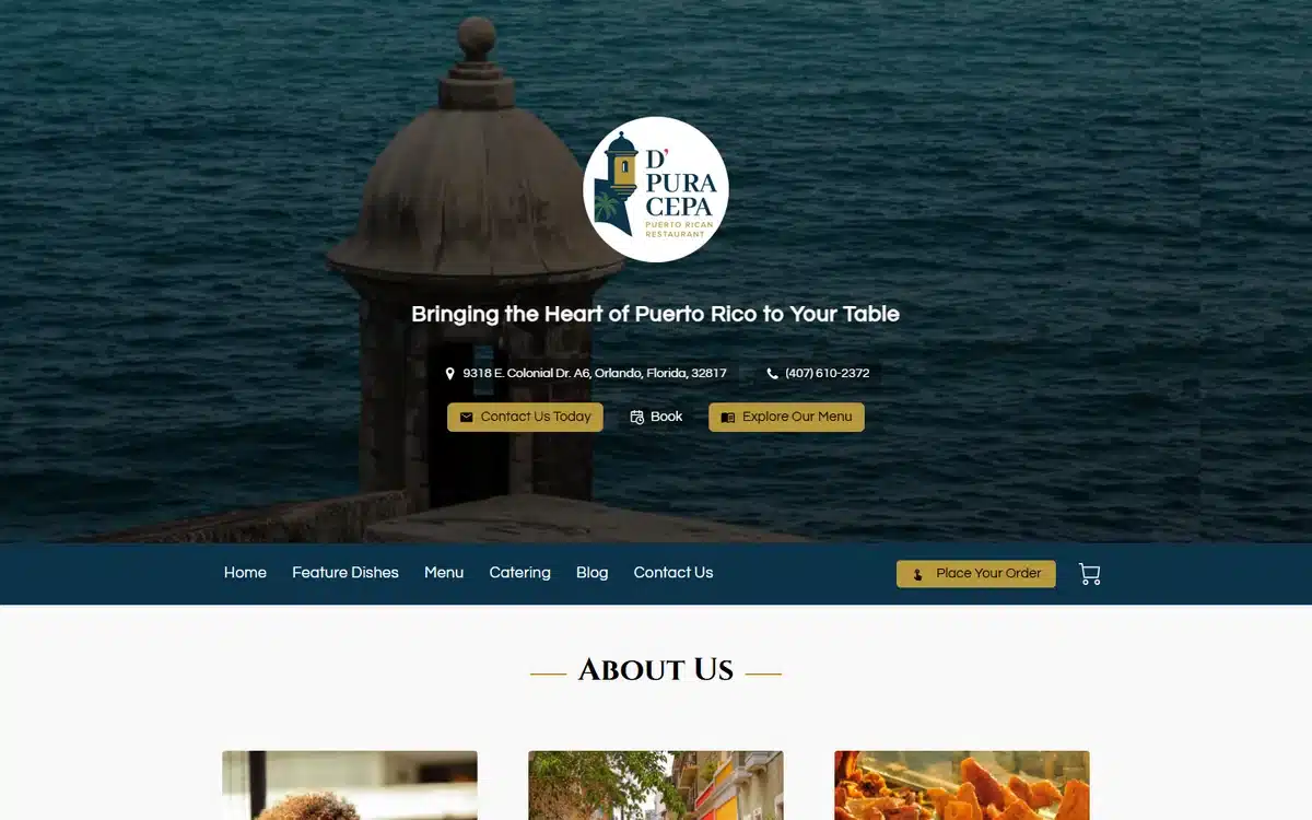
D’ Pura Cepa in Orlando, Florida sells more than a meal. The hero is a Puerto Rico coastal fortress, the tagline (“Bringing the Heart of Puerto Rico to Your Table”) sits over it, and the page treats the cuisine as cultural transport. It’s one of the more atmospheric restaurant website examples in this list.
Borrow this: heritage and origin-led restaurants can borrow imagery from the homeland, not just the plate. The website is a chance to set the stage.
12. Rodney’s Jamaican Jerk BBQ
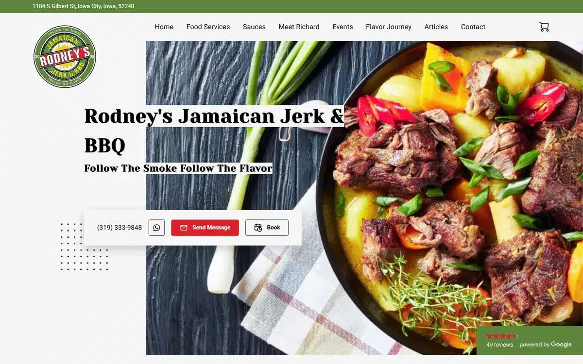
Rodney’s Jamaican Jerk BBQ in Iowa City uses a top-down skillet shot bursting with peppers, rice, and seared protein, plus a circular badge logo with confident serif typography. It hits two boxes at once: appetite appeal and brand polish.
Borrow this: overhead “flat lay” photography is one of the most consistently strong choices for restaurants serving colourful, ingredient-led dishes.
13. Dunn Dada Kitchen NYC
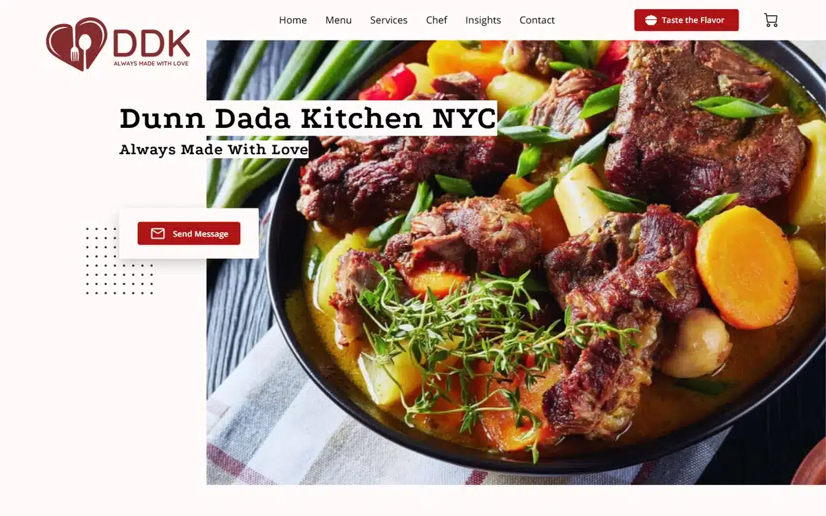
Dunn Dada Kitchen NYC opens with a hearty stew bowl, vibrant colour, and a tightly cropped composition. Caribbean food photography lives or dies on saturation, and this hero gets it right. The site keeps everything else simple so the food has the room.
Borrow this: cuisines with bold colour profiles (Caribbean, West African, South Asian) shouldn’t dull down the photography. Push saturation, not subtlety.
14. N’ Da Kitchen
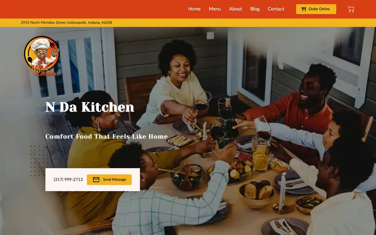
N’ Da Kitchen in Indianapolis takes a lifestyle approach: a multi-generation family at a table, hands reaching for serving dishes. It frames the restaurant around the experience of sharing food rather than the food itself. For soul food and family-style concepts, this is often the stronger angle.
Borrow this: if your value proposition is the meal as an occasion, hero the people, not the plate. Faces and hands convert.
15. Chiwaffles
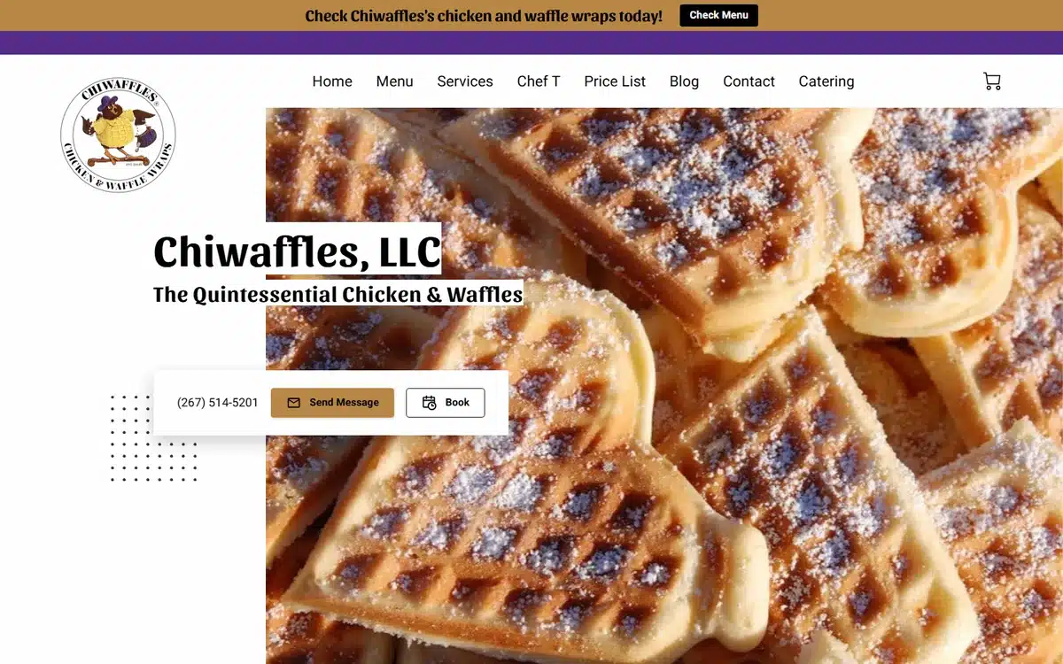
Chiwaffles in Philadelphia uses a tight, golden close-up of a waffle taking up the entire viewport. The branding is playful (the name does most of the heavy lifting), and the hero is texture, not narrative. It works because waffles photograph beautifully at macro scale.
Borrow this: dishes with strong texture (waffles, biscuits, croissants, dumplings) deserve macro photography, not wide shots. Texture is appetite appeal.
16. Blowfish Sushi & Ramen
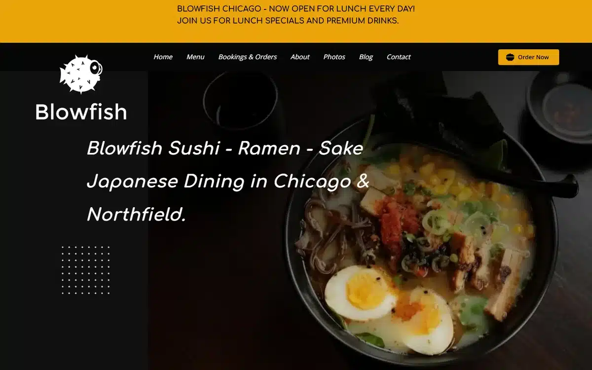
Blowfish Sushi & Ramen in Chicago pairs a moody overhead ramen bowl with a minimal black background and refined typography. The result reads as a higher-end sit-down spot than a quick takeout shop, which appears to be the intended position. The composition does the work of three paragraphs of copy.
Borrow this: minimalism is a positioning signal. A spare, black-and-white site tells visitors to expect something more considered than the average ramen counter.
17. Chirori Omakase & Sushi
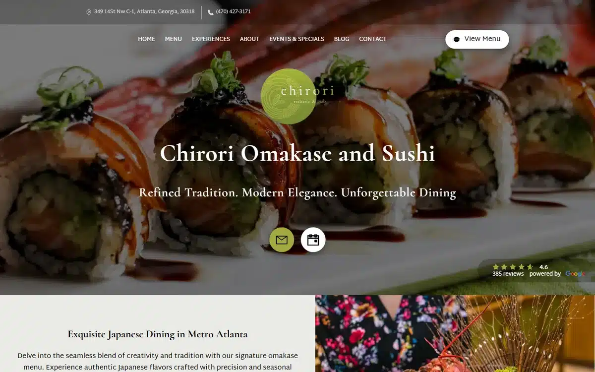
Chirori Omakase & Sushi in Atlanta is among the most polished restaurant website examples in this list. Premium sushi photography, a circular sage-green logo, and a serif headline (“Refined Tradition, Modern Elegance”) combine to position the room as a special-occasion destination.
Borrow this: omakase and tasting-menu restaurants benefit from a quieter, more elegant homepage than higher-volume sushi spots. Match the design to the dining pace.
18. Rama’s Kitchen
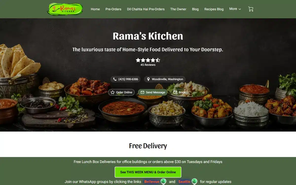
Rama’s Kitchen in Woodinville, Washington uses an overhead Indian thali spread with vibrant colour, plus a clean green-and-white brand palette. A short ratings strip near the top adds quick social proof. The page balances appetite appeal and credibility without crowding.
Borrow this: visible review ratings near the hero are one of the highest-ROI additions a restaurant website can make, particularly for cuisines diners are exploring rather than already familiar with.
19. Fork and Spoon PDX
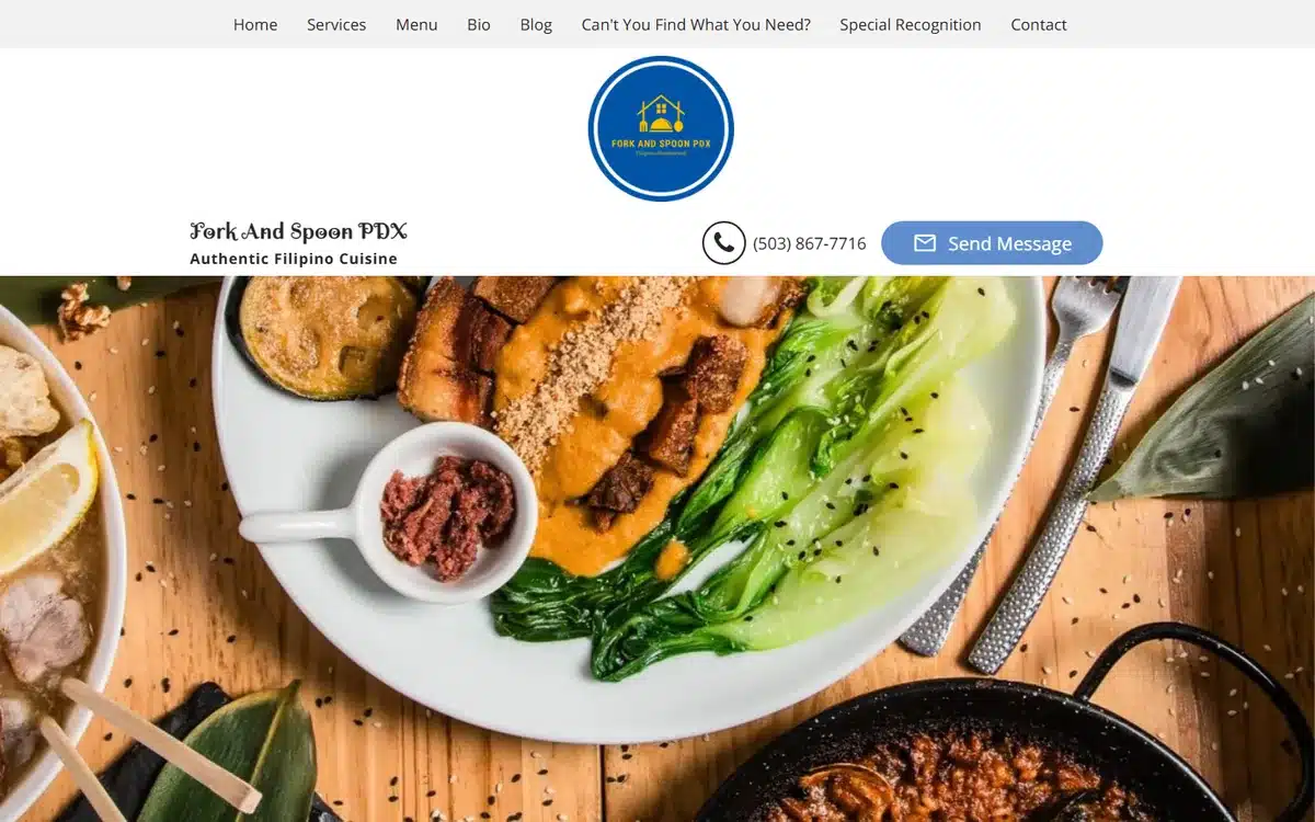
Fork and Spoon PDX in Portland leans on a single overhead shot of a plated Filipino dish: rice, protein, vegetables, all framed with intention. The composition is plated-meal photography done well, and it carries the page on its own.
Borrow this: under-represented cuisines (Filipino, Burmese, Senegalese, Peruvian) benefit from a more deliberate, almost-still-life approach to food photography. The website is often a visitor’s first introduction to the cuisine.
20. Brunchbox
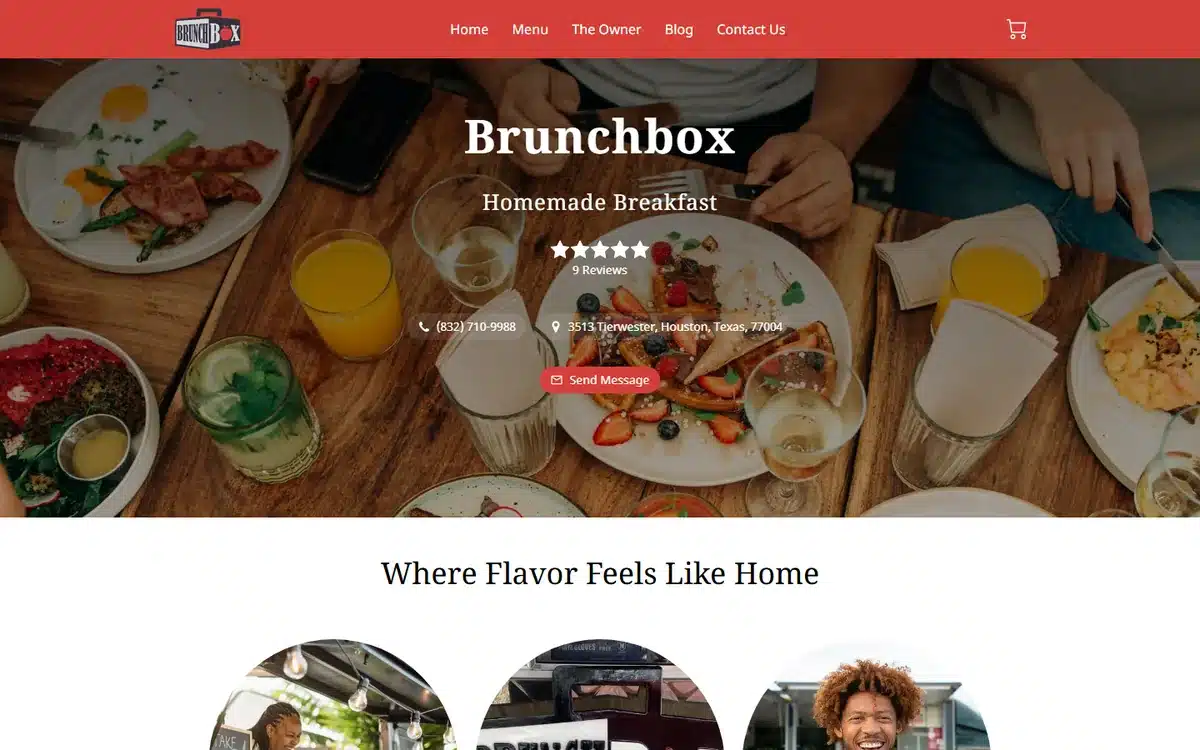
Brunchbox in Houston opens with a top-down brunch spread across a wooden table: pancakes, eggs, juices, plates and hands at the edges. It’s the platonic ideal of a brunch-spot hero. Warm, full, social, and easy to imagine yourself in.
Borrow this: brunch and breakfast spots should hero the social-meal moment, not a single plate. Brunch is bought as a group experience.
21. Cafe Avenue
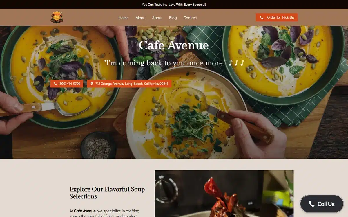
Cafe Avenue in Long Beach uses a flat-lay of two soup bowls, a side, and rustic wooden surroundings. The colour palette is warm and earthy, the headline plays on music (“on a melodic note”), and the whole composition signals “neighbourhood café” without saying it.
Borrow this: cafés have an unfair advantage with flat-lay photography. A single well-staged shot can carry the entire homepage.
22. Porto Fino
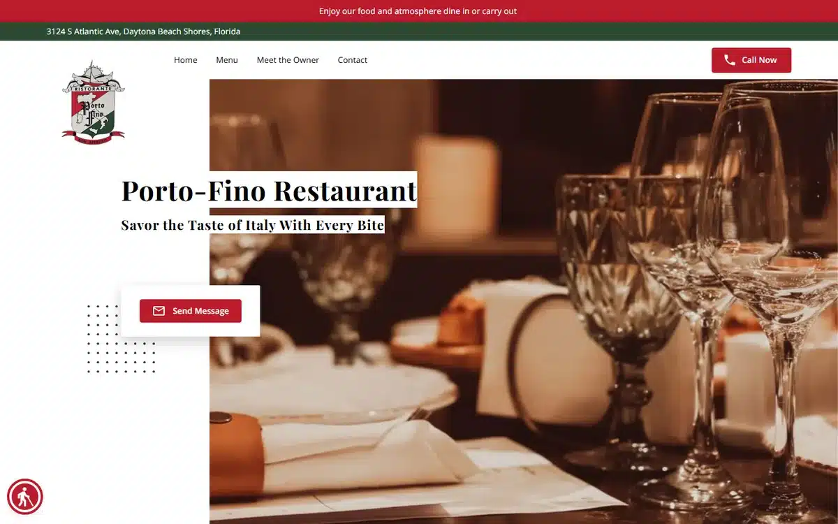
Porto Fino in Daytona Beach Shores, Florida uses a moody candlelit tablescape (wine glass, low light, dark backdrop) and an elegant serif title. The website signals occasion dining before anyone reads a menu. For Italian fine-dining concepts, this is a strong template.
Borrow this: candlelit tablescape photography is shorthand for “date night” and “anniversary dinner”. If that’s your bookings mix, lean into it.
23. Nutri-Packs Nigerian Food
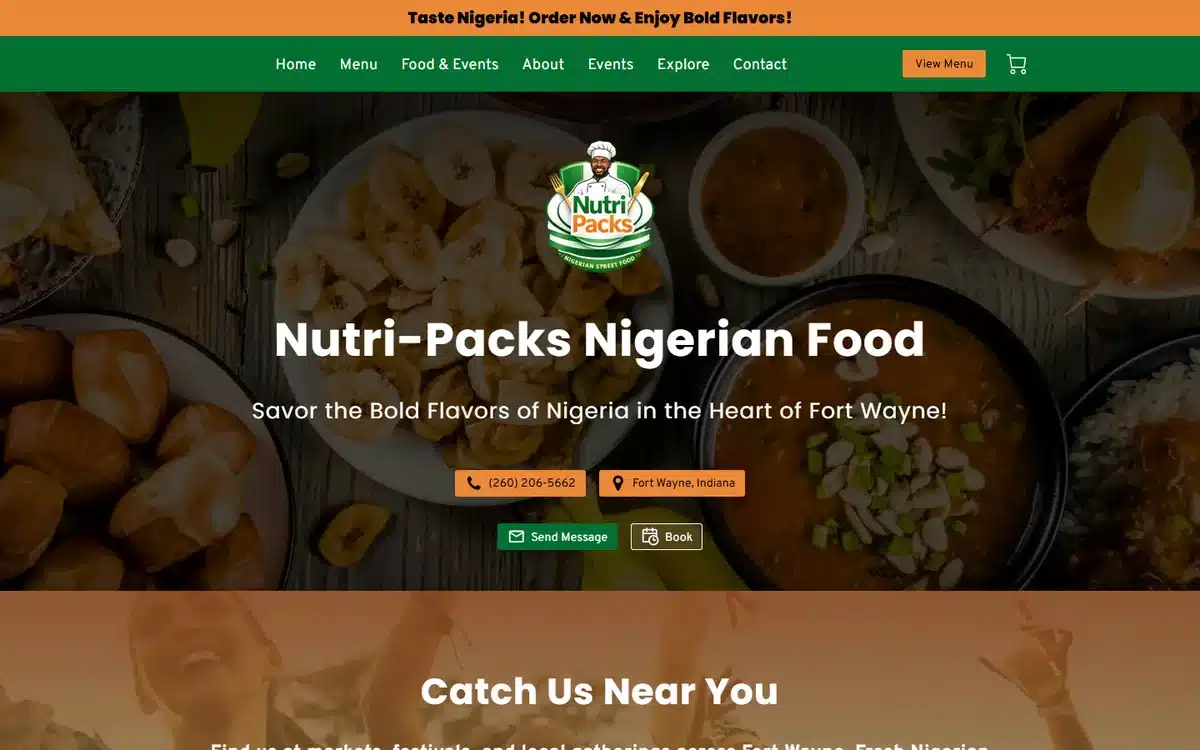
Nutri-Packs Nigerian Food in Fort Wayne, Indiana opens with a bird’s-eye spread of jollof, sides, and protein on a warm wooden background. The green-orange brand palette ties back to West African flag colours without being heavy-handed. The headline (“Savor the Bold Flavors of Nigeria”) sets the tone in one line.
Borrow this: regional cuisines benefit from a brand palette that references the cuisine’s cultural roots subtly through colour, not literally through flags or maps.
24. Madina Restaurant
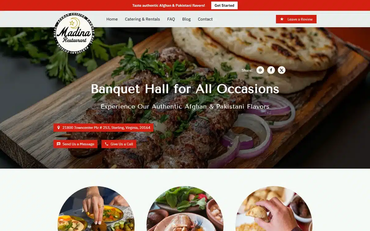
Madina Restaurant in Sterling, Virginia uses a horizontal board shot stacked with kebabs, naan, and accompaniments. It’s communal, plentiful, and reads as a place built for groups. The site also makes its banquet and catering offerings visible, which matters for Mediterranean and South Asian restaurants where occasion catering is a meaningful revenue line.
Borrow this: if catering or large-group bookings are a real revenue stream, surface them on the homepage. Don’t bury them in a sub-nav.
25. B-Box
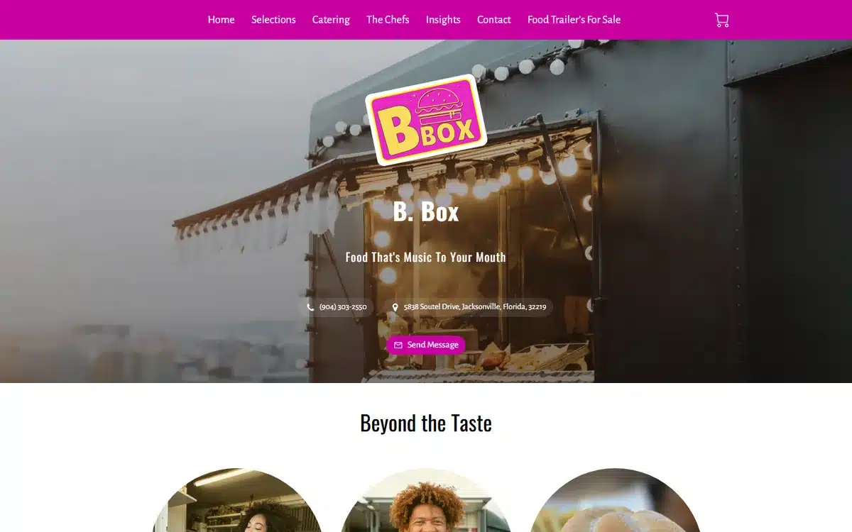
B-Box in Jacksonville, Florida shows what a food-truck website should look like in 2026. The hero is a wide shot of the truck itself with neon signage glowing, the brand palette is bold magenta, and the headline reads more like a music-festival flyer than a corporate menu. Mobile food businesses live on personality.
Borrow this: food trucks compete on identity. If the truck looks great, hero the truck. The food can come second.
26. The Rolling Stove
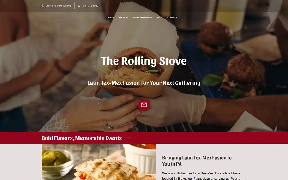
The Rolling Stove in Blakeslee, Pennsylvania goes lifestyle: warm, slightly soft-focus hands sharing tacos around the truck. It communicates “we serve a crowd” without showing the truck or a menu. The page positions the business as a catering-and-events option as much as a roadside stop.
Borrow this: food trucks that take private bookings should hero the events angle, not just the daily-serve menu. The two customers behave differently.
27. Lolo Hawaiian Shave Ice & Treats
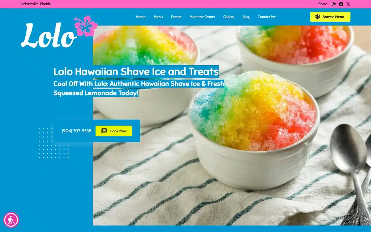
Lolo Hawaiian Shave Ice & Treats in Jacksonville, Florida uses a hero of rainbow shave-ice bowls in saturated tropical colours. Dessert restaurant website examples should be the most visually loud sites of any cuisine: this one earns that.
Borrow this: dessert and ice-cream businesses should max out saturation, not minimise it. Photogenic is the entire pitch.
28. Stix Churroholics
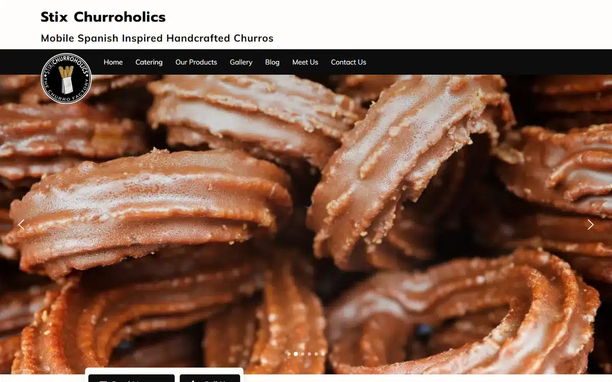
Stix Churroholics in Porterville, California goes the opposite direction: macro churro photography on a clean white layout. Dessert can also be elegant, and this site shows it. The composition feels closer to a packaging design portfolio than a takeout menu, in a good way.
Borrow this: dessert is one of the few categories where two opposite design directions both work. Pick saturated-and-loud or clean-and-elegant, and commit.
29. The Earthy Kitchen
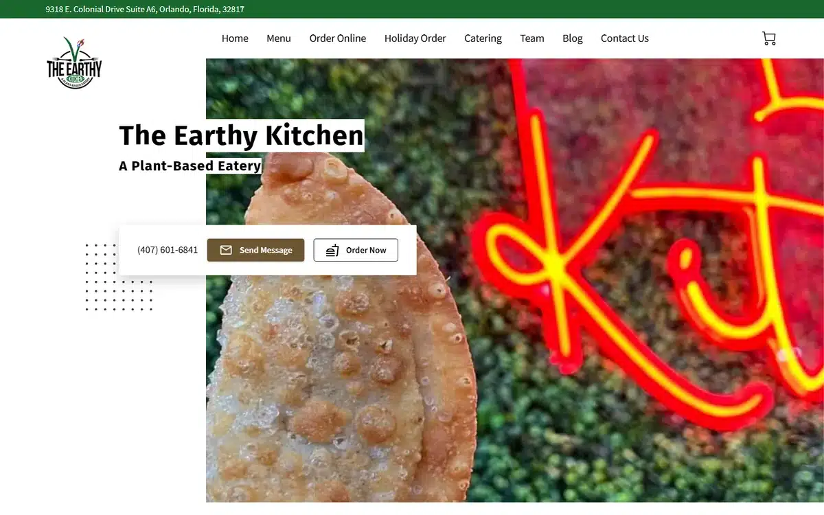
The Earthy Kitchen in Orlando, Florida is among the most distinctive vegan restaurant website examples we found. Bright green neon signage as the backdrop, a single empanada in front, and the subhead “A Plant-Based Eatery”. It rejects the conventional “leafy green and wholesome” vegan aesthetic and replaces it with something closer to streetwear.
Borrow this: vegan and plant-based concepts benefit from breaking the category aesthetic. Most vegan restaurant websites look identical. Standing out helps.
30. Assateague Bar & Grill
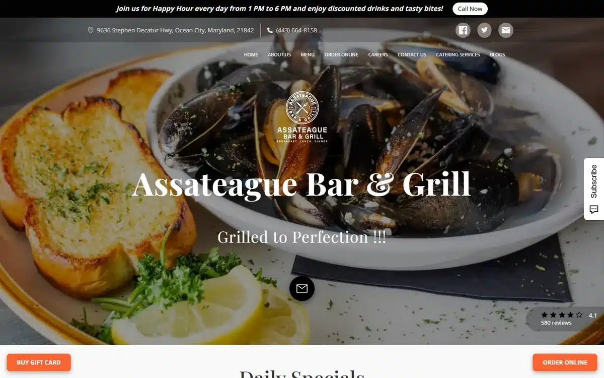
Assateague Bar & Grill in Ocean City, Maryland closes the list with a coastal-seafood archetype done well. Mussels in a tomato broth, a hunk of garlic bread, a circular logo over the top, and a colour palette of warm cream and dark red. The image conveys both the cuisine and the setting in one shot.
Borrow this: coastal and seafood restaurants should let the produce and the setting speak. Don’t over-style the food. Most seafood looks best closest to how it arrives at the table.
Frequently asked questions
How much does a restaurant website cost?
A professionally built restaurant website typically lands somewhere between $0 and $5,000 upfront, depending on who builds it. The cheapest option is a basic website builder you maintain yourself, which can be free at the entry tier but often shows its limitations on mobile and on Google. Done-for-you builds with photography, menu integration, and Google Business Profile setup typically range from $300 to $1,000 one-time, plus hosting. Custom-designed agency builds usually start around $3,000 and run higher depending on scope.
What features should a restaurant website have in 2026?
The non-negotiables in 2026: a visible menu (HTML, not a PDF download), online ordering or reservations one click from the homepage, click-to-call phone number on mobile, current hours and address above the fold, and Google Business Profile-aligned location and category information. Above that, the highest-ROI additions are review ratings near the hero, a sticky “book a table” or “order now” button, dietary tags on the menu, and a few real interior or kitchen photos.
Do restaurants really need a website?
Yes. Even with strong social media and a Google Business Profile, restaurants without a website tend to lose the booking moment. Diners researching where to eat almost always check the menu and hours before deciding, and Google’s local listings often surface the restaurant’s own website as the canonical source for both. Operators relying solely on social profiles tend to also have less control over their own brand presentation.
How do I make a website for my restaurant?
Three realistic routes. Build it yourself with a restaurant-friendly website builder like UENI, Squarespace, or Wix: takes typically 5 to 20 hours, and works if you have decent photography to start with. Hire a freelancer through a platform like Upwork or Fiverr: typically $300 to $1,500 and 2 to 4 weeks, with mixed quality. Or use a done-for-you service that builds the site, photographs the food, and configures Google Business Profile in a single package: typically the fastest route to a professional result if budget allows.
What’s the best platform for restaurant websites?
There’s no single best answer, but the practical filter is whether the platform handles menu updates, online ordering, and mobile responsiveness well out of the box. Restaurant-focused builders like UENI and Toast tend to include menu management and reservation widgets natively. General-purpose builders like Squarespace and Wix need third-party add-ons for those features. WordPress offers the most flexibility but the most maintenance overhead. For most independent restaurants, a restaurant-aware platform usually wins on time saved.
How do I get my restaurant website to rank on Google?
The single biggest lever for restaurant Google rankings isn’t on the website itself: it’s the Google Business Profile. Optimise that first (complete profile, primary category, photos, hours, regular review collection). Then on the website, make sure the restaurant’s name, address, and phone number match the profile exactly, the menu is in HTML not PDF, and each location page (if multi-site) has its own page with city-specific content. If you’re collecting bad reviews, our guide on how to remove bad reviews from Google My Business covers the formal flagging process.
Next steps
If these restaurant website examples have given you ideas, the next step is to pick the two or three design or functionality choices that fit your concept and start there. You don’t need every feature on this page. You need the ones that match the way your guests actually decide.
If you’d rather skip the build and have a professional restaurant website delivered for you, UENI builds a done-for-you small business website in seven days, complete with menu integration, Google Business Profile setup, and SEO basics included. Many of the restaurant website examples in this list were built that way.
For more on filling the website once it’s live, our guide to small business advertising ideas walks through 12 channels that work for restaurants and other local businesses.
Sources
- Live homepages of the 30 UENI customer restaurants linked from each example above, reviewed in May 2026. Each restaurant is a real, currently-trading UENI customer; the description of each is based on direct observation of the homepage at time of review.
All observations in this article (design and functionality patterns across the 30 restaurant website examples) are based on direct review of the live sites in May 2026. Cost ranges in the FAQ are typical market ranges drawn from UENI’s experience building restaurant websites, presented as ranges rather than figures attributed to a single external source.