You are at a party where you don’t know anyone. You stumble across the same person twice while ordering a drink at the bar and you two start a casual conversation. After a few exchanged niceties and ice-breaker topics, the person asks you – what do you do? This is exactly what happens when a visitor lands on your about us page.
The about us page example list that we have curated will give you the right tools to answer this question accurately.
Table of Contents
Building an about us page block by block
You will keep the readers going if you properly structure information on your about us page. As long as they’re given the correct information at the right moment, some of them will gladly click on that call to action button somewhere along their reading path.
Before writing your about us page, think about the writing style you want to represent your brand and stick with it until the end.
Solve problems and stand up for something
By saying what you do, you should point out the problems that you can solve.
You never know if you are the solution to their issue. Remember, when people are reading your about us page, they’re reading it with the what’s-in-it-for-me lens, so you express your core customers by defining the problems. And it’s up to you to make a bitesize list of the issues you solve, what you do and how you do it. Don’t let them play “Where’s Waldo” when trying to figure out what you are all about.
Some people will visit your about us page to see if your values align with theirs. Make sure to mention what you stand for in its purest form. For example, “We make PETA-certified, cruelty-free face creams” tells the person you are not testing your products on animals.
Keep it simple and clutter-free
Keep in mind that you don’t know if that person is from your line of work, so you don’t want to come off as pompous by using industry jargon. What you want is to tell them what you do in layman’s terms but with conviction. If you’re not excited about what you do, why bother talking about it?
Don’t forget, it’s still small talk, so don’t take too much of the friendly stranger’s time talking about yourself unless they have more questions or seem genuinely interested in what you have to say. As long as you say enough for them to have a solid grasp on what you do, you can relax. Make sure you stick to the point, though. You don’t want to be vague about any aspect of your work.
This entire “small talk” part of your about us page exists in the first few paragraphs. You should place essential information in the screen area that requires no scrolling or clicking to get to the next chunk of content.
The same as your interlocutor (let’s call the person Casey), a visitor that landed on your about us page will take action if they want to learn more and they’ll scroll and click to get to more information.
Moving past basic information – time for the brand story
We’re assuming the conversation at the bar is still going and Casey seems somewhat interested in your story so far. It’s prime time to tell them why you do what you do – what drove you to start your business, how you started, what got you to where you are right now, and where do you see yourself in five years (yes, Casey works in HR, how did you know?).
Everybody loves a success story, but nobody likes a showoff. If you can, tell a story of how you fell and how you got up. It’s empowering. If not, and your growth has been an uninterrupted rising line, just ensure your about us page doesn’t turn into this meme.

Tap into the power of images and video
Since Casey has already invested in your story, don’t be surprised if you get asked for visual proof.
Being already invested in your story, it shouldn’t surprise you if Casey shows interest in seeing who your team members are.
With that in mind, any great about us page will have a solid visual aspect, and images and videos will be its integral part. Pictures of your coworkers will further humanize your company. A brand video will double down on explaining your values and guide the visitors to understand your business’s ethos better.
Transparency is king
We can’t stress this enough – be as transparent as possible when talking about how your business functions. Casey is smart and will see if you’re withholding information and won’t be very interested in what you have to say next. This is especially important for small businesses that rely on outsourcing.
Say you run an online store for your clothing brand. There’s almost a 100% chance you outsource your manufacturing. The people landing on your about us page know that you most likely do and would like to see if you are sourcing your product ethically. What better way than to show them where and by whom the things they’re about to buy are being made?
Showcase testimonials and credentials
This deep into the conversation with Casey, you can go a little more in-depth about your business and point out who recommends you and what business credentials you have, like licenses, certificates and awards.
As far as testimonials go, you should be able to show the first name, the last name and the job title of a person who gave you a rating.
Include a call to action
About us pages should have at least one call to action (CTA). It’s usually after you’ve given sufficient information to spark actual interest. That’s when you give your business card to Casey and say: “You know, Casey, you can sign up for a free trial. No credit card required.”
Don’t just use CTA’s for driving significant conversions, use them:
- To give more information about a specific topic, you don’t want to clutter up your main thread with
- To drive newsletter subscriptions (especially if you’re still in the R & D stage but are already online)
- To drive traffic to your how-to’s, tutorials
- To drive traffic to images/videos of your company partaking in initiatives and charity work
Remember, all these suggestions are equally important for the about me pages.
The tried and tested “mission, vision, values” format – is it right for you?
This way of formatting the about us page is a bit outdated and has received a lot of flack for having a history of not being genuine and being a BS farm for corporations to make them feel they fooled the 99%.
That doesn’t mean you, as a small business, can’t use it, provided you have enough tangible data to walk the talk.
First of all, never put mission, vision and values statements at the beginning of your page, even if they are purely fact-based. Basic information will always have the advantage.
Mission vs vision
First, we have to understand the difference between mission and vision statements. Even though they both are your future-telling devices, a mission statement is all about defining your business, your goals and the actions you will take to reach those goals – the near future. A vision statement is a best-case scenario you visualize for the company – the distant future.
Reach into your pool of tangible data to show how you’re moving towards achieving your goals. Lean hard on the visual storytelling here to attract more attention from your readers.
Also, explain how achieving all the goals from the mission statement ensures a bright future projected by your vision statement.
Company values
Even if you decide to use this format, we still strongly suggest that you put your values front and center of your about us page, meaning at its very beginning and in its “haiku” form. The values section can expand on what you do to align your business with your official beliefs.
Partaking in initiatives that reflect your values and showing proof of that is a great way to affirm your position on the topics you care about.
One last look at what to do when writing about us pages
Before we move on to analyzing what did the standout small businesses do with their about us pages, let’s see our suggestions in a more stripped-down manner:
- Start by clearly defining what problems you solve
- Share your values and company culture early on
- Always choose simple language over the industry jargon
- Be as straightforward as possible about what you do and how you do it
- Talk about why you started your business
- Talk about the challenges you had along the way (people like to read success stories that had ups and downs)
- Showcase your team, your assets, your events as both images and videos
- Be transparent on how your business works under the hood
- Showcase your testimonials and credentials
- Use CTAs to nudge the visitors further into interaction with your business
- Use the mission, vision, values format only if you have enough tangible data to warrant its use
About us page examples
Since we are focused on small businesses, most of the about us pages we’ll show you will be about pages of small businesses.
Yellow Leaf Hammocks – making your values your prime asset
Yellow Leaf Hammocks is an online store that sells very specific handmade hammocks. On their about us page, they’re not offering a super-comfortable vacation item, they’re offering you a chance to become part of a great story at the cost of you owning a super-comfortable vacation item.
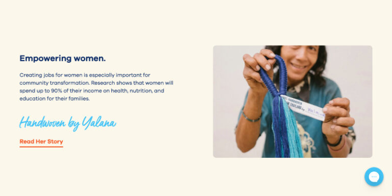
What’s more, they do it with just 13 sentences spread across six paragraphs, accompanied by images that further deepen the readers’ connection to their values.
Their values can be summed up in these two statements (quoted from their website):
- “We empower our weavers and their families to break the cycle of poverty and build a brighter future.”
- “Turning women into breadwinners not only builds self-esteem but improves their standing in the community and enables them to pool resources and improve infrastructure.”
How do Yellow Leaf Hammocks manage to immerse you into their world?
They deliver on their strong point – the fact they help a small community in Thailand lead a dignified life. They do it right off the bat.
The first thing you see is a video that is basically an employee testimonial. It shows the happy women from the Mlabri tribe in Thailand who talk about how making hammocks for this company has improved their livesmaking The video doesn’t show the tribespeople sitting on a chair in a studio, reading a rehearsed statement. No, they show them as they are, in their everyday environment, expressing their true feelings about their work.
Once you scroll down from the video, they slowly lead you through bite-size pieces of crucial information. Where there’s more to be said, there’s a “Learn more” CTA. In fact, there is a total of 3 CTAs on the page – one that leads you to a page where you learn about the Mlari tribe community, one that leads to a page that tells a story of one of their weavers and once they’ve told you everything about their people and their values, a CTA that says “shop hammocks”.
Takeaway
If you have a great story that sparks genuine emotion, go all-in on it and do it on all fronts – words, images, videos. As great as your story might be, you should still make it snappy and to-the-point, it will make a better effect. Finally, if there’s more to be told, feel free to use CTAs to guide users towards more knowledge.
Eight hour day
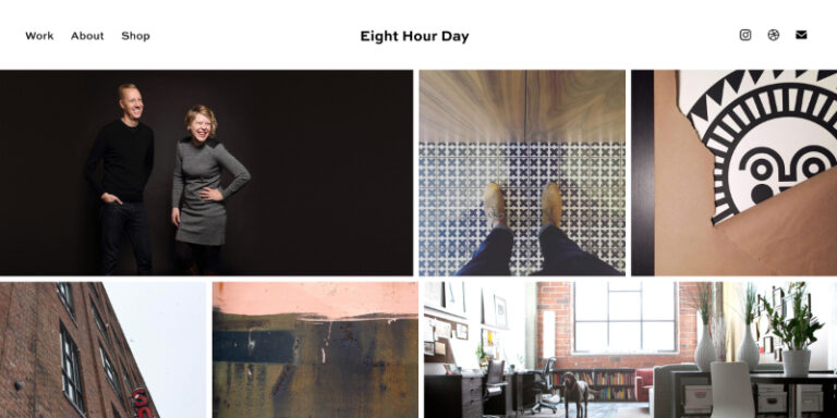
Designers all around the world, behold the kings of simplicity when it comes to writing an about us page for a creative studio focused on design & illustration!
Their entire about us page consists of three sentences and six images. In those three sentences, they tell you who they are, they tell you what they do and what they believe in as two creatives. Out of the six pictures, one shows Katie Kirk & Nathan Strandberg, one shows their office and the remaining four shows you a glimpse into their work.
That’s it. No fluff, no designer jargon, no background story, no nothing. Just, to put it in their own words “two individuals with a passion for creativity”.
Takeaway
Simplicity and honesty go a long way and we believe that Katie and Nathan have figured out that that’s exactly what their audience is looking for when deciding on how to format their about us page.
With that in mind, your takeaway can be this – stripping down to the very basics can work. It does for Katie & Nathan.
Makeup for melanin girls – problem-solving at its finest
Makeup for Melanin Girls (MFMG) is more than just a makeup online store, it’s as they say in their about us page, “a community of thousands of women that are tired of being the last two shades in a collection and hearing “we’re working on it” when yet another brand ignores the beauty needs of deeper skin tones.” And their about us page emphasizes this real problem in the makeup industry.
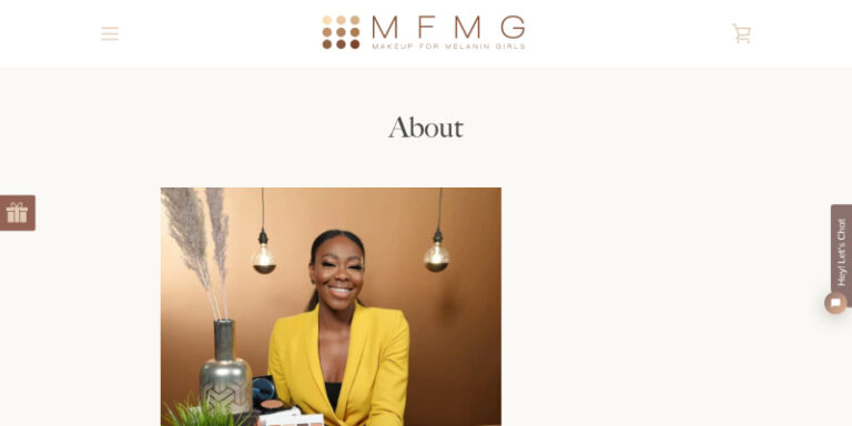
The format is super-simple – there’s the founder’s photo and there’s her compelling story.
What it also does is make it crystal clear that they are THE makeup online store that solves that problem by sharing the story of Tomi, the founder of Makeup for Melanin Girls, who as a young fashion model had a bad experience with a makeup artist who didn’t have a fitting makeup kit to match her skin tone.
It also tells us Tomi’s hero’s journey, where she grew from a young fashion model learning how to do her own makeup out of necessity into a brand owner that is slowly but steadily changing the face of the makeup industry in the US.
Takeaway
This is another example of how a super-simple about us page can do so much for your brand. MFMG puts the personal story of its founder front and center, showing you that your problem is her problem and that by joining forces, you can help solve it. If that’s not one reassuring about us page, then we don’t know which is.
Minaal – bagful of purpose
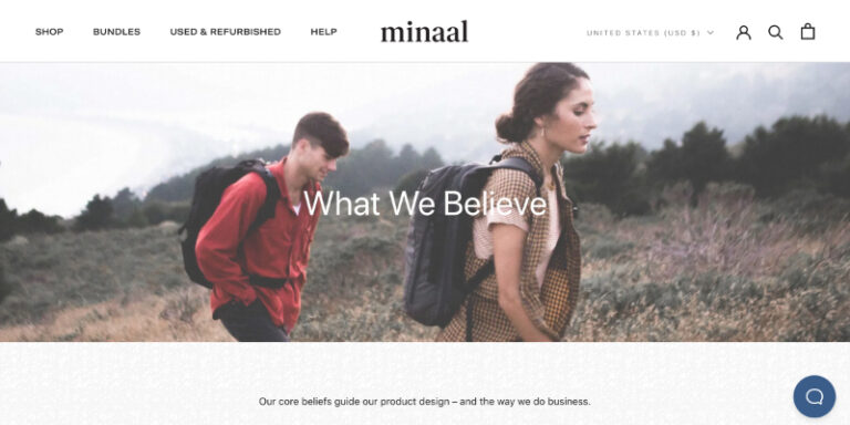
If there’s one word you could use to describe what Minaal’s about us page is all about, it would be purpose.
This online store that sells traveling bags makes it very clear that it makes bags that are designed for one thing and one thing only – unrestricted movement, where the restrictions they talk about are the ones of consumerism.
In their about us page, Minaal openly vouches for a functionality-centric design that can last a lifetime and against planned obsolescence and disposability. This quote is quite telling of their stance: “We believe in making products you only need to buy once.”
How do they do it?
They do it by cutting down what they have to say to its essence. Just like Yellow Leaf Hammocks, Minaal uses super-short paragraphs and images in pairs. With each scroll of the mouse, you are more and more invested in what they have to say.
Takeaway
Minaal is another example of an about us page written by a brand that knows its audience well, which isn’t a surprise when you take into account that they’re designing their bags in cooperation with their core audience – the eternal travelers.
Zeedog – creating the need through storytelling
The people from Zeedog are making a really valid point – why shouldn’t dog accessories be treated as a part of a dog owner’s lifestyle? The best thing about their about us page is that they make that point with just one image.
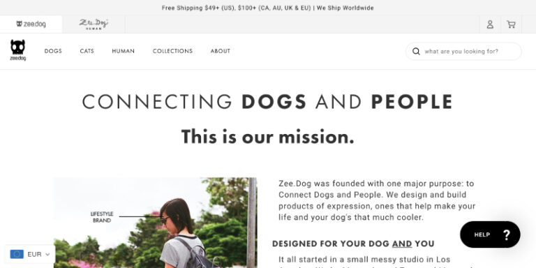
In addition to getting their point across early on, Zeedog founders connect with the dog owners by pointing out that they have two doggos of their own. They further deepen the connection by venting out frustration with how they couldn’t find a pet store that had dog accessories they could identify with.
It’s right there that you realize they’re out to change the world, they’re on a mission – and you believe them. That’s what a good story does to you.
Takeaway
Regardless of how niche you think your company is, there’s always a way to make it relevant in a broader sense with an approach that sparks emotion and curiosity. That’s what Zeedog did very successfully.
htmlBurger – let the visuals do the talking
htmlBurger is a frontend web development company and when you’re in the business they’re in, your compelling story doesn’t have to come through words, it can come through your designing skills. That’s exactly what htmlBurger did.
Scroll after scroll, they show you how skilled they are at web design and that’s how they actually lead you to read on. The written content doesn’t lead as much but what it does well is that it shows you that they’re really fun to work with.
Showcasing the team the right way
They use team images to their advantage big time. Each team member has a headshot that is neatly integrated into the design of the page and all of them have quirky job titles to their names. Each of the headshots pops up when you hover over it, which makes the whole experience a tad more dynamic.
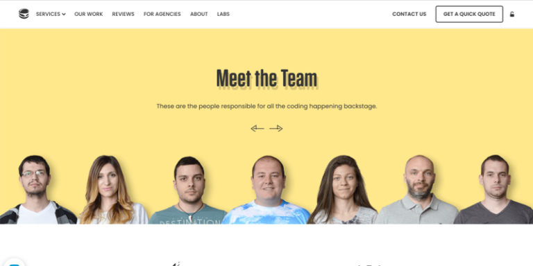
That’s not the end of the team members showcase, there are also photos of the office during work time.
Takeaway
Sometimes it’s better to let your work do the talking and wrap the words around it to turn it into a neat package. What better opportunity than when you are a web development company like htmlBurger?
Many of the visual aspects of htmlBurger’s website wouldn’t be possible without a developer that knew how to write custom code. Learn how to integrate custom code into your UENI website to try to recreate some of the features you’ve seen here.
KeyNest – attracting future clients and employees alike
This startup that helps Airbnb hosts and real estate agents keep track of their keys did a couple of things right when they wrote their about us page:
- They’ve shown the problem and solved it
- They’ve bragged in a way that increases trust
- They’ve designed the about you page with future employees in mind
The hook for every Airbnb owner comes as early as the second sentence of the about us page: “Marc was getting fed up with changing his plans to meet Airbnb guests who were arriving late, so he asked his local cafe to hold the keys for him – and that’s when KeyNest was born.”
Just as reviews are important when selecting an Airbnb host, so are the awards, when a host browses companies to partner with. That’s why KeyNest’s showcasing of their achievements hits the target – it’s important information.
But how do they attract future employees?
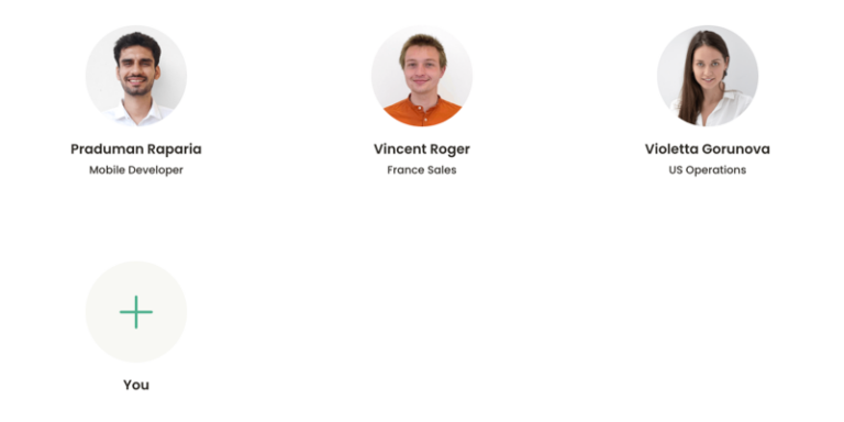
They do it through smart design. KeyNest have dedicated a significant portion of the about us page to show us their team members, so much so that you’d have to scroll through the circle-shaped headshots to get to the next segment.
Somewhere around the third scroll, you stumble across a circle with the plus sign and the following text under it – you. That’s pretty powerful in our books.
Takeaway
KeyNest showed us that showcasing awards helps increase trustworthiness, that presenting the problem and then you as its solution is always the best way to go and finally, they showed us that we can achieve different goals through the sheer power of smart design.
Picking up inspiration from KeyNest, take the opportunity to learn the basics of website design for small businesses.
Drip – kings of prospecting new hires
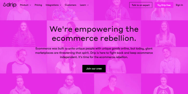
This marketing automation platform with small ecommerce businesses at its core is using their about us page to attract new employees like no other page we researched.
In fact, their about us page is built around one sole purpose – talent recruitment. The word recruitment sounds quite fitting when you read their first few lines of text that end with this: “It’s time for the ecommerce rebellion.” Uncle Drip really wants you for the army of small-ecommerce.
What are they doing right?
Their copy is successful at sparking the fighting spirit in the reader. This really hits home when a prospective employee reads a pumped-up call to arms almost, all in the spirit of the most popular trope out there – the rise of the underdog. For that audience, this copy sparks a sense of belonging before they even apply for a job.
They even use a classic storytelling device – the five W’s (who, what, when, why, where). Even Drip answers only the who, what, why and how, that’s more than enough to give you an insight into how they “fight the power”.
Another thing Drip is doing right when presenting their team is giving you the option to view their LinkedIn accounts.
Takeaway
Drip really hit the nail on the head with their about us page – urgency, energy and enthusiasm are simply jumping from the screen. This tells us that if you have a cause you feel strongly about, use it to gather more like-minded people into your tribe.
Drip used it to get to the new employees, you can do the same to attract clients.
Before you become a Drip warrior, you might want to sift through examples of great small business websites for inspiration.
People Tree – champions of transparency
One of the industries that thrived on the lack of transparency for decades is the fashion industry. Ten years ago, you probably wouldn’t find a single fashion brand that would tell you where exactly their clothes are made. Today, you would.
Even though the good old backward ways of doing business are alive and well, more and more businesses are refusing to walk the same path. Such is the case with People Tree, a clothing brand from the UK that is very strong on sustainability and fair trade practices.
Transparency at People Tree
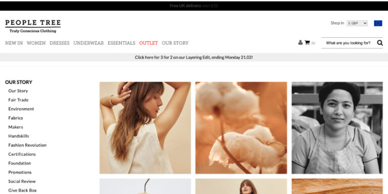
There aren’t many clothing brands out there that are willing to tell you the names of the factories their clothes are made at. Not People Tree – they have an entire landing page dedicated to showcasing all of their manufacturing partners and their facilities and then an additional landing page for each manufacturer.
What else stands out?
The way People Tree organized the about us section really stood out to us. There is literally a sea of information to sift through because the brand has so much to say about what they believe in and how and why they do what they do. All the key topics are neatly organized in a list on the left and it’s up to you to choose where to start.
Takeaway
People Tree are fearless about sharing their values. However, they’re aware of the sheer amount of information necessary to be truly transparent. That’s why they turned their about us page into an index of information you can peruse through.
With that in mind, you too don’t have to cut out what you have to say just because you’re afraid it will be overwhelming to the readers. Rather cut up the information into meaningful stand-alone topics and let the people choose what to learn about first.
Feel inspired by People Tree’s approach to fashion? Read our blog about how to start an online clothing business and start your own brand journey.
Conclusion
From all the examples we’ve shown you, one thing stands out – the problem story.
Almost every about us page presented the problem, attached an emotion to it, shared a personal story, andstartingstarting then introduced themselves as the solution. You can’t go wrong with that.
Of course, that’s not all – you’ve learned that sometimes words don’t have to do the talking, images and web design are sometimes more than ok, especially if you are offering visual solutions to your clients, like designers or web designers would.
Finally, you shouldn’t forget that your future teammates are landing on your about us or about me page so building at least a portion of that real estate for them is something you should do.
Now that you know how to write an about us page, it’s time to start thinking about web design. In our next blog post, read about the 5 questions to ask yourself before designing a website and get one step closer to running an unstoppable online business.
FAQ: What should I write on an about us page?
You should write about who you are, what you do, how and why you do it as concisely as possible so the readers’ minds don’t wander off and forget you ever existed in the first place. That really happens, people have increasingly shorter attention spans so make it snappy, or they’re gone.
Once they can call you an acquaintance, you can expand. You can write about your trials and tribulations on your way to becoming a successful business, awards you won or communities that you helped along the way just as long as you don’t forget to keep it simple.
How do you write an about page?
Before writing an about us page or an about me page, you should first know or at least have a rough idea of who your audience is. Knowing that will help you establish the tone of the entire piece. After that, you set yourself on a mission to establish an emotional connection with the readers as early as possible.
Here’s how to do that:
- Describe a problem, attach an emotion to it by sharing a relevant personal story
- Show yourself as the hero that saves the day (minding the tone you already established)
- Stick to the facts and to the most basic explanations of who you are and what you do
- Use video and images to deepen the understanding and keep your readers’ attention
- Be 100% transparent about how you do your business
- If possible, showcase your awards, certificates, testimonials to build trust
- Sprinkle the whole page with different types of CTAs in order to get those visitors moving from the awareness stage right into the consideration stage of your sales funnel
What is the about us page for?
Its main purpose is to tell your story. You can make it a compelling one if you follow the guidelines we gave you in this blog post and if you do, you surely will stand out in a positive way. You wouldn’t believe how many great websites have average to just plain boring about us pages.
In pure marketing terms, it’s one of the tools for engaging with the website visitors during their time in the awareness stage of your sales funnel. It’s also one of the tools to gently nudge them into the consideration stage. Whether or not that nudge happens depends greatly on how you’ll tell your story. We believe you can and so should you.
How can UENI help you write an outstanding About Us page?
Well, we are specialists in creating websites for small businesses. We know what to write to make Casey, or whoever your visitor is, love your brand. Thousands of businesses were able to grow online with a professional website that let them reflect the best of their brands.
Give us a shout if you need a hand!

