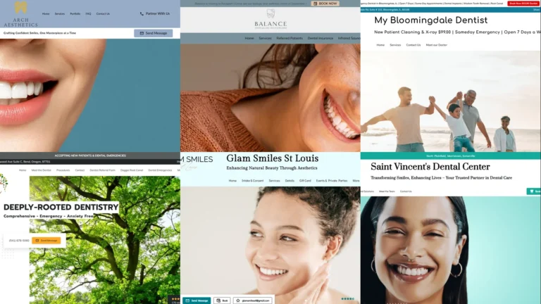
A dental practice’s website is doing two jobs at once. The first is appointment booking — most prospective patients shop two or three clinics on Google before picking up the phone, and the website decides which clinic they call. The second is anxiety reduction — dental visits are stressful for a meaningful share of patients, and the homepage either calms that or makes it worse. To show what works, this guide collects 20 dental website examples from UENI customer practices across the US, covering general dentistry, cosmetic, pediatric, orthodontics, and dental implants. Each example is a working clinic’s live site, and each one shows a specific design choice you can borrow.
Key takeaways
- Strong dental website examples lead with a real smile photo — patient portrait, family lifestyle, or close-up smile. Stock-photo “business handshakes” do nothing for a dental brand.
- The non-negotiable functionality stack for a dental site in 2026: a visible online-booking button above the fold, click-to-call on mobile, an insurance + financing badge if the practice accepts both, current hours, and Google reviews visible without scrolling.
- Pediatric and cosmetic practices need different design tones. Pediatric leans bright + kid-friendly with playful illustration; cosmetic leans editorial + beauty-aesthetic with refined typography. Don’t mix the two voices on the same site.
- Patient anxiety is the biggest invisible conversion killer. Pages that look clinical-sterile lose patients to pages that look warm-and-modern, even at identical price points.
- Most dental prospects arrive via Google search or Google Business Profile. Optimising the profile and the website together — consistent name, address, phone, and specific primary category like “Cosmetic Dentist” not just “Dentist” — usually drives more new patients than either does alone. Our Google Business Profile guide covers the profile side.
What makes a good dental website?
Before the 20 dental website examples, it helps to set the bar. A dental site’s job is narrower than most: convert a Google-driven, comparison-shopping, often-anxious visitor into a booked first appointment. Two things matter most: the design and the functionality.
The design
The design is the anxiety filter. Patients arriving from a “dentist near me” search are scanning four or five practice websites in under ten minutes, and the design tells them whether your clinic feels safe and modern or sterile and cheap. The strongest dental website examples share three traits. The hero image is a real smile or a real patient interaction, not stock photography of perfect teeth. The colour palette is calming — soft teals, warm whites, navy with gold accents — never aggressive reds or harsh fluorescents. And the typography mixes a friendly sans-serif with a refined serif so the site reads as both approachable and professional.
The functionality
Functionality is what turns the comparison-shopper into a booked appointment. Dental websites that perform usually nail four things. A prominent “Book Online” or “Request Appointment” button sits above the fold on desktop and as a sticky element on mobile. Phone numbers are tap-to-call on phones. Insurance acceptance and financing options are surfaced near the hero so price-anxious patients don’t have to dig. And the practice’s primary differentiator — pediatric specialty, cosmetic focus, sedation dentistry, implants — is named explicitly, not buried in a generic “services” page. The single most common failure pattern we see is dental sites that look elegant but force the patient to call to find out anything about pricing or availability.
20 best dental website examples (2026)
Every example below is a real UENI customer’s live site, captured in May 2026. They cover general family dentistry, cosmetic, pediatric, orthodontics, and dental implants, on purpose: a good dental website example for a pediatric practice looks nothing like one for a cosmetic boutique, and the variety is the point.
1. Arch Aesthetics
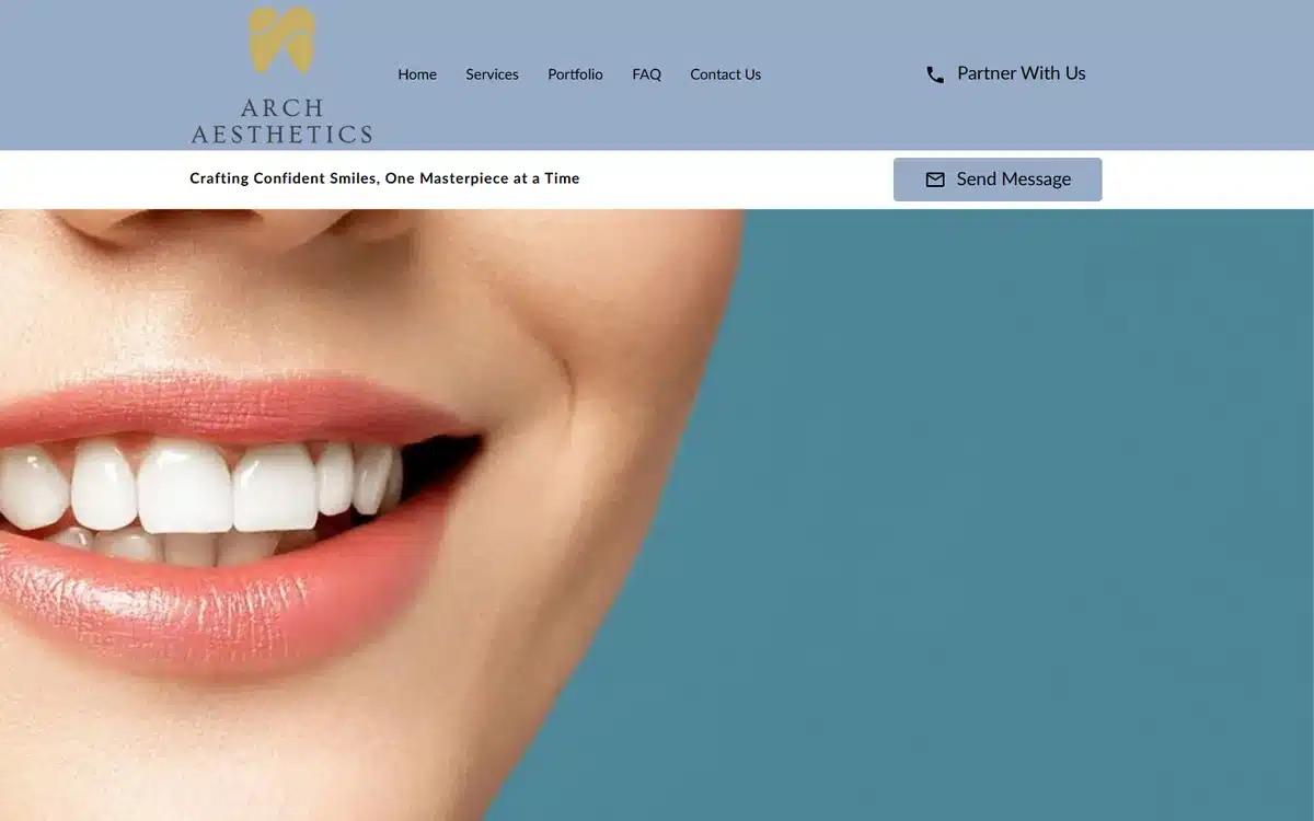
Arch Aesthetics in Denver leads with one of the most editorial heroes in this list: a sculptural close-up of a smile on a teal split-screen, treated more like a beauty-brand product shot than a dental clinic photo. Cosmetic dentistry competes on aesthetics, and the website needs to look like aesthetics matter to the team.
Borrow this: cosmetic practices should hire a real photographer and treat the homepage like a luxury beauty brand. Stock photos undercut the price point you want to charge.
2. All Smilez Dentistry
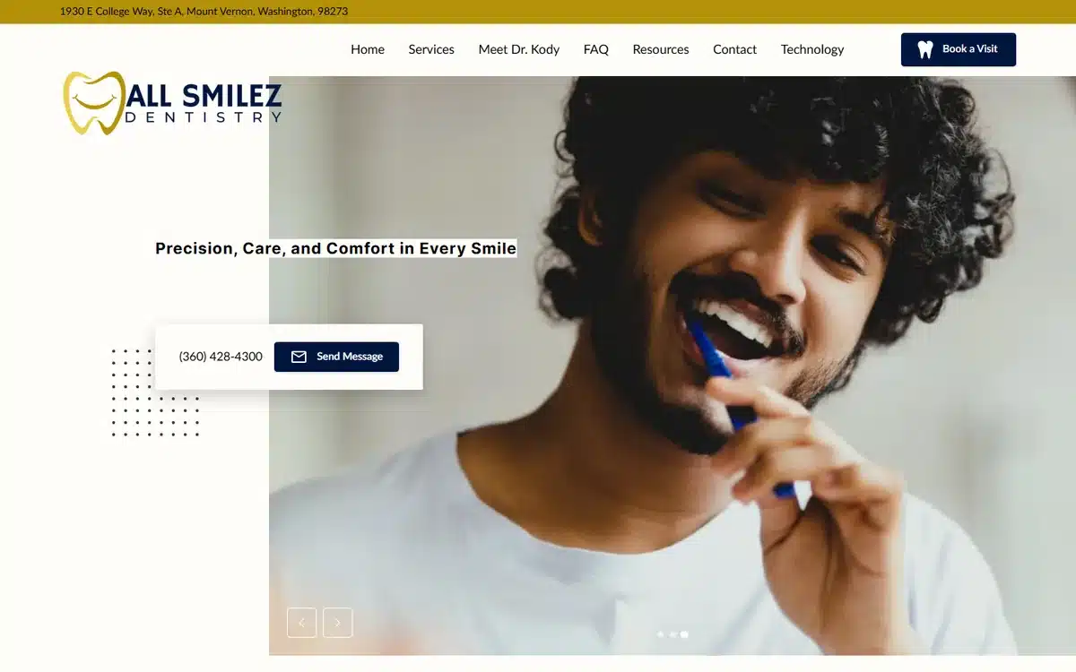
All Smilez Dentistry in Mount Vernon, Washington pairs a warm patient portrait with the tagline “Precision, Care, Comfort in Every Smile”. The three-word value triad is doing exactly what taglines should do: pre-empting the three biggest patient concerns in order.
Borrow this: if your homepage tagline names the three things patients worry about most (skill, kindness, comfort), you’ve answered the unspoken questions before they’re asked.
3. Balanced Dental Hygiene Suite
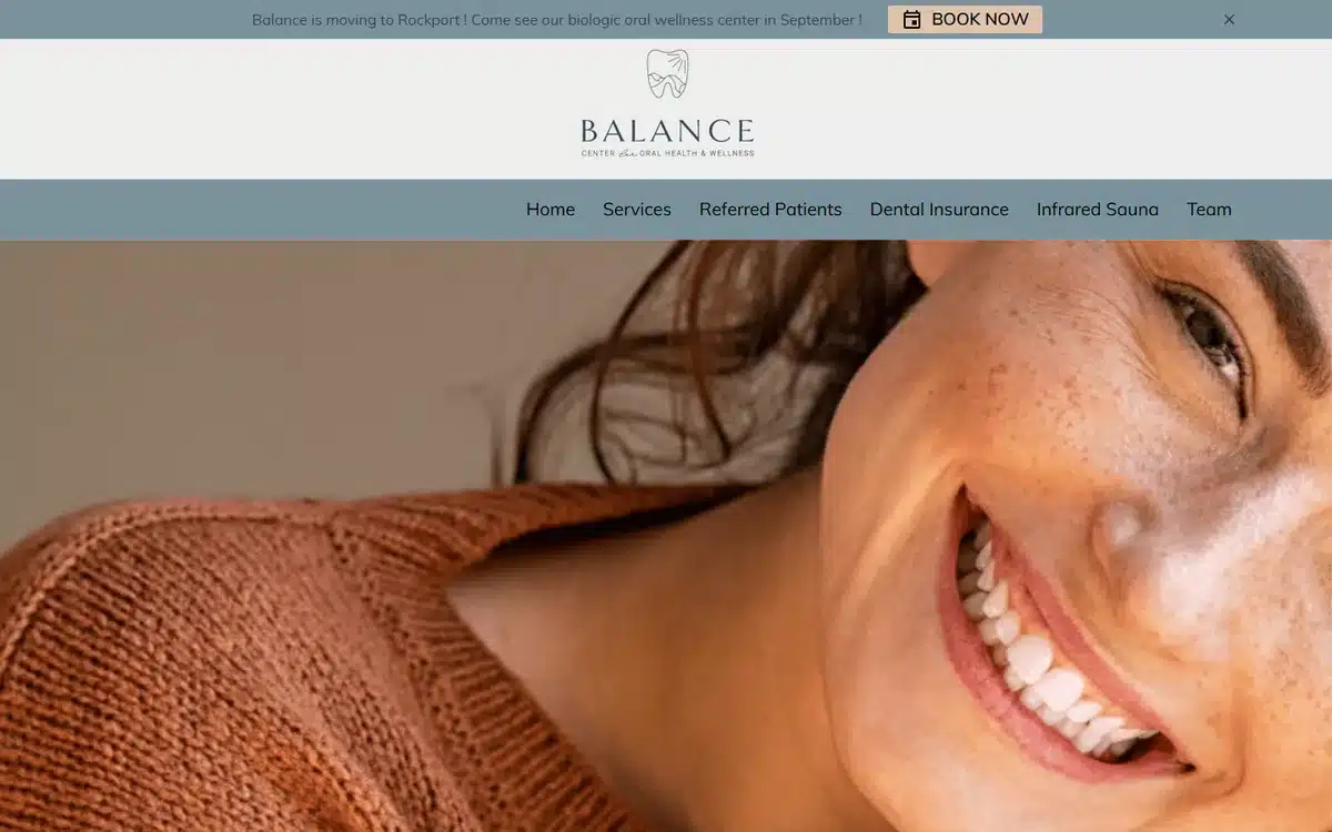
Balanced Dental Hygiene Suite in Rockport, Maine treats the hero like an editorial photo shoot — soft earth tones, freckled portrait, calming composition. The site doesn’t lead with teeth at all; it leads with the patient experience. For hygiene-focused practices, that’s the better pitch.
Borrow this: not every dental hero needs to show teeth. Sometimes the calming patient portrait does more to convert than the smile close-up.
4. Bloomingdale Dental Center
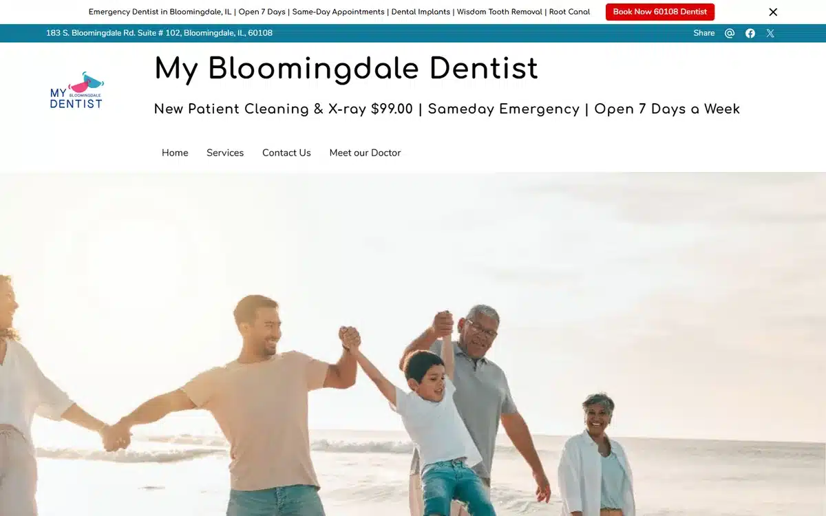
Bloomingdale Dental Center in Bloomingdale, Illinois opens with a multi-generational family running on a beach, plus a $99 X-ray promo bar near the top. The hero communicates “family practice” instantly without anyone reading a word, and the promo bar handles the price-shopper.
Borrow this: family-dentistry practices benefit from heroing the family, not the dentist. Patients buy family clinics on relationship, not credentials.
5. Castillo Dental Group
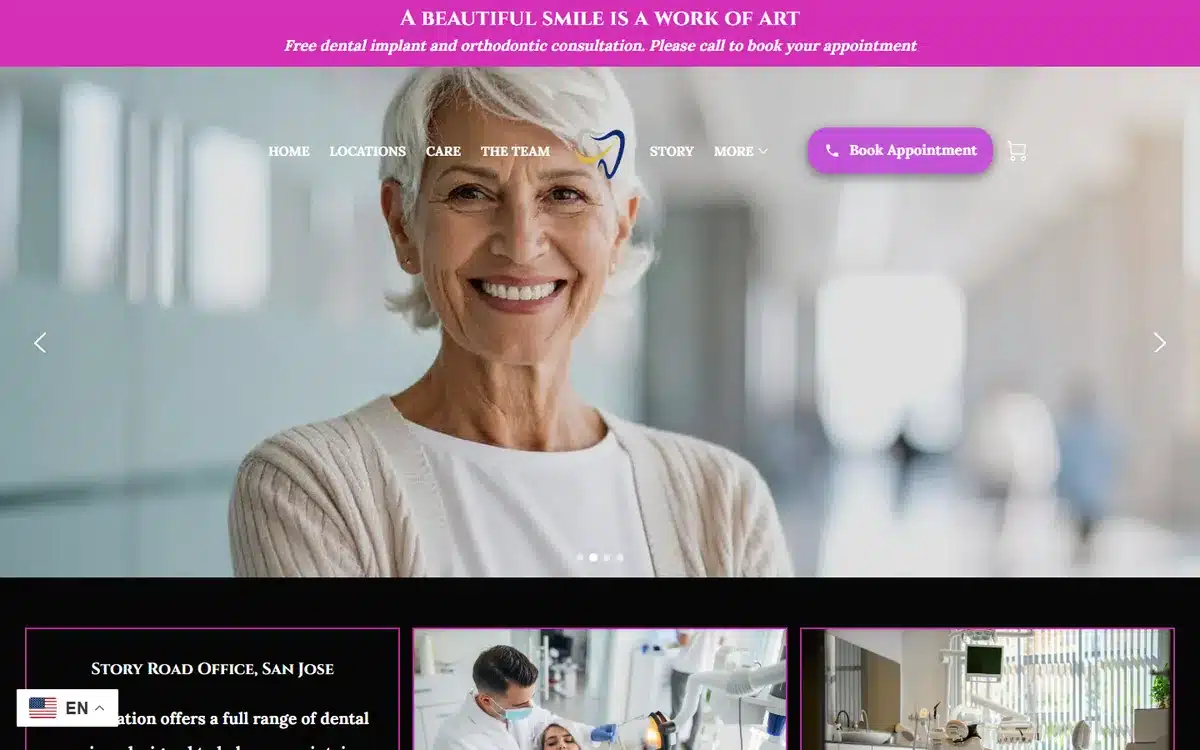
Castillo Dental Group in San Jose pairs a mature patient portrait with the tagline “A beautiful smile is a work of art”. The age of the patient in the hero is intentional — implant practices need to communicate to a 50+ demographic that the website was built with them in mind.
Borrow this: the age of the person in your hero photo signals who the practice is for. Match the demographic to the service you most want to grow.
6. Central Dental Care
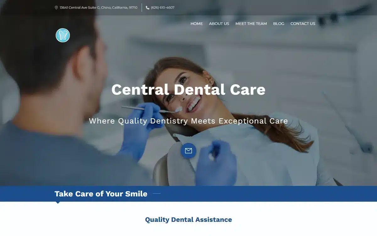
Central Dental Care in Chino, California uses an authentic dentist-at-work hero — gloves visible, patient in chair, no obvious staging. The composition reads as “this is a real clinic with real procedures”, which is exactly the trust signal for patients shopping their first appointment.
Borrow this: a real procedural photo outperforms a posed team portrait for new-patient conversion. Patients want to see what the visit will actually look like.
7. Deeply Rooted Dentistry
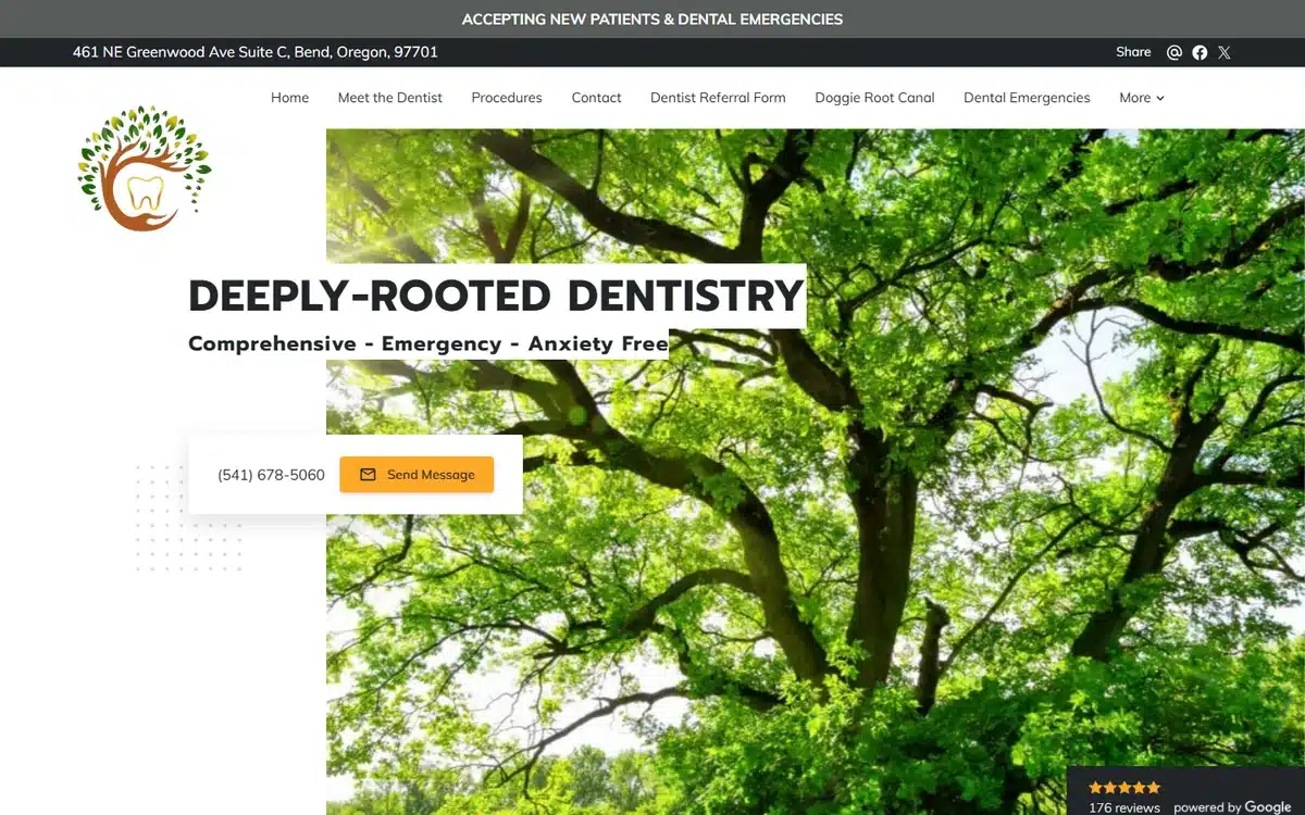
Deeply Rooted Dentistry in Bend, Oregon leans into the unusual: a lush tree canopy hero and a tree-with-tooth logo. The site is rejecting the entire category aesthetic — no smiles, no clinic, no scrubs — and substituting a holistic-wellness frame instead. For practices targeting natural/holistic-leaning patients, this is much stronger than the conventional approach.
Borrow this: if your practice serves a specific philosophical patient base (holistic, biological dentistry, integrative health), break the category aesthetic. Don’t compete on the same visual axis as every other dentist in town.
8. Dental Services of Bristol
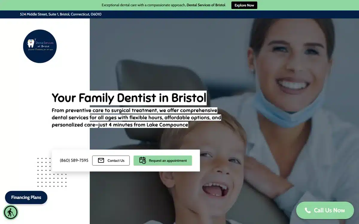
Dental Services of Bristol in Bristol, Connecticut uses a dentist + child patient warm clinical hero with a financing badge visible. Family practices that handle pediatrics AND adult work need to hero the pediatric angle since that’s the higher-emotion buying decision.
Borrow this: mixed family practices should hero the pediatric care moment even if adult work is the bigger revenue line. Parents make the appointment decision; lead with the child’s experience.
9. Duke City Dental
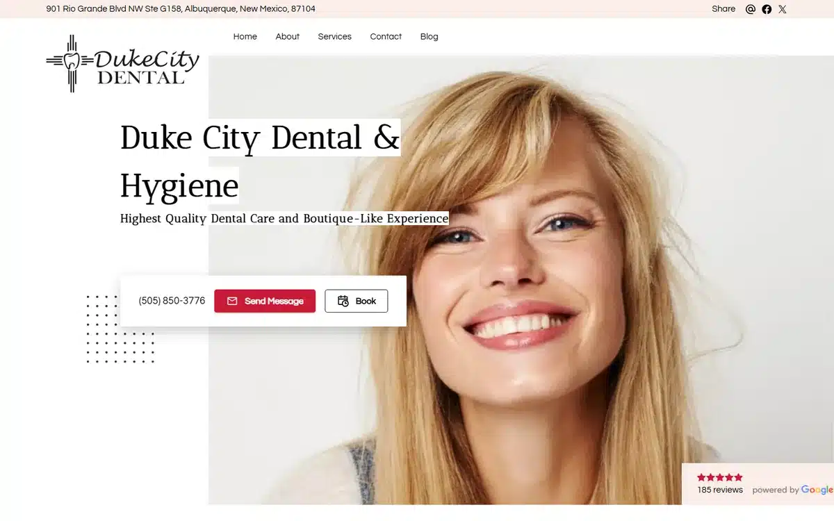
Duke City Dental in Albuquerque positions itself as a “boutique-like experience” with an airy patient portrait and a visible Google reviews badge near the hero. For practices charging above category average, “boutique” is the right word — premium without sounding stuffy.
Borrow this: if you charge above local average, name the experience in the tagline. “Boutique”, “concierge”, “premium” all signal price-tier without quoting prices.
10. Glam Smiles St. Louis
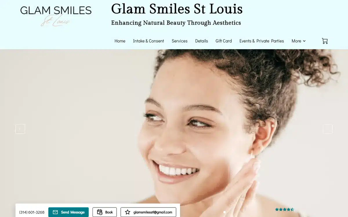
Glam Smiles St. Louis uses an editorial beauty portrait with the tagline “Enhancing Natural Beauty Through Aesthetics”. The aesthetics-forward positioning is unmistakable — this is a cosmetic dentistry practice that wants to be read as adjacent to medspas and aesthetic clinics, not as adjacent to general dentists.
Borrow this: cosmetic dentistry sites should borrow visual codes from medspas and beauty brands, not from general dental practices. The pricing tier and the patient profile sit closer to those categories.
11. Kids Dental Express
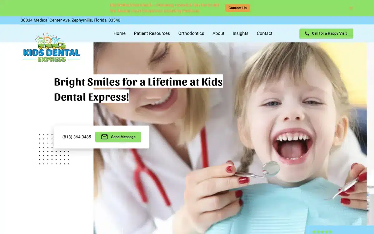
Kids Dental Express in Zephyrhills, Florida hero-images a smiling child holding a dental mirror with the tagline “Bright Smiles for a Lifetime”. For pediatric dentistry, the hero must look fun, not clinical — and a kid who looks comfortable holding the dental mirror is a strong reassurance signal for parents.
Borrow this: pediatric dental sites should show kids comfortable WITH dental equipment, not just kids with great teeth. The reassurance is “my kid won’t be scared here”.
12. Let Dr. Joe Do It
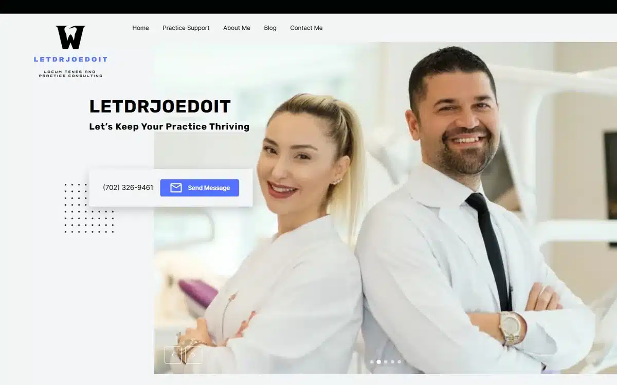
Let Dr. Joe Do It in Henderson, Nevada takes a confident dentist-duo hero and a tagline more typical of a consultancy than a dental clinic. The brand is loud and ownable, which works in a saturated Las Vegas market where every clinic looks the same.
Borrow this: in saturated local markets, the brand voice is your differentiator. Cautious sounds-like-every-dentist taglines lose to confident ones every time.
13. Matthew Lovato DDS
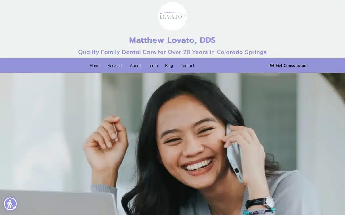
Matthew Lovato DDS in Colorado Springs uses a patient-on-phone lifestyle portrait with the headline “Quality Family Dental Care for Over 20 Years in Colorado Springs”. The tenure number does heavy lifting — patients evaluating a small practice want to know it’s been around.
Borrow this: if your practice has been operating 10+ years in the same community, surface the tenure number above the fold. Longevity is one of the cheapest trust signals available.
14. Metro Dental Center
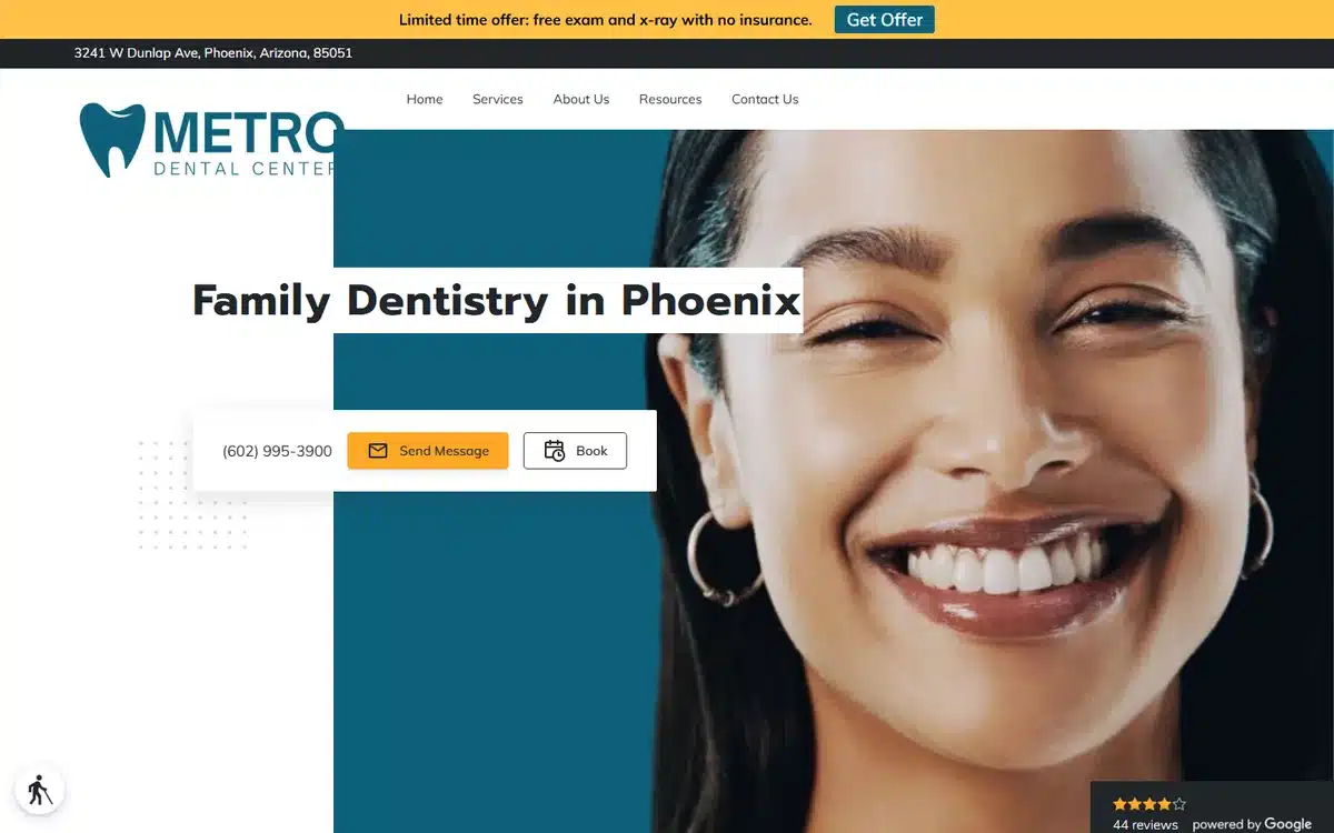
Metro Dental Center in Phoenix pairs a joyful hoop-earring portrait with a “Family Dentistry in Phoenix” anchor and a visible Google rating. The hero conveys the demographic the practice serves — urban, multicultural, family — without saying it out loud.
Borrow this: the hero patient should look like the patient base you want more of. Demographic match in imagery shapes who books and who doesn’t.
15. Mosery Orthodontics
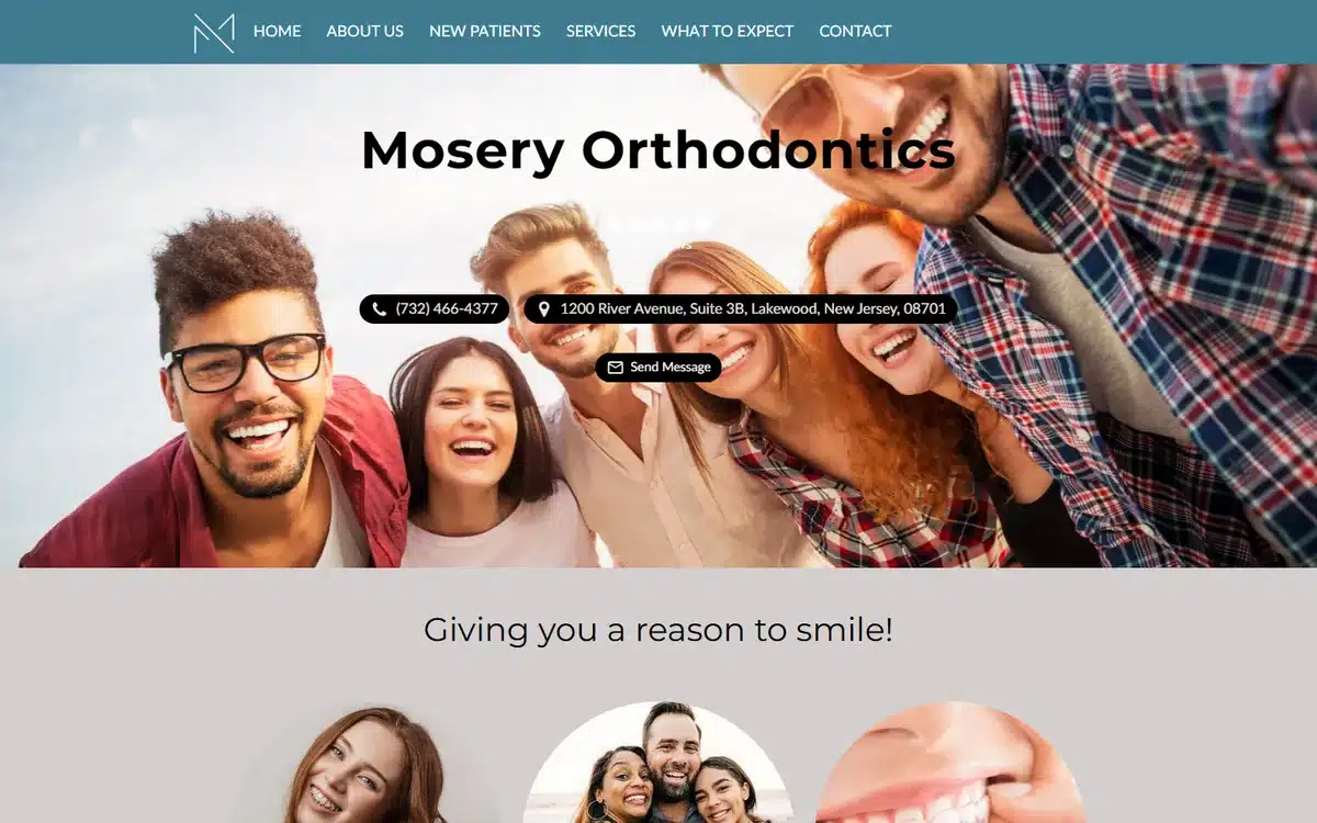
Mosery Orthodontics in Lakewood, New Jersey heroes a group of smiling teens and adults with the tagline “Giving you a reason to smile!”. Orthodontics sells the outcome, not the process — and the outcome is a happy group photo, not a metal bracket close-up.
Borrow this: orthodontics websites should never hero hardware. The hardware is what the patient is trying to AVOID showing on their face for 18 months.
16. Orchid Family Dental
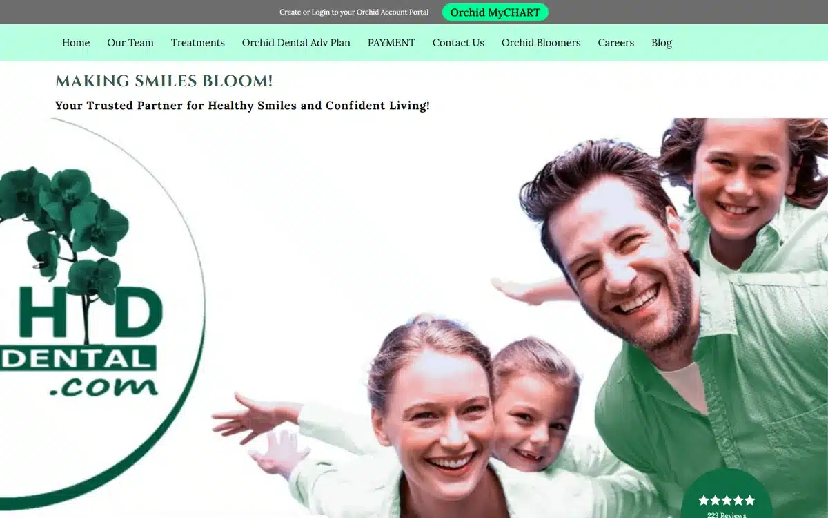
Orchid Family Dental in Richardson, Texas uses a playful animated family illustration with the tagline “Making Smiles Bloom!”. Illustration over photography is unusual for dental and it works precisely because of that — the practice looks distinctly more approachable than category-default photographic competitors.
Borrow this: illustration is an under-used route for family and pediatric practices wanting to feel warmer than a photo-based competitor. Done well, it differentiates.
17. Saint Vincent’s Dental Center
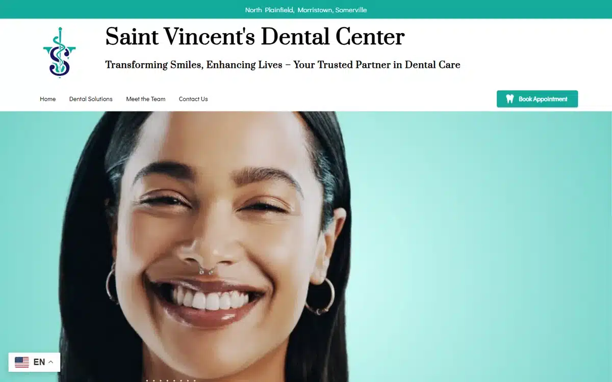
Saint Vincent’s Dental Center in North Plainfield, New Jersey uses a vibrant teal background and a striking smile portrait with a monogram logo. Bold colour against a clean portrait is the kind of “noticeable but not loud” balance most dental sites miss.
Borrow this: one saturated brand colour does more work than four. Pick the colour that matches the practice mood and commit to it.
18. SF Bay Area Mini Dental Implants
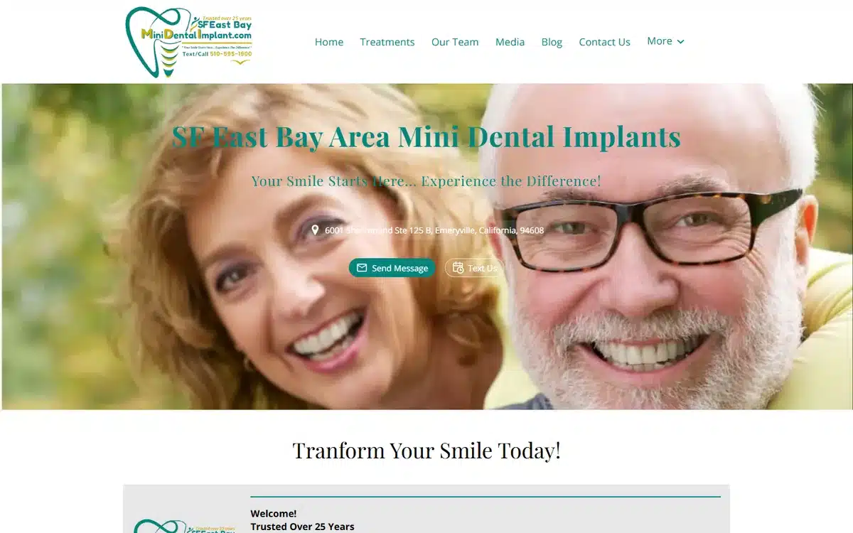
SF Bay Area Mini Dental Implants in Emeryville, California heroes a mature couple portrait targeting the implant demographic precisely. The practice doesn’t try to be everything to everyone; it owns one specialty and shows the patient who’d want it.
Borrow this: niche specialty practices win on specificity, not breadth. Show the exact patient profile the niche serves; let general dentists worry about general appeal.
19. Southern Dental Direct
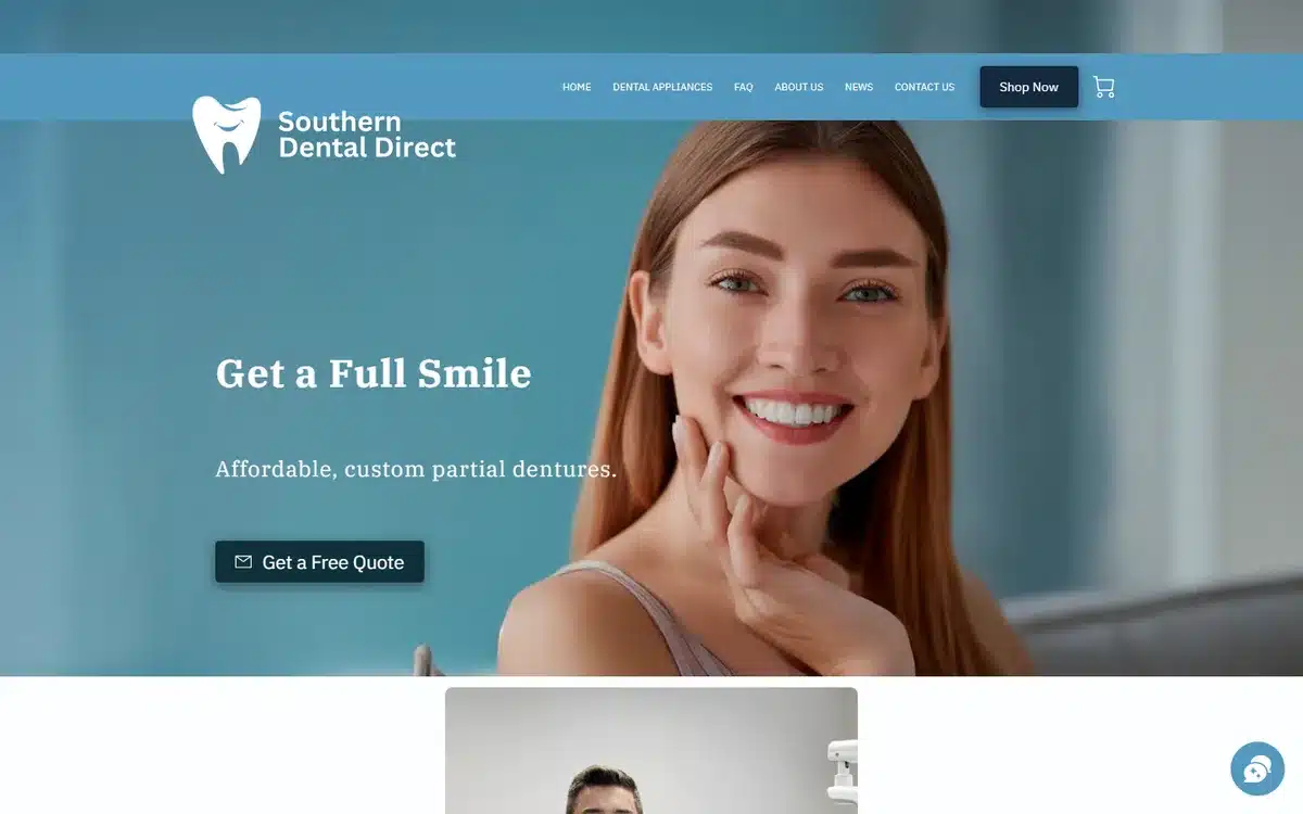
Southern Dental Direct in Mississippi leads with a “Get a Full Smile” positioning and affordable partial-denture messaging. For value-tier practices, the hero needs to surface affordability without sounding cheap — the tone here threads that needle well.
Borrow this: affordability positioning works on dental sites when paired with a confident outcome (“get a full smile”) instead of a discount marker (“starting at $X”).
20. West Plains Family Dentistry
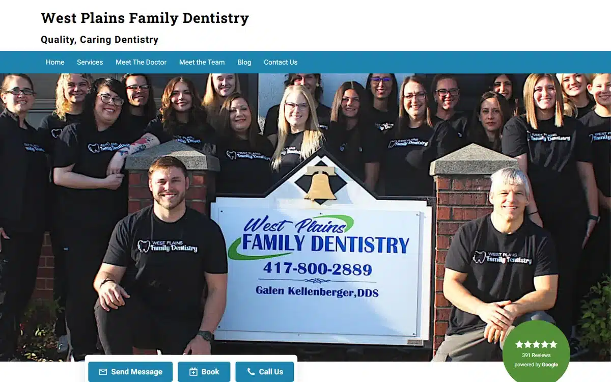
West Plains Family Dentistry in West Plains, Missouri closes the list with a real team photo in front of the practice signage. For small-town practices, the “real photo of the real team in front of the real building” is the strongest possible trust signal — and the easiest to produce.
Borrow this: small-town and rural dental practices should always hero a real team photo at the real practice. Stock imagery actively hurts you in markets where prospects know everyone.
Frequently asked questions about dental website examples and design
How much does a dental website cost?
A professionally built dental website typically lands somewhere between $0 and $10,000 upfront. Done-for-you builds with patient photography, practice-area pages, and Google Business Profile setup typically range from $500 to $2,500 one-time, plus hosting. Dental-specific agency builds (with intake integration, paid-ad landing pages, and ongoing content) usually start around $5,000 and run higher.
What features should a dental website have in 2026?
The non-negotiables: a visible online-booking or “Request Appointment” button above the fold, click-to-call phone on mobile, insurance acceptance + financing options surfaced near the hero, named services (general, cosmetic, pediatric, emergency, sedation) with separate URLs, real patient photos (with consent), and an SSL certificate. The highest-ROI additions are Google review ratings near the hero, before-and-after galleries for cosmetic practices, and a virtual tour or interior photos to ease first-visit anxiety.
Do dental practices need a website?
Yes. Most prospective patients research a dental practice online before contacting it — checking reviews, services, hours, and sometimes insurance acceptance. A sparse or amateur site loses patients to better-presented competitors at the moment of comparison. Even practices full of patients tend to grow faster when the website matches the in-clinic quality.
How do I make a website for my dental practice?
Three realistic routes. Build it yourself with a dental-friendly website builder like UENI, Squarespace, or Wix (typically 10 to 30 hours, and reasonable if you have real photography to start with). Hire a freelancer through Upwork or a local agency (typically $500 to $3,000 and 3 to 6 weeks, quality varies). Or use a done-for-you dental-website service that builds the site, organises patient photography, and configures Google Business Profile in a single package — usually the fastest route to a professional result.
What’s the best platform for dental websites?
There’s no single best answer, but the practical filter is whether the platform handles online booking, insurance/financing displays, and mobile responsiveness well out of the box. Dental-specific platforms (PBHS, ProSites, Sesame) include intake forms and practice-management integration natively. General-purpose builders like UENI, Squarespace, and Wix handle the marketing-site side well but typically need third-party tools for online booking. WordPress offers the most flexibility but the most maintenance overhead.
How do dental websites rank on Google?
Three factors carry most of the weight. Specific service pages with city or neighbourhood in the URL (e.g. “/pediatric-dentist-houston/”) outrank generic homepage content on commercial queries. A complete Google Business Profile with the most specific category (Cosmetic Dentist, Pediatric Dentist, Orthodontist) plus regular review collection signals legitimacy. And reviews on Google plus dental-vertical directories (Healthgrades, Vitals, Zocdoc) feed the prominence signal Google uses to rank local results. Long-form dentist bios with credentials, residencies, and continuing-education milestones help more than most practices realise.
Next steps
If these dental website examples have given you ideas, pick the two or three trust-signal moves that fit your practice. Dental practices over-invest in copy and under-invest in real patient photography. Reversing that ratio is the highest-ROI design change available.
If you’d rather skip the build and have a professional dental website delivered for you, UENI builds a done-for-you small business website in seven days, complete with Google Business Profile setup, service-page templates, and SEO basics included. Several of the dental website examples in this list were built that way.
For the marketing side of small-practice growth once the site is live, our guide to small business advertising ideas walks through 12 channels that work for dental practices and other local businesses.
Sources
- Live homepages of the 20 UENI customer dental practices linked from each example above, reviewed in May 2026. Each practice is a real, currently-trading UENI customer; the description is based on direct observation of the homepage at time of review.
Observations in this article (design patterns, cost ranges, typical timelines, ranking-factor weightings) are based on UENI’s experience supporting dental website builds and direct review of the live sites in May 2026. Presented as typical ranges, not figures attributed to a single external source.