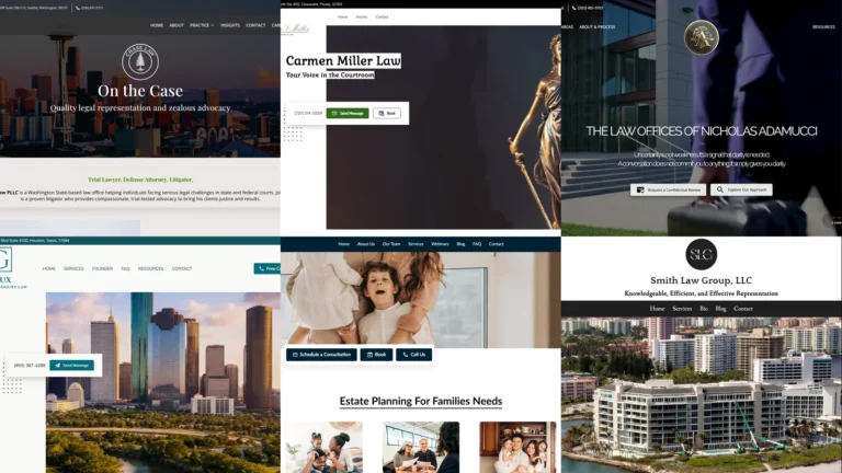
A law firm’s website does more reputational heavy-lifting than almost any other small-business site we see. A potential client researching a personal-injury claim, a divorce, an estate plan, or a criminal-defence consultation is making a high-stakes decision under stress. The website is often the first place they form an opinion about whether the firm can be trusted. To make that easier, this guide collects 30 real law firm website examples from UENI customer firms operating across the US, covering personal injury, family, criminal, wills and estate, corporate, immigration, labour, bankruptcy, and disability practice areas. Each example is a working firm’s live site, and each one shows a specific design or trust-building move you can borrow for your own practice.
Key takeaways
- Strong law firm website examples lead with trust signals — attorney portraits, courtroom imagery, scales-of-justice symbolism, or city-skyline shots that signal local authority. Trust is the entire pitch for legal services.
- The non-negotiable functionality stack for a law firm site in 2026: a visible “Free Consultation” or “Schedule a Call” CTA above the fold, a working contact form, click-to-call on mobile, named practice areas, and at least one attorney photo with credentials.
- Practice-area specificity drives Google ranking far more than firm-name branding. A “personal injury lawyer Houston” page outperforms a “Houston law firm” page on commercial queries every time.
- Social proof beats persuasive copy. Reviews, case results (where ethics rules allow), awards badges, and bar-association memberships all convert better than longer “About Us” paragraphs.
- Most prospective clients reach a law firm website from a Google search or a Google Business Profile. Optimising the profile and the website together — consistent name, address, phone, practice areas — usually moves more leads than either does alone. Our Google Business Profile guide covers the profile side.
What makes a good law firm website?
Before the 30 law firm website examples, it helps to set the bar. A law firm site’s job is narrower than most: convert a stressed, search-driven visitor into a booked consultation. Two things matter most: the design and the functionality.
The design
The design is the trust signal. Legal services are a high-trust category, and the website does most of the trust work before any conversation happens. The strongest law firm website examples share three traits. The hero image carries authority — a real attorney portrait, a courtroom shot, a Lady Justice statue, a city-skyline image that grounds the firm in its market — never generic stock photography of “business handshakes”. The colour palette is restrained, usually navy, charcoal, burgundy, or forest green with a single accent colour (gold, red, or teal). And the typography is serif or near-serif for the firm name, signalling tradition and seriousness without feeling dated.
The functionality
Functionality is what turns trust into a booked consultation. Law firm websites that perform usually nail four things. A prominent “Free Consultation” or “Schedule a Call” button sits above the fold on desktop and as a sticky element on mobile. Phone numbers are tap-to-call on mobile. A short contact form (name, phone, email, brief description) sits one click from the homepage, not three. And the practice areas are named explicitly, both as page sections and as separate URLs Google can index. The single most common failure pattern we see is law firms with elegant homepages and no clear path from “I read this” to “I booked a call”.
30 best law firm website examples (2026)
Every example below is a real UENI customer’s live site, captured in May 2026. They cover personal injury, family, criminal, wills and estate, corporate, labour and employment, bankruptcy, disability, and general-practice firms across the US, on purpose: a good law firm website example for a personal-injury practice looks nothing like one for an estate-planning practice, and the variety is the point.
1. Adamucci LLC (Greenwich Attorney)
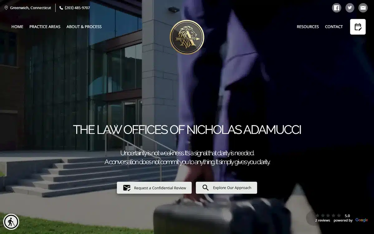
Adamucci LLC in Greenwich, Connecticut uses one of the most confident hero photos in this list: a moody, cinematic shot of an attorney holding a briefcase, lit from above, with a gold-crest logo dropped cleanly over the top. The site signals “boutique, serious, well-resourced” before any prospect reads a single word of copy. That’s the brief done right.
Borrow this: if your firm is positioned as premium, your hero photo should look like a film still, not a stock shot. Boutique firms compete on perceived gravitas.
2. Chase Law
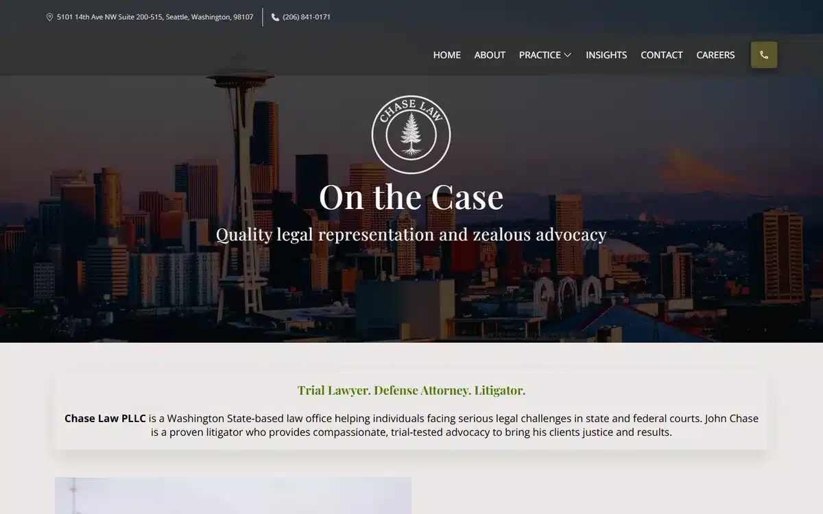
Chase Law in Seattle pairs a Seattle skyline at golden hour with a confident centred logo and the tagline “On the Case”. For criminal-defence and DUI firms, the city-skyline hero anchors the practice in the local market — a useful Google trust signal as well as a brand one.
Borrow this: if your practice is geographically tied, hero a recognisable image of your city or county. It tells Google AND the prospect “we serve this place”.
3. Gaux Accident & Injury Law
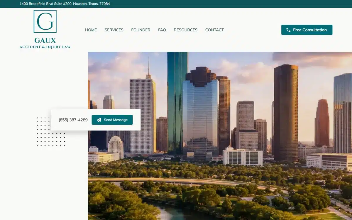
Gaux Accident & Injury Law in Houston uses the Houston skyline behind a clean brand mark, with a green accent palette and a “Free Consultation” CTA prominent above the fold. The site does the personal-injury basics right: clear practice focus, local imagery, no-cost-no-friction CTA.
Borrow this: personal-injury sites should put the “free consultation, no fee unless we win” promise above the fold. The whole category competes on that one offer.
4. Law Office of Eric P. Smith
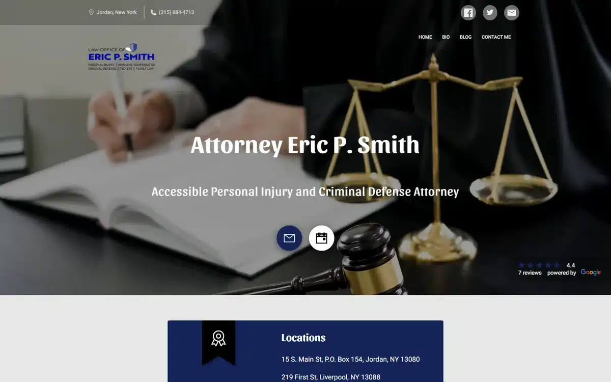
Law Office of Eric P. Smith in upstate New York uses a tight close-up of a gavel and scales on an attorney’s desk. The composition reads as serious and procedural — exactly the tone you want when a prospect is researching personal injury and litigation matters.
Borrow this: not every law firm needs an attorney face on the homepage. Sometimes the props (gavel, scales, legal pad, fountain pen) do better trust-work than a portrait.
5. Right Side Law
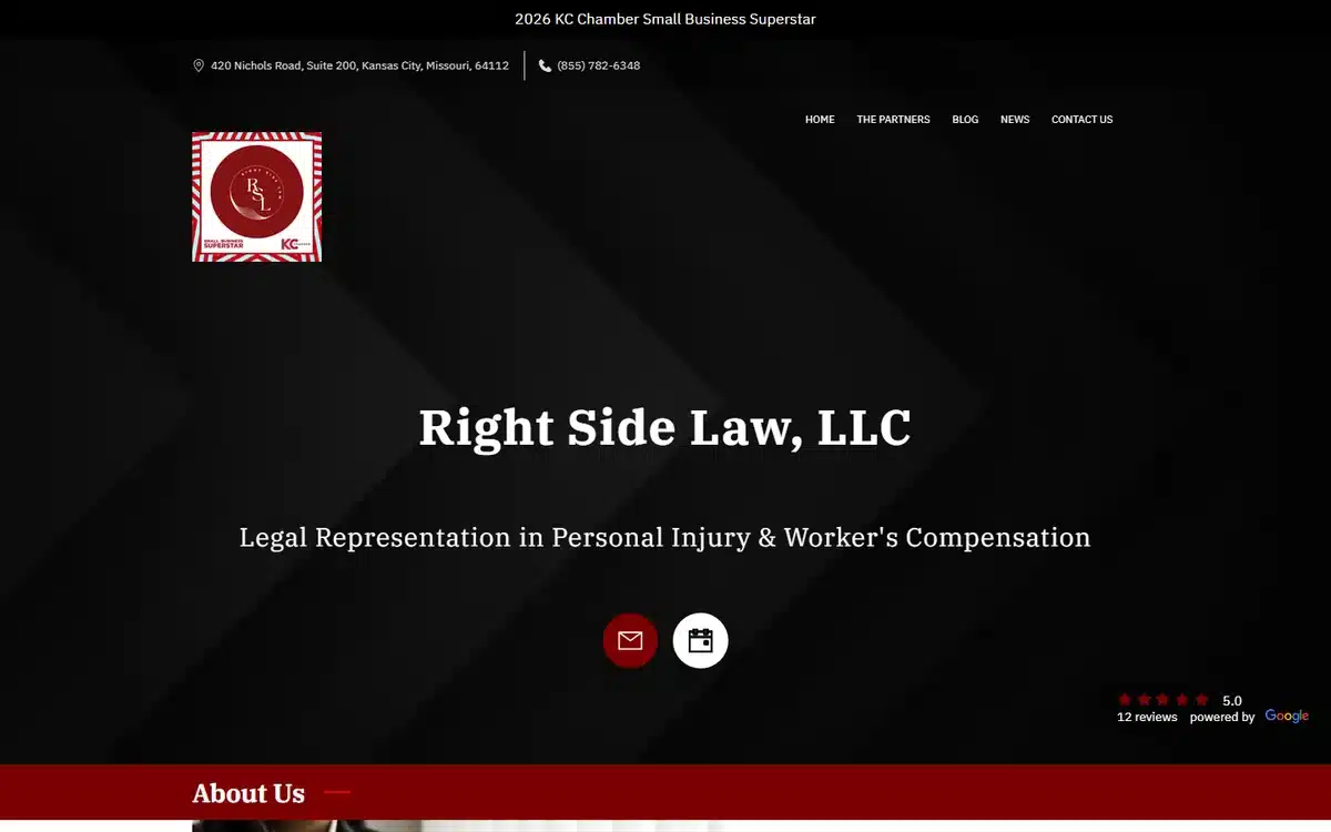
Right Side Law in Kansas City breaks the navy-and-gold pattern with a bold dark palette and red accents, plus a Chamber of Commerce “Superstar” badge prominently displayed. For personal-injury firms competing on local credibility, the badge is a useful trust shortcut.
Borrow this: if your firm has won local awards, certifications, or bar-association recognitions, surface them on the homepage. Awards convert.
6. Law Office of Maurizio D. Lancia
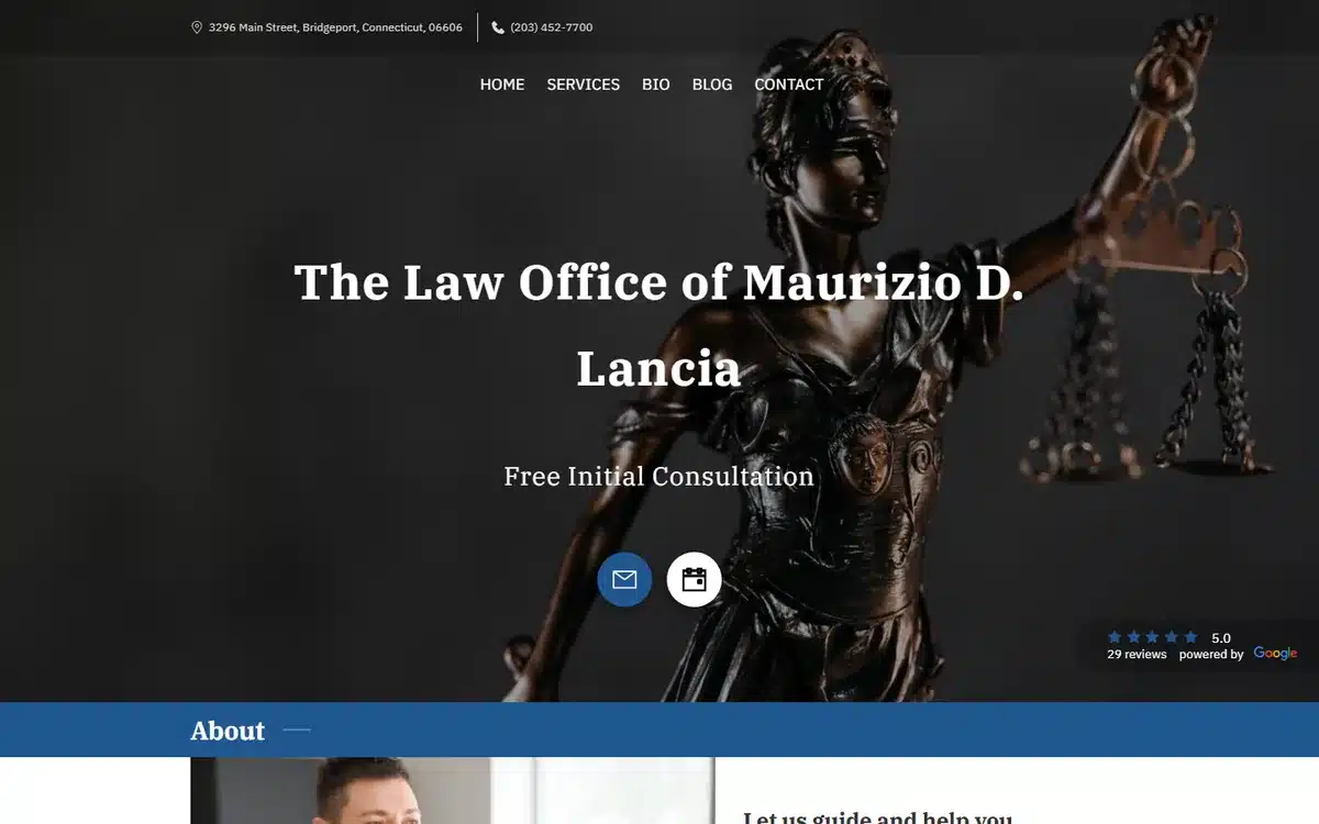
Law Office of Maurizio D. Lancia in Bridgeport, Connecticut takes the classic Lady Justice statue and treats it cinematically — dark backdrop, dramatic lighting, statue centred and slightly tilted. It’s editorial, not corporate, and it positions a personal-injury practice as something more considered.
Borrow this: Lady Justice imagery is overused in legal websites, but it still works when shot deliberately. Treat the symbolism with care; don’t slap it on as a default.
7. Carmen Miller Law
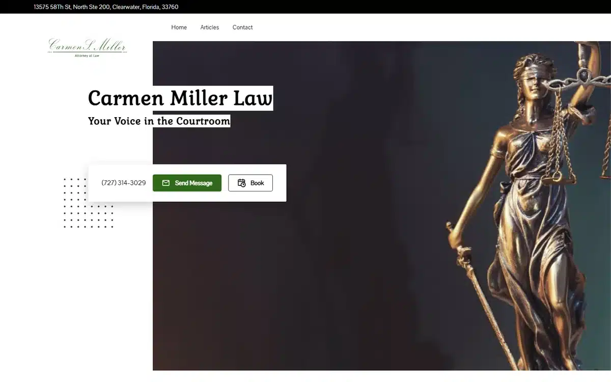
Carmen Miller Law in Clearwater, Florida uses a bronze Lady Justice statue against a dark dramatic palette with gold accents. Family-law firms often face a tone trade-off — too soft and prospects question authority, too austere and prospects feel intimidated. This site lands the balance well.
Borrow this: family law benefits from the same gravitas signals as litigation work. Avoid the temptation to soften the brand to “approachable” if it costs you the trust signal.
8. Law Office of Josephine Smalls Miller
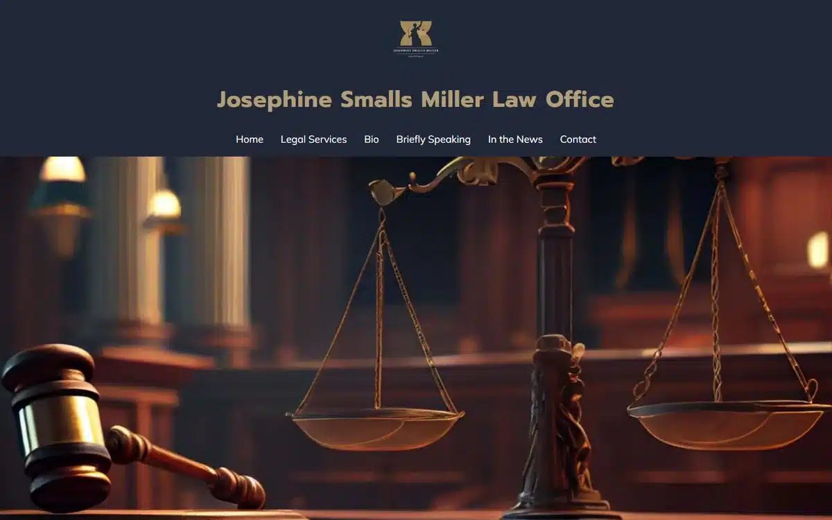
Law Office of Josephine Smalls Miller in Danbury, Connecticut leans into classic courtroom imagery: gavel and scales on warm wood, navy navigation, refined serif typography. It’s the textbook law-firm aesthetic done well, with no shortcuts taken.
Borrow this: classic doesn’t mean dated. A well-executed traditional aesthetic outperforms a “modern” attempt that misses the trust beats.
9. The Salerno Firm
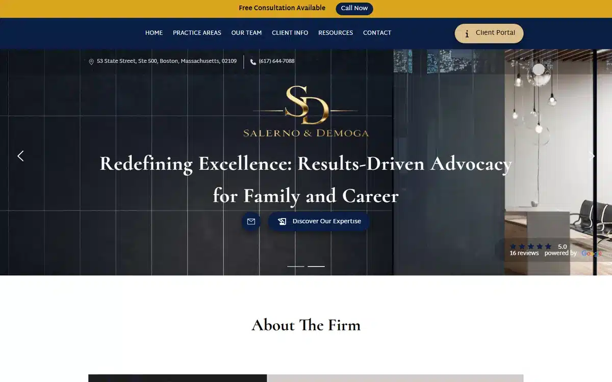
The Salerno Firm in Boston uses a navy-and-gold luxury palette with a tight monogram and a clear value-proposition headline. Family-law boutiques benefit more from “premium” positioning than mid-market ones do — the headline plus monogram does that work efficiently.
Borrow this: a strong monogram is one of the best ROI design investments for a law firm. It reads as established and ownable across the site, social, and stationery.
10. Jim Strickland Law
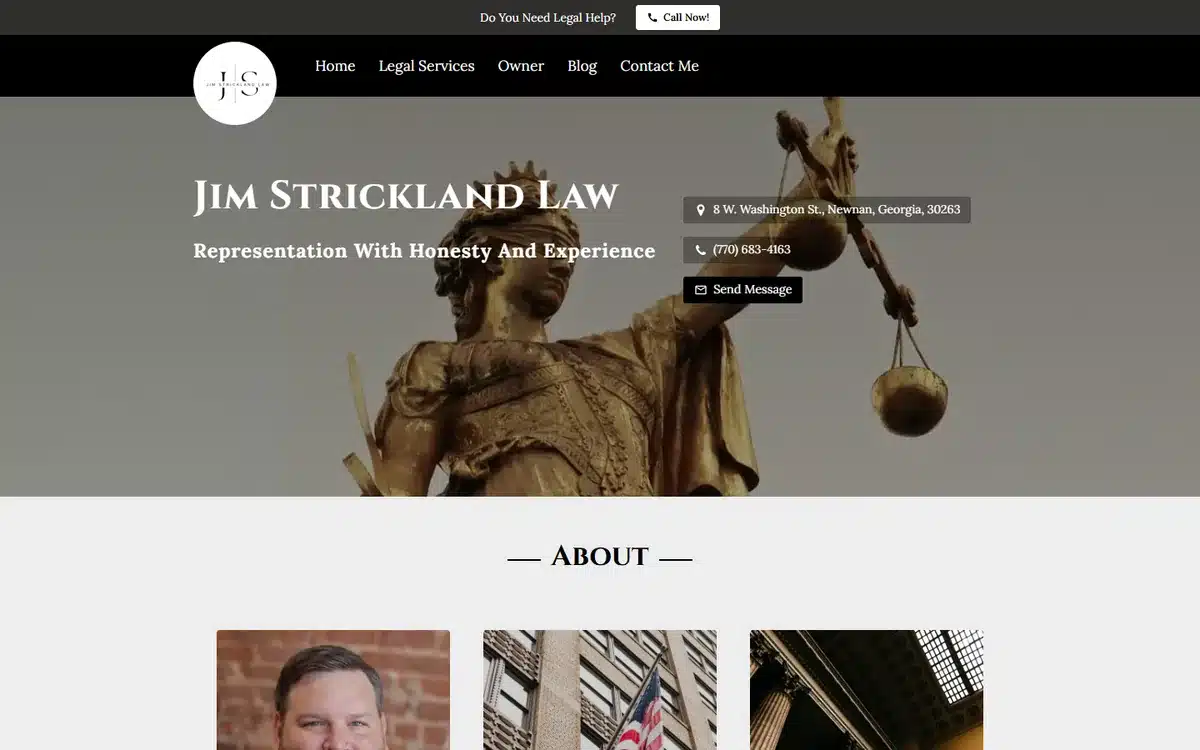
Jim Strickland Law in Newnan, Georgia uses a striking Lady Justice statue lit from below with gold accents. Unusual for a small-town criminal-defence practice — and the unusualness is exactly what makes the site memorable.
Borrow this: solo practitioners in competitive local markets win on “who do I remember?”. An unexpected hero beats a generic one.
11. North Side Law Offices
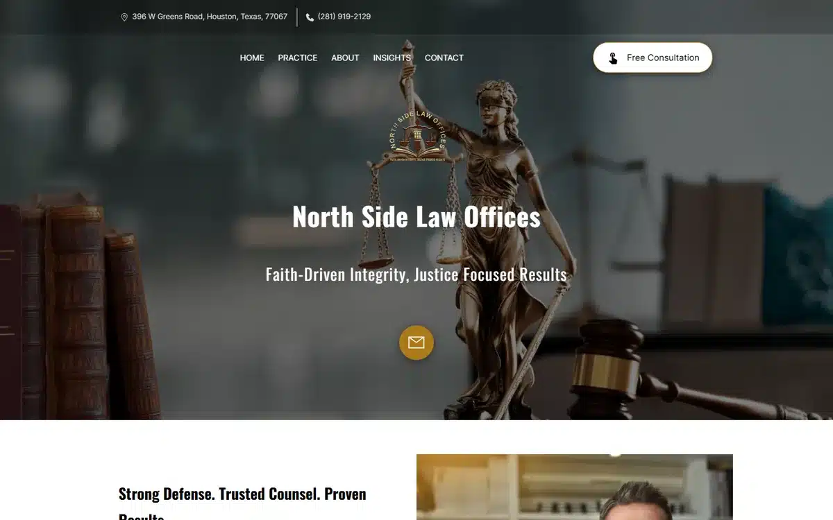
North Side Law Offices in Houston combines Lady Justice imagery with a gavel, set against a textured backdrop, with a faith-driven tagline. For practices that lead with values (faith-based representation, community focus, family-owned), the homepage is where that positioning lives or dies.
Borrow this: if your practice has a values-led positioning, surface it on the homepage. Prospects looking for a values-aligned attorney are filtering hard.
12. Vanguard Advocates
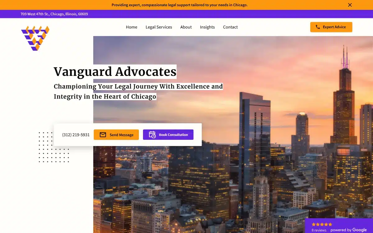
Vanguard Advocates in Chicago opens with a Chicago skyline at sunset and modern violet call-to-action buttons. The Google review rating sits prominently below the hero — useful social proof for criminal-defence prospects shopping multiple firms.
Borrow this: surfacing Google review counts and ratings near the hero is one of the highest-ROI law firm website examples we see. Prospects use it as a quick-filter signal.
13. Hernandez Legal PA
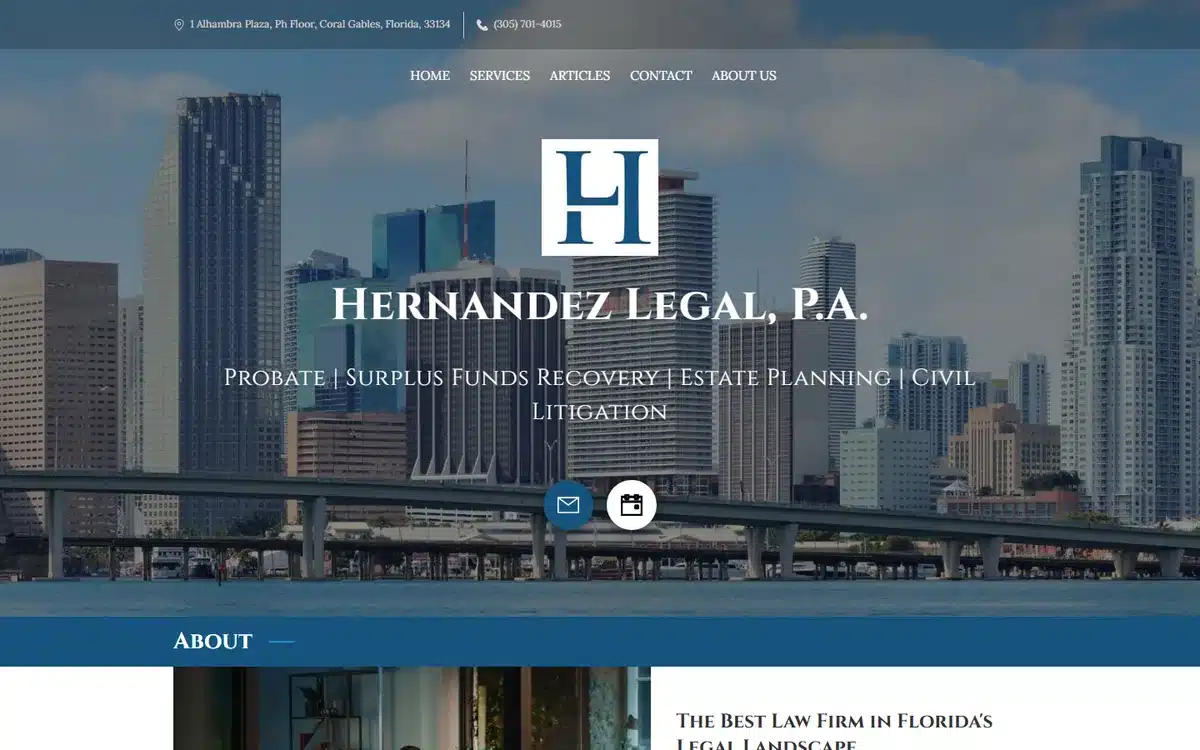
Hernandez Legal PA in Coral Gables, Florida uses an oversized H monogram floating over a blue Miami skyline. The composition is bold and ownable; the monogram does most of the brand work, and the skyline grounds the firm in its market.
Borrow this: a large, confident monogram outperforms a small one. Don’t be shy with the brand mark — let it carry the page.
14. Thomann Law
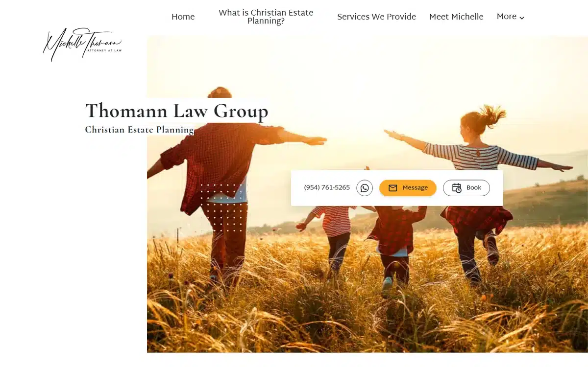
Thomann Law in Davie, Florida hero-images a family running through a field at sunset — warm tones, joyful motion, no courtroom in sight. For estate-planning and family-law practices, the emotional hero outperforms the procedural one because prospects are buying peace of mind, not litigation.
Borrow this: estate planning is about protecting people you love, not about legal procedure. The hero should evoke the outcome, not the process.
15. Law Offices of Delonda K. Coleman
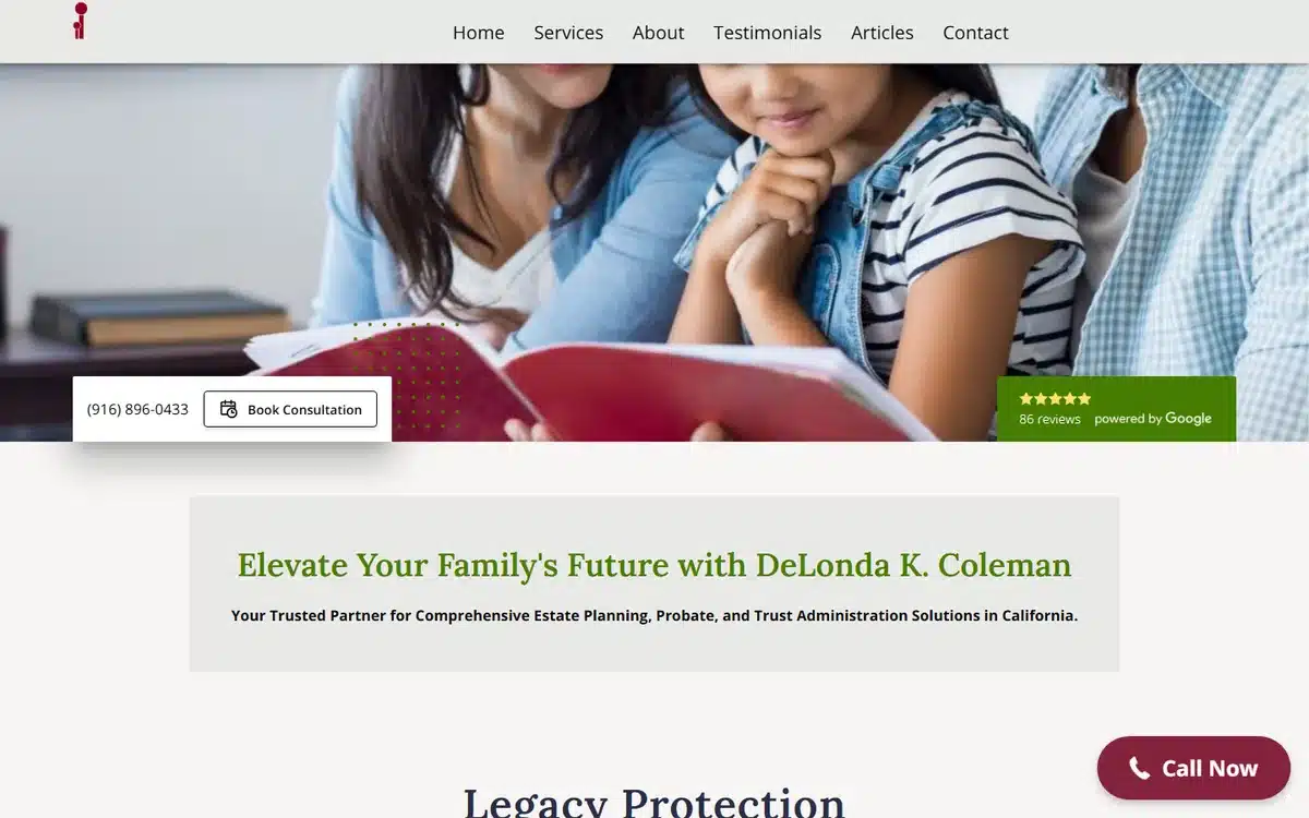
Law Offices of Delonda K. Coleman in Elk Grove, California pairs a lifestyle hero (mother and daughters reading a book) with a Google reviews badge near the top. For multi-generational family law and estate practice, the lifestyle hero communicates the why; the reviews badge handles the trust.
Borrow this: pair an emotional hero with a credibility marker (reviews, awards, bar memberships) within the same above-the-fold view. The emotion sells the visit; the credibility seals it.
16. Lazarow Law Firm
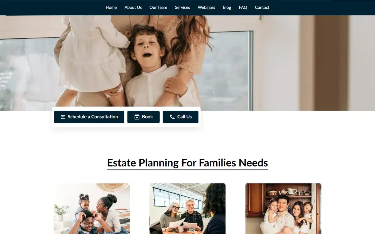
Lazarow Law Firm in Tucson goes further on the emotional-hero approach: a father lifting a smiling child against a clear-sky backdrop. Estate-planning prospects respond strongly to imagery that names what they’re protecting; this site does that in one shot.
Borrow this: the most effective estate-planning hero photos show the relationship the prospect is trying to protect — children, spouse, ageing parent — not the legal document.
17. Duquette Law Group
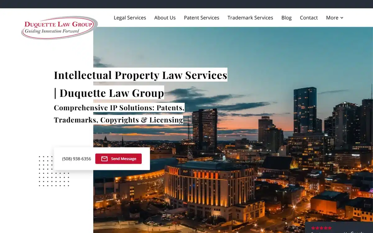
Duquette Law Group in Worcester, Massachusetts uses a city skyline at dusk with intellectual-property positioning. For corporate and IP practices, the hero needs to signal B2B fluency, not consumer warmth.
Borrow this: corporate law is bought differently. Tone the hero accordingly — sleeker palette, no family imagery.
18. Law Office of Warren J. Bennia
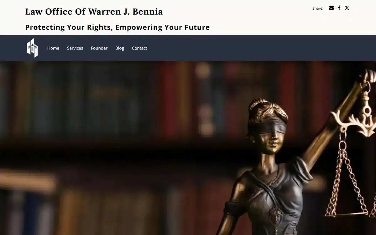
Law Office of Warren J. Bennia in New York pairs a blindfolded Lady Justice bronze with a library backdrop, navy header bar, and refined serif typography. It’s the most traditional design in this list — and that’s appropriate for the practice.
Borrow this: traditional design works when the firm’s positioning is traditional. Don’t chase modern aesthetics if your clients value institutional gravitas.
19. Meyer Law
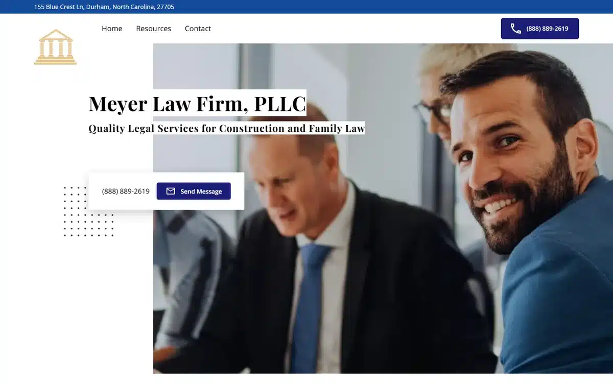
Meyer Law in Durham, North Carolina uses a two-attorney collaboration photo — both partners visible, smiling, working together at a desk. For multi-attorney practices, putting the actual humans on the homepage is a much stronger trust signal than abstract symbolism.
Borrow this: if your firm has two or more attorneys, hero them together. Prospects buy from people; show the people early.
20. Law Offices of Russell E. Adler
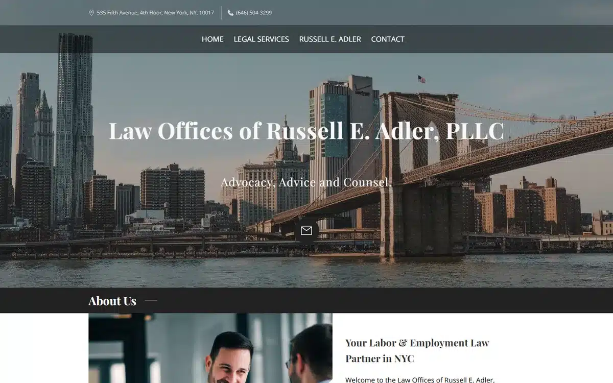
Law Offices of Russell E. Adler in New York opens with the Brooklyn Bridge dominating the hero, with strong navy typography over the top. Labour and employment practices benefit from NYC iconography in a way other categories don’t — the city is the practice’s reputation by association.
Borrow this: in industries where the market matters as much as the firm (NYC labour law, Houston energy law, DC regulatory practice), let the city carry part of the brand.
21. Vantage Legal Solutions
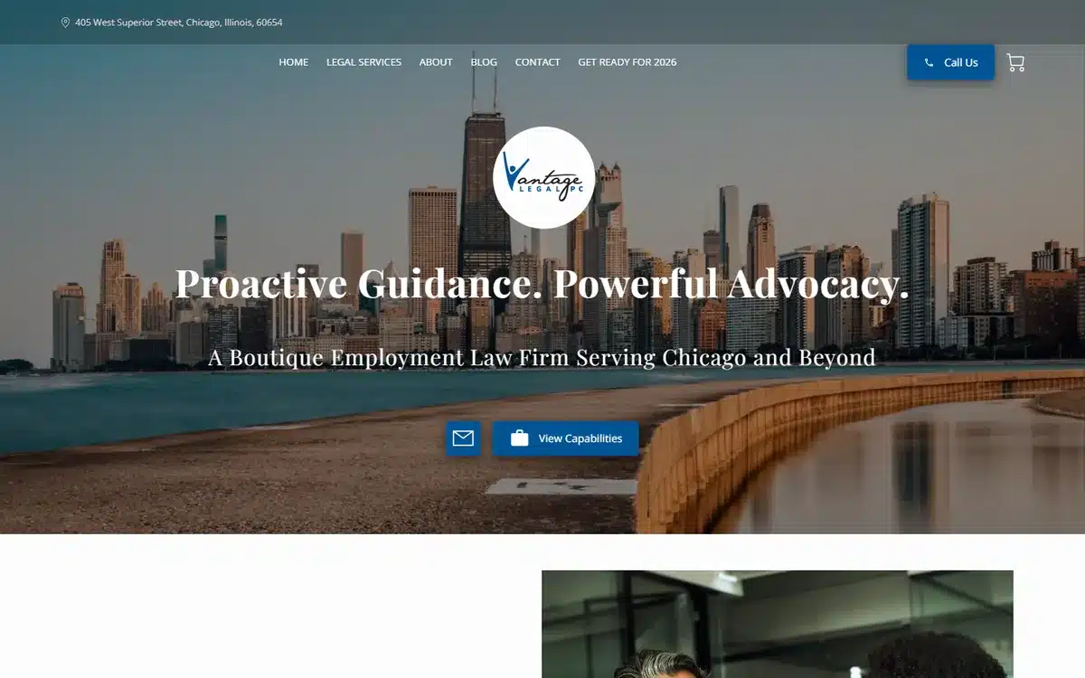
Vantage Legal Solutions in Chicago pairs the Chicago skyline with a clean circular brand mark. For labour-and-employment practices targeting both corporate and individual clients, the design has to read as professional to both audiences without alienating either.
Borrow this: when your practice serves two distinct client types (employer-side and employee-side, in this case), keep the brand neutral. Don’t pick a side visually.
22. Law Offices of R. Kenneth Bauer
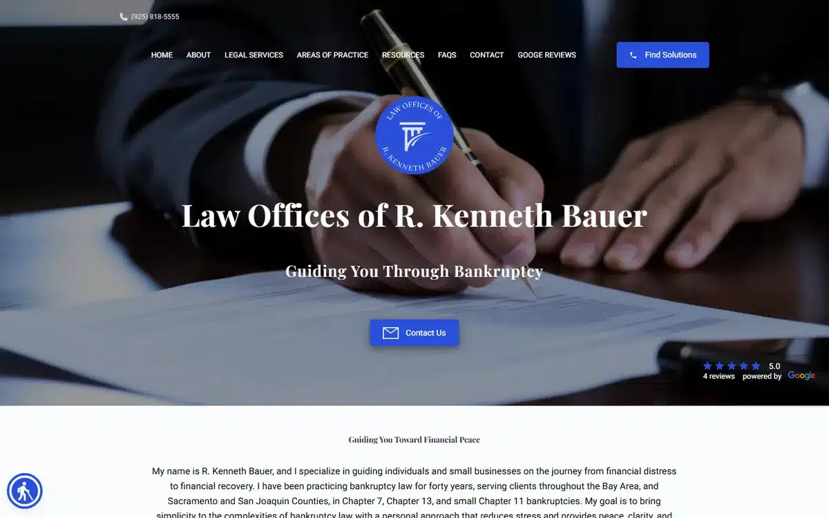
Law Offices of R. Kenneth Bauer in Walnut Creek, California uses a blue shield badge over a signing-pen photo. For bankruptcy practice — where clients arrive feeling defensive and stressed — the shield iconography signals protection and steadiness. Both of which matter more than gravitas at the point of search.
Borrow this: bankruptcy practices should signal protection and reset, not punishment. Visual choices matter at least as much as copy here.
23. Villamor Law Offices
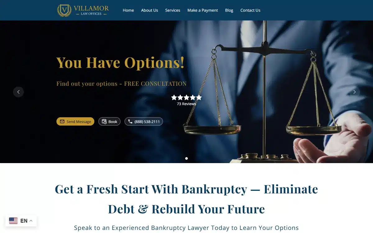
Villamor Law Offices hero-images an attorney holding scales of justice, dark navy backdrop with gold accents. The composition pulls double duty — the symbolic scales handle the legal signal, the real person handles the personal trust.
Borrow this: combining a literal symbol (scales, gavel, books) with a real attorney in one frame is hard to pull off, but when it works it carries more weight than either element alone.
24. Gary J. Martone, Attorney at Law
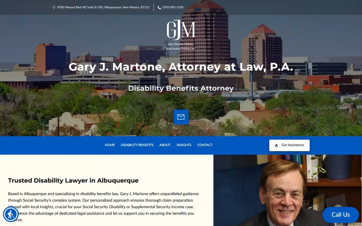
Gary J. Martone, Attorney at Law in Albuquerque uses an Albuquerque skyline behind a clean GJM monogram, with disability-law positioning explicit in the URL and tagline. For Social Security disability practices, the local-skyline + clear-niche pairing helps both ranking and prospect trust.
Borrow this: niche legal practices (SSDI, immigration appeals, veterans benefits) should put the niche in the URL, the tagline, and the hero alt-text. Don’t bury the specificity.
25. Spartan Disability Advocates
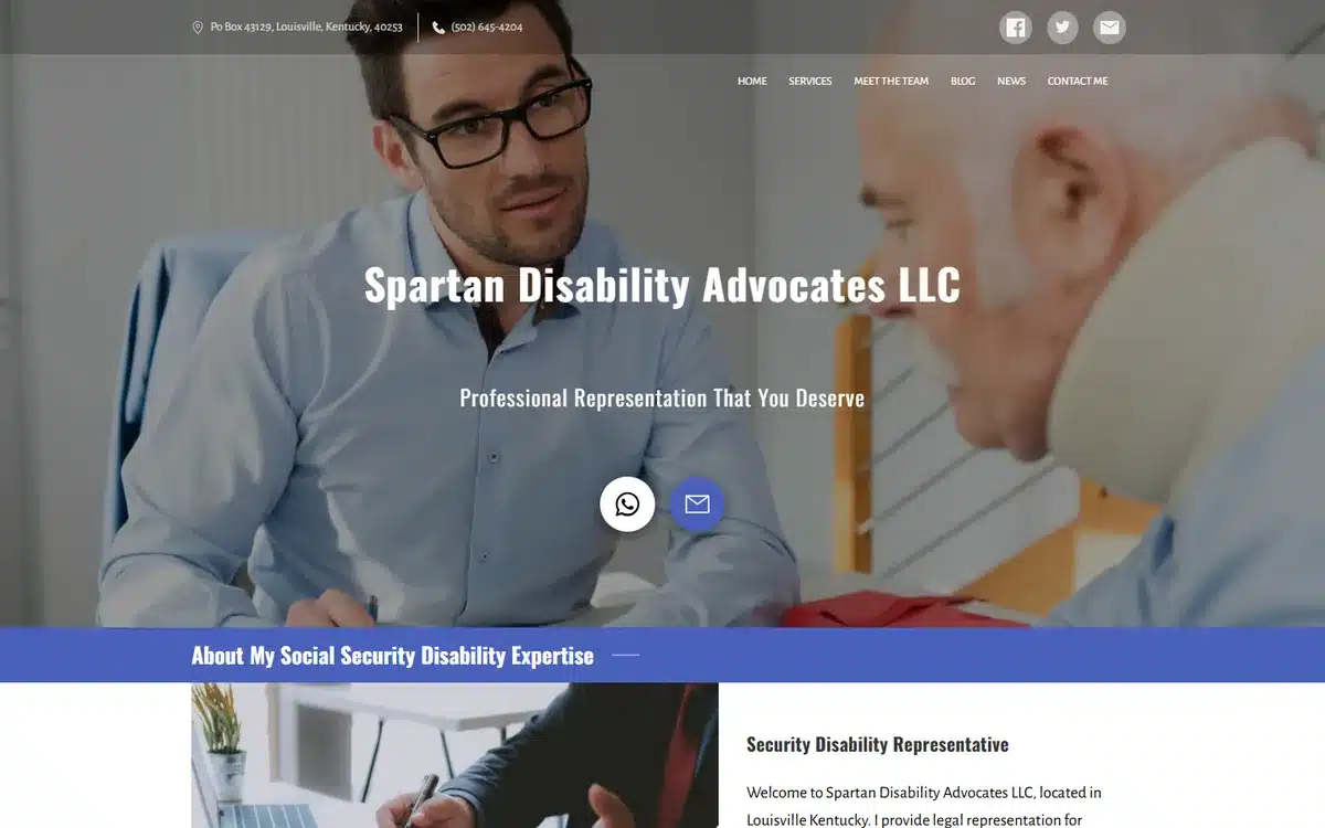
Spartan Disability Advocates in Louisville, Kentucky uses an empathetic client-consultation hero photo — an attorney sitting across from a client, listening. For SSDI and disability practices where prospects are often physically and emotionally vulnerable, the listening posture signals more than any tagline.
Borrow this: disability and elder-law practices benefit from showing the consultation moment itself, not the case win. The visit is the product; the outcome is the bonus.
26. Houston Legal Solutions
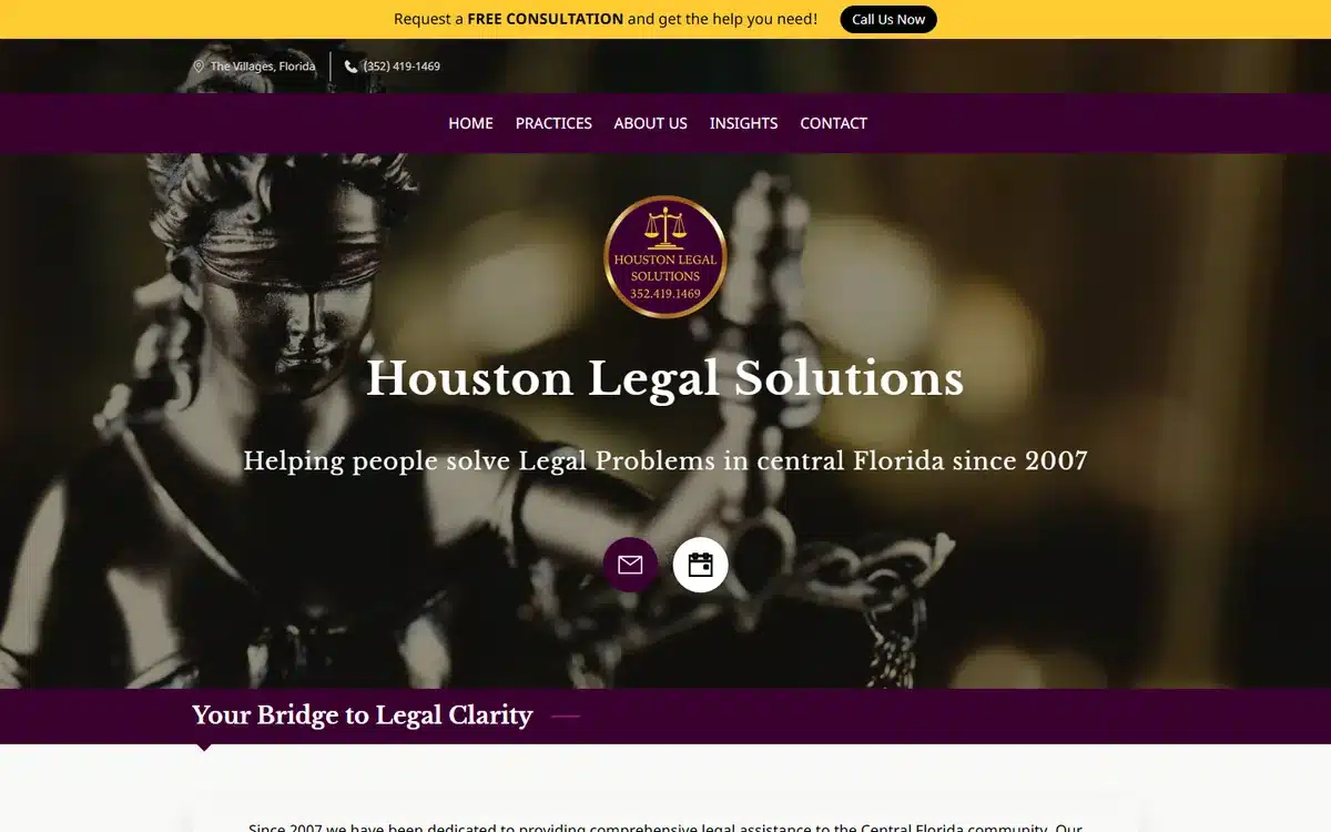
Houston Legal Solutions in central Florida uses a dramatic close-up of scales of justice in low dramatic lighting with gold accents. Despite the firm name’s Texas association, the practice covers multiple categories — and the symbolic hero works precisely because it doesn’t commit to a single practice area.
Borrow this: general-practice firms have a harder time with hero photography because they can’t lead with a niche image. Symbolism (scales, gavel, classical motifs) is the safer choice than picking one area’s imagery.
27. Mattei Law
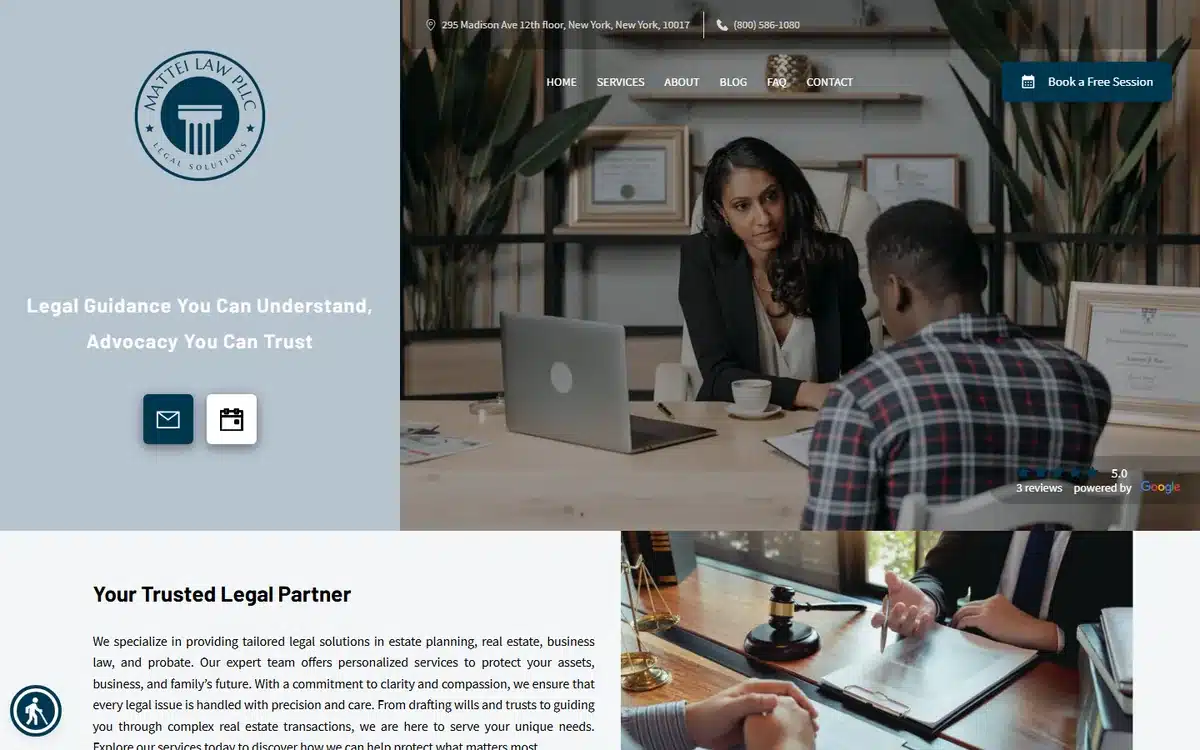
Mattei Law in New York hero-images a genuine client-attorney consultation scene — natural posture, real expressions, no obvious stock-photo feel. It’s one of the most authentic-looking law firm website examples in this list, and that authenticity does the trust work.
Borrow this: invest in real photography over stock. The cost of a half-day shoot pays back across the website, social, and pitch decks for years.
28. Norman Law Group
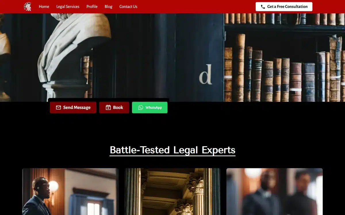
Norman Law Group in Dallas takes an unusual route: a barrister’s wig on a red drape against a library backdrop. The composition reads as theatrical and confident — appropriate for a firm whose URL is fighttowinmycase.com. Brand and image align.
Borrow this: when your firm name or URL leans confident-aggressive, the hero photography should match. Don’t soften the visuals if the verbal brand is bold.
29. Smith Law Group
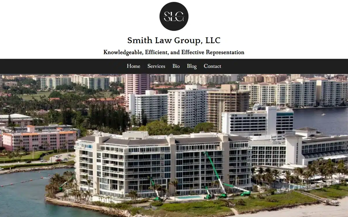
Smith Law Group in Boca Raton, Florida pairs a coastal aerial hero with a sophisticated SLG monogram. For firms in resort markets — Boca, Naples, Newport Beach, Aspen — the location-led hero communicates the client base as much as the practice does.
Borrow this: in luxury-market cities, the location image is part of the brand promise. Don’t pick a generic city shot; pick the one that says “this market specifically”.
30. Wright Law
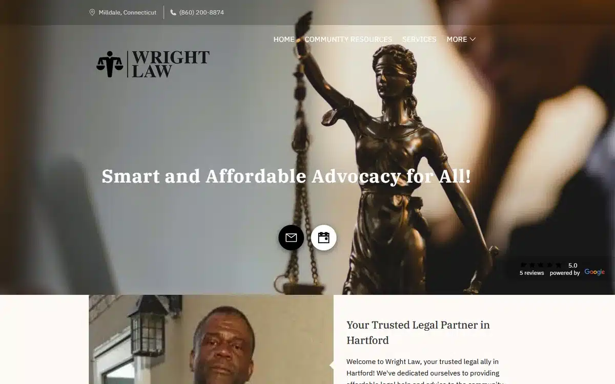
Wright Law in Milldale, Connecticut closes the list with a bronze Lady Justice statue and a shield logo. The composition is classical without being stuffy, and the shield logo adds a protection signal that complements the Lady Justice symbolism nicely.
Borrow this: pairing two complementary symbols (scales + shield, gavel + open book, courthouse + monogram) reinforces the trust signal more than either does alone.
Frequently asked questions about law firm website examples and design
How much does a law firm website cost?
A professionally built law firm website typically lands somewhere between $0 and $10,000 upfront. The cheapest option is a basic website builder you maintain yourself, often free at the entry tier but limited on design polish and SEO defaults. Done-for-you builds with attorney photography, practice-area pages, and Google Business Profile setup typically range from $500 to $2,500 one-time, plus hosting. Custom-designed law-firm-agency builds usually start around $5,000 and run to $25,000 or more, depending on whether they include intake automation, paid-ad landing pages, and ongoing content.
What features should a law firm website have in 2026?
The non-negotiables: clear practice-area pages (one per area, with separate URLs Google can rank), a working contact form one click from the homepage, click-to-call phone on mobile, a “Free Consultation” or “Schedule a Call” CTA above the fold, attorney bios with credentials and bar admissions, and an SSL certificate (still surprisingly common to find missing on older legal sites). Above that, the highest-ROI additions are Google review ratings near the hero, a chat widget for after-hours leads, and dedicated landing pages for paid Google Ads campaigns.
Do law firms need a website?
Yes. The substantial majority of US law firms now maintain a website, and prospective clients increasingly research a firm online before contacting it. Even firms relying primarily on referrals tend to find that prospects check the website before calling — a sparse or amateur site can lose a referred prospect who showed up ready to hire.
How do I make a website for my law firm?
Three realistic routes. Build it yourself with a law-firm-friendly website builder like UENI, Squarespace, or Wix: typically 8 to 25 hours of work, and reasonable if you have headshots and a clear practice-area list. Hire a freelancer through Upwork, Fiverr, or a local agency: typically $500 to $3,000 and 3 to 6 weeks, with quality varying widely. Or use a done-for-you legal-website service that builds the site, organises attorney photography, and configures Google Business Profile in a single package: usually the fastest route to a professional result if the budget allows.
What’s the best platform for law firm websites?
There’s no single best answer, but the practical filter is whether the platform handles practice-area page templates, contact-form intake, and mobile responsiveness well out of the box. Legal-specific website platforms (Clio Grow, FindLaw, LawLytics) include intake forms and case-management integration natively. General-purpose builders like UENI, Squarespace, and Wix handle the marketing-site side well but typically need third-party tools for intake automation. WordPress offers the most flexibility but the most maintenance overhead. For most solo and small-firm practices, a marketing-focused builder paired with a separate intake tool usually beats one all-in-one legal-tech stack.
How do law firm websites rank on Google?
Three factors carry most of the weight in our experience. Practice-area-specific pages with city or county names in the URL and headline (e.g. “/personal-injury-lawyer-houston/”) outrank generic firm pages on commercial queries. A complete Google Business Profile matched to the website’s name, address, and phone signals legitimacy. And reviews — both on Google and on legal-vertical directories like Avvo and Martindale-Hubbell — feed the prominence signal Google uses to rank local results. Long-form attorney bios with bar admissions and case histories also help, more than most firms realise.
Next steps
If these law firm website examples have given you ideas, pick the two or three trust-signal moves that fit your practice. Most firms over-invest in copy and under-invest in photography and trust markers. Reversing that ratio is the highest-ROI design change available.
If you’d rather skip the build and have a professional law firm website delivered for you, UENI builds a done-for-you small business website in seven days, complete with Google Business Profile setup, practice-area page templates, and SEO basics included. Several of the law firm website examples in this list were built that way.
For the marketing side of small-practice growth once the website is live, our guide to small business advertising ideas walks through 12 channels that work for legal practices and other local businesses.
Sources
- Live homepages of the 30 UENI customer law firms linked from each example above, reviewed in May 2026. Each firm is a real, currently-trading UENI customer; the description of each is based on direct observation of the homepage at time of review.
Observations in this article (design patterns, cost ranges, typical timelines, ranking-factor weightings) are based on UENI’s experience supporting law firm website builds and direct review of the live sites in May 2026. Presented as typical ranges, not figures attributed to a single external source.